The network for creativity
Join 1.25M professional creatives like you
Connect with clients, get discovered, and run your business 100% commission-free
Creatives on Contra have earned over $150M and we are just getting started
Back to feedPost

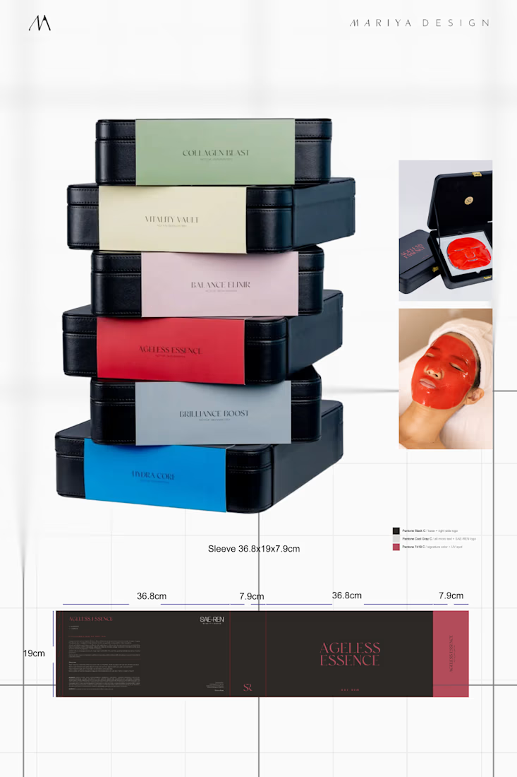
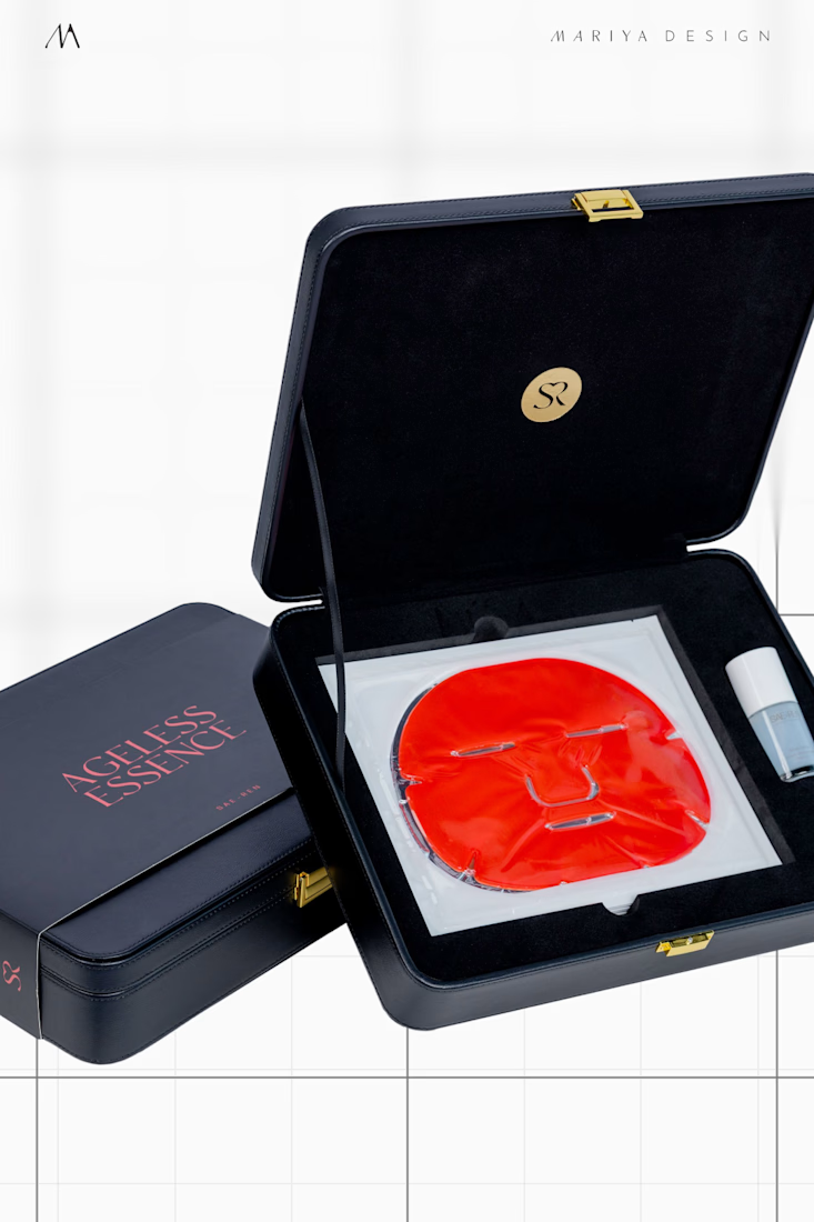
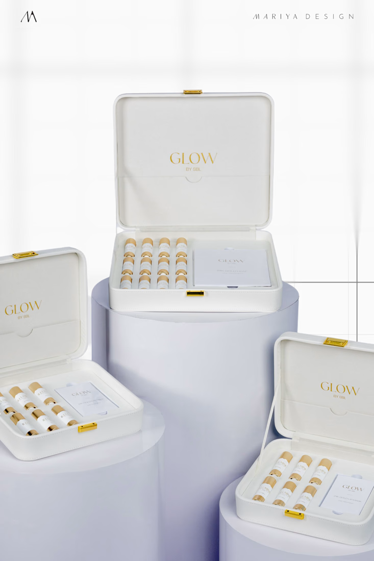
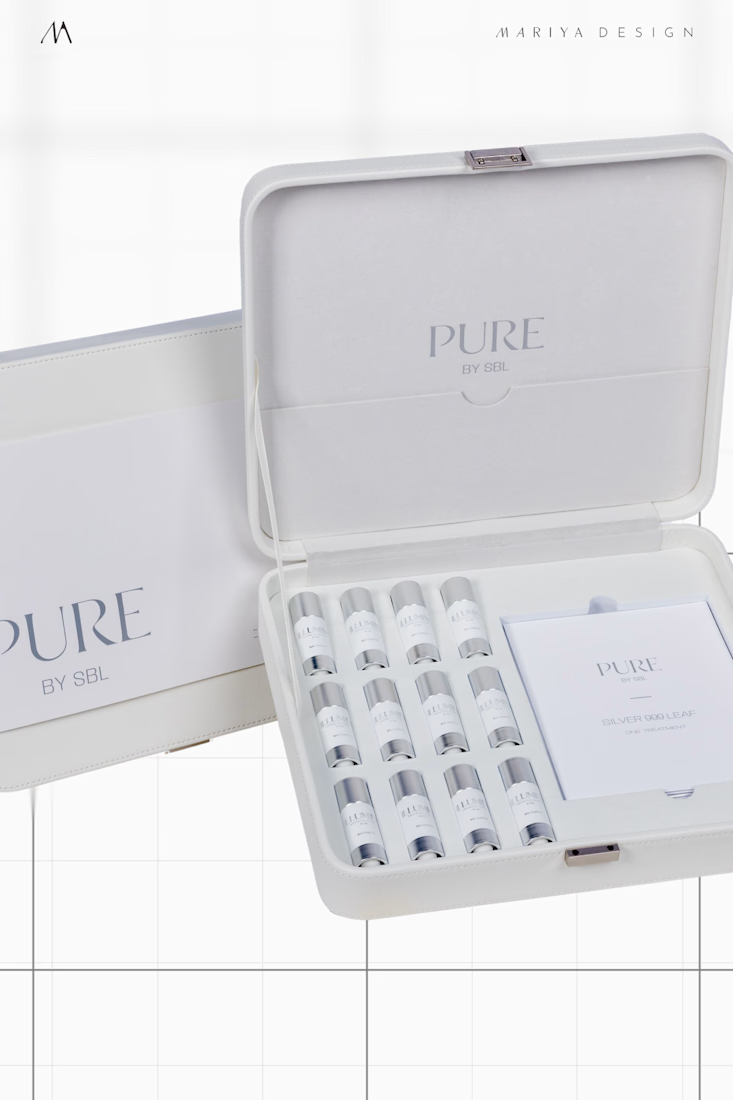
SAE-REN, a Singapore beauty lounge case study: skincare line packaging.
Treatment kits, bottles, ampoules, inserts, and sleeves shared the same structural hierarchy.
Controlled differences in color, finish, and material separated Pure (silver), Glow (gold), and later ASM (black) while keeping them part of one family.
next up: makeup expansion


The network for creativity
Join 1.25M professional creatives like you
Connect with clients, get discovered, and run your business 100% commission-free
Creatives on Contra have earned over $150M and we are just getting started








Related posts

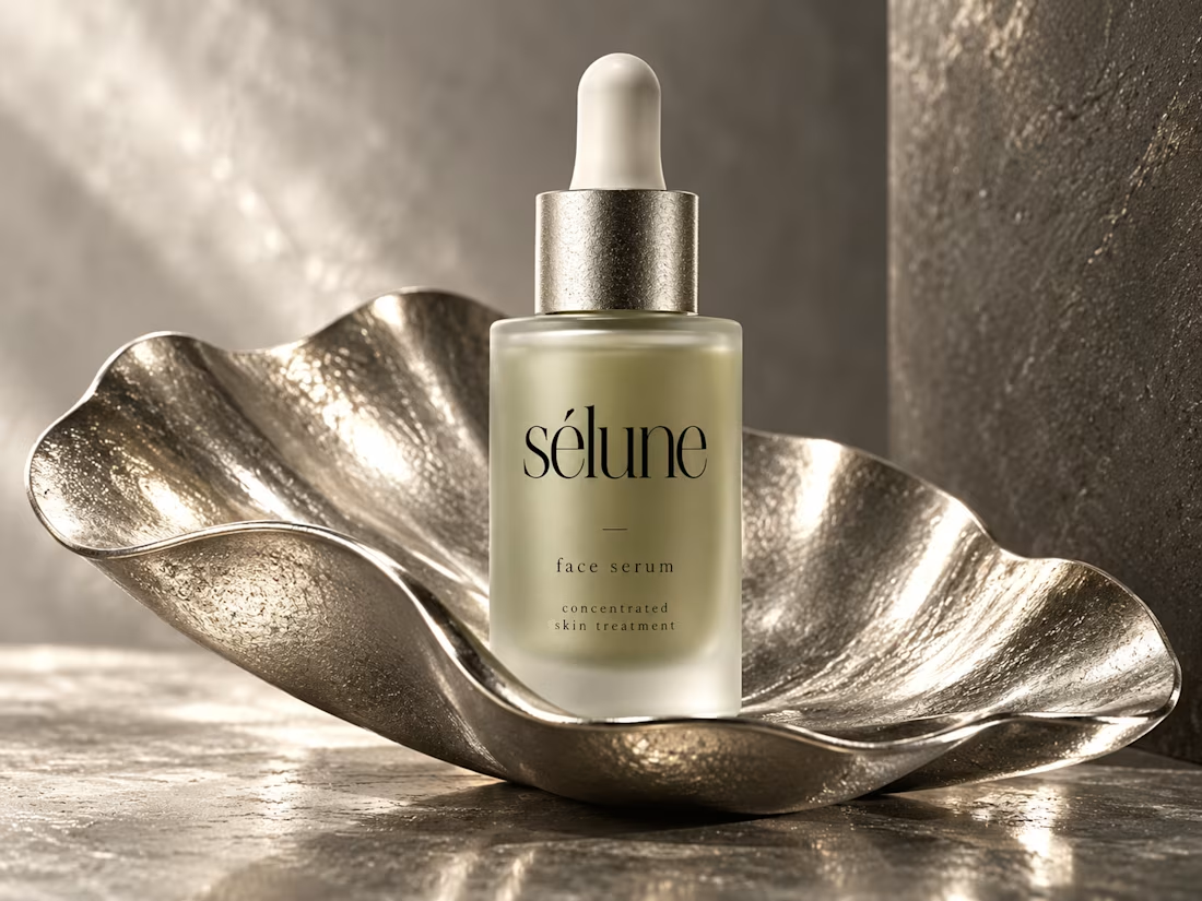
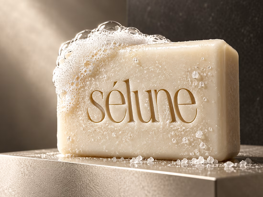
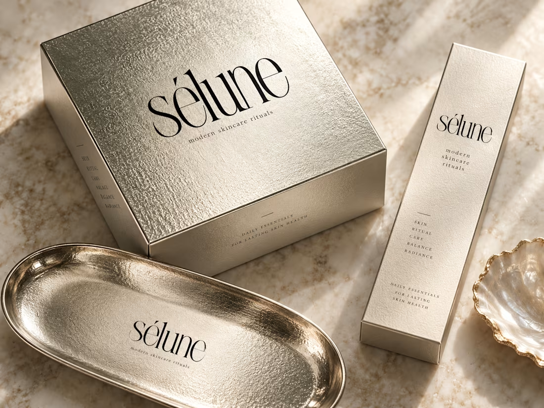
✨ Introducing SÉLUNE — where skincare meets quiet luxury.
What do you think of this direction for a modern skincare brand? ✨

Amaizinh nusrat ♥️♥️🔥


Mastering Claude + Figma MCP has been a process, but it’s already made iterating on brand assets significantly faster
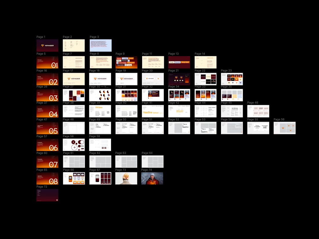

Same here, once it clicks the iteration speed is wild. Would be cool to see how you set up your workflow.

The Good Times website is live 👀
Most app sites start with a phone mockup and a list of features. This one starts with the problem, so you can see yourself in it first. The app shows up after that, as the answer.
https://goodtimestimer.com/
Built with Astro.


Great concept