pro
Maria Luciano
Visual designer & video editor creating high-end content.
New to Contra
Maria is ready for their next project!
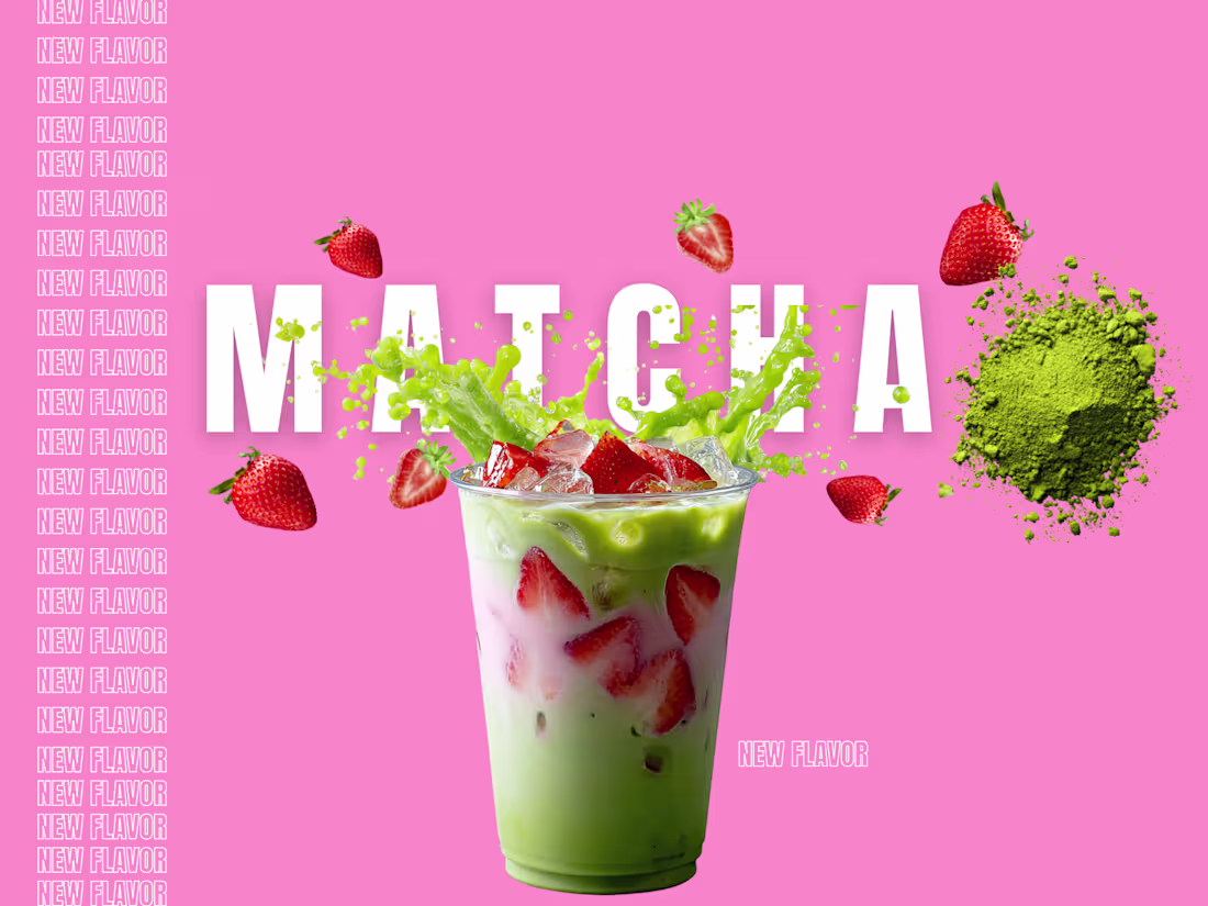
Strawberry Matcha concept screens. 🍓🍵
Following up my recent design experiments with this personal concept project! I had a lot of fun playing around with layout depth for these-matching bold typography with vibrant color stories, crisp product imagery, and fun green splashes.
Graphics like this are a great example of how a brand can stop a mobile scroll and make an audience crave a product before they even read the menu. 🥤
1
1
83
I utilized the CapCut Video Studio AI Agent to generate ethereal, Ghibli-inspired sequences that captured the transition from a dying world into a vibrant sanctuary. I then moved these assets into the editor to layer Sound Effects (SFX) specifically cinematic orchestral scoring and distinct character voices to build an immersive, emotional narrative.
My focus was on a hand-drawn anime aesthetic: I used high-saturation color grading to make the magical elements pop and integrated my signature Lucci intro to maintain brand consistency. I finished with a Genesis of Gamma title card to establish this as a professional pilot for a new multiverse series.
https://www.instagram.com/reel/DWph9VHjpHF/?igsh=YjR5bDA1MmViam11
https://www.instagram.com/reel/DWph9VHjpHF/?igsh=YjR5bDA1MmViam11
#CapCutVideoStudio #capcutccp #AnimeAesthetic #Multiverse #LucciGraphicDesigns
2
3
262
I utilized the CapCut Video Studio Al Agent to generate cinematic 4k cyberpunk clips that captured the intensity of an urban escape. I then moved these assets into the editor to layer Sound Effects (SFX)— specifically heavy breathing and distant police sirens –to build immediate tension and world-building.
My focus was on a 'premium' aesthetic: I used custom minimalist typography for the location and status updates and added Glitch transitions to sync with the character's digital visor. I finished with a 'To Be Continued' title card to give the video a professional teaser-trailer structure.
https://www.instagram.com/reel/DWjK1jGDgzW/?igsh=MTBscjJkN2ZqM3MwNw==
https://www.tiktok.com/t/ZP8b7T19F/
15
35
2.4K
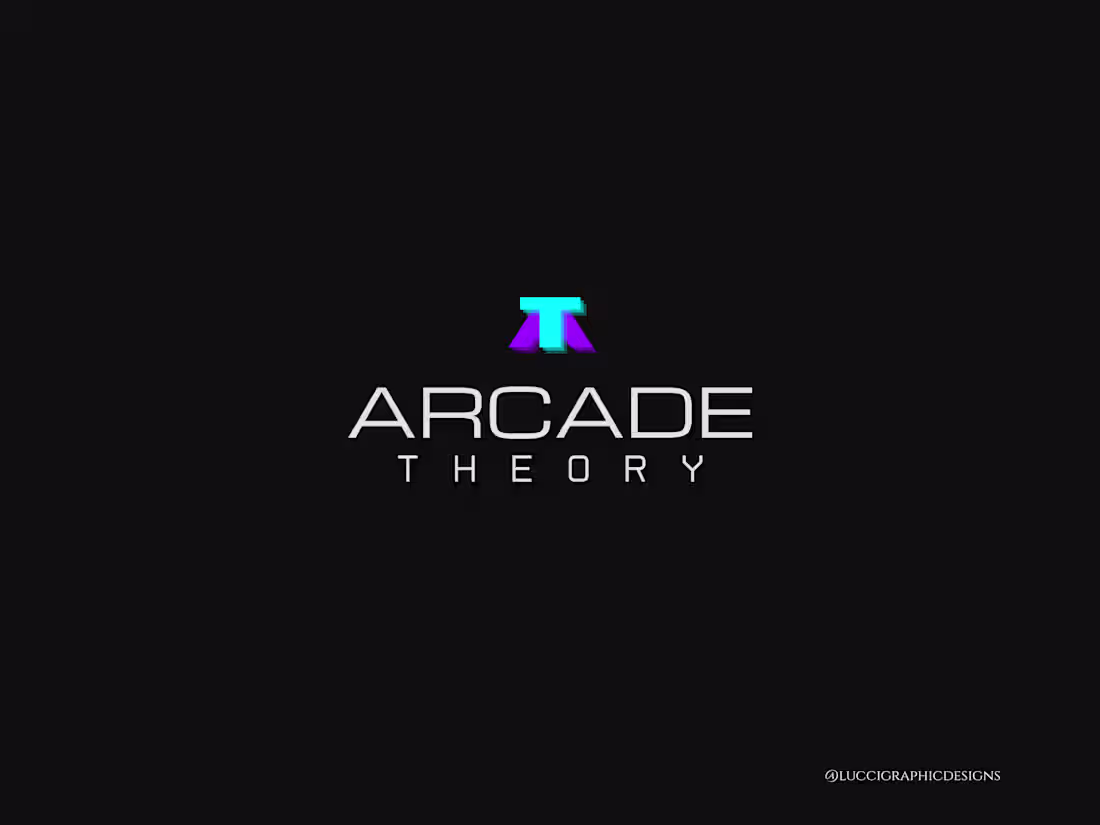
Arcade Theory — Brand System
The Goal:
Create a high-impact, typography-led identity that balances modern minimalism with a lifestyle vibe, ensuring flexibility for both digital and physical branding.
The Solution:
I developed a scalable system including a bold primary wordmark and geometric secondary variations. These were designed specifically for signage-readiness and brand clarity.
Technical Standards:
All marks are custom-built to be trademark-safe and delivered in vector formats (SVG/PDF) for perfect scalability from social icons to storefront displays.
1
111
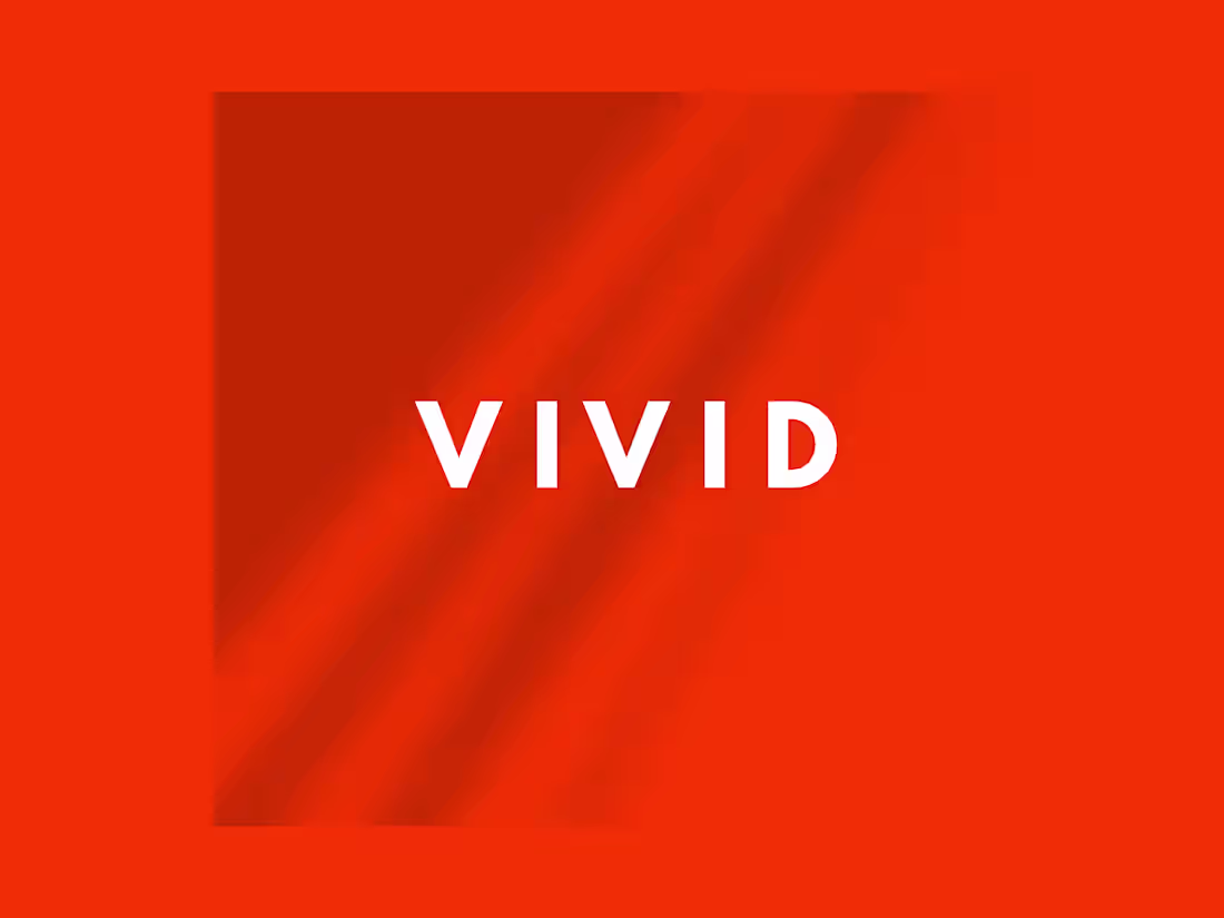
VIVID is a high-energy lifestyle and wellness concept designed for the modern, aesthetic-driven consumer. By pairing a high-impact, electric orange with grounded, earthy tones and bold typography, the identity bridges the gap between vibrant energy and sophisticated luxury. This project showcases a full-scale brand application across digital platforms, physical apparel, and high-end marketing materials.
2
129
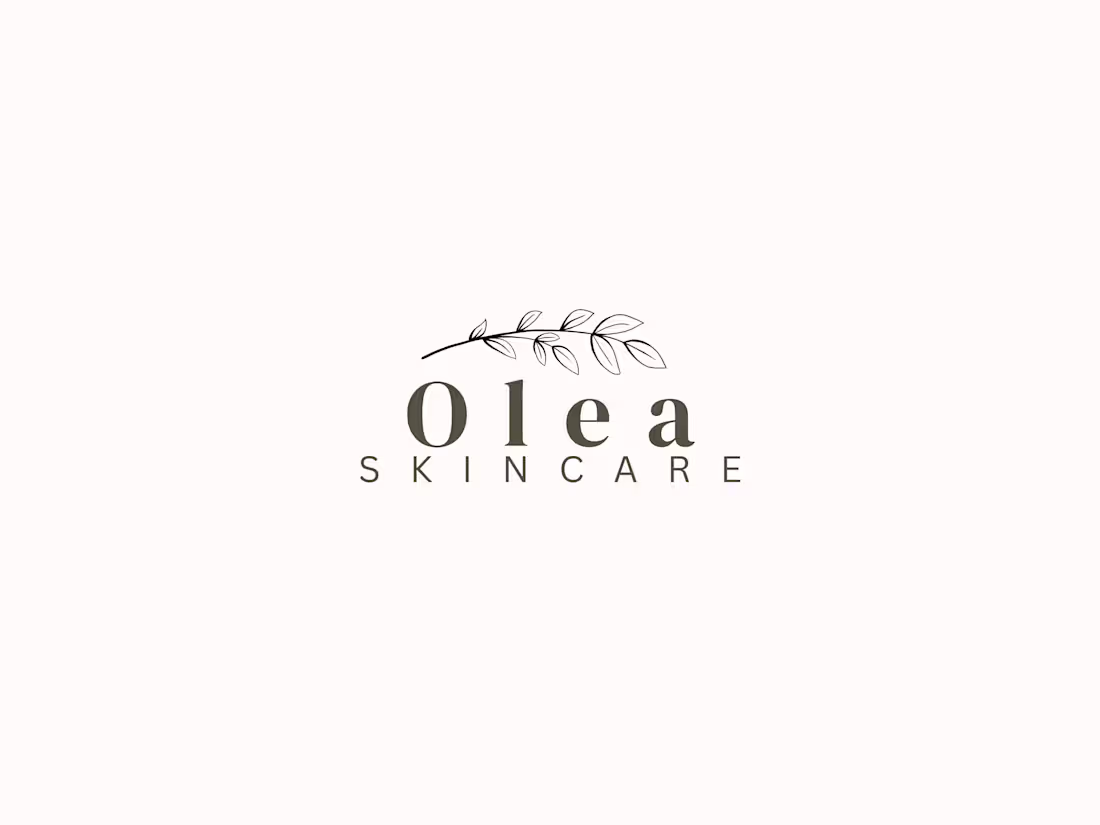
A process‑driven identity exploration for Olea Skincare. I started by building a soft, botanical palette and gathering visual references to define the brand’s tone. From there, I refined the wordmark and supporting elements, shaping a clean, modern direction that reflects Olea’s natural, beauty‑focused essence. Sharing the palette, logo concept, and mood‑board to show how the identity comes together.
3
131
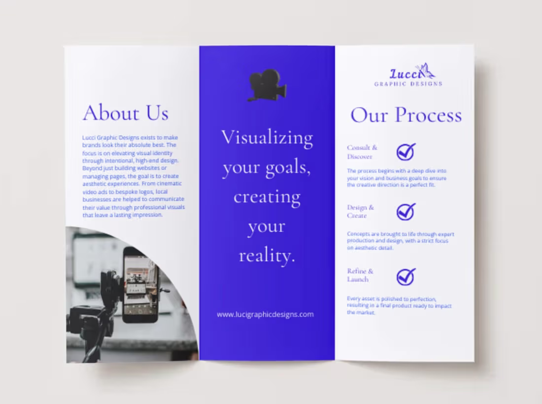
Visualizing your goals, creating your reality.
I designed this trifold brochure to showcase how I elevate brands through intentional, high-end design. It’s a live example of my expertise in layout, typography, and visual storytelling—proving that marketing materials can be both functional and aesthetically pleasing.
What this highlights:
• Print & Layout: Modern trifold design with a focus on hierarchy.
• Brand Identity: Cohesive visual language across all platforms.
• Full-Service Design: Showcasing web design, social media, and video production.
Ready to elevate your brand's aesthetic? Let’s build something beautiful together.
23
212
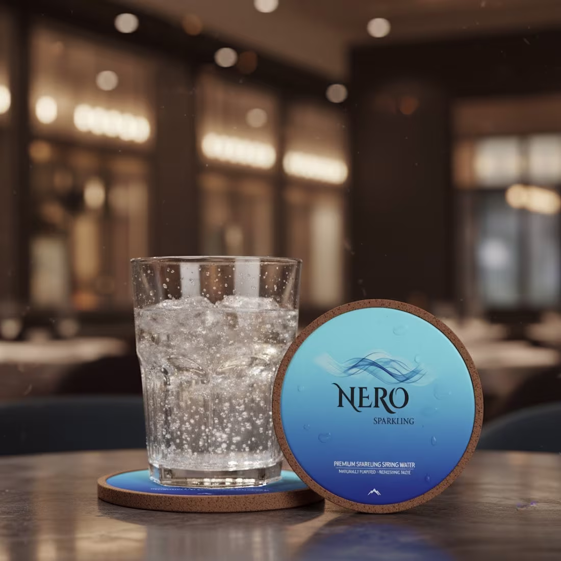
Nero | A Premium Minimalist Branding
Concept:
For the Nero logo concept, I wanted to explore the intersection of luxury and hydration. I focused on creating a visual identity that felt both high-end and refreshing, leaning into a sleek, minimalist aesthetic.
The Work:
Logo Design: Developed a modern, sophisticated wordmark designed for high-end shelf appeal.
Brand Identity: Curated a crisp, clean visual language that communicates purity and premium quality.
Product Mockups: Created realistic product visualizations to show how the brand lives in a retail and lifestyle environment.
20
202
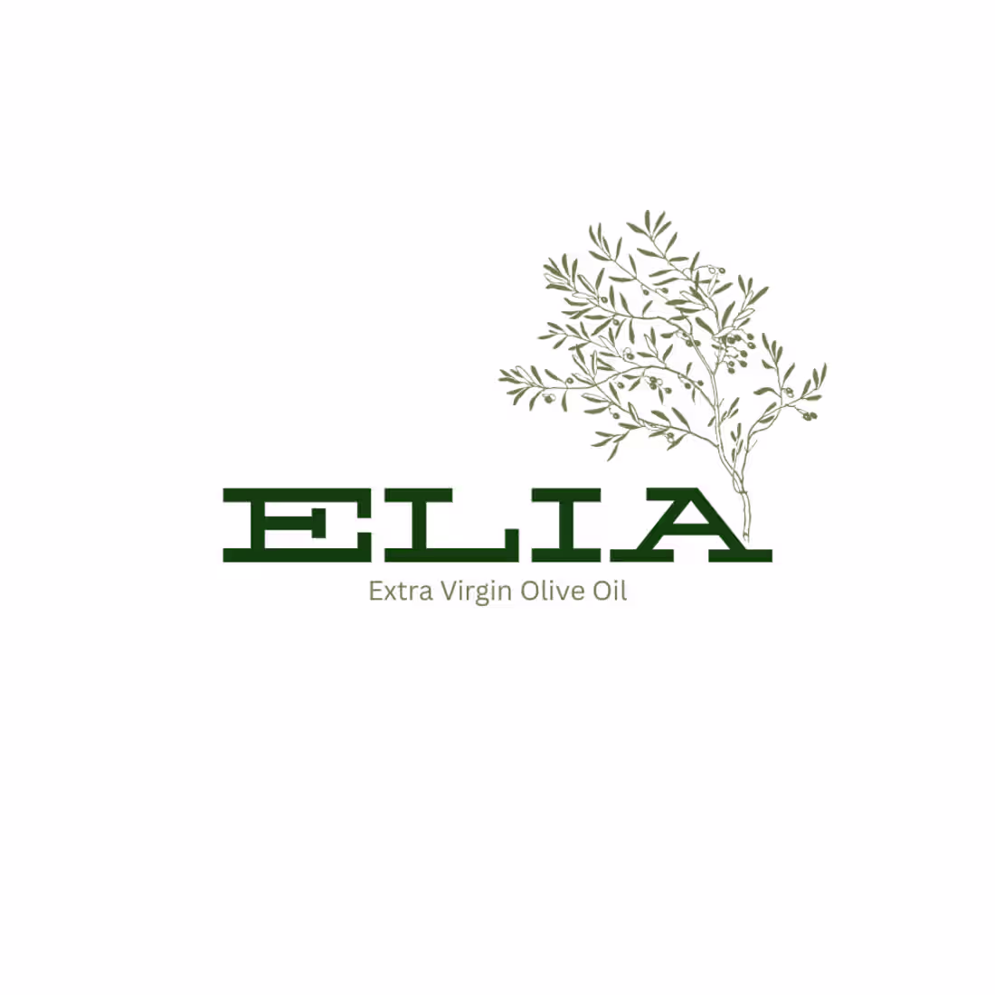
Elia Olive Oil | Brand Identity & Packaging
Project Overview Elia is a visual exploration of Mediterranean luxury and organic purity. My goal was to create a cohesive brand language that feels as fresh as the product itself, centering on organic shapes and a soft, nature-inspired palette.
The Design Approach I focused on "modern simplicity"- balancing sophisticated typography with a clean layout to ensure the product would stand out on high-end retail shelves. This project showcases my process of taking a brand from a primary logo concept to a fully realized 3D product mockup, ensuring every visual touchpoint communicates quality and authenticity.
26
231
Currently managing monthly social media content and visual branding for two clients. Focused on creating high-end, aesthetically pleasing graphics and video/photo edits that drive engagement.
1
93