The network for creativity
Join 1.25M professional creatives like you
Connect with clients, get discovered, and run your business 100% commission-free
Creatives on Contra have earned over $150M and we are just getting started
Back to feedPost
Strawberry Matcha concept screens. 🍓🍵
Following up my recent design experiments with this personal concept project! I had a lot of fun playing around with layout depth for these-matching bold typography with vibrant color stories, crisp product imagery, and fun green splashes.
Graphics like this are a great example of how a brand can stop a mobile scroll and make an audience crave a product before they even read the menu. 🥤

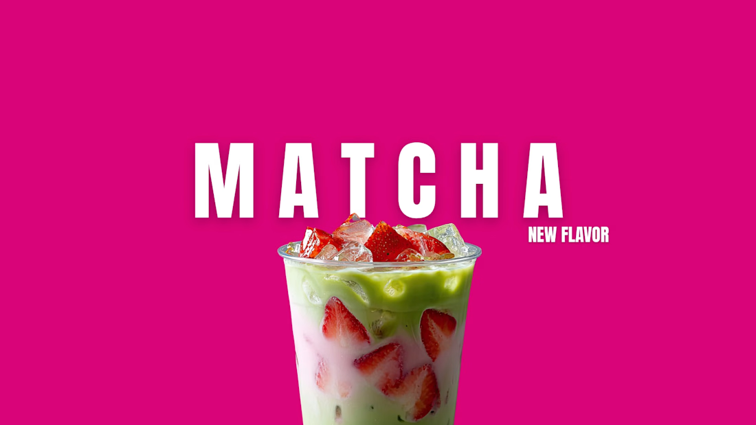

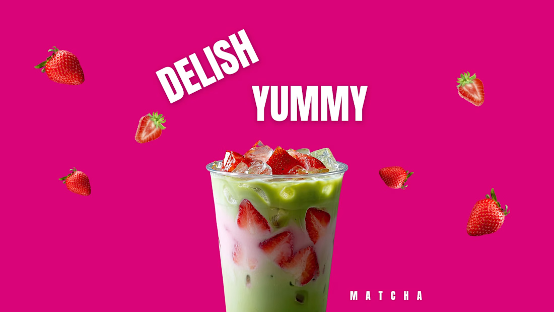
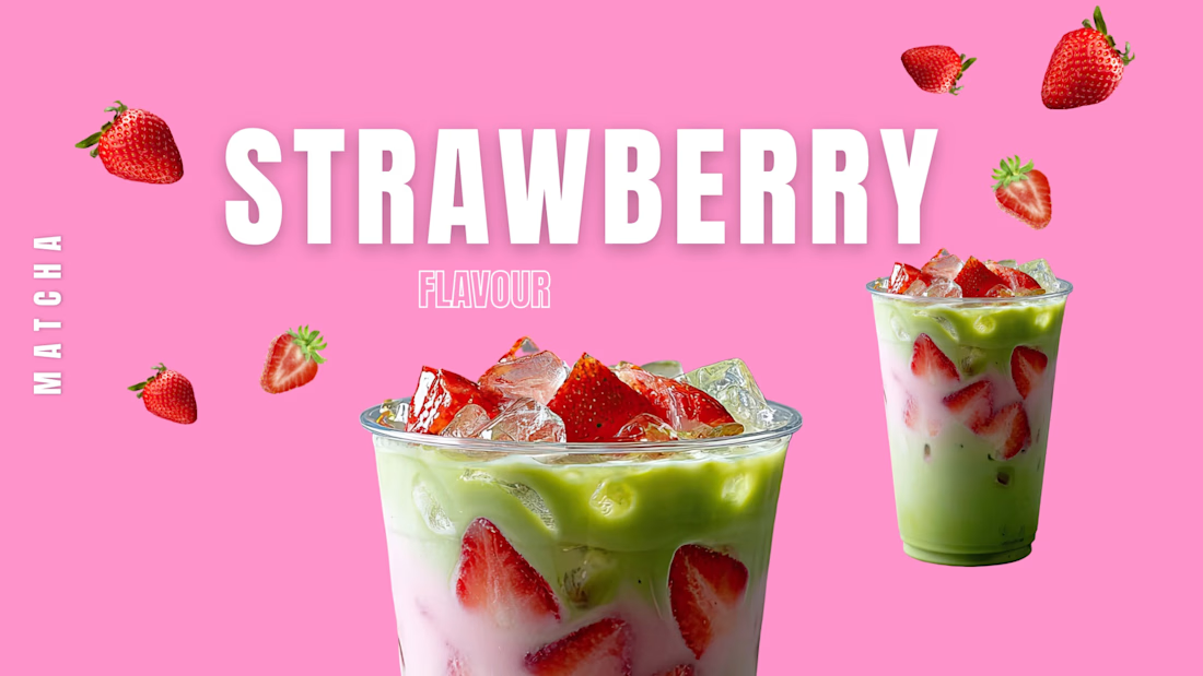

The animation version of the strawberry matcha concept. 🎬✨ Had to bring these colors to life with some movement!
The network for creativity
Join 1.25M professional creatives like you
Connect with clients, get discovered, and run your business 100% commission-free
Creatives on Contra have earned over $150M and we are just getting started





Related posts

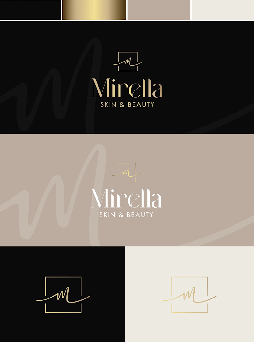
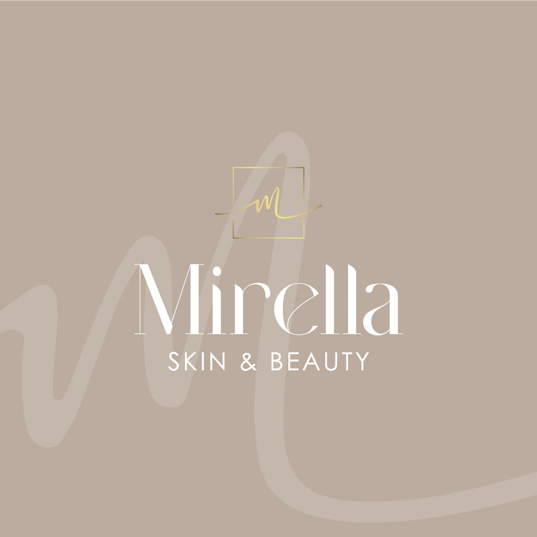
Mirella Skin & Beauty — A Refined Identity for a Modern Beauty Brand
A refined visual identity concept created for a modern beauty brand.
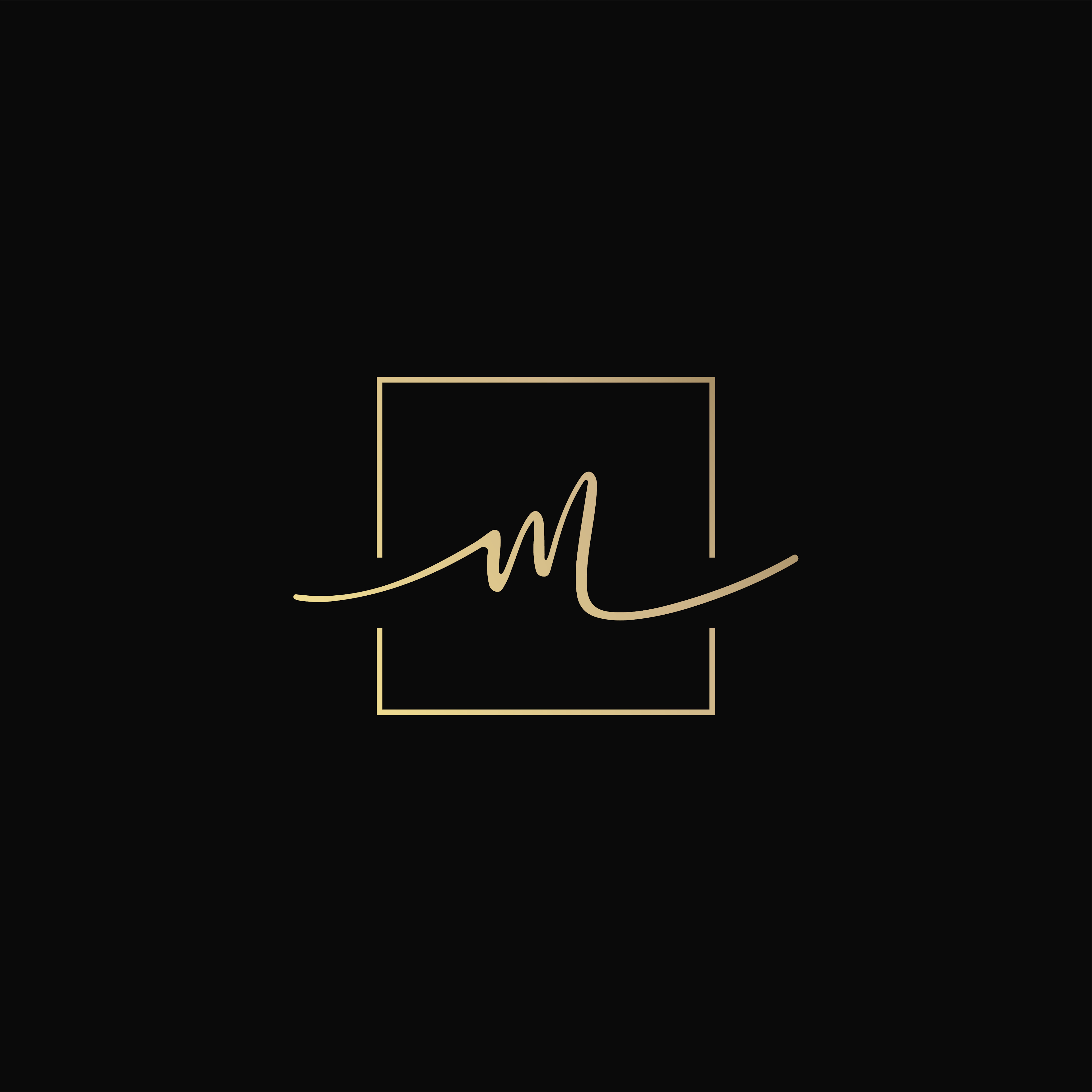
The direction combines soft neutrals, warm gold accents and elegant typography to create a sophisticated yet feminine look. The custom monogram adds a personal touch to the identity, while the subtle handwritten element brings softness and individuality to the brand.
The concept includes:
— Logo design
— Monogram / secondary mark
— Color palette
— Business card design
— Logo variations for different applications
The goal was to create a timeless identity that feels elegant, personal and effortlessly luxurious. ✨
#BrandIdentity #LogoDesign #BeautyBranding #VisualIdentity #BrandDesign #GraphicDesign #BeautyBrand #Branding


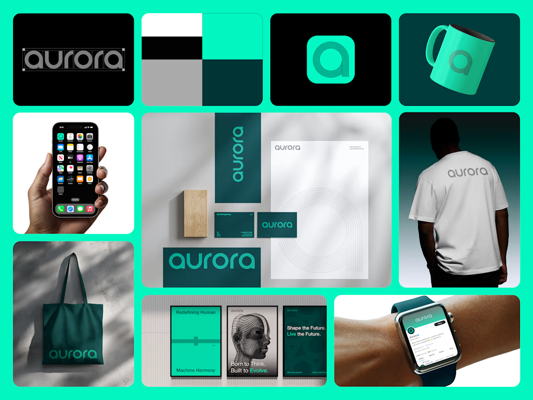
A look inside the Aurora brand design package ✨
This project was built as a complete, scalable visual identity system:
• Primary wordmark & responsive app icon
• Custom typography selection & layout
• Comprehensive merch & stationery mockup suite
The striking color palette gives it a modern, energetic edge that works seamlessly across print posters and digital screens.
Explore the full case study on my profile or Behance and let’s build your next branding project together on Contra! 🚀
#GraphicDesign #BrandGuidelines #LogoDesigner #MerchDesign #AppIcon #ContraDesigner



Weekend, but still building. Just wrapped up a fresh logo concept for a construction brand clean, bold, and built to last. Open and taking on new projects. What industry should I brand next? Drop it in the comments 👇
