
pro
Olga & Joyd Branding ✦ Web Design
Premium branding and web design for businesses ready to grow


Built to Look Like It Has Always Existed 🎾
Some brands want to look new. This one wanted the opposite.
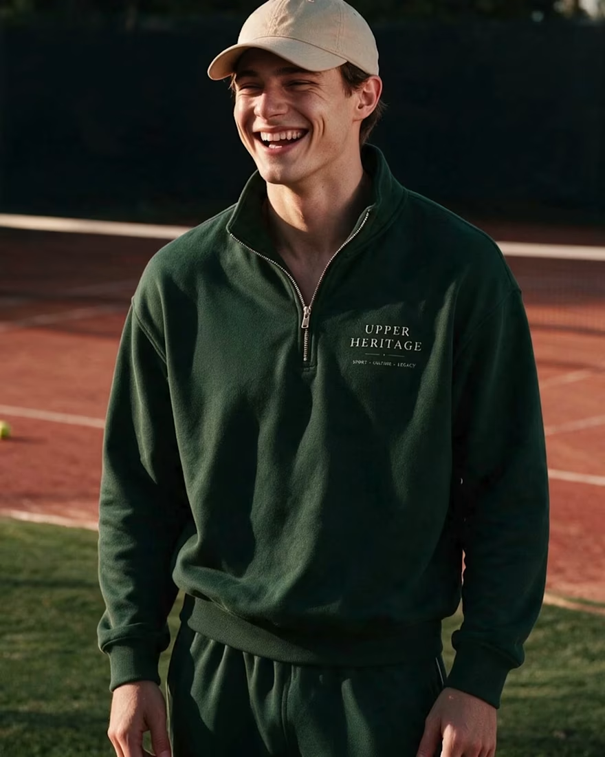
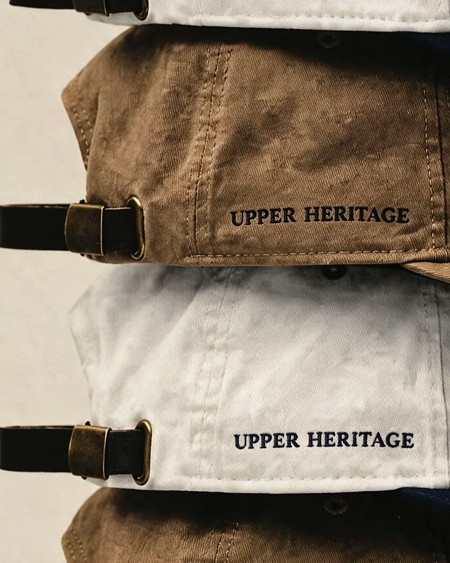
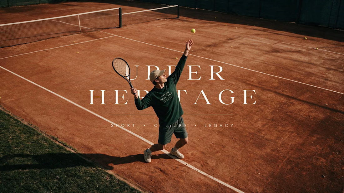
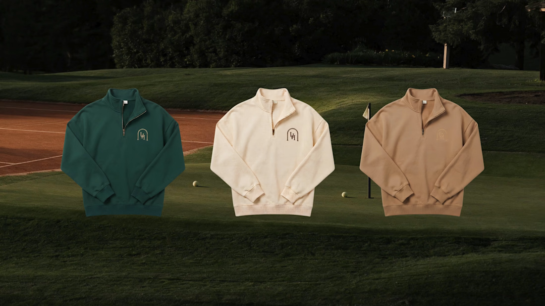
Upper Heritage borrows the codes of club tennis — crests,
hand-painted signage, court green. Designed to feel founded
in 1934 and simply never advertised.
The hardest part of...
Slow, On Purpose ✨
Some brands don't need to shout and not everything needs to move fast. Exploring web design for a premium lifestyle brand"


When "just testing the logo" goes a little too far... haha. I guess when you love a project, you just can't stop at one slide! What do you think — did I overdo it, or is this exactly what the brand needed? ✨ check it out
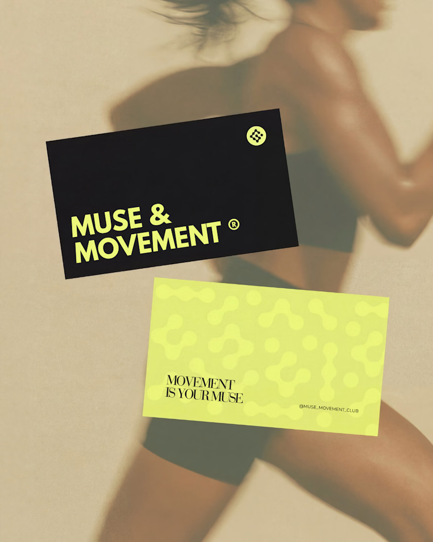
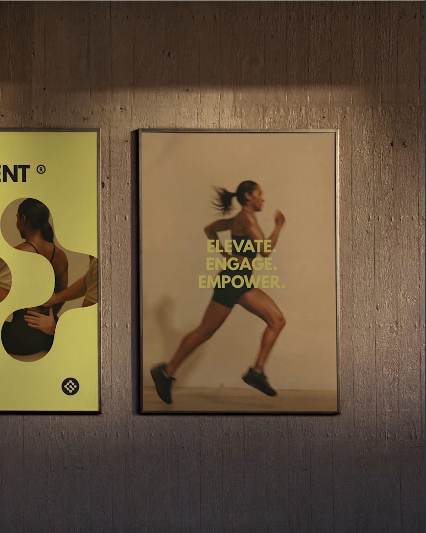
MUSE & MOVEMENT ® — Beta Phase.
Building the ultimate movement space for women.
Full project coming soon. 🎾
brandingsportsdesignsportsactivationBrand DesignLogo DesignVisual DesignAdobe IllustratorFigmaJitter


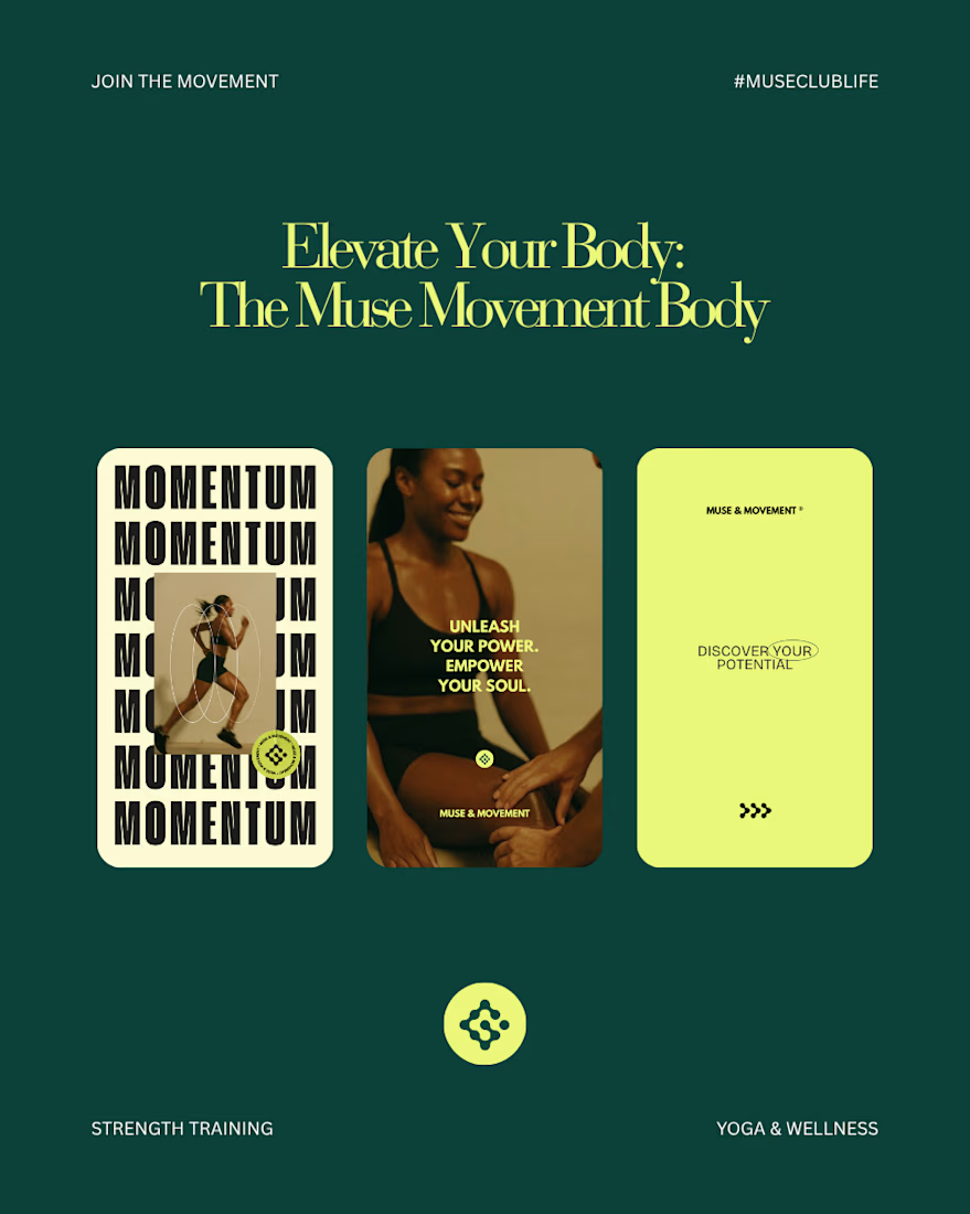
Kajabi Magic in the works ✨


NEW PAID PROJECT