The network for creativity
Join 1.25M professional creatives like you
Connect with clients, get discovered, and run your business 100% commission-free
Creatives on Contra have earned over $150M and we are just getting started
Back to feedPost

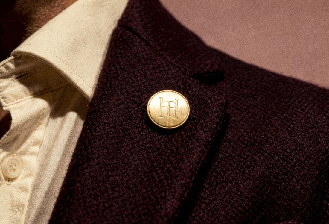
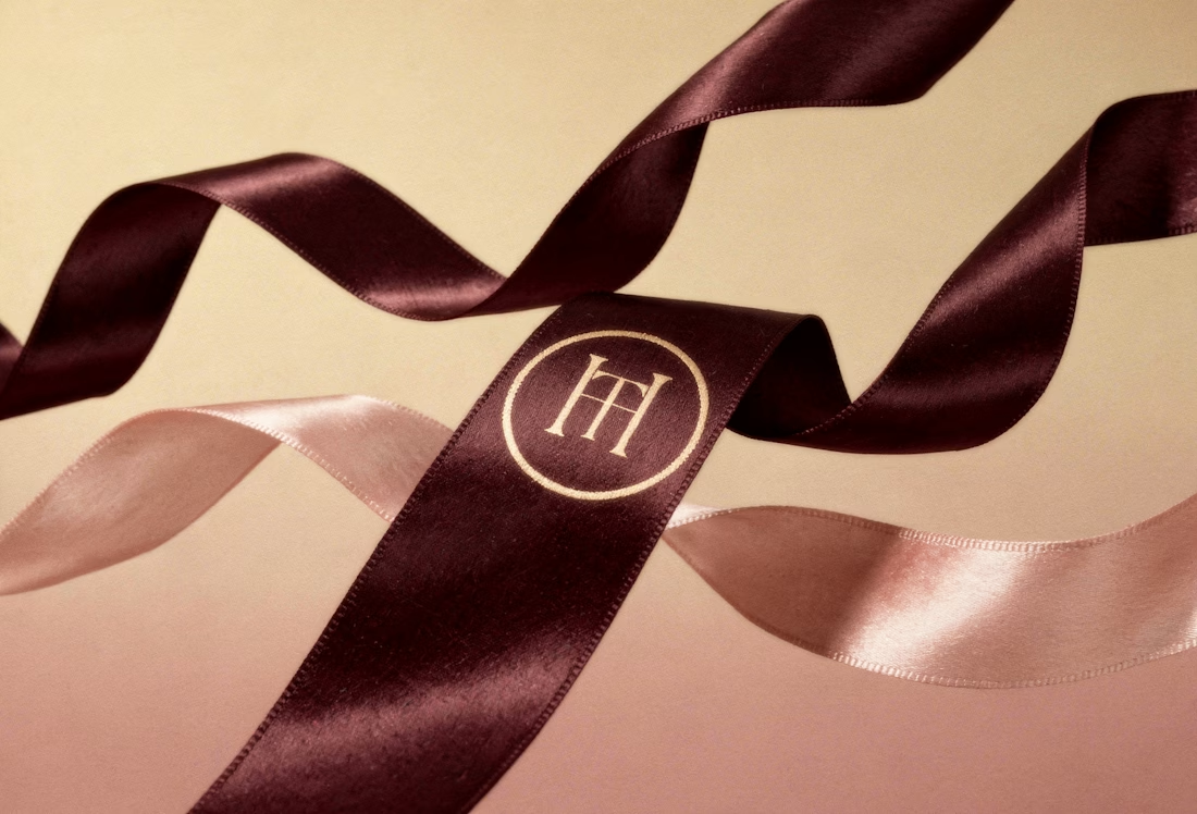
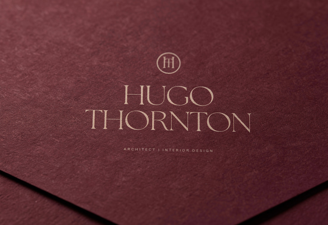
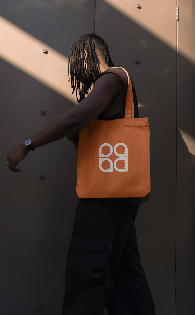
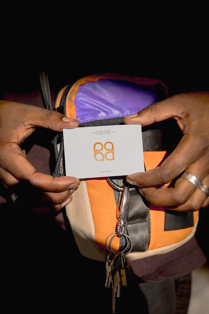
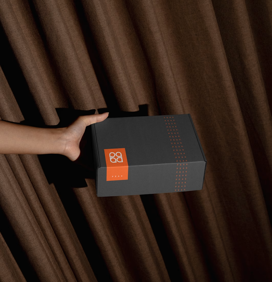
When "just testing the logo" goes a little too far... haha. I guess when you love a project, you just can't stop at one slide! What do you think — did I overdo it, or is this exactly what the brand needed? ✨ check it out
The network for creativity
Join 1.25M professional creatives like you
Connect with clients, get discovered, and run your business 100% commission-free
Creatives on Contra have earned over $150M and we are just getting started








Related posts


Fresh case study 🚀🚀🚀
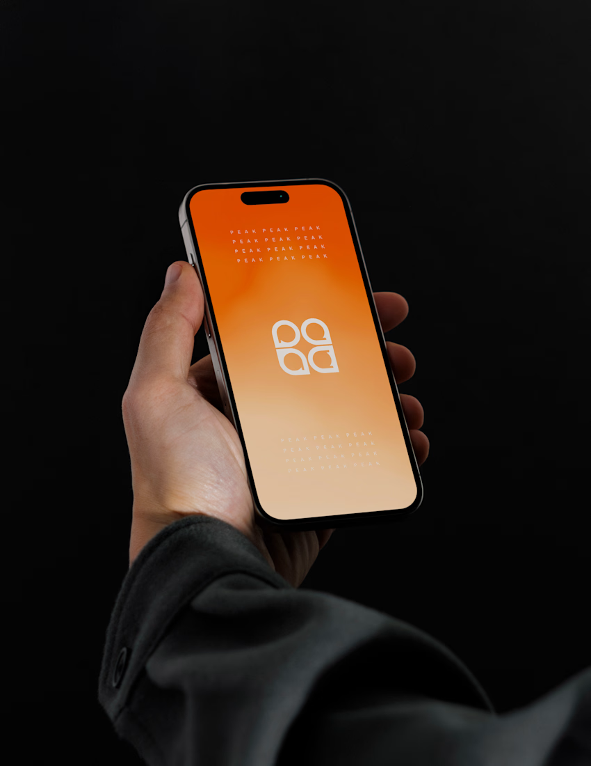
Brand identity for Peak, an all-in-one website builder for WordPress that I design and build. A four-letter mark, a warm paper-and-ember palette and one system that runs from the favicon to the packaging.


A four-letter mark that has to hold from favicon to packaging is a tough constraint. Did you draw one letterform first and build the other three from it, or design them together as a set from the start?

Recovery Brand Identity / Logo & Visual Direction
A new identity project for a recovery-focused brand that wanted to move away from the conventional clinical look of its category.
The direction combines clinical credibility with a more modern, movement- and performance-driven visual language.
First look at the logo. Full identity coming next.
Logo design and creative direction by Lepisov Branding
Social media Branding: collab with Mike Creative Mints



Beautyy


