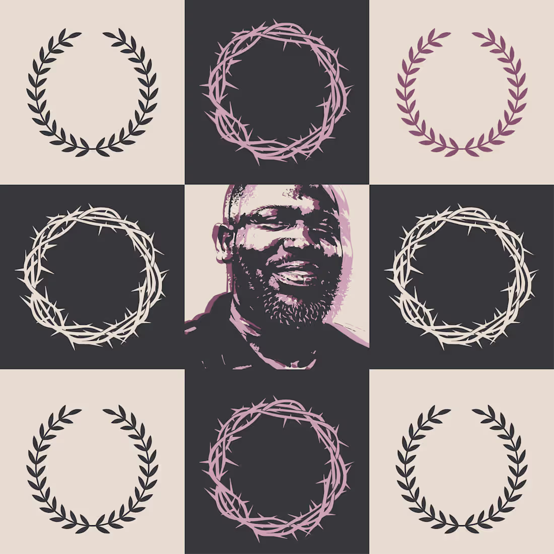
EP cover built on a 3x3 grid.
Laurel and thorn crowns create a tension between glory and pain.
Muted palette, stencil portrait, minimal system.
1
61
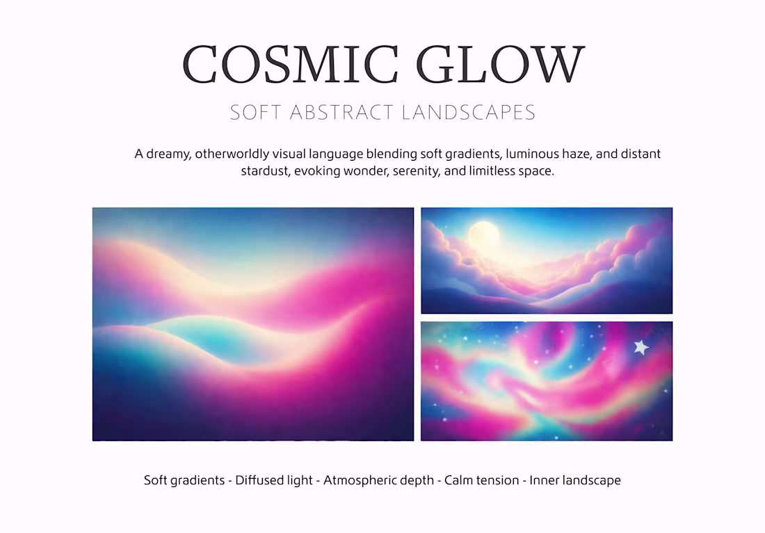
A visual direction based on soft gradients, diffused light, and minimal abstract forms.
Designed to create a calm, immersive presence and a cohesive visual language across digital content.
1
88
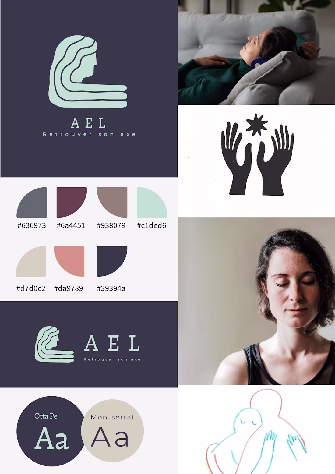
AEL is a visual identity developed for a practitioner working in soft healing and holistic support.
The brand was built around the idea of retrouver son axe — returning to one’s center.
The challenge was to create an identity that could feel calm, grounded, and emotionally safe without becoming clinical or overly spiritual.
Instead of using familiar wellness tropes, the visual direction focuses on presence, silence, and reconnection through a symbolic logo, a restrained color system, and spacious composition.
The final identity includes:
logo system
color palette
typography pairing
moodboard
vertical and horizontal lockups
AEL is designed to feel quiet, human, and steady — a brand that supports rather than performs.
1
97
Poster design for an electrobrunch / after-rave event concept.
I created a bold visual identity centered on custom-style typography, high contrast, and cosmic-inspired symbols. The aim was to design a poster that feels playful, memorable, and immediately eye-catching while keeping the event information clear and structured.
1
130
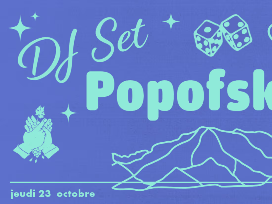
Event poster series designed for Bras de Fer, a music and cultural venue in Nantes. The project combines bold typography, vibrant colors and playful illustrations to create distinctive visuals for DJ sets and events. Each poster develops its own graphic universe while maintaining a recognizable identity for the venue.
1
4
163
I design bold and coherent visual identities for cultural projects, brands and creative initiatives.
My approach combines graphic design, illustration and motion thinking to build visual systems that are expressive, modular and easy to use across different formats.
A brand system may include:
• Logo design
• Color palette and typography system
• Visual language and graphic elements
• Brand guidelines
• Applications for posters, social media or editorial formats
Perfect for creative studios, festivals, fashion projects and independent brands looking for a distinctive visual identity.
0
114
:I create dynamic reels for events, music projects, festivals, and creative brands. My work combines motion design, typography, graphic design, and visual storytelling to produce short videos with strong identity, rhythm, and visual impact.
0
113
I create visually strong reels for events, music projects, cultural venues, and creative brands.
0
155
Social Media Reels
0
151
A color system designed for Bras de Fer, balancing warmth, rhythm, bold contrast, and a festive visual language inspired by music, gatherings, and local cultural energy.
1
3
227
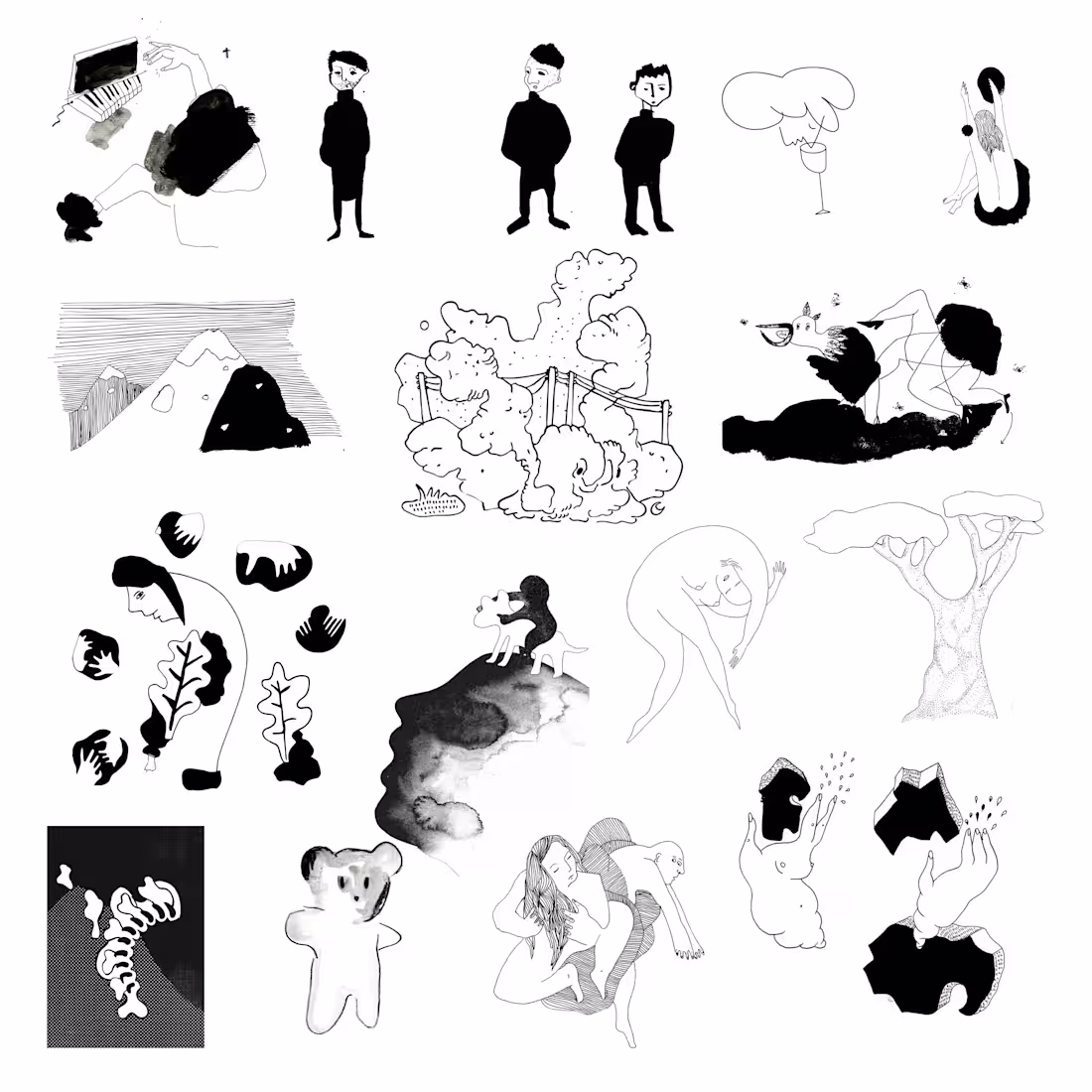
Black-and-white editorial illustration series exploring bodies, landscapes, and symbolic forms through hand-drawn composition, contrast, and poetic visual storytelling.
7
359
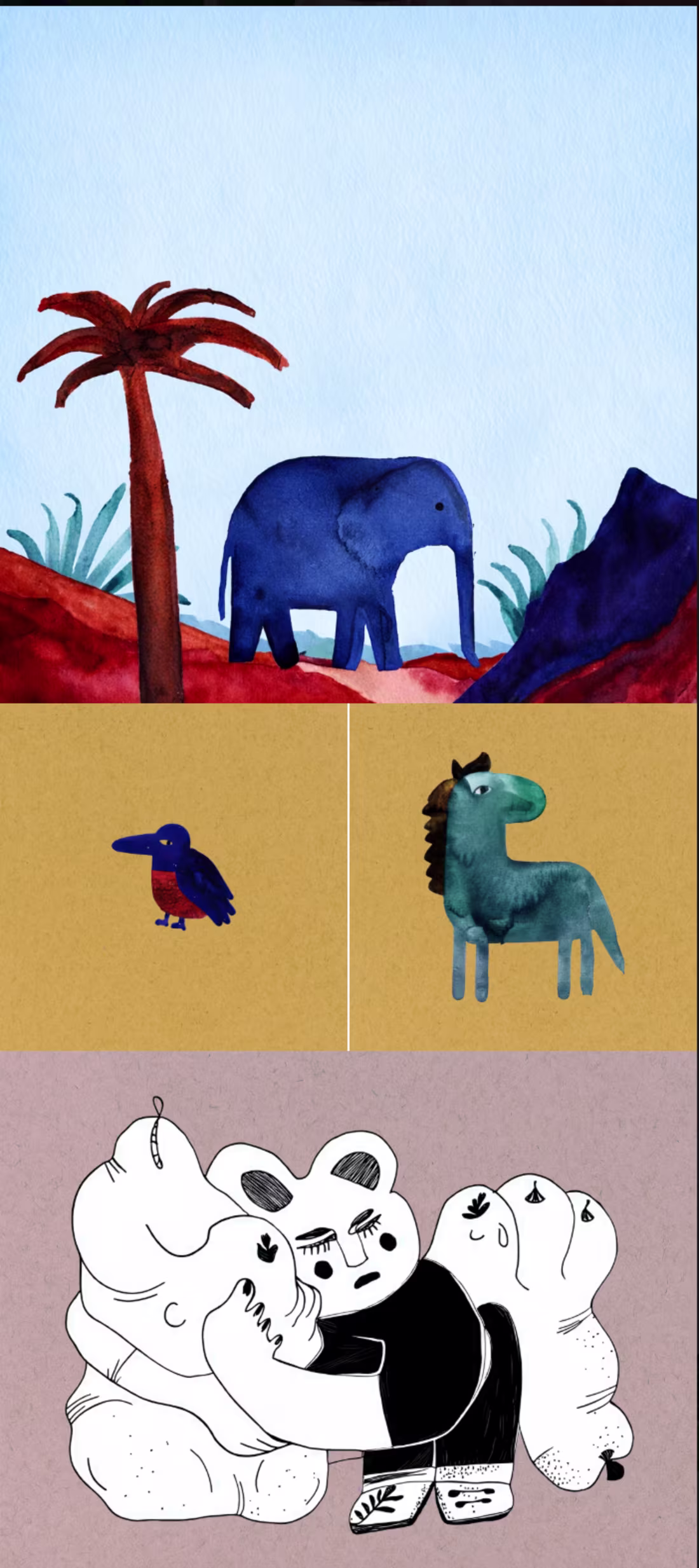
Children’s Illustration — Characters & Nature
This illustration series is inspired by the world of children's stories and imagination.
The artworks feature playful animals, simple landscapes and expressive characters created with watercolor textures and soft colors.
The visual language is minimal and poetic, designed to spark curiosity and emotion while remaining clear and accessible for young readers. Each character has a gentle personality, inviting children to explore small stories and imaginary worlds.
This style is well suited for children’s books, educational materials, magazines and storytelling projects.
1
179
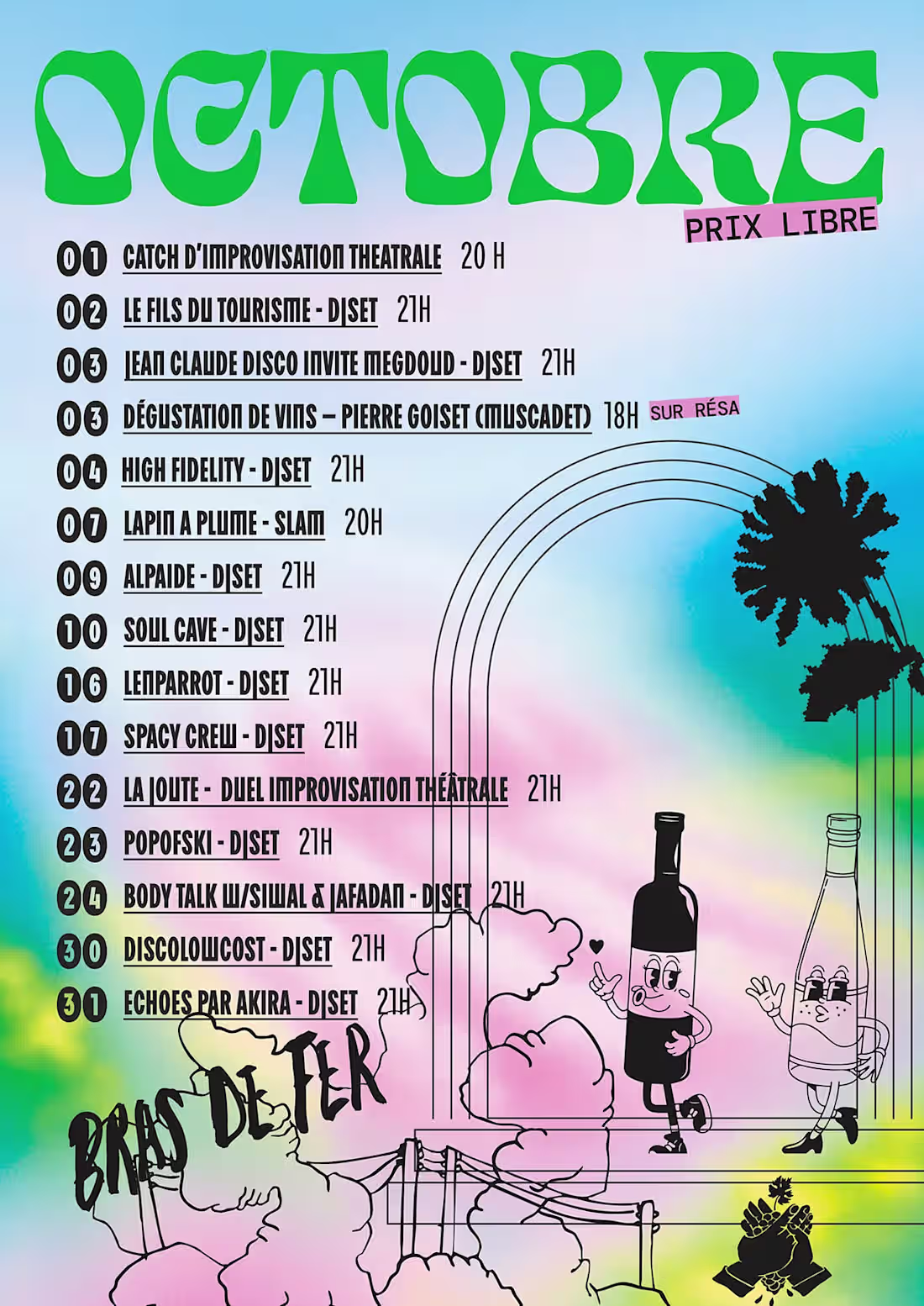
Visual identity and poster design for the cultural venue Bras de Fer.
This series of posters mixes bold typography, colorful gradients and expressive illustrations inspired by underground music culture and DIY graphic design.
Each event visual develops its own playful atmosphere while contributing to a coherent visual language for the venue’s monthly program.
1
181
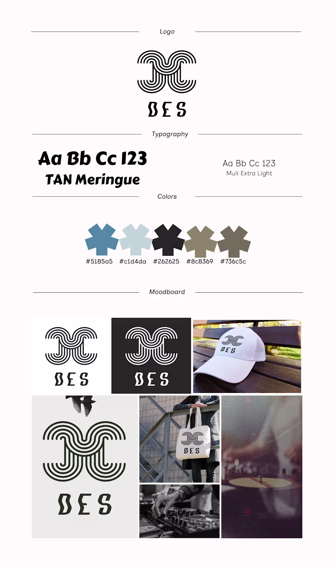
DES (Deep Electro Sound) is a visual identity created for an electronic radio show focused on deep electro culture.
The logo is built from a modular system of parallel lines forming a rhythmic and geometric structure. Inspired by radio waves and electronic frequencies, the curves translate the invisible movement of sound into a bold visual symbol.
The identity explores ideas of signal, rhythm and motion, creating a strong mark that works across radio visuals, event posters, digital platforms and merchandise.
Rooted in minimalist design and Bauhaus influences, the DES identity transforms electronic sound into a visual language.
1
154
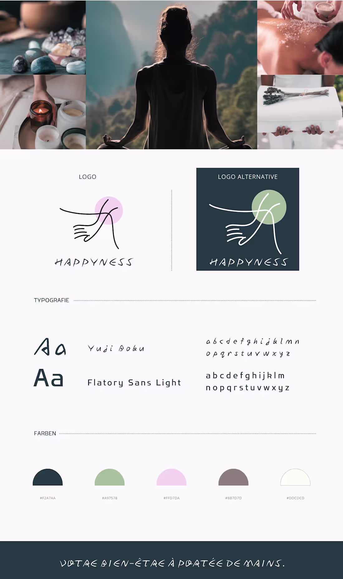
A visual identity designed for a contemporary wellness brand rooted in calm, balance, and human connection.
The concept explores the idea that well-being is something tangible — something we can literally hold in our hands. The logo symbol illustrates two hands gently meeting, suggesting care, trust, and support. The organic line evokes softness and fluidity, inspired by body movement in yoga and therapeutic gestures.
The visual language blends minimalism with warmth. Soft pastel tones and natural shades create a calming atmosphere inspired by spa rituals, meditation spaces, and holistic therapies.
The typographic pairing combines a handwritten expressive font with a modern sans-serif typeface, balancing emotion and clarity. This contrast reflects the brand philosophy: human, sensitive, yet contemporary and professional.
1
139