
Laura Lewczyk Sultan
Senior Designer • Brand Strategy


The Variable logo design process went in many directions before we arrived at the final version. The initial brand name was different and the team had done some early design exploration through AI. I began by expanding on their present vision, but the more we reviewed that design direction, the more the founders realized they wanted to explore something new. After a company name change to Variable, we started from scratch with original concepts. After a fresh discovery session, we arrived at the handwritten wordmark. Early on we had a toy block graphic element that accompanied the logo text, but shifted that to the hand-drawn triangle graphic element to maintain minimalism while still depicting early education.
13
34
875

In a previous role at an interior design firm, I was the only marketing employee. I was busy functioning as the graphic designer, presentation designer, marketing coordinator, and social media manager. My goal was to increase our social media engagement, so I had the idea to add some custom furniture illustrations to our social feed for a bit of character. The resulting reposts and comments from the featured furniture brands greatly increased both our following and engagement. Plus I got to have some fun and creative freedom with the illustrations!
2
136
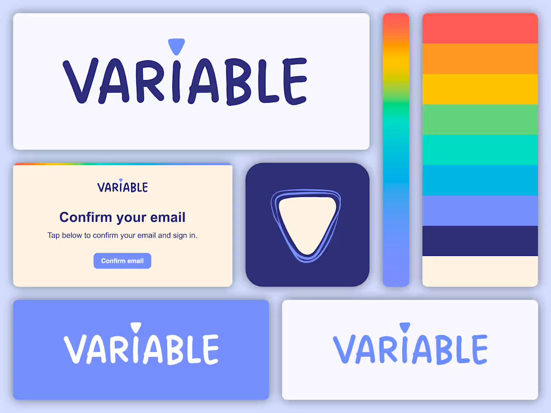
Variable is an AI-powered platform for teachers. I worked closely with the founders to build a brand identity that balanced innovation and playfulness. The Variable team had a strong vision for the brand’s personality, but defining its visual direction required extensive collaboration, including discovery sessions, a company name change, custom typography exploration, and numerous concept iterations. The completed logo includes a custom handwritten wordmark paired with a playful geometric element inspired by early education.
3
123
After the client selected the initial typeface pairing concept for the AfterGlow Skin by Carli logo, we dove a bit deeper into customization for a unique result. I leaned into the soft, organic brand aesthetic and transformed the G and K characters with gentle curves. I wanted to add a graphic element that could be used in various ways to tie the brand together and allude to glow/sun/moon. The circle element emphasizes the word “glow” while anchoring the two lines of logo text together.
1
146