The network for creativity
Join 1.25M professional creatives like you
Connect with clients, get discovered, and run your business 100% commission-free
Creatives on Contra have earned over $150M and we are just getting started
Back to feedPost

After the client selected the initial typeface pairing concept for the AfterGlow Skin by Carli logo, we dove a bit deeper into customization for a unique result. I leaned into the soft, organic brand aesthetic and transformed the G and K characters with gentle curves. I wanted to add a graphic element that could be used in various ways to tie the brand together and allude to glow/sun/moon. The circle element emphasizes the word “glow” while anchoring the two lines of logo text together.


The network for creativity
Join 1.25M professional creatives like you
Connect with clients, get discovered, and run your business 100% commission-free
Creatives on Contra have earned over $150M and we are just getting started









Related posts

Have you ever designed packaging for a brand that never launched? 👀
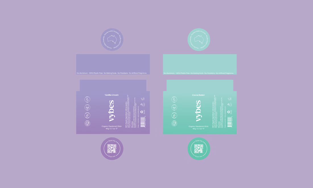
Surprisingly, it’s happened to me more times than I expected.
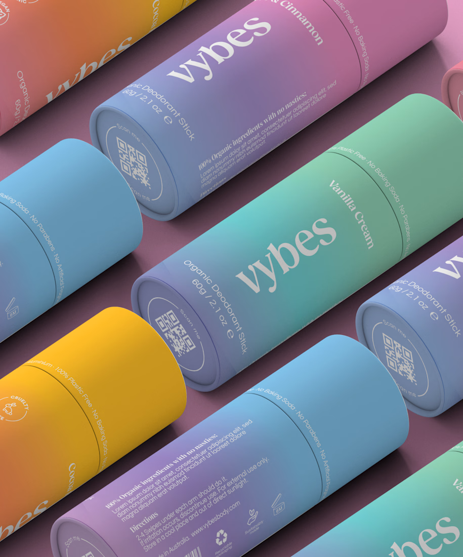
Vybes was an organic deodorant brand from Australia I worked on, designing packaging for a product that, in the end, never made it to market.
It’s a weird feeling putting so much thought into packaging for a product that people will never see on a shelf.
How many unreleased projects are hiding in your folders? 😂



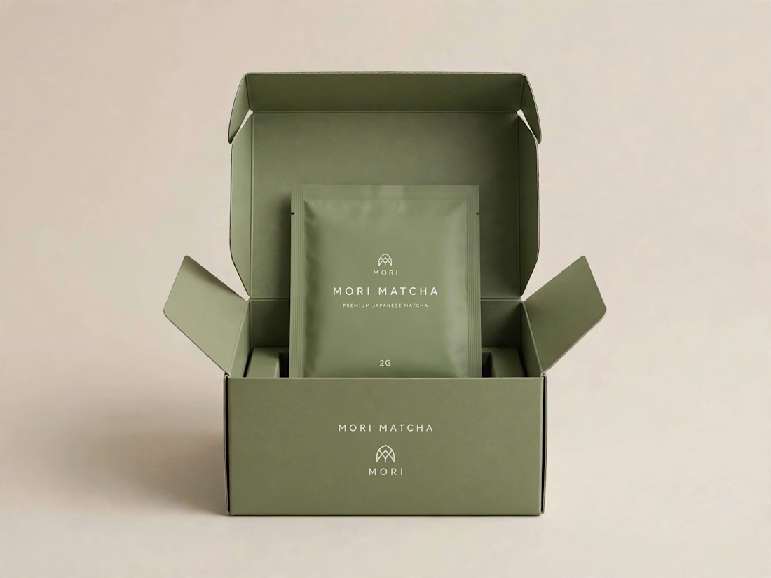
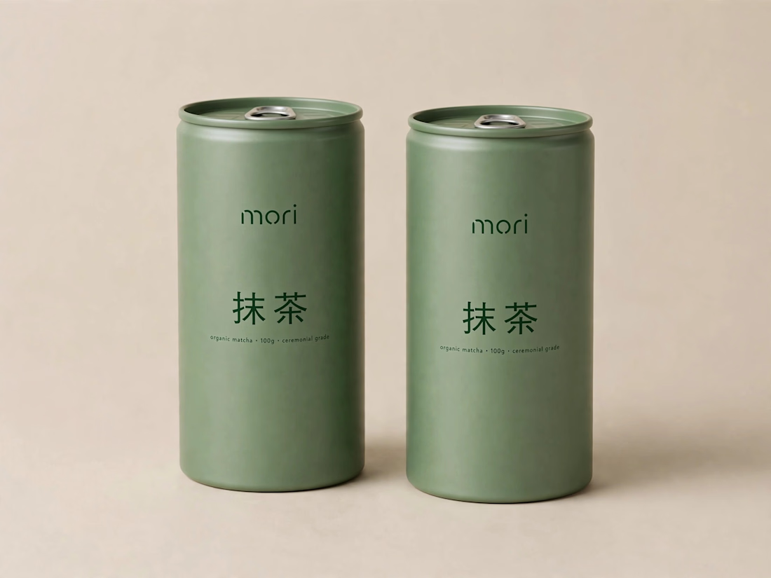
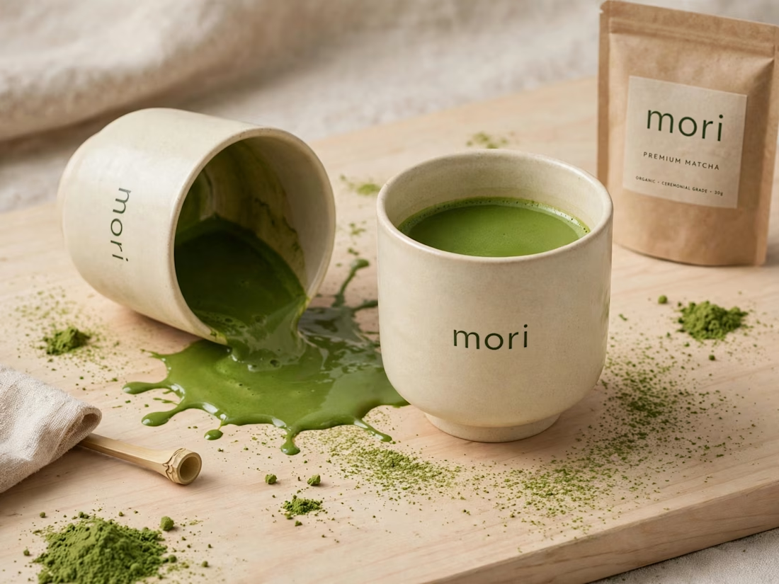
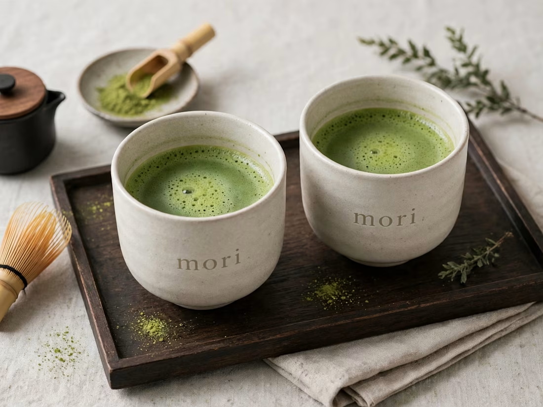
more visuals from my latest project — mori matcha 🍵
explored minimal Japanese packaging with earthy greens and calm typography.
focusing on premium ceramic cups and clean can design.
#branddesign #packagingdesign #visualidentity #brandstrategy #matcha #minimaldesign #japanesedesign #figma #mockup #branding



Approved logo for a mental health and daily habit app built for seafarers and offshore workers.
Can't wait to share more.