
Keshav kumar
10+ Years CPG Packaging Specialist | Brand Strategist
- 9
- Followers


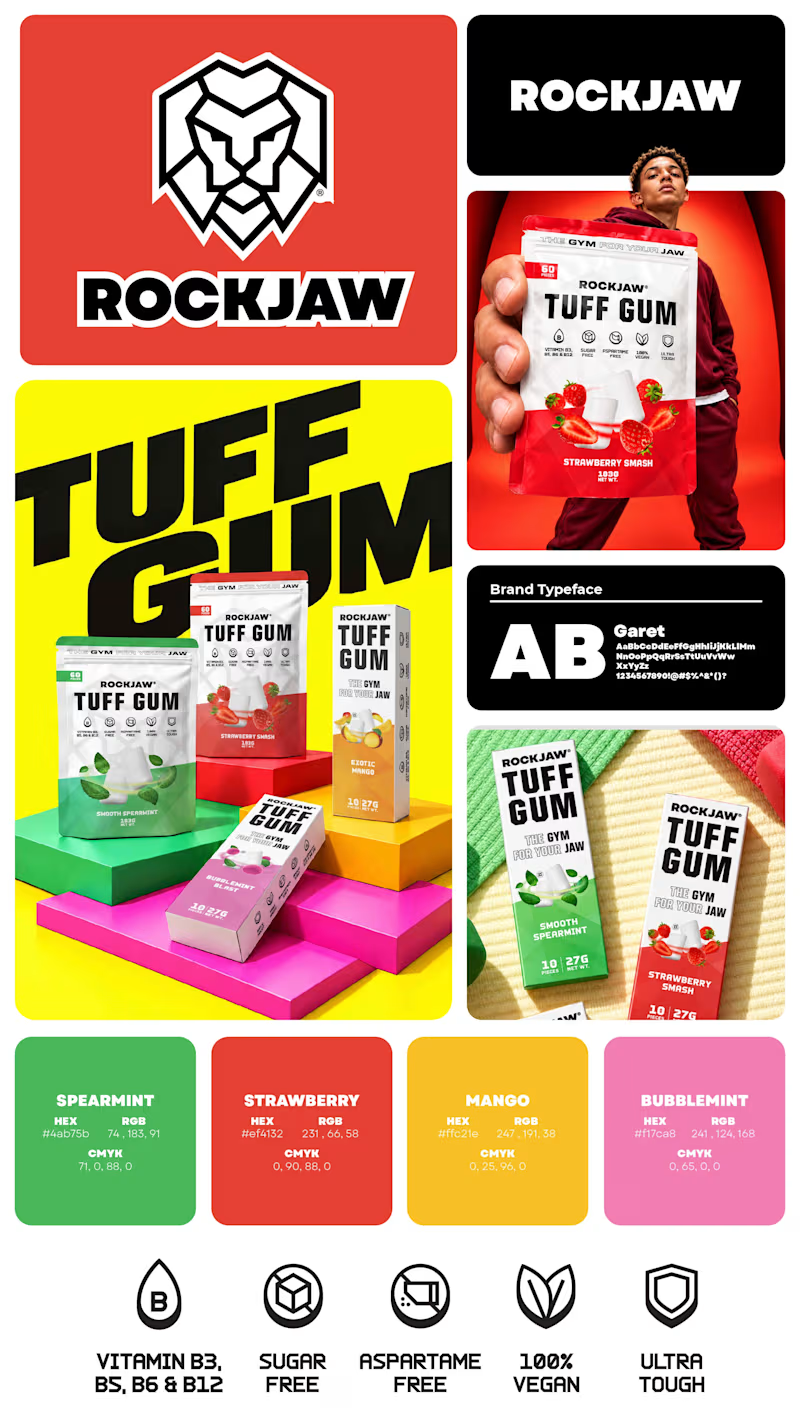
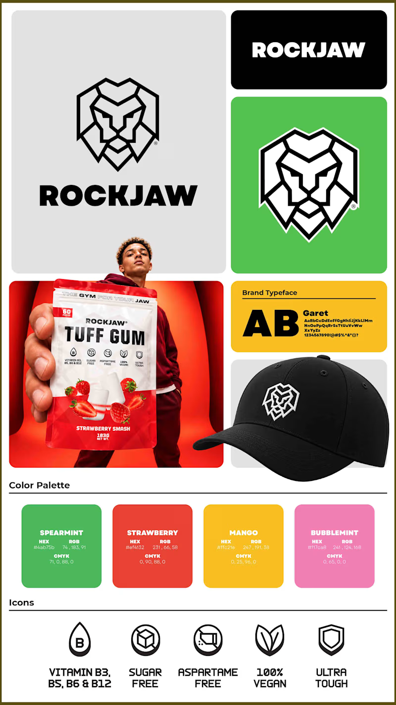
Which version of the image do you like the most? In one, I have focused more on merch and the logo, whereas the other one focuses on hero shots of packaging variants.
6 votes
Ends in 1d
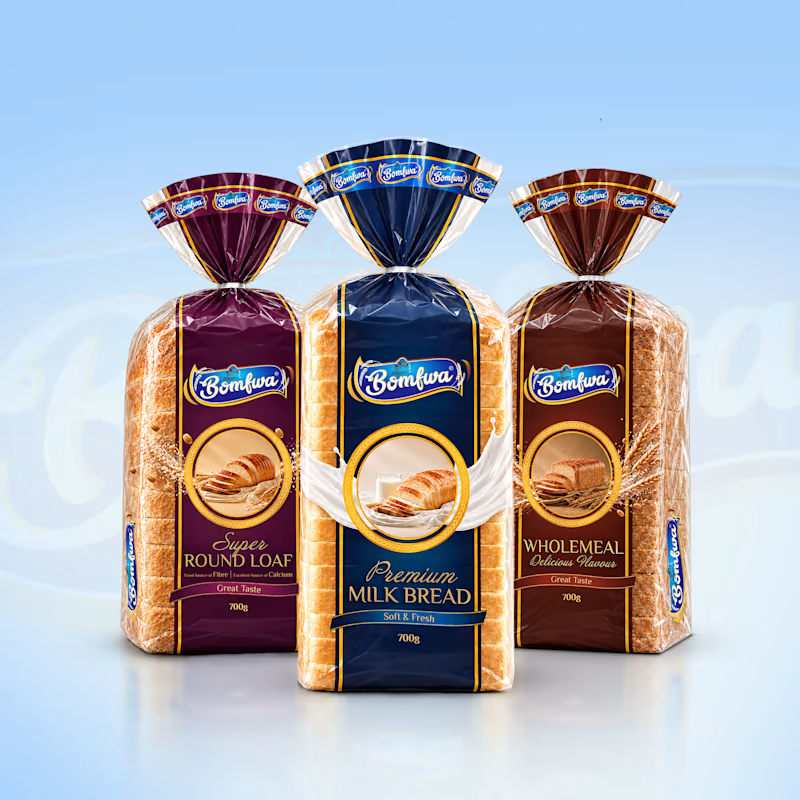
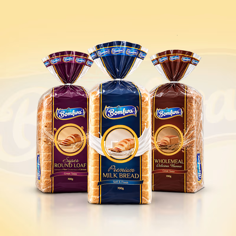
Which background color works better for this bread lineup I am working on to showcase to a client, is it cool blue background on the left, or the warm cream background on the right?
I thought of using blue as it gives a consistent and wholesome feel while matching with the front...
8 votes
Ends in 3h
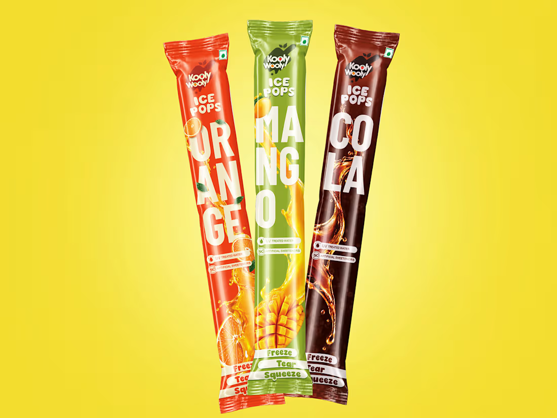
A thought from the studio while working on an ice-pop project 🍧
Minimal packaging can be beautiful, but in a busy freezer aisle, a little more color and character can help a product earn that second look. I’m exploring a design that feels vibrant and full of life while keeping...
I have recently got my first client a day before, but the payment after a day of reaching my wallet still shows to be under review.
Can anyone please tell me how much time does it normally take for contra to process the payment and make it available for withdrawal?
Still trying to...
I need some advice, I am new to contra, and have recently got a new client. I did raise the invoice and it has been accepted.
My question is that this paid invoice doesn't show up in my hired and it also doesn't let client review me. It still shows 0 under hired on my profile. Would it take some time, or did I do something wrong?