
Jesse Abara
Brand Designer | Designs that sell your brand story.




One of the most outstanding things about the visual identity of a brand isn't about looking pretty, but deciding who/what the brand is, what purpose you serve, and whom you are serving it to.
I just recently concluded a successful logo project for an up-and-coming agricultural firm, with the objective of standing out as bold, reliable and luxurious.
In all, we didn't just want to make things look beautiful, but to carve a visual path that would be rewarding in the long run.
I had a lot of interesting times exploring lots of different ideas for this project.
Ready to build something real?
Let's talk!
#logodesign #branddesign
0
89
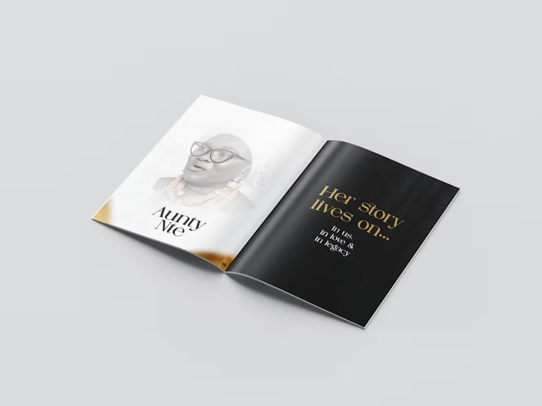
A minimal, yet classic design layout style, aimed at easing the readability and overall experience for every participant.
0
108

A modern and minimal logo design project for a Forex Trading Academy, combining the letter "M" with the bullish(upward) trading chart, that shows innovation and easy navigation.
Bold, Appropriate, Memorable mark, built using abstract shapes to represent, innovation, adaptability and scalability which are important values in the forex trading industry.
#branding #branddesign #logodesign
0
113