


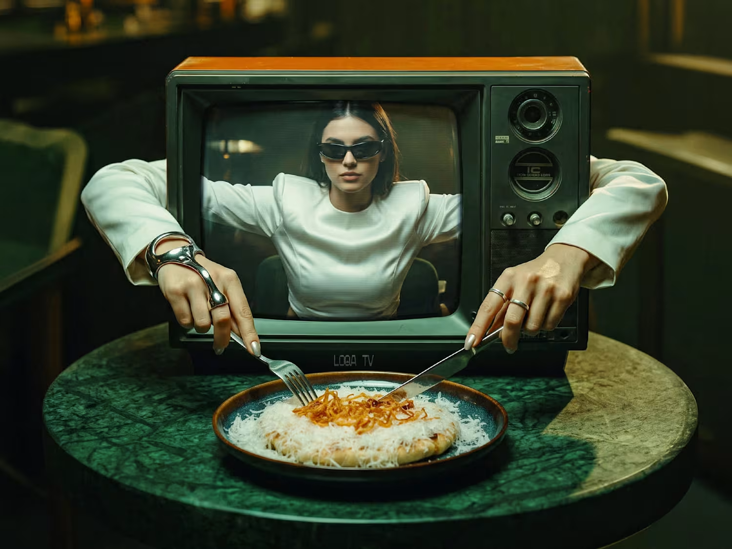
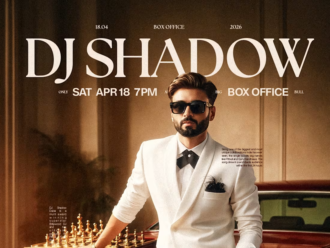
BOX OFFICE — Where nightlife gets the cinematic treatment.
A series of visual explorations developed for BIG BULL's BOX OFFICE IP, bringing together vintage luxury, cinematic storytelling, and a little visual drama.
From disco-ball billiards and gilded portraits to Bollywood-inspired settings and retro luxury, each concept takes a different creative direction while staying rooted in the same visual identity.
Different scenes
Different stories
One BOX OFFICE.
1
41
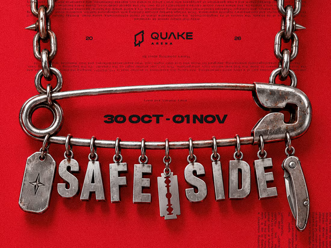
SAFE SIDE — A Rather Unsafe Visual Identity.
What started as an exploration of safety pins, industrial chains, razor blades and metallic fangs evolved into a Halloween identity built around a simple contradiction: not everything associated with safety looks particularly safe.
That irony became the foundation of SAFE SIDE, a Halloween IP developed for QUAKE Arena's Halloween weekend, featuring Korolova's Hyderabad debut.
From visual research and concept development to a cohesive design language of chrome elements, sharp silhouettes and bold typography, the idea took shape across the weekend's campaign.
A little danger, a little humour, and absolutely no commitment to looking safe.
1
63
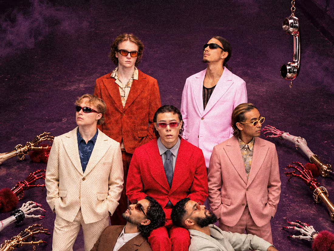
BAD CALL — HALLOWEEN WEEKEND ☎️
A little spooky, a little glamorous, and a whole lot of chaos. Created this Halloween campaign for BIG BULL Hyderabad, ranked #61 in DJ Mag's Top 100 Clubs, blending surreal Halloween elements, gothic fashion aesthetics, cinematic compositions, and bold typography into one cohesive visual universe.
Four artists, four distinct compositions, one unforgettable creative direction.
2
101
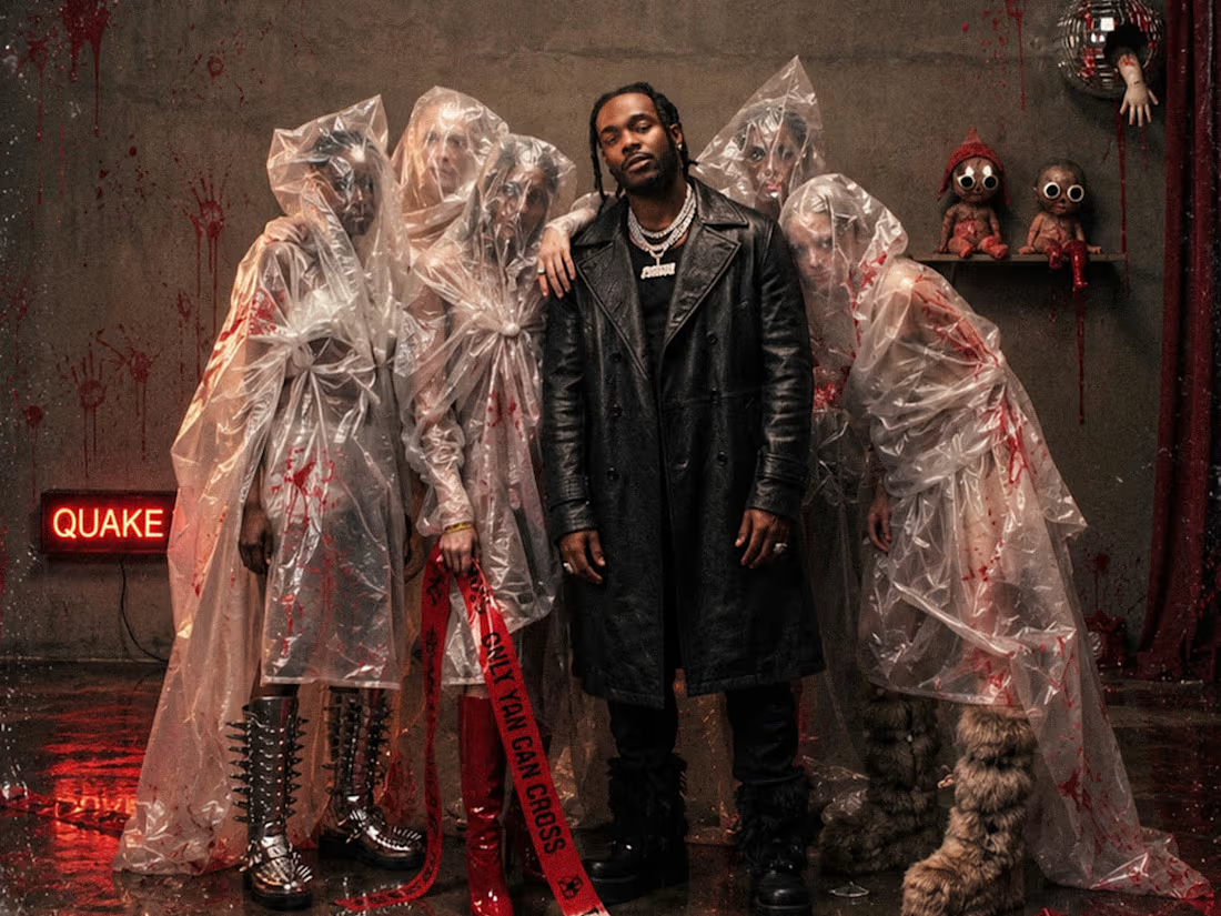
Explored different creative directions for QUAKE’s Halloween campaign, blending horror, dark fashion, and cinematic storytelling.
From eerie plastic-covered figures and unsettling environments to a sinister elevator concept, each visual was imagined and crafted to bring a unique perspective to Halloween, with bold red accents, gritty textures, dramatic lighting, and a haunting editorial aesthetic.
👻🌪️
2
89