SAFE SIDE — A Rather

Jasnoor Singh


SAFE SIDE — A Rather Unsafe Visual Identity.
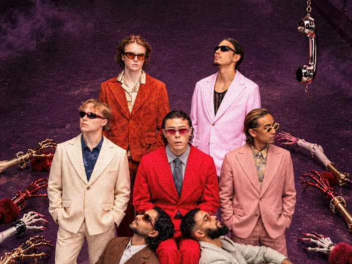
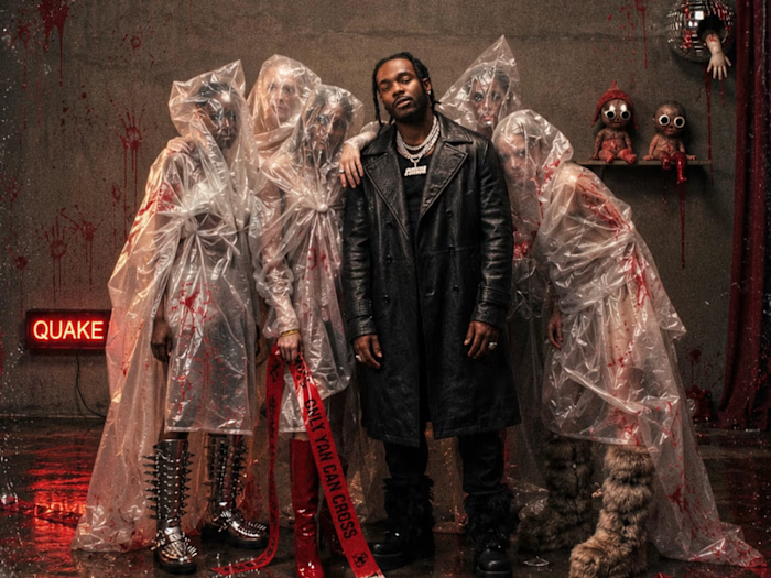
What started as an exploration of safety pins, industrial chains, razor blades and metallic fangs evolved into a Halloween identity built around a simple contradiction: not everything associated with safety looks particularly safe.
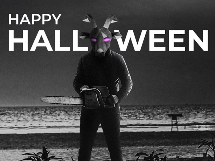
That irony became the foundation of SAFE SIDE, a Halloween IP developed for QUAKE Arena's Halloween weekend, featuring Korolova's Hyderabad debut.
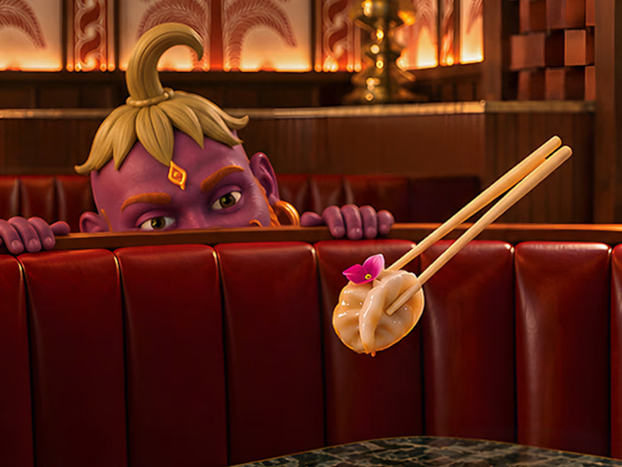
From visual research and concept development to a cohesive design language of chrome elements, sharp silhouettes and bold typography, the idea took shape across the weekend's campaign.
A little danger, a little humour, and absolutely no commitment to looking safe.
Like this project
Posted Nov 4, 2026
SAFE SIDE — A Rather Unsafe Visual Identity. What started as an exploration of safety pins, industrial chains, razor blades and metallic fangs evolved into a...