Izumo Kobu
Brand Designer for hospitality, luxury & lifestyle brands
- 10
- Followers



GOOD ENERGY FITNESS — From Brand Identity to Digital Experience 🩵
Strong in type. Soft in tone.
For this week's design brief by @the.brief.booth, I explored a women’s-only fitness brand that combines bold typography, soft colours and playful hand-drawn elements.
Alongside the...


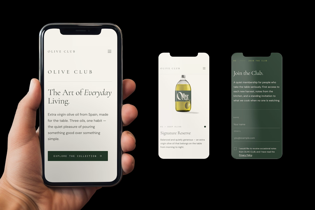
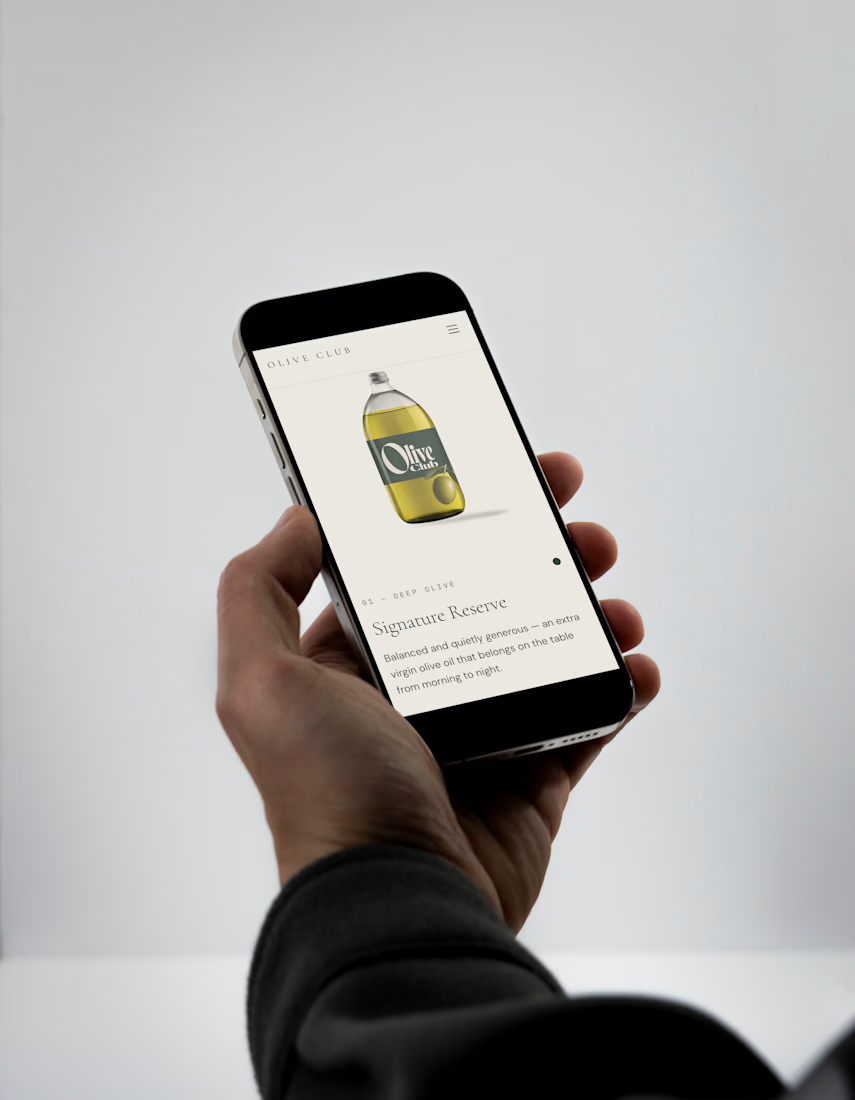
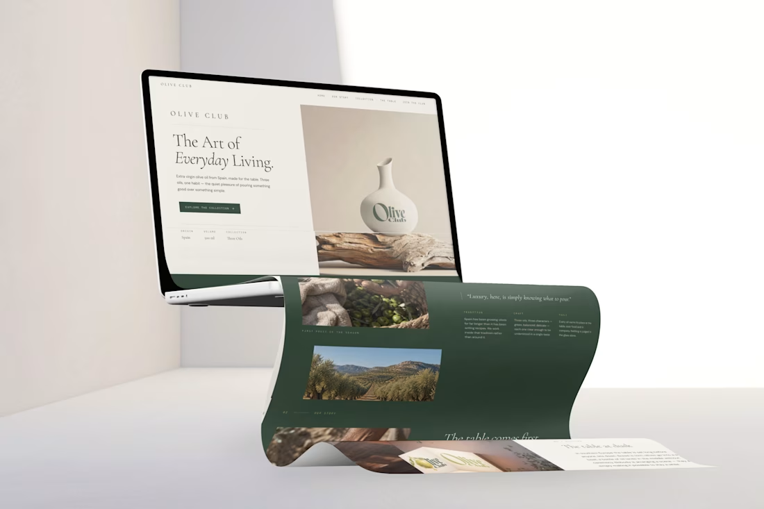
🫒 OLIVE CLUB — Desktop or Mobile?
One brand, two digital experiences.
For my latest OLIVE CLUB website, built with Base44, I explored how the same visual identity translates across different screen sizes.
Now I'm curious to hear your thoughts!
Which UI presentation do you prefer? 👀
3 voted
75%
1 voted
25%
4 votes
Closed
🫒 OLIVE CLUB — The Art of Everyday Living.
My entry for the #Base44Challenge!
For this challenge, I decided to take OLIVE CLUB, a premium Spanish olive oil brand concept I originally developed for The New Brief, one step further — from visual identity to a fully functional...
Visual Identity Explorations — 3 Creative Briefs 🎨
Three briefs, three different visual directions.
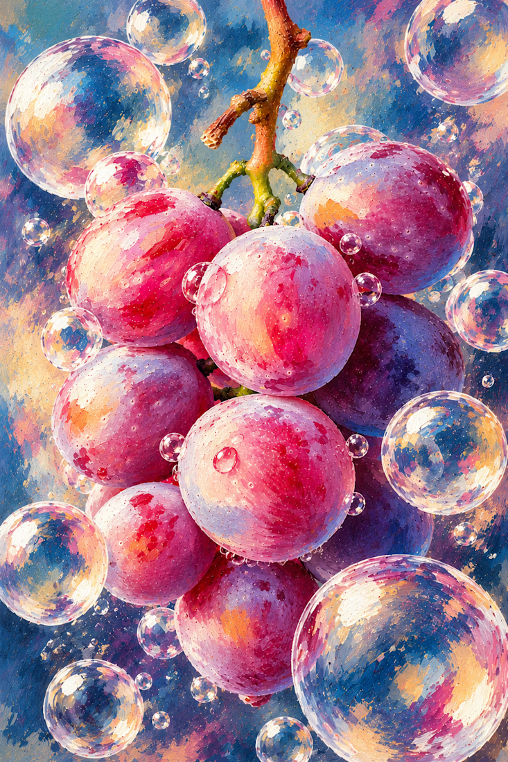
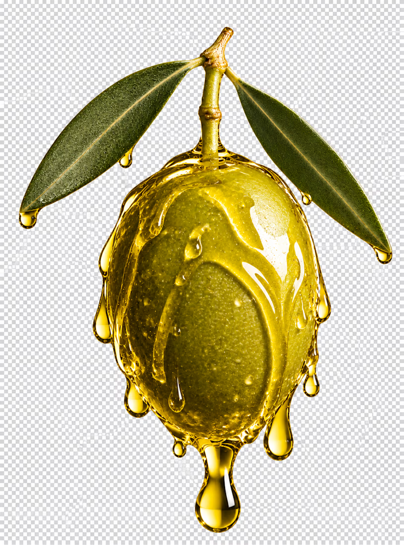
This week, I've been exploring how textures, materials and unexpected visual treatments can help shape a brand's identity.
Always looking for something unique, visually impactful...

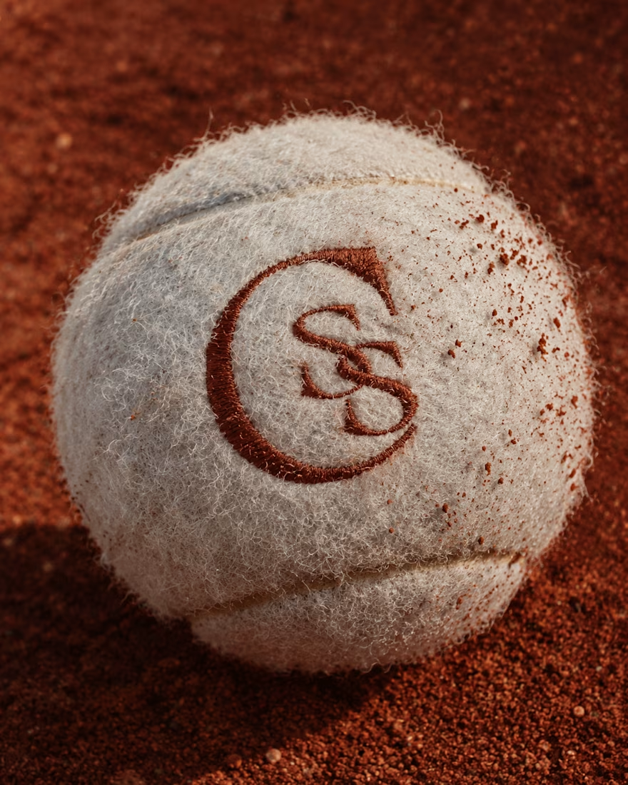
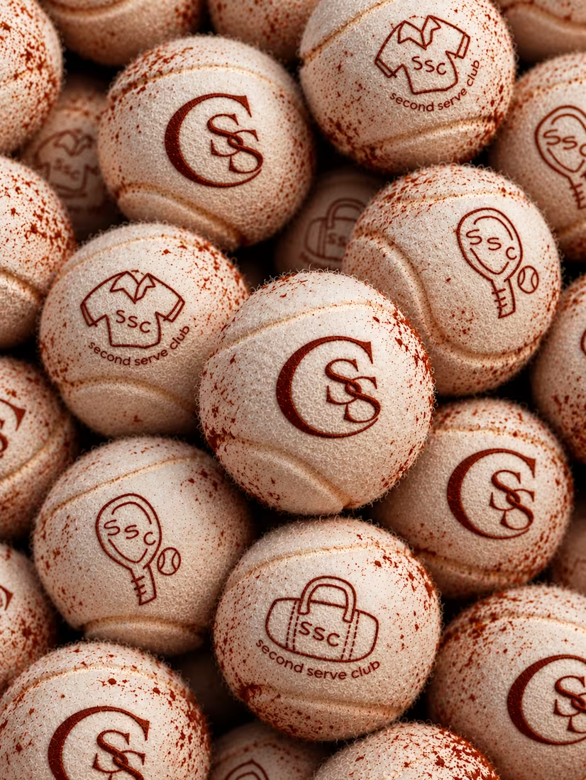
Second Serve Club — Exploring Visual Identity Through AI & Design.
For this branding challenge, I created a series of original logo marks in Adobe Illustrator, inspired by vintage tennis culture.
I then explored how these designs could come to life by combining my own typography,...