The network for creativity
Join 1.25M professional creatives like you
Connect with clients, get discovered, and run your business 100% commission-free
Creatives on Contra have earned over $150M and we are just getting started
Back to feedPost
GOOD ENERGY FITNESS — From Brand Identity to Digital Experience 🩵
Strong in type. Soft in tone.
For this week's design brief by @the.brief.booth, I explored a women’s-only fitness brand that combines bold typography, soft colours and playful hand-drawn elements.
Alongside the visual identity, I wanted to take the project one step further by building a functional web app with Base44.
The experience includes membership registration, a digital ENERGY PLAN pass and class booking — bringing the brand beyond its visual identity and into everyday interactions.
A small experiment in connecting branding, UI design and functionality.
💻 Explore the live app:
https://good-energy-flow.base44.app
#BrandIdentity #DigitalExperience #UIDesign #Base44 #FitnessBranding #BrandDesign


Great idea for the fitness industry! Many fitness apps use dark mode, and I think your colour palette works really well here.

I wanted to create something different :) These pastel color fits good with fitness app, I think!
The network for creativity
Join 1.25M professional creatives like you
Connect with clients, get discovered, and run your business 100% commission-free
Creatives on Contra have earned over $150M and we are just getting started








Related posts

Which creative direction better communicates a Tech-Forward AI Brand Identity for anvio.online ?
25 voted
44%
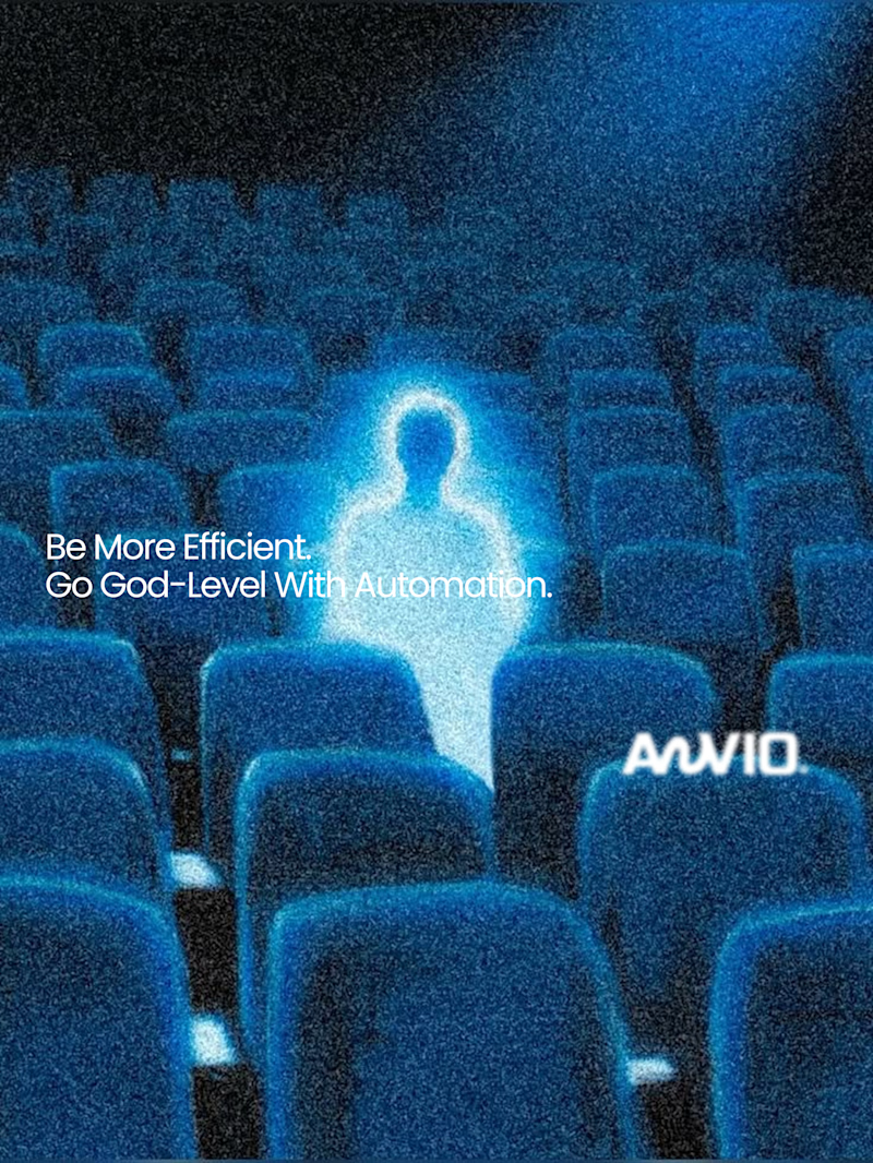
32 voted
56%
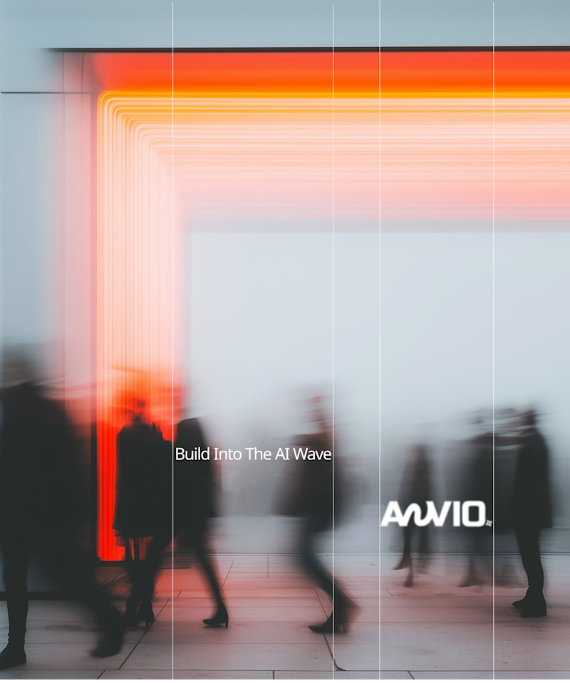
57 votes
Closed

Fast vibrant energy gets my vote. The warm glow feels more human, which is nice for an AI brand.


EarthHub – A Platform for Nature Expeditions ⛰️
Stumbled upon this project in my hard drive, had to publish!


Top to bottom nice work

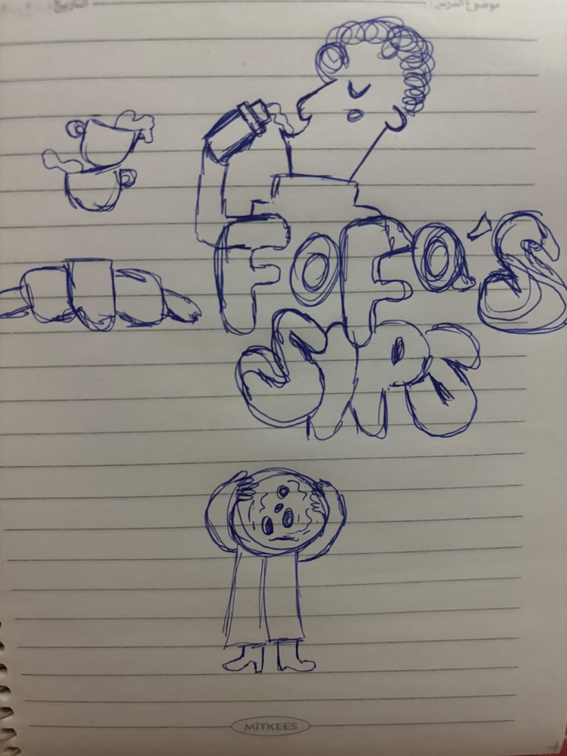
I turned one of my notebook doodles into a whole brand identity. And honestly this was way more fun than I expected I usually work on UI/UX and digital products so I wanted to take a step back from screens and explore something completely different: illustration-led branding.
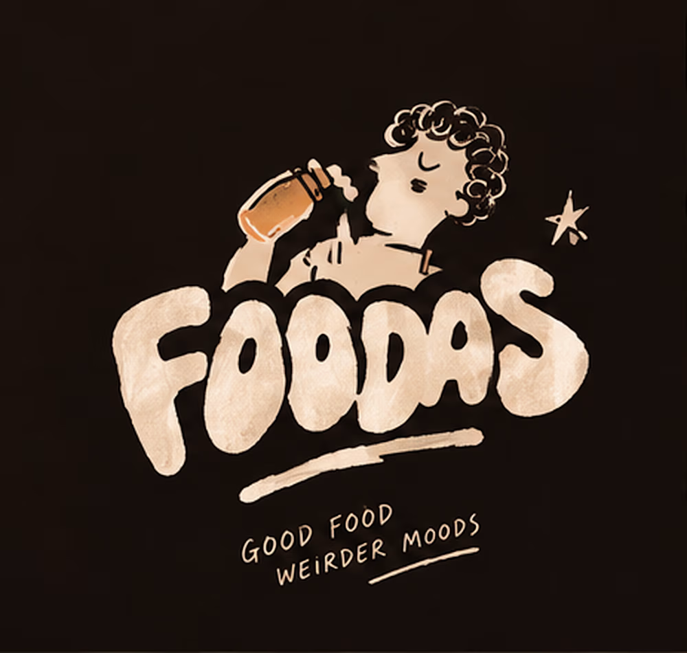
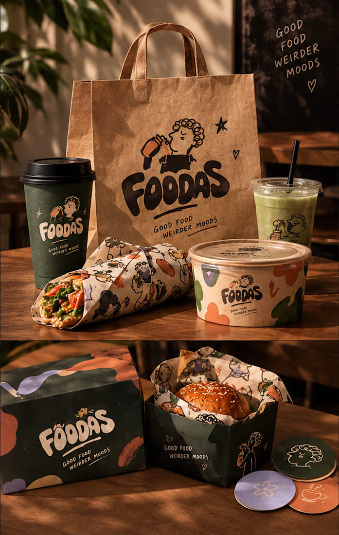
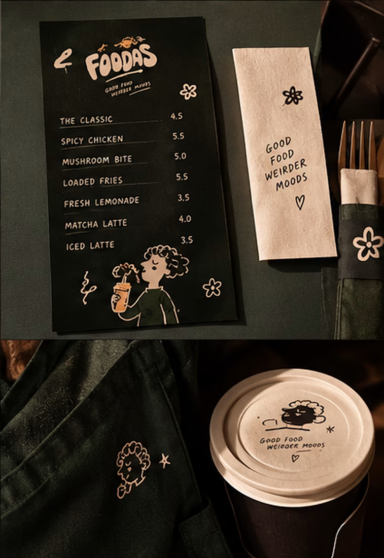
I took my original FOODAS sketch and built an entire visual world around it from the logo and mascot illustrations to the color palette packaging, cups, and menus
The goal wasn't to make it look perfectly polished and predictable I wanted it to feel playful, a little weird, and still premium.
Now I'm curious about one thing:
Can playful, imperfect illustrations make a brand feel more premium or do you think premium branding needs to be more minimal?
I have a feeling designers will disagree on this one