
Isabel J. H.
Creating clean, effective print & editorial designs
New to Contra
Isabel is ready for their next project!
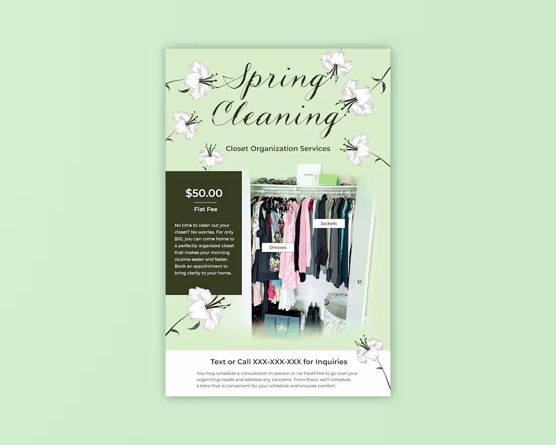
It's officially spring cleaning season. When I reorganized my closet I thought this could be a fun side hustle idea, so I designed this poster to advertise the service.
I searched for script fonts on Adobe Fonts and landed on Madelinette. The "Rustica" variation of this font makes the type look like it's written in vine. I also searched for reference photos of lilies and drew one in Adobe Illustrator.
Currently, I'm living in New York City, so I plan to print these out and display them in local coffee shops on the Upper East Side to get the attention of women who need their closets reorganized but may not have time to do so. Anyone else cleaned out their closet yet?
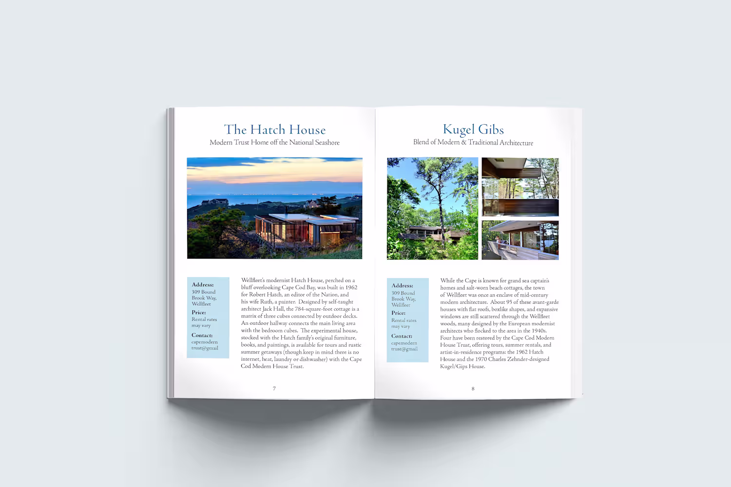
1
38
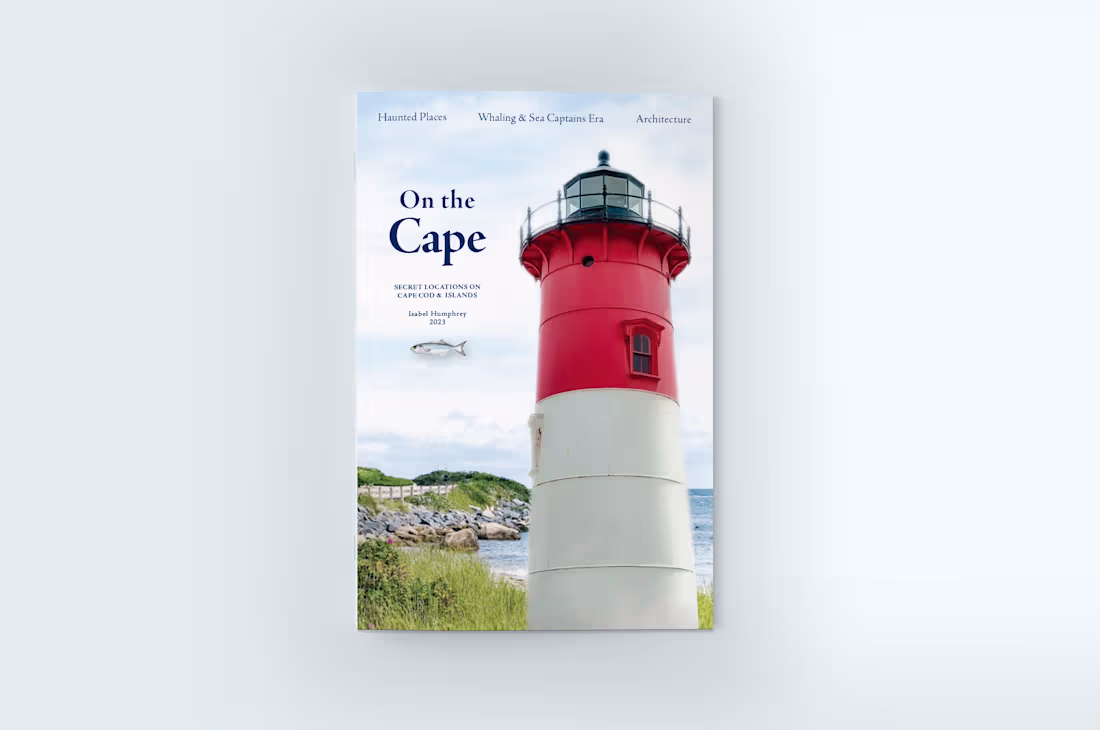
Here is the cover to a travel guide of Cape Cod, Massachusetts. To create the cover image, I combined two photos in Photoshop. One is an original photo I took of the Nauset Beach Lighthouse, recognizable as the logo for Cape Cod potato chips. After isolating the lighthouse and deepening its red saturation, I placed it over a photo I downloaded from https://unsplash.com/ (https://unsplash.com/). Finally, I added the lockup and the fish.😊
1
445
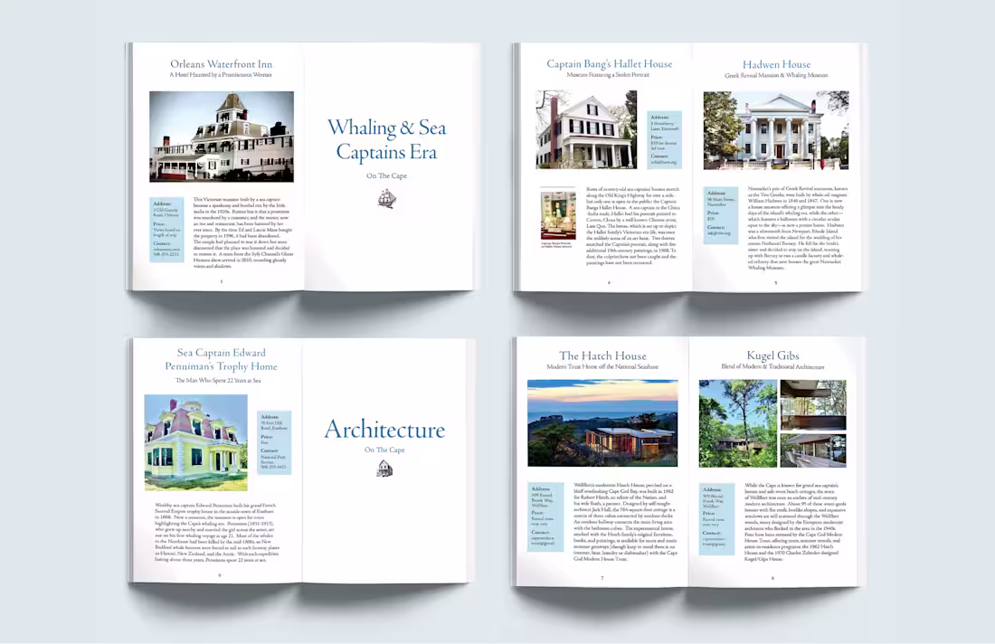
In this travel guide, I divided the content into categories. A full page with just typography signals that a new topic is beginning.
1
172
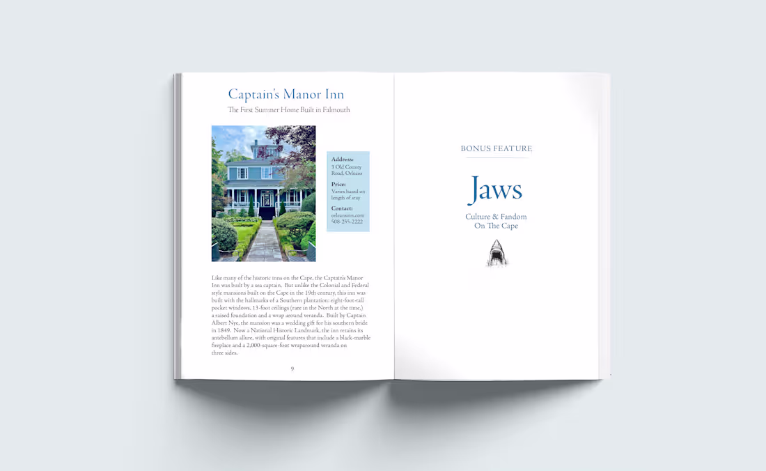
Have you ever been to Cape Cod, Massachusetts? It's known for its beaches, clam chowder, and light houses, but it has so much more. Historical and cultural sites are embedded in the region, like an old sea captain's home or a museum dedicated to the movie JAWS. Read on to discover more secrets ...
1
441
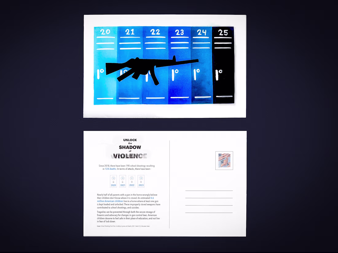
School shootings have remained a threat to students' sense of safety for years in America. That's why I screen-printed this postcard, "Unlock the Shadow of Violence," where the imagined silhouette of a rifle lurks over a row of lockers.
As stated on the back of the card:
"Nearly half of all parents with a gun in the home wrongly believe their children don't know where it is stored. An estimated 4.6 million American children live in a home where at least one gun is kept loaded and unlocked. These improperly stored weapons have contributed to school shootings and suicides. (source: https://www.edweek.org/) Tragedies can be prevented through both the secure storage of firearms and advocacy for changes in gun control laws. American children deserve to feel safe in their place of education, and not live in fear of lockdown."
1
463
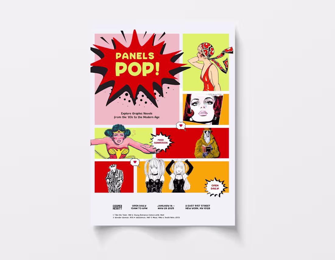
Here is a museum poster ad for an exhibition on pop art and comic history. It features cutouts of some of comic's most iconic characters in history, starting with Tillie the Toiler from the 1920s (top right) going all the way to contemporary manga characters.
The poster is also laid out to mimic a comic book or graphic novel page, against a pop art inspired color palette.
1
433
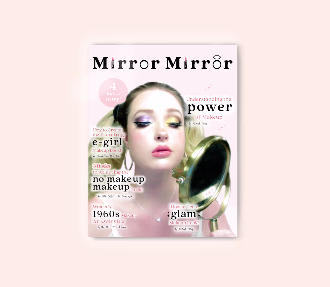
Young girls are struggling with body dysmorphia due to social media. Makeup can, in some cases, mask insecurities while self love is in process. "Mirror, Mirror" is a vibrant magazine exploring various makeup trends and looks to explore, targeted at 12-14 year old girls.
(p.s. the background of this mockup is the hex code of a foundation shade...)
1
456
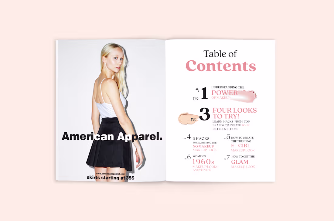
"Mirror, Mirror" is a vibrant magazine exploring various makeup trends and looks to explore, targeted at 12 to 14-year-old girls. It also includes ads for beauty brands like Glossier, Dry Bar, and, who remembers American Apparel?
(p.s. the background of this mockup is the hex code of a foundation shade...)
1
374
Young girls are struggling with body dysmorphia due to social media. Makeup can, in some cases, mask insecurities while self-love is in process.
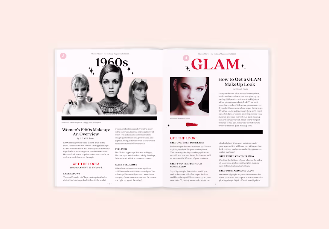
"Mirror, Mirror" is a vibrant magazine that explores various makeup trends and looks, targeted at 12 to 14-year-old girls. For this interior spread, I designed the layout for an article from the H&MUA studio (left) and L'Oréal (right). Each article describes a unique makeup look to try out: a 1960s trend, featuring 60s model Twiggy and others, and a glam look, featuring Barbara Palvin.
(p.s. the background of this mockup is the hex code of a foundation shade...)
1
339
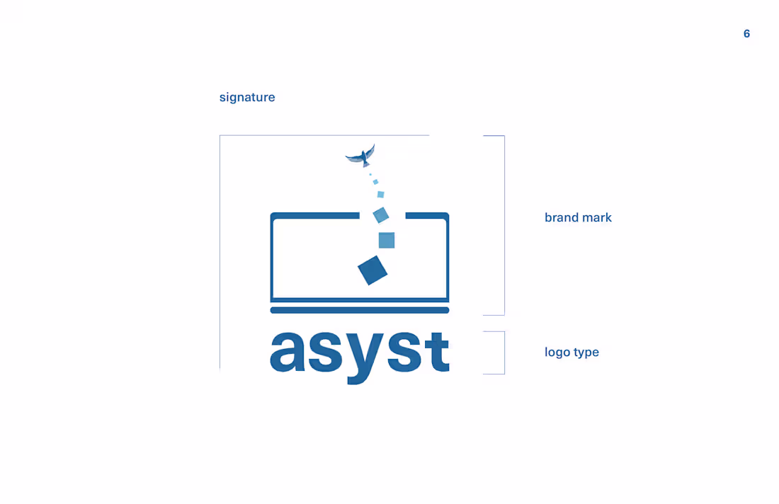
I had a client who wanted to build an outsourcing platform, where contractors are hired overseas. He called the platform "asyst," and favored corporate, sans-serif typefaces. He chose this logo that illustrates the distance between the employer and the overseas workers, but also the connection between them. It's an uplifting visual of sending a message online to someone far away. My client chose this concept because the tone comes across as trustworthy, approachable, and kind, which is exactly how he wanted visitors to interpret his platform.
1
164
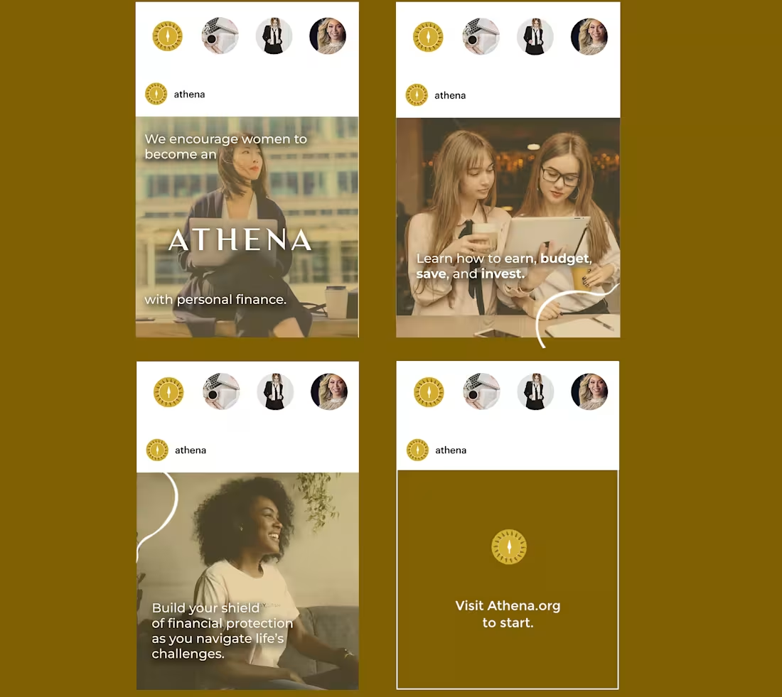
"Athena" is a brand and campaign I created to connect university women with financial literacy resources. Here is an example of a social media advertisement, targeted towards women aged 19 to 24.
To make the images appear cohesive, I overlaid a square of the brand color and lowered the opacity. I tried to include a range of different types of women, and show them working both independently or collaboratively. The post concludes with a simple call to action.
0
132
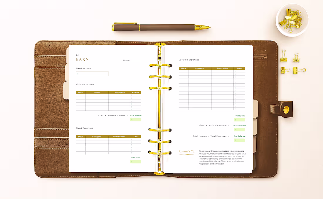
This is a spread from a financial planner I designed as part of a larger campaign project on boosting financial literacy in young women. The "EARN" spread suggests tracking monthly income and expenses to ensure the former surpasses the latter!
1
454
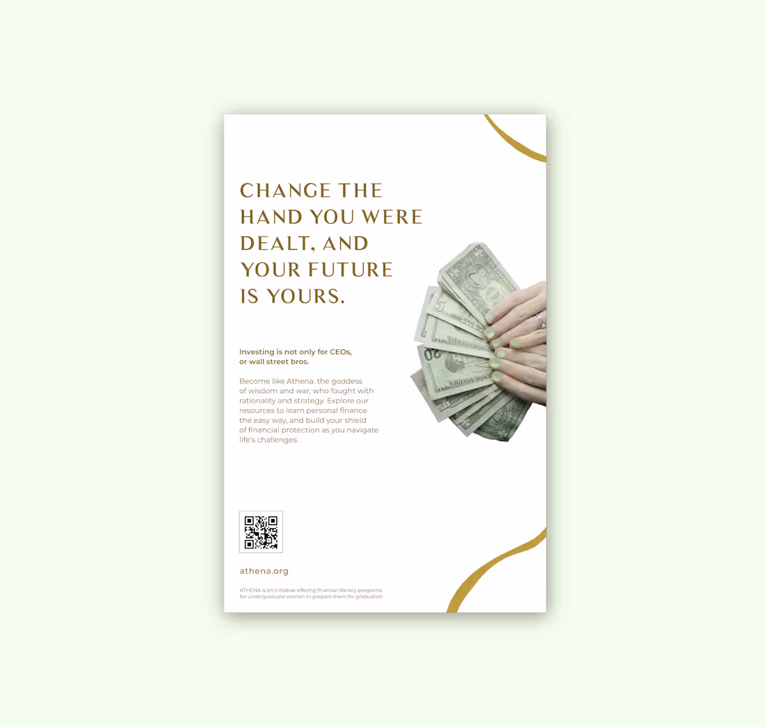
Change the hand you were dealt, and your future is yours.
This is a poster advertisement for the brand "Athena," a financial literacy initiative targeted towards young women. An ad like this might be seen in a coffee shop, library, or university bus station where young women are found. The large type is seen first, and the need for financial prosperity will inspire them to come a bit closer to read about the program.
At the bottom is a QR code link to the website and boilerplate text.
1
379
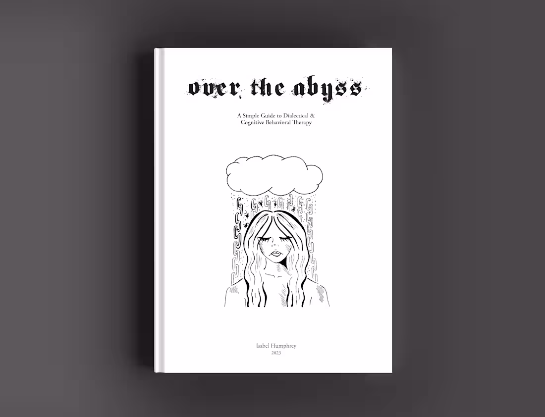
How to illustrate a negative thought spiral?
They can be like rain coming down fast in large, uncontrollable quantities. They can be heavy, and stay chained to the mind. In this cover illustration, the subject experiences heavy thoughts raining down as chains from her mind's thought bubble. This is used to explain the issue the booklet "Over the Abyss" addresses, as it explains cognitive behavioral therapy treatment in an understanding and empathetic tone.
2
386
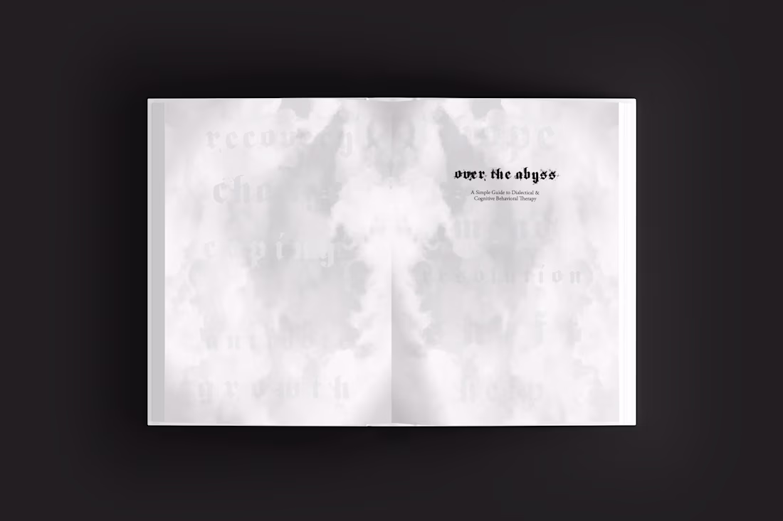
"Over the Abyss: A Simple Guide to Dialectical & Cognitive Behavioral Therapy" is a booklet that explains psychiatric concepts in an intimate and somber tone. The mission is to gain the patient's trust by reflecting their emotions back at them.
This mockup shows the title page spread, where an image of a cloudy sky is mirrored from the spine. Words like "change," "amend," "help," and "growth" are seen faintly in the sky. This reflects where the reader is at mentally, searching for these concepts in their life and seeing them just out of reach.
0
270