The network for creativity
Join 1.25M professional creatives like you
Connect with clients, get discovered, and run your business 100% commission-free
Creatives on Contra have earned over $150M and we are just getting started
Back to feedPost

In this travel guide, I divided the content into categories. A full page with just typography signals that a new topic is beginning.


The network for creativity
Join 1.25M professional creatives like you
Connect with clients, get discovered, and run your business 100% commission-free
Creatives on Contra have earned over $150M and we are just getting started






Related posts

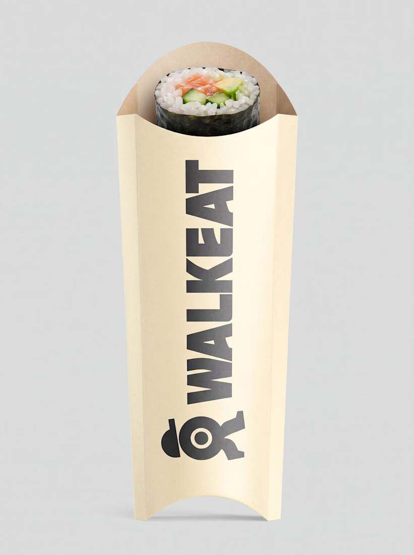
A sushi roll with a life of its own.
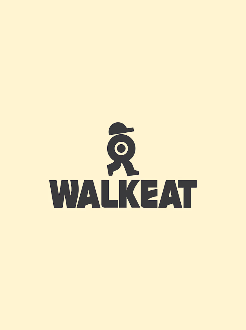
The WALKEAT identity transforms the shape of a sushi roll into a walking character. Its circular center references the cross-section of the roll, while the cap and legs bring movement and personality to the figure.
The custom-designed wordmark reinforces this concept through subtle modifications to the W, A, and E, creating a visual connection between typography and symbol.
A simple, playful and contemporary identity that communicates the product without relying on literal Japanese imagery or an overly cartoonish character.


Great work!!


Some of my recent works. As you can see I have pretty wide range of styles and topics 😅


the range is real

One of the hardest things in branding is knowing what not to change.
Nubank recently worked with Koto to evolve its visual identity as the company expands internationally.
They kept the recognizable logo but rebuilt the wider system around typography, colour, illustration, photography, and motion.
The interesting part for me is how much of this work happens inside the actual product.
Animations built in Rive, a more consistent interface language, and an identity that needs to work across different markets without losing its personality.
I think that's where branding is heading, especially for digital-first companies.
A good identity shouldn't just look great in a presentation. It needs to work just as well inside the product people use every day.

Top-notch branding/rebranding