
Iprahim Zayed
Hi, I'm Ibrahim, a Web Designer focused on creating modern a



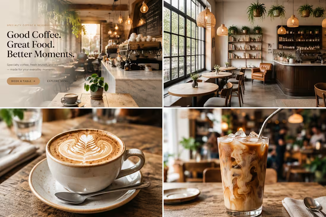
Brew & Oak Café — Premium Restaurant Website
Brew & Oak Café is a premium modern American café website designed and developed as a professional digital experience, combining sophisticated UI/UX design, strong visual identity, responsive layouts, and functional restaurant features.
The website was designed with a strong focus on creating a polished, real-world product rather than a basic template. Every section was carefully structured to provide an intuitive user journey, from discovering the café and browsing the menu to making a table reservation.
Design & UI/UX
The website features a contemporary American café aesthetic with:
Premium editorial-style typography
Warm and sophisticated color palette
High-quality food and café imagery
Clean and spacious layouts
Modern card-based components
Smooth micro-interactions
Subtle animations
Responsive design across desktop, tablet, and mobile
Clear visual hierarchy
Strong and consistent call-to-action elements
The interface was designed to feel premium, welcoming, modern, and conversion-focused.
Main Website Features
Home Page
A visually strong landing page introducing the café, featured menu items, signature offerings, customer reviews, and clear calls to action.
Digital Menu
A fully structured restaurant menu with categorized food and beverage items, prices, descriptions, images, featured products, and dietary information.
Table Reservation System
A functional reservation experience allowing customers to select:
Date
Time
Number of guests
Contact information
Special requests
The system is designed to prevent conflicting reservations and provide customers with a clear confirmation experience.
Reservation Management
Reservations can be managed through an administrative interface with statuses such as:
Pending
Confirmed
Completed
Cancelled
No Show
Admin Dashboard
A professional dashboard for managing the restaurant website and its content, including:
Reservations
Menu items
Customer reviews
Café information
Opening hours
Reservation settings
Newsletter subscribers
Gallery
A responsive visual gallery showcasing the café atmosphere, coffee, brunch, desserts, and food photography.
Contact & Location
A dedicated contact experience with business information, opening hours, contact form, social media links, and location section.
Technology & Platform
The project was developed using Base44, utilizing its application-building, database, backend, and interactive functionality to create a complete restaurant web application.
The goal was not simply to create a static website, but to build a scalable digital product with functional data management and a professional user experience.
Responsive Experience
The entire interface was designed with a responsive-first approach to ensure a consistent experience across:
Desktop
Laptop
Tablet
Mobile
Special attention was given to mobile navigation, reservation forms, menu browsing, image layouts, and touch-friendly interactions.
Professional Design Approach
As a professional web designer, the project focuses on the details that separate a polished commercial website from a standard template:
Consistent spacing system
Strong typography hierarchy
Intentional component design
Responsive behavior
Clear conversion paths
Consistent branding
Accessible interactions
Realistic content
Functional user flows
Professional empty, loading, success, and error states
The final experience is intended to represent the type of premium digital presence a modern American café or restaurant would use for its customers.
Project Goal
The goal of Brew & Oak Café is to demonstrate how modern web design, UX strategy, visual branding, and functional application development can come together to create a complete restaurant digital experience.
This project represents a combination of professional UI/UX design, responsive web development, database-driven functionality, and modern product thinking, built with Base44.
0
16
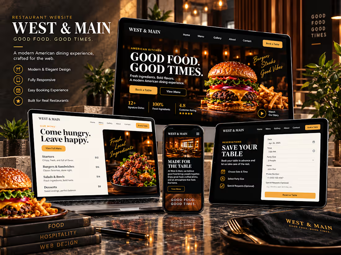
Project Name
West & Main | Modern American Restaurant Website
Project Type
Professional Restaurant Website Design
My Role
Web Designer • UI/UX Designer • Responsive Web Designer
Project Description
West & Main is a professional restaurant website concept designed to combine strong visual identity with a simple, conversion-focused user experience.
The website was designed around the idea of “Good Food. Good Times.”, using bold editorial typography, a clean light-and-dark color system, warm orange accents, and high-quality food and restaurant photography.
My goal was to create more than an attractive homepage. I designed a complete restaurant experience that helps visitors discover the brand, explore the menu, learn about the restaurant, view the gallery, and easily request a table reservation.
The Design Approach
I focused on creating a premium but approachable visual style that reflects a modern American restaurant.
The interface combines:
Clear visual hierarchy
•Professional typography
•Strong food photography
•Modern light and dark sections
•Consistent spacing and components
•Simple navigation
•Menu categories
•Restaurant storytelling
•Gallery presentation
•Customer review sections
•Location and contact information
•Table reservation experience
•Clear calls to action
•UI/UX
The user experience was structured around the actions restaurant visitors care about most.
From the homepage, users can quickly explore the menu, discover the restaurant story, browse the gallery, find restaurant information, or book a table.
The reservation section uses a clean form structure for date, time, number of guests, contact information, and special requests.
The menu is organized into categories such as starters, burgers, mains, sides, desserts, and drinks, making the content easier to explore.
Responsive Design
The project was designed with responsive behavior in mind so the visual identity can remain consistent across desktop, tablet, and mobile layouts.
My approach to responsive web design focuses on preserving:
Visual Quality • Readability • Navigation • Content Hierarchy • Clear CTAs • Consistent Branding
Tools
Figma • Web Design Tools • UI/UX Design Tools • Responsive Design Workflow
لو استخدمت أدوات فعلية مختلفة في تنفيذ الموقع، زي Framer أو Webflow أو Base44 أو غيرها، ضيفها هنا فقط لو استخدمتها فعلًا.
Skills
Web Design
UI Design
UX Design
Responsive Web Design
Landing Page Design
Restaurant Website Design
Visual Design
Typography
Layout Design
Brand Identity
User Experience
Conversion-Focused Design
Deliverables
Homepage Design • Menu Experience • Restaurant Story • Gallery • Reviews • Reservation Form • Contact & Location • Responsive Layout
Short Description for Contra
A professional restaurant website designed to combine modern UI/UX, strong visual identity, responsive layouts, food-focused storytelling, and an intuitive reservation experience.
Professional Designer Statement
I design professional websites that combine strong visual design with practical user experiences. My focus is creating modern, responsive, and brand-focused websites that not only look premium, but also help businesses communicate clearly, build trust, and guide visitors toward meaningful actions.
3
65
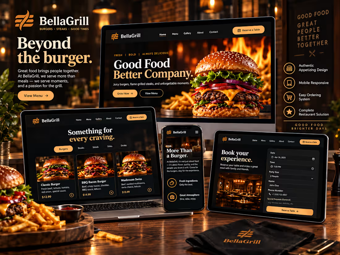
BellaGrill | Premium Restaurant Website Design
Web Design • UI/UX Design • Responsive Design • Visual Design
BellaGrill is a premium restaurant website concept created to demonstrate my approach to building modern, visually engaging, and user-focused digital experiences.
My goal wasn't simply to create an attractive restaurant website. I wanted to design a complete digital experience where branding, UI/UX, typography, imagery, responsive layouts, and conversion-focused elements work together as one system.
The Project
BellaGrill is built around a bold, premium visual identity inspired by flame-grilled food and contemporary dining.
I designed the experience to immediately communicate the restaurant's personality while keeping the interface intuitive and easy to navigate.
The dark visual foundation, warm golden accents, expressive typography, and large food photography create a distinctive identity that carries consistently throughout the website.
My Approach to Professional Web Design
My approach to web design goes beyond making pages look good.
I focus on creating websites that combine:
Strong Visual Identity
Every color, font, image, and layout decision supports the personality of the brand.
Clear User Experience
I structure pages around what visitors need to see and what action they should take next.
Responsive Design
The interface is designed to maintain its visual quality and usability across desktop and mobile experiences.
Conversion-Focused Layouts
Important actions such as viewing the menu and booking a table receive clear visual priority.
Consistent Design Systems
Cards, buttons, typography, spacing, imagery, and interface elements follow a consistent visual language throughout the experience.
UI/UX Design
The website was designed as a complete restaurant experience rather than a single landing page.
The interface includes dedicated experiences for exploring menu items, discovering the restaurant's story, viewing signature dishes, reading customer feedback, and making a reservation.
The menu uses strong food photography and structured cards to make individual dishes easy to discover while maintaining the premium aesthetic.
Clear categories help users navigate between Burgers, Steaks, Sides, and Drinks without unnecessary complexity.
A Strong Brand Experience
One of my priorities was creating a recognizable visual language for BellaGrill.
The combination of black backgrounds, warm bronze and gold tones, cream typography, rounded elements, editorial headlines, and high-impact food photography creates a consistent identity across the entire interface.
The result is a website that feels designed specifically for the brand rather than built from a generic restaurant template.
Responsive & Mobile Design
Responsive design is an important part of my web design process.
The mobile experience was designed to preserve the same premium identity while adapting the navigation, content hierarchy, menu cards, forms, imagery, and calls to action for smaller screens.
This allows the visual experience to remain consistent while keeping interactions clear and accessible.
Reservation Experience
The website also includes a dedicated reservation experience.
Instead of separating functionality from design, the booking interface follows the same visual system as the rest of the website.
Form fields, date selection, guest selection, special requests, and reservation actions are organized into a clean interface designed to make the booking journey feel like a natural part of the brand experience.
The Result
BellaGrill represents the type of websites I aim to create:
Modern. Responsive. Visually distinctive. User-focused. Brand-driven.
The final concept demonstrates my ability to transform a business idea into a polished digital experience by combining professional web design, UI/UX thinking, responsive layouts, visual storytelling, and strong brand direction.
My goal with every website is not simply to deliver a beautiful interface, but to create a digital presence that feels professional, memorable, and built around the needs of the business and its users.
What I Can Design
Professional Website Design
UI/UX Design
Landing Pages
Responsive Web Design
Restaurant & Hospitality Websites
Business Websites
Visual & Art Direction
Website Redesigns
Mobile-Friendly Interfaces
Project Skills
Web Design • UI Design • UX Design • Responsive Design • Restaurant Website • Landing Page Design • Visual Design • Art Direction
Short Contra Description
A premium restaurant website designed to showcase my approach to professional web design, combining strong visual identity, intuitive UI/UX, responsive layouts, high-impact imagery, and conversion-focused user journeys.
4
93
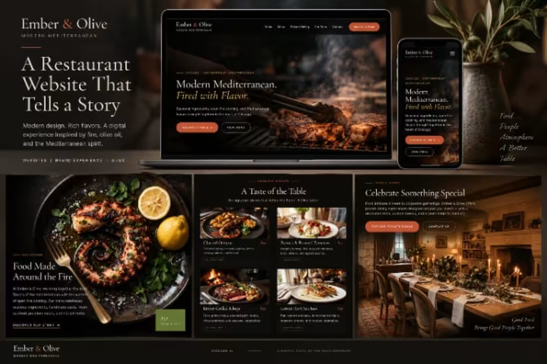
Ember & Olive
Modern Mediterranean Restaurant Website
Web Design • UI/UX Design • Responsive Design • Art Direction
Ember & Olive is a premium restaurant website concept designed around the warmth of Mediterranean dining and the visual character of open-fire cooking.
The goal was to create a digital experience that feels refined, atmospheric, and modern, while making it easy for visitors to explore the food, understand the restaurant’s identity, discover private dining, and move toward making a reservation.
The Concept
Modern Mediterranean. Fired with Flavor.
The creative direction combines a dark, cinematic interface with warm food photography, earthy olive tones, burnt orange accents, and elegant typography.
Rather than designing a traditional restaurant website, I wanted the experience to feel like entering the restaurant itself, with fire, texture, food, and atmosphere driving the visual story.
The Challenge
The main challenge was balancing a premium editorial aesthetic with a clear and intuitive user experience.
The website needed to showcase the restaurant’s personality without overwhelming the essential actions visitors would be looking for.
The design therefore focuses on three key principles:
Strong Visual Storytelling
Large-scale imagery creates an immediate connection with the food and atmosphere.
Clear Navigation
Important information and actions remain easy to discover throughout the experience.
Conversion-Focused CTAs
Actions such as Reserve a Table, View Menu, Explore Private Dining, and Contact Us are given clear visual priority.
Visual Direction
The visual identity is built around contrast.
Deep black and charcoal backgrounds create a sophisticated foundation, while warm orange, muted gold, olive green, and natural food tones bring energy to the interface.
Elegant serif typography adds an editorial character, while minimal supporting typography keeps descriptions and navigation clean and readable.
The result is a visual system that feels premium, warm, handcrafted, and distinctly food-focused.
The Dining Experience
Food photography plays a central role throughout the website.
The menu section uses a structured visual grid to showcase signature dishes through photography, dish names, descriptions, prices, and dietary information.
Instead of treating the menu as a simple list, the interface turns browsing the food into part of the overall brand experience.
Storytelling Through Design
The Food Made Around the Fire section introduces the story behind the restaurant through a strong combination of imagery and editorial typography.
This section connects the visual identity with the restaurant concept, creating a natural transition between brand storytelling and menu exploration.
The design intentionally gives photography enough space to become part of the narrative rather than simply functioning as decoration.
Private Dining
The experience also includes a dedicated private dining section for special occasions and group experiences.
Warm interior photography, focused messaging, and prominent calls to action help distinguish this experience from the main menu while maintaining the same visual identity.
Responsive Experience
The interface was designed with responsiveness in mind, maintaining the same visual personality across different screen sizes.
On mobile, the experience prioritizes bold photography, readable content, simplified navigation, and accessible calls to action while preserving the premium aesthetic of the larger layout.
Design Approach
Visual Identity
A sophisticated dark theme paired with warm Mediterranean-inspired accents.
Typography
A combination of expressive editorial typography and clean supporting text.
Photography
Large, immersive food and interior imagery used as a core storytelling element.
User Experience
Clear hierarchy and focused navigation guide visitors through the restaurant experience.
Responsive Design
Layouts adapt to smaller screens while retaining the original visual direction.
The Result
The final concept transforms Ember & Olive into a complete digital dining experience rather than simply an informational restaurant website.
The final interface balances visual storytelling, brand personality, usability, and clear calls to action, creating an experience designed to make the restaurant feel desirable before the visitor ever steps through the door.
Food. Fire. Atmosphere.
A digital taste of the Mediterranean.
Project Services
Web Design • UI/UX • Responsive Design • Visual Design • Art Direction • Landing Page Design
Project Tags
Web Design UI Design UX Design Restaurant Website Responsive Design Landing Page Figma Art Direction Visual Design
Short Preview Description
A premium Mediterranean restaurant website combining cinematic food photography, elegant typography, responsive UI, and conversion-focused design to create an immersive digital dining experience.
4
113