The network for creativity
Join 1.25M professional creatives like you
Connect with clients, get discovered, and run your business 100% commission-free
Creatives on Contra have earned over $150M and we are just getting started
Back to feedPost

Ember & Olive
Modern Mediterranean Restaurant Website
Web Design • UI/UX Design • Responsive Design • Art Direction
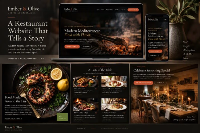
Ember & Olive is a premium restaurant website concept designed around the warmth of Mediterranean dining and the visual character of open-fire cooking.
The goal was to create a digital experience that feels refined, atmospheric, and modern, while making it easy for visitors to explore the food, understand the restaurant’s identity, discover private dining, and move toward making a reservation.
The Concept
Modern Mediterranean. Fired with Flavor.
The creative direction combines a dark, cinematic interface with warm food photography, earthy olive tones, burnt orange accents, and elegant typography.
Rather than designing a traditional restaurant website, I wanted the experience to feel like entering the restaurant itself, with fire, texture, food, and atmosphere driving the visual story.
The Challenge
The main challenge was balancing a premium editorial aesthetic with a clear and intuitive user experience.
The website needed to showcase the restaurant’s personality without overwhelming the essential actions visitors would be looking for.
The design therefore focuses on three key principles:
Strong Visual Storytelling
Large-scale imagery creates an immediate connection with the food and atmosphere.
Clear Navigation
Important information and actions remain easy to discover throughout the experience.
Conversion-Focused CTAs
Actions such as Reserve a Table, View Menu, Explore Private Dining, and Contact Us are given clear visual priority.
Visual Direction
The visual identity is built around contrast.
Deep black and charcoal backgrounds create a sophisticated foundation, while warm orange, muted gold, olive green, and natural food tones bring energy to the interface.
Elegant serif typography adds an editorial character, while minimal supporting typography keeps descriptions and navigation clean and readable.
The result is a visual system that feels premium, warm, handcrafted, and distinctly food-focused.
The Dining Experience
Food photography plays a central role throughout the website.
The menu section uses a structured visual grid to showcase signature dishes through photography, dish names, descriptions, prices, and dietary information.
Instead of treating the menu as a simple list, the interface turns browsing the food into part of the overall brand experience.
Storytelling Through Design
The Food Made Around the Fire section introduces the story behind the restaurant through a strong combination of imagery and editorial typography.
This section connects the visual identity with the restaurant concept, creating a natural transition between brand storytelling and menu exploration.
The design intentionally gives photography enough space to become part of the narrative rather than simply functioning as decoration.
Private Dining
The experience also includes a dedicated private dining section for special occasions and group experiences.
Warm interior photography, focused messaging, and prominent calls to action help distinguish this experience from the main menu while maintaining the same visual identity.
Responsive Experience
The interface was designed with responsiveness in mind, maintaining the same visual personality across different screen sizes.
On mobile, the experience prioritizes bold photography, readable content, simplified navigation, and accessible calls to action while preserving the premium aesthetic of the larger layout.
Design Approach
Visual Identity
A sophisticated dark theme paired with warm Mediterranean-inspired accents.
Typography
A combination of expressive editorial typography and clean supporting text.
Photography
Large, immersive food and interior imagery used as a core storytelling element.
User Experience
Clear hierarchy and focused navigation guide visitors through the restaurant experience.
Responsive Design
Layouts adapt to smaller screens while retaining the original visual direction.
The Result
The final concept transforms Ember & Olive into a complete digital dining experience rather than simply an informational restaurant website.
The final interface balances visual storytelling, brand personality, usability, and clear calls to action, creating an experience designed to make the restaurant feel desirable before the visitor ever steps through the door.
Food. Fire. Atmosphere.
A digital taste of the Mediterranean.
Project Services
Web Design • UI/UX • Responsive Design • Visual Design • Art Direction • Landing Page Design
Project Tags
Web Design UI Design UX Design Restaurant Website Responsive Design Landing Page Figma Art Direction Visual Design
Short Preview Description
A premium Mediterranean restaurant website combining cinematic food photography, elegant typography, responsive UI, and conversion-focused design to create an immersive digital dining experience.

The network for creativity
Join 1.25M professional creatives like you
Connect with clients, get discovered, and run your business 100% commission-free
Creatives on Contra have earned over $150M and we are just getting started




Related posts


cohestra’s journal in light and dark. which would you keep?
26 voted
41%
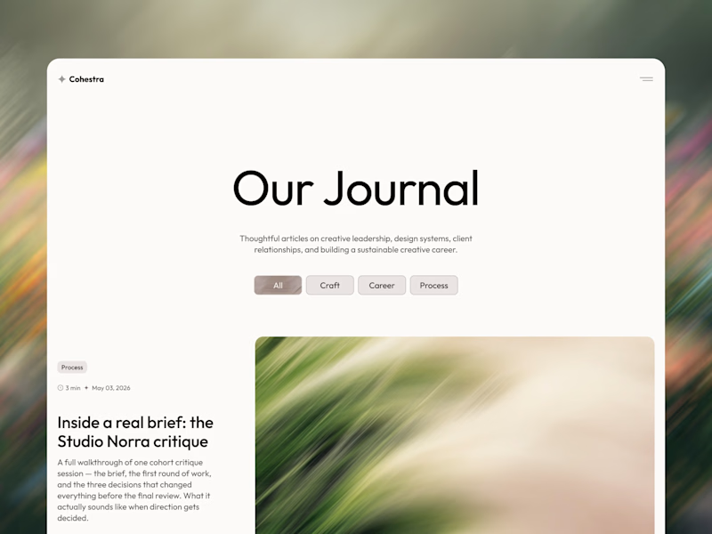
37 voted
59%
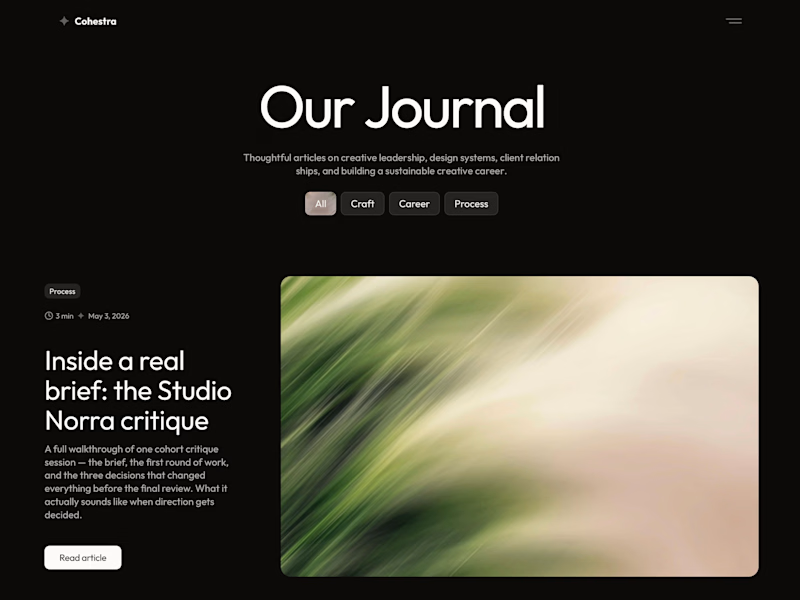
63 votes
Closed


light: more clear for me 🎉


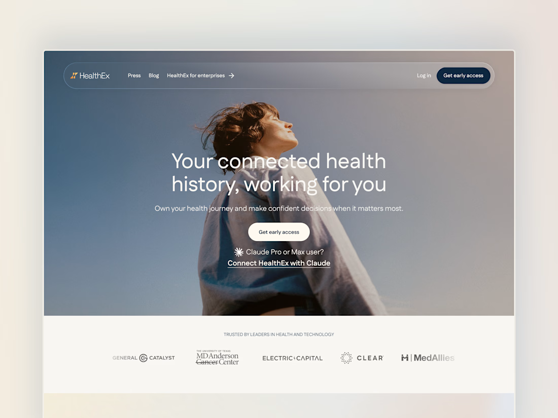
Project back from December 2025: Secret City designed the HealthEx website and hired me to build it in Framer.
P.S. they've gone through several site restructures since then (so it looks different from my snapshots), but it goes to show how easy Framer makes it for clients to manage and update their site independently.


Awesome😍