The network for creativity
Join 1.25M professional creatives like you
Connect with clients, get discovered, and run your business 100% commission-free
Creatives on Contra have earned over $150M and we are just getting started
Back to feedPost

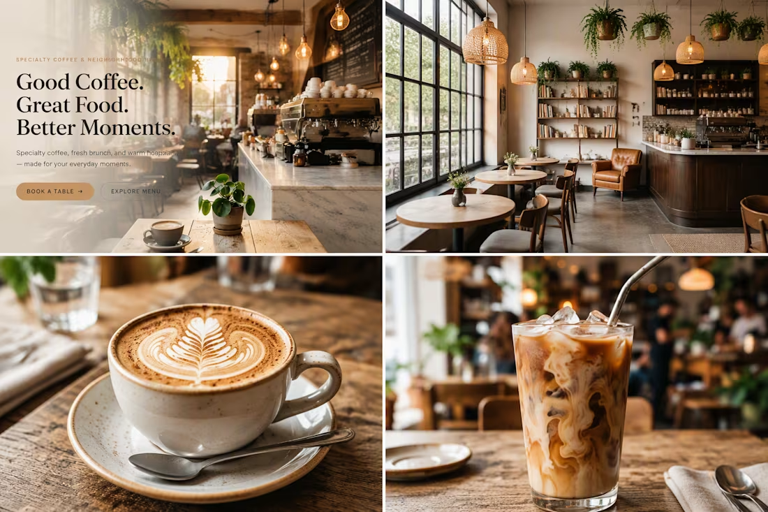
Brew & Oak Café — Premium Restaurant Website
Brew & Oak Café is a premium modern American café website designed and developed as a professional digital experience, combining sophisticated UI/UX design, strong visual identity, responsive layouts, and functional restaurant features.
The website was designed with a strong focus on creating a polished, real-world product rather than a basic template. Every section was carefully structured to provide an intuitive user journey, from discovering the café and browsing the menu to making a table reservation.
Design & UI/UX
The website features a contemporary American café aesthetic with:
Premium editorial-style typography
Warm and sophisticated color palette
High-quality food and café imagery
Clean and spacious layouts
Modern card-based components
Smooth micro-interactions
Subtle animations
Responsive design across desktop, tablet, and mobile
Clear visual hierarchy
Strong and consistent call-to-action elements
The interface was designed to feel premium, welcoming, modern, and conversion-focused.
Main Website Features
Home Page
A visually strong landing page introducing the café, featured menu items, signature offerings, customer reviews, and clear calls to action.
Digital Menu
A fully structured restaurant menu with categorized food and beverage items, prices, descriptions, images, featured products, and dietary information.
Table Reservation System
A functional reservation experience allowing customers to select:
Date
Time
Number of guests
Contact information
Special requests
The system is designed to prevent conflicting reservations and provide customers with a clear confirmation experience.
Reservation Management
Reservations can be managed through an administrative interface with statuses such as:
Pending
Confirmed
Completed
Cancelled
No Show
Admin Dashboard
A professional dashboard for managing the restaurant website and its content, including:
Reservations
Menu items
Customer reviews
Café information
Opening hours
Reservation settings
Newsletter subscribers
Gallery
A responsive visual gallery showcasing the café atmosphere, coffee, brunch, desserts, and food photography.
Contact & Location
A dedicated contact experience with business information, opening hours, contact form, social media links, and location section.
Technology & Platform
The project was developed using Base44, utilizing its application-building, database, backend, and interactive functionality to create a complete restaurant web application.
The goal was not simply to create a static website, but to build a scalable digital product with functional data management and a professional user experience.
Responsive Experience
The entire interface was designed with a responsive-first approach to ensure a consistent experience across:
Desktop
Laptop
Tablet
Mobile
Special attention was given to mobile navigation, reservation forms, menu browsing, image layouts, and touch-friendly interactions.
Professional Design Approach
As a professional web designer, the project focuses on the details that separate a polished commercial website from a standard template:
Consistent spacing system
Strong typography hierarchy
Intentional component design
Responsive behavior
Clear conversion paths
Consistent branding
Accessible interactions
Realistic content
Functional user flows
Professional empty, loading, success, and error states
The final experience is intended to represent the type of premium digital presence a modern American café or restaurant would use for its customers.
Project Goal
The goal of Brew & Oak Café is to demonstrate how modern web design, UX strategy, visual branding, and functional application development can come together to create a complete restaurant digital experience.
This project represents a combination of professional UI/UX design, responsive web development, database-driven functionality, and modern product thinking, built with Base44.


The network for creativity
Join 1.25M professional creatives like you
Connect with clients, get discovered, and run your business 100% commission-free
Creatives on Contra have earned over $150M and we are just getting started




Related posts


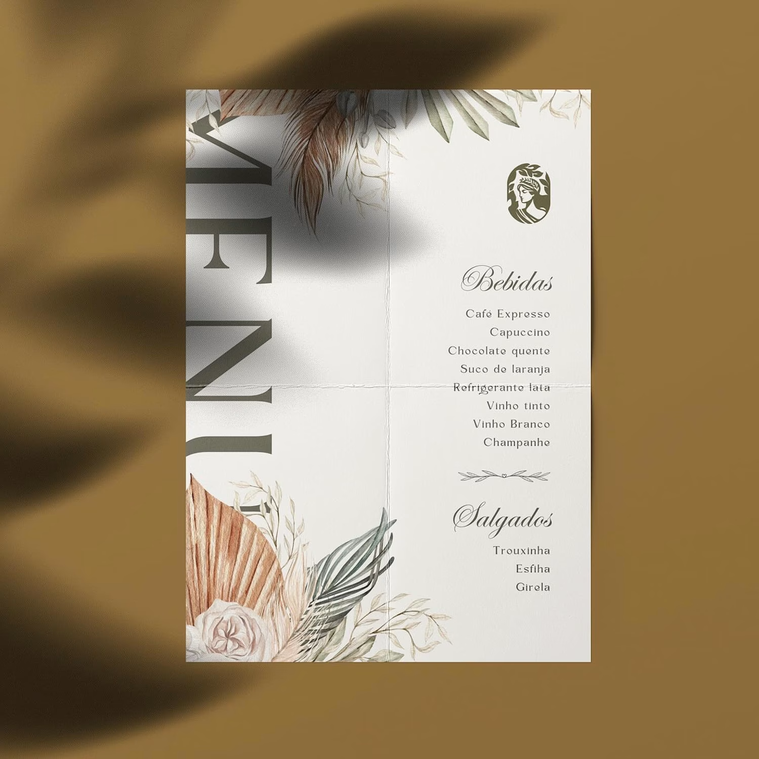
Hot take: aesthetics and clinical results should walk hand in hand.
Most brands in this space lean into cold, sterile whites or aggressive dark tones. It reads functional, but it also feels like something you'd hide in a medicine cabinet, not display on your vanity.
For this rebrand, we anchored the identity in classical beauty and organic sophistication. By combining warm earthy tones, botanical cues, and timeless iconography, we moved away from the "pharmacy product" feel into true high-end personal care.
It was a deliberate shift: positioning the brand not for someone who feels like they are treating a flaw, but for someone investing in a premium daily ritual.
Would a piece like this deserve a spot on your display shelf?






This is brilliant!


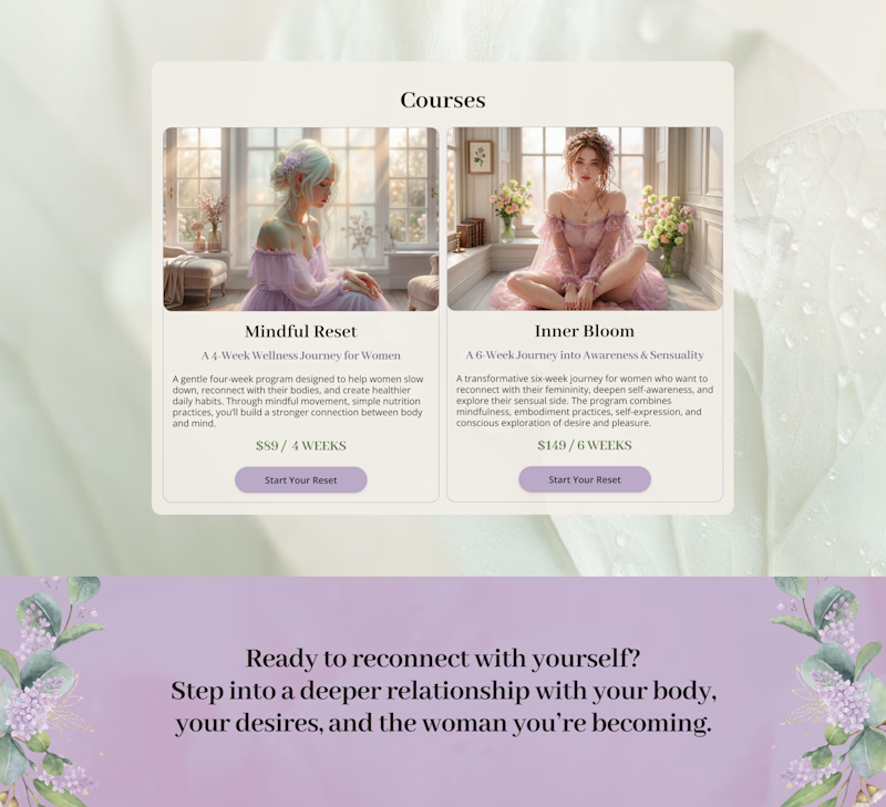
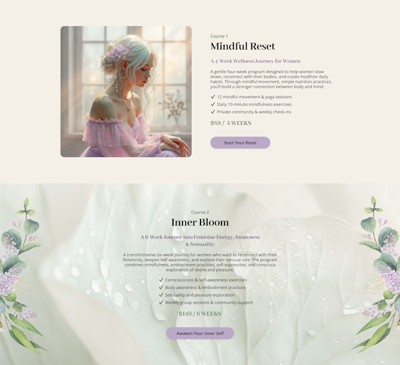
Cards or sections? How should you showcase courses on a Kajabi website?
It depends on what you want visitors to see first.
Course cards are great when you want to show the full picture at a glance – “Here are all the programs we offer.” They make the product range clear before visitors start scrolling.
Separate sections work better when each course needs more attention – its story, audience, benefits, and outcomes.
When we design Kajabi websites, we don’t use one layout for every course.
We choose the structure that makes the offer easier to understand – and easier to explore.

28 voted
65%
15 voted
35%
43 votes
Closed


the course cards make the offer easy to scan. did you test sections too?


Site of the Day!
Heed Collective's first award, and I couldn't be prouder of what we created together. Celebrating a project we poured so much care into ✨

how exciting, so well deserved.