max
Serge Herasymchuk
Kajabi Expert | I Turn Course Creators Into Premium Brands
- $250k+
- Earned
- 151x
- Hired
- 5.00
- Rating
- 1.1K
- Followers
Sharing another milestone from our work with Focal Dystonia Method 🚀
After completing the initial Kajabi migration, we continued improving the platform with a complete website redesign. We refreshed the existing pages in Figma, designed new ones, and brought everything to life...
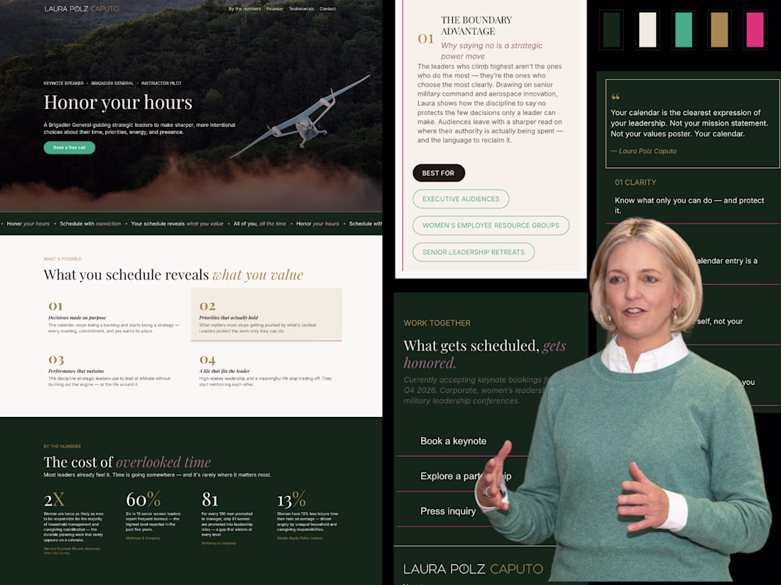
Sharing one of our recent Kajabi projects 🚀
This project came with a unique challenge.
Our client had an AI-generated website mockup that captured the overall vision, but turning that concept into a real website required much more than simply recreating the design. The goal was...
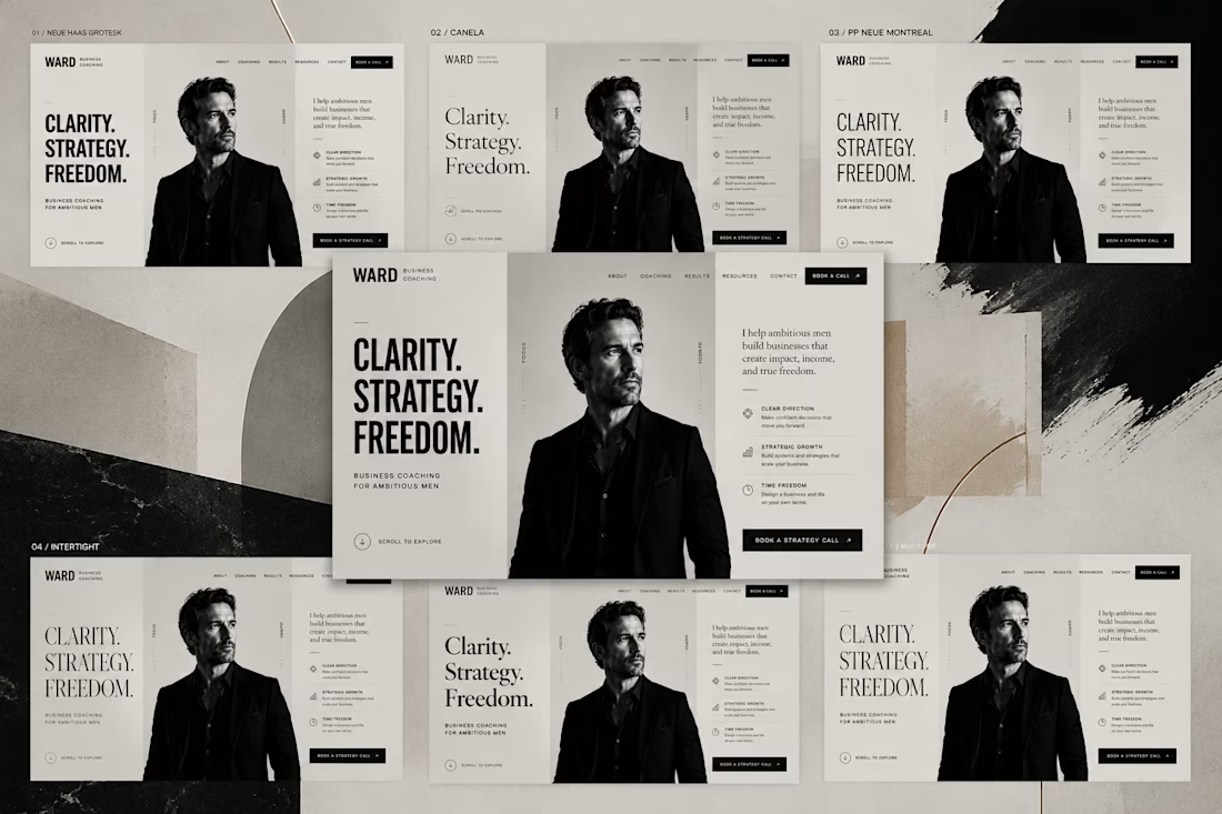
Why does one design feel more professional than another? Not because of different content.
The difference is in the details:
• spacing
• typography hierarchy
• visual balance
• alignment
• consistency
Each change is barely noticeable on its own. But when combined, they completely...
10 voted
15%

58 voted
85%

68 votes
Closed