
Adeyemi Adewale
Video & motion designer crafting emotion-first content
Ready for work
Adeyemi is ready for their next project!
Website explainer video - Motion Graphic design for E-commerce store
0
23
Long Form documentary video edits Using Adobe Aftereffects
0
65
Logo Animation For Meet up with Jbrandy Podcast
0
69
Aimtoget In-Hub App Promo
Client: Aimtoget
Role: Motion Graphics Designer & Copywriter
Project Type: Digital Signage / FinTech Product Marketing
The Challenge
Aimtoget operates a successful physical Tech Hub, but we identified a gap: many of the freelancers and tech professionals using the physical workspace were unaware of the Aimtoget Mobile App and its powerful FinTech capabilities. The objective was to create an eye-catching, loopable motion graphics promo for the Hub's TV screens to convert daily foot traffic into active app users.
1
108
Website promo explainer video
0
114
How do you explain a great app feature without losing your audience's attention? You show, you don't just tell.
Here’s a recent promo animation I designed for the Aimtoget app. The goal was to take a relatable problem (having airtime but needing cash) and turn it into a smooth, satisfying UI walkthrough that proves how easy the app is to use. I animated this using a combination of Jitter for rapid UI motion and Adobe After Effects to dial in those crisp micro-interactions and transitions.
Got an app or digital product that needs a high-converting explainer? Let’s bring your UI to life.
2
2
134
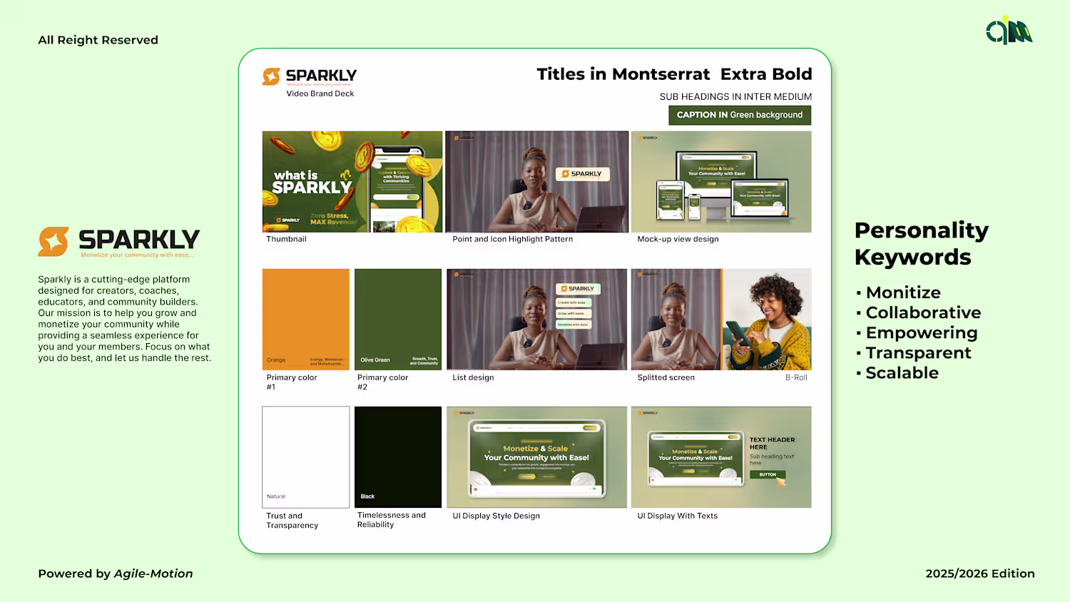
Sparkly Motion System Development
1
16
Pluhg Visual Identity and Motion Design
0
21
I don’t invest in trends; I invest in legacies.
The Vitalwell animation represents the exact moment an idea becomes an empire. It’s clean, it’s sharp, and it’s expensive. If your brand doesn't move with this kind of calculated intent, you’re just taking up space.
The new era of vitality has arrived. Catch up or watch from the sidelines
2
109
Logo Animation Case Study Portfolio
1
12
I designed Sparkly’s kinetic logo reveal — a pixel-smart, emotion-first motion mark that reads in under 1 second. Built as MP4 + Lottie for fast in-app integration, the animation lifts first impressions, preserves app size, and scales to socials and ads. Want a motion mark that lands immediately? DM — Don’t wait. Feel.
1
106
Short form video Editing
1
7
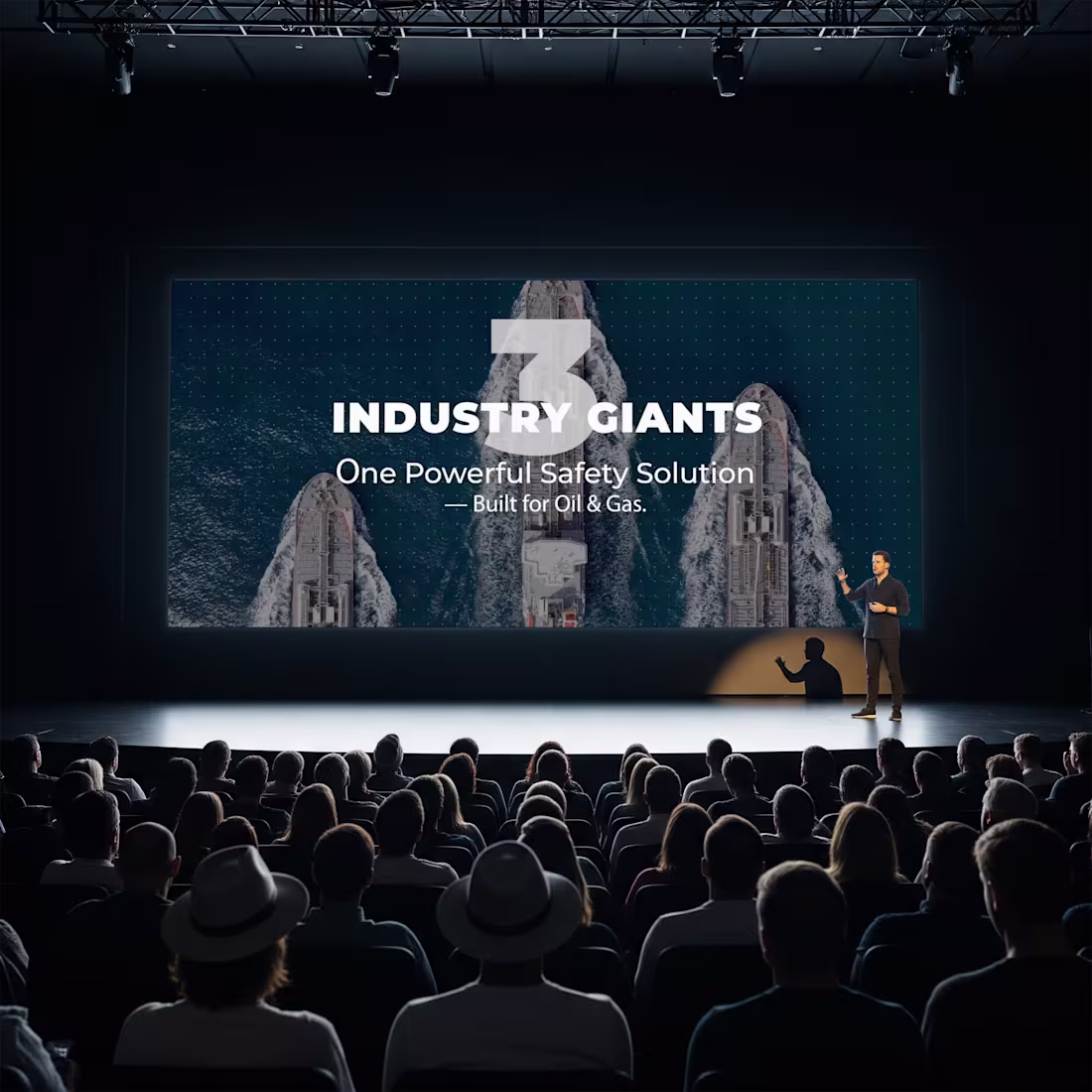
Unifying the Three Giants of Synergy Plus
0
3
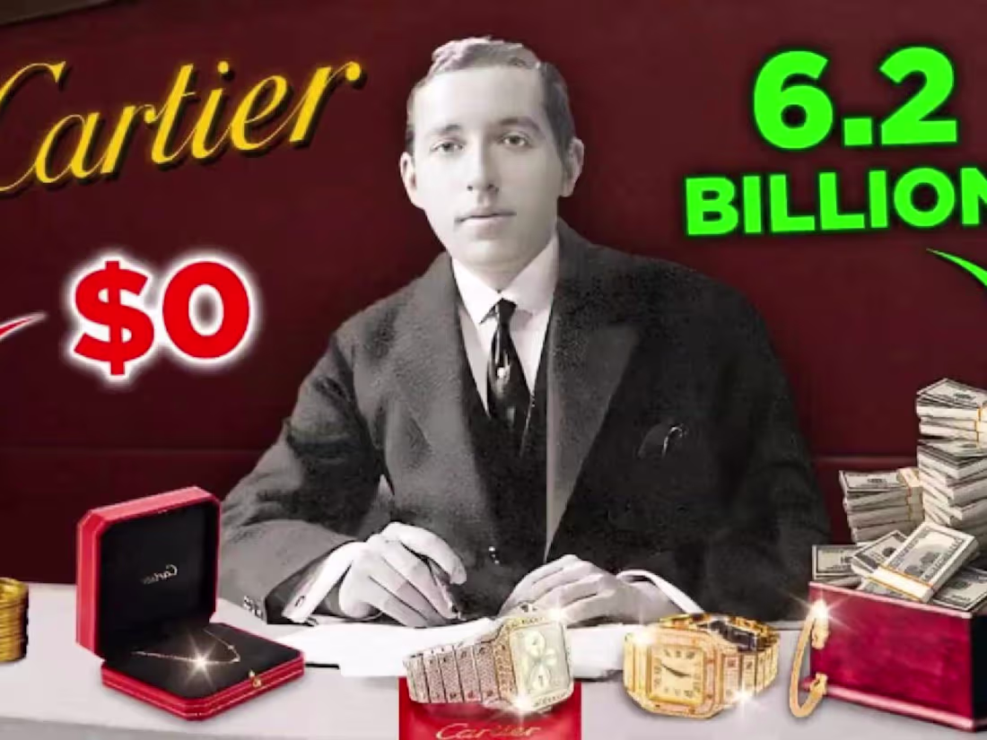
The cartiers: A family, A brand and a legacy of luxury | Cartie…
0
3
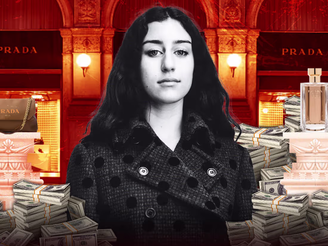
Mario Prada Banned Women in Prada – His Granddaughter Broke the…
0
7
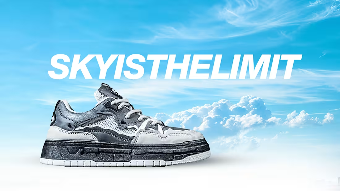
SNEAKER CREATIVE VIDEO ADS
0
7
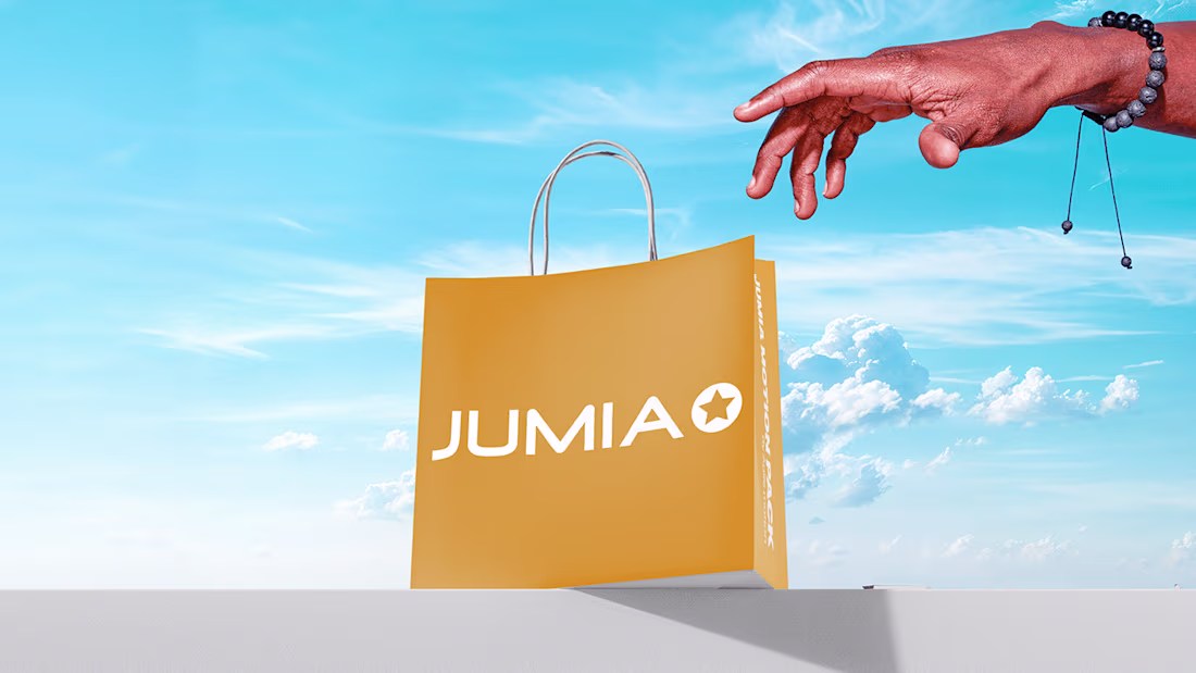
A Motion Design Vision for Jumia
0
3
Transforming Competitor Ads into High-Performing
0
4
CASE-STUDY: BRAND IDENTITY GUIDELINES
0
2
Case Study: Brand Identity
0
0
I created a marketing video for Sparkly that introduces the product website and shows how to navigate it — animating UI, microcopy, and elements for clarity and emotion. The video teaches users where to go, what to click, and why the product matters, while keeping the motion lightweight for fast playback. Want UX-first motion that converts? DM — Don’t wait. Feel.
1
86
I was walking with an ecommerce fashion company and here is how I advertised one of thier product promo videos.
Let me know what you think in the comment section
1
2
106