
pro
Inch Graphica
I make founder brands feel premium and trusted.
Ready for work
Inch is ready for their next project!
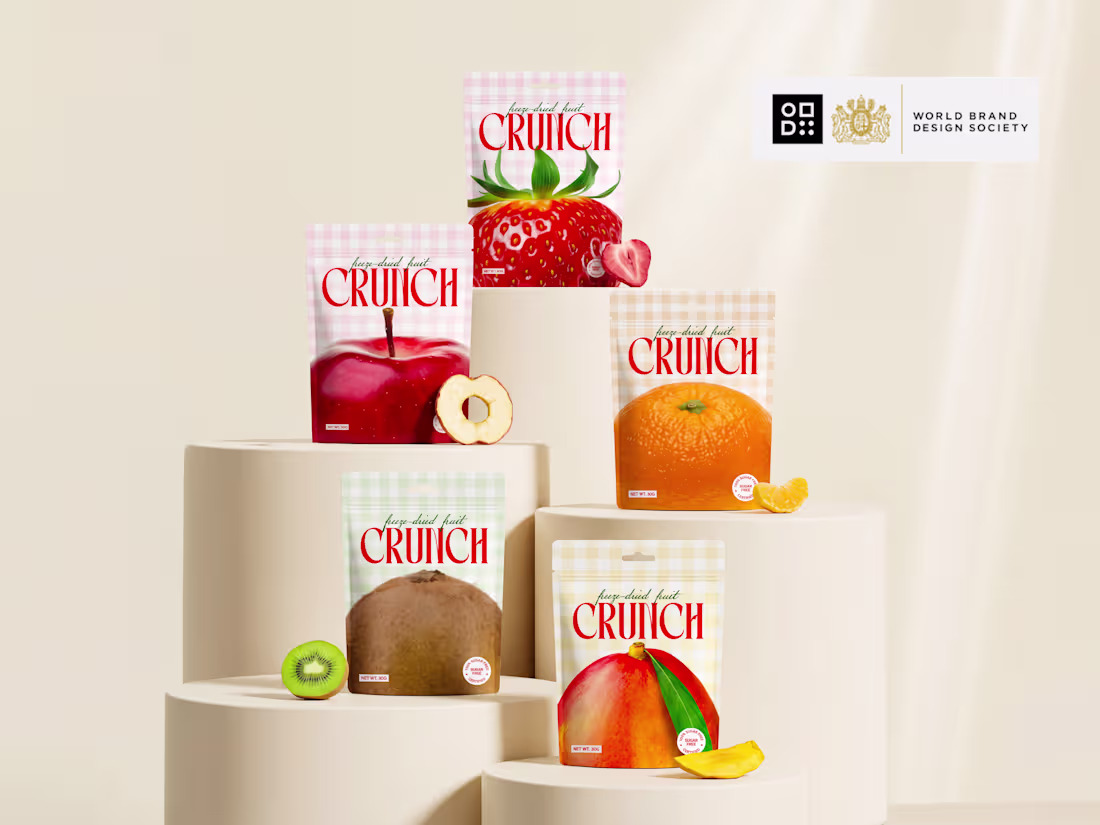
What if snack packaging was impossible to ignore? 👀
Meet CRUNCH! a brand identity designed to feel as bold as the first bite.
Every flavor has its own personality through color, graphics, and expression, while staying connected as one recognizable brand system. The goal wasn't just to design packaging it was to create a brand that jumps off the shelf and stays in your memory.
From the logo to the packaging, every detail was crafted to feel fresh, playful, energetic, and premium.
✨ Bold visuals.
✨ Distinct flavor identities.
✨ One unforgettable brand.
If you saw this on the shelf... would you pick it up?
Check it out (https://contra.com/p/3oEvmov2-crunch-bold-freeze-dried-fruit-snack-brand-design)
1
36
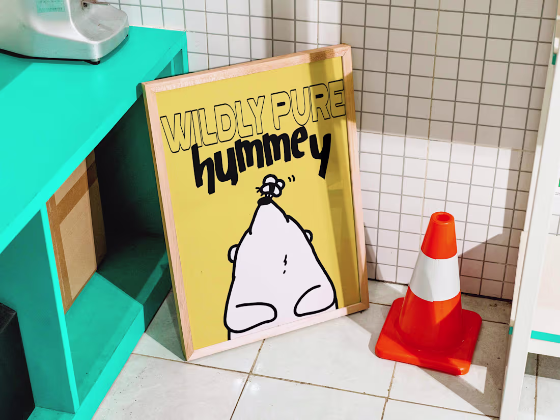
Designed a premium honey brand that feels as pure as the product inside 🍯🐝
Meet Hummey a complete brand identity and packaging design crafted to turn a simple honey jar into a memorable, shelf-ready brand experience.
This project includes a full visual identity system built with intention and storytelling:
✔ Brand Strategy
✔ Logo Design
✔ Packaging Design
✔ Custom Illustrations
✔ Visual Identity System
The goal was to create something warm, natural, and premium balancing playfulness with sophistication so the brand stands out instantly while still feeling authentic and trustworthy.
From concept to execution, every detail was designed to help the product connect emotionally with customers and leave a lasting impression in just a few seconds on the shelf.
If you're building a product-based brand and want design that goes beyond just visuals and actually sells your story, i'd love to collaborate.
Check Here: (https://www.instagram.com/p/DaDWJIgDaW2/?hl=en&img_index=1)
0
22
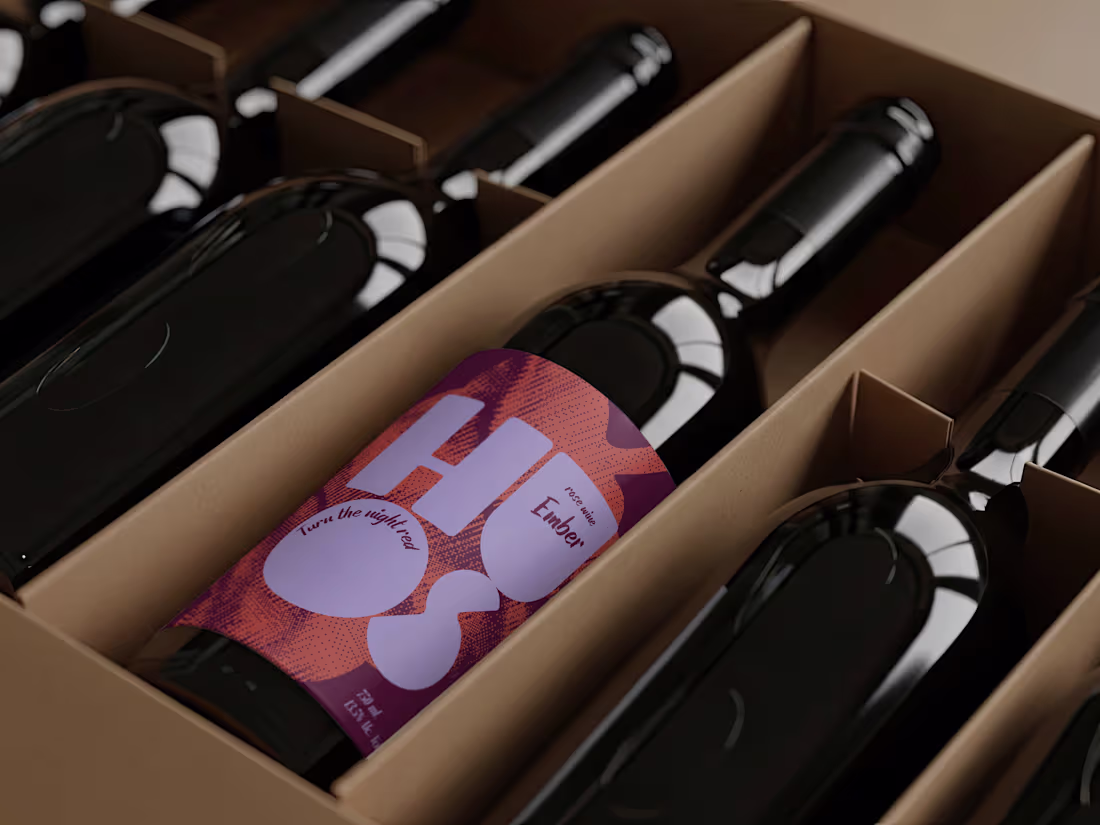
First look at HUOS a bold wine branding concept.
Every detail, from the logo to the label and packaging, was created to give this wine a personality that customers would actually notice on the shelf. Bold, playful, and approachable because great packaging should do more than look beautiful. It should sell the story.
2
3
139
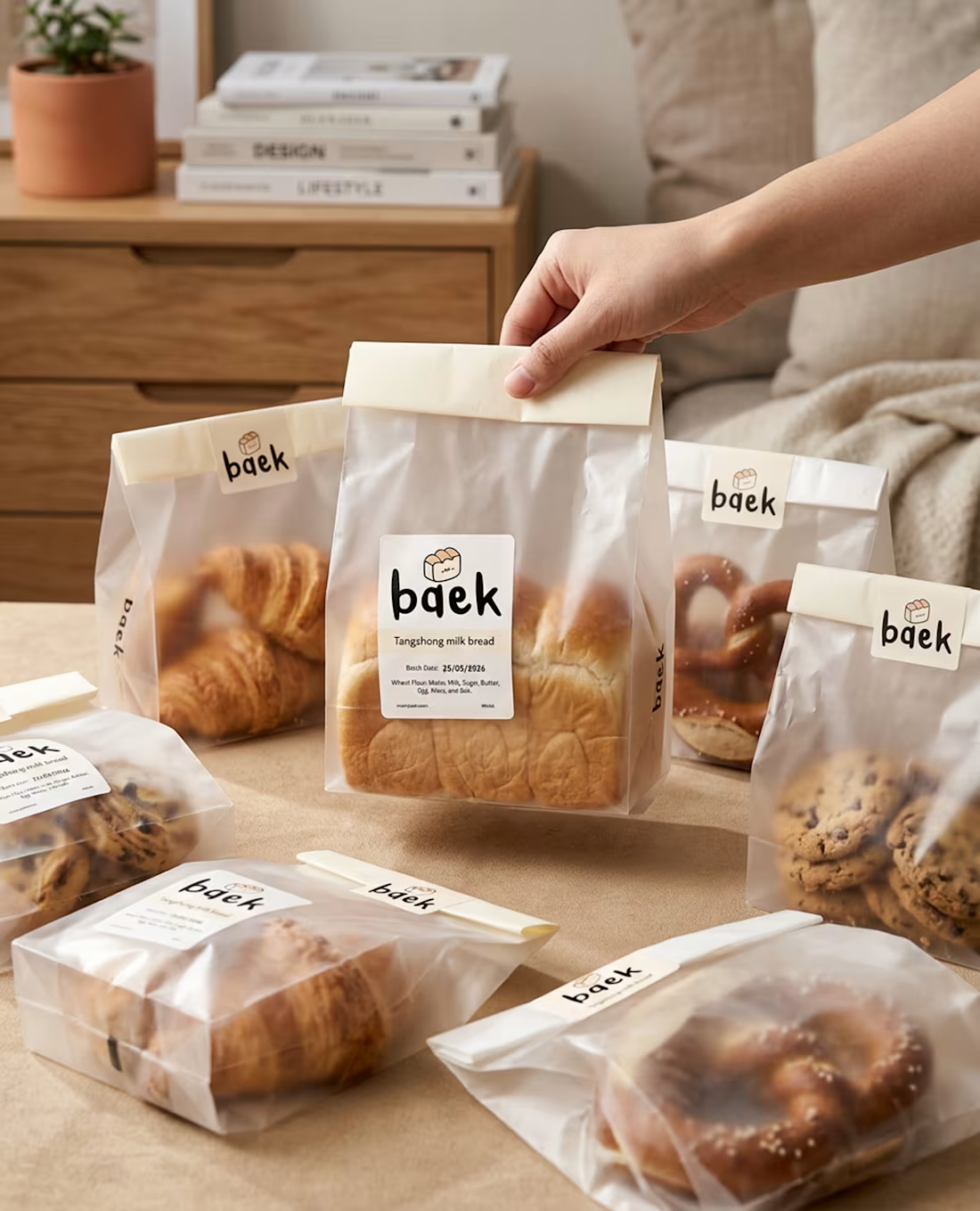
BAEK modern Korean bakery identity
A closer look at the brand system where every element is designed to feel soft, intentional, and quietly premium. From packaging to visual details, the identity reflects a calm café experience inspired by Korean bakery culture.
Simple forms. Warm tones. Clean storytelling.
2
78
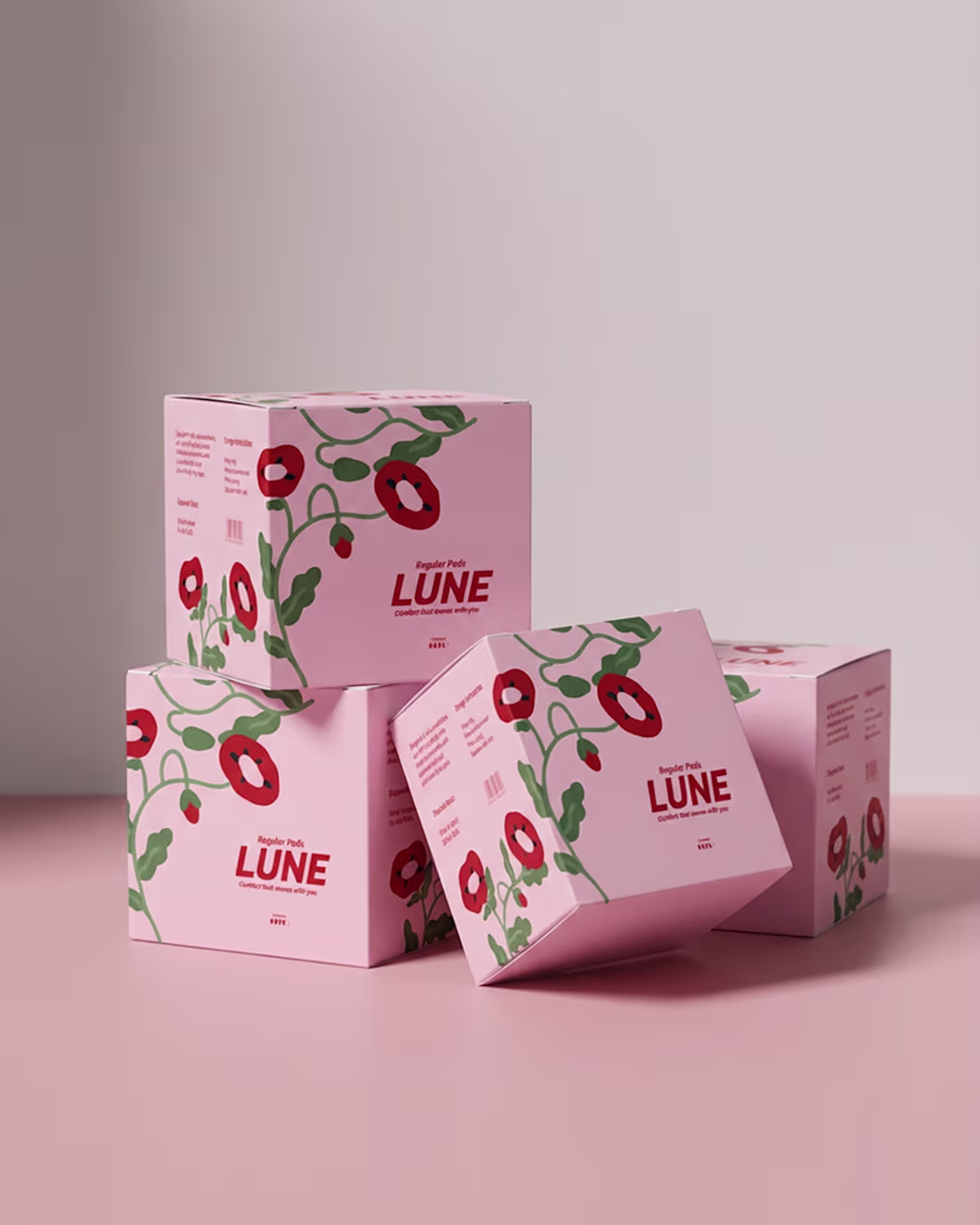
Design a Calm and Confident Brand Identity for LUNE Period Care
1
5

Designed a bold, high-energy identity
0
5
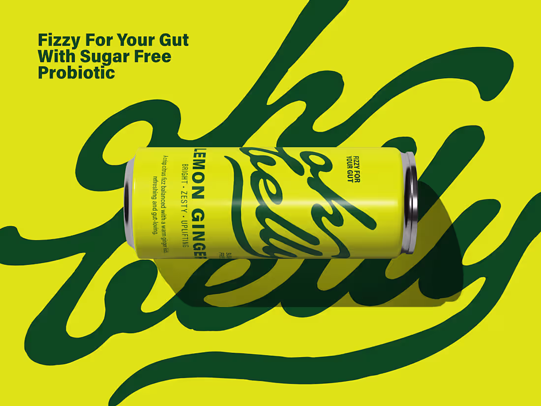
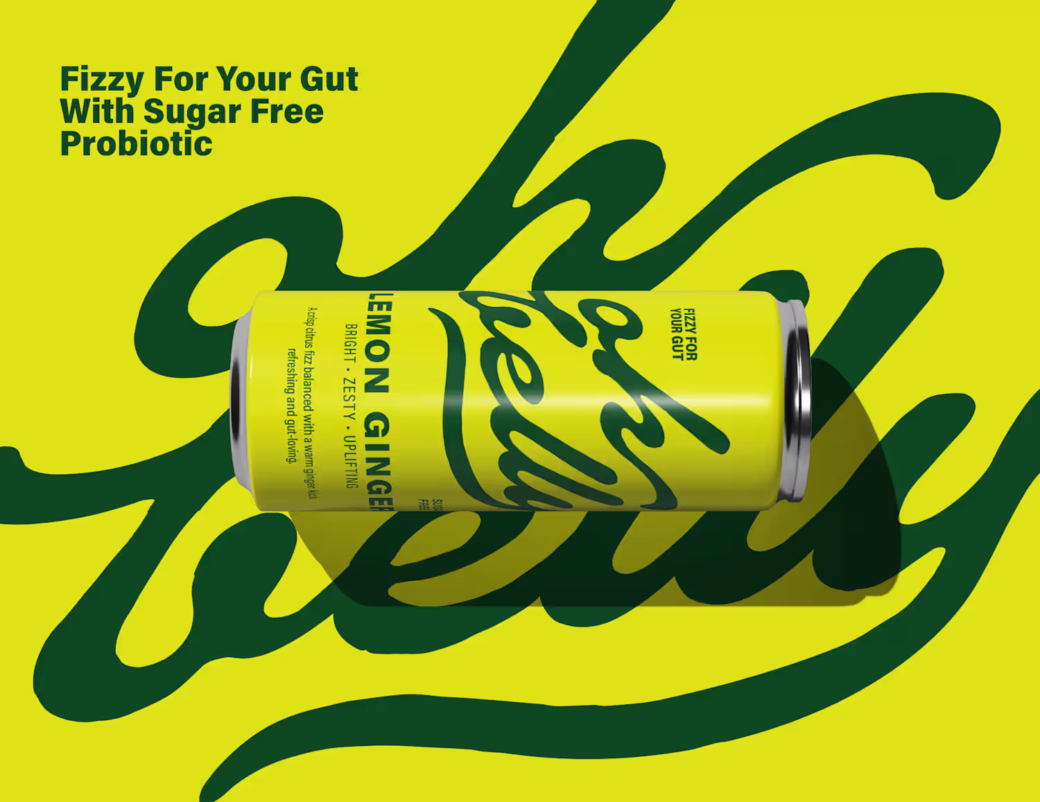
Oh Belly - Probiotic soda brand identity
1
6
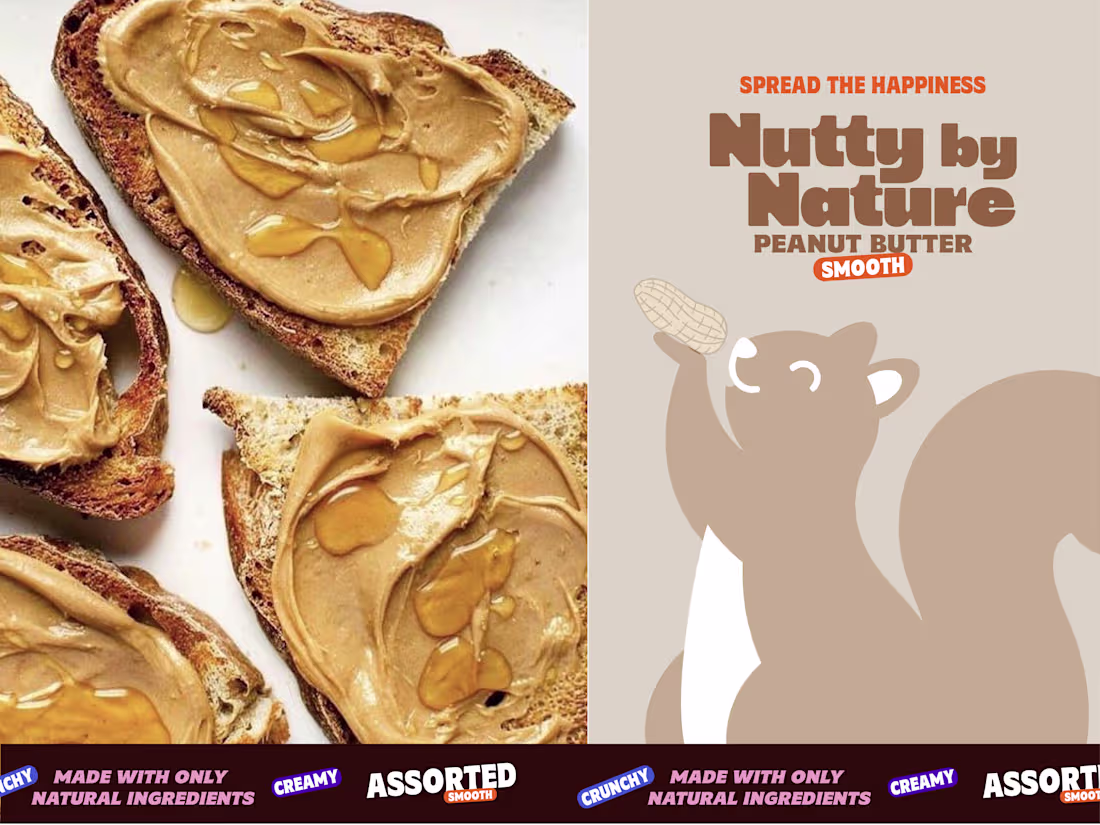
Excited to share my version of Nutty by Nature a peanut butt...
0
0
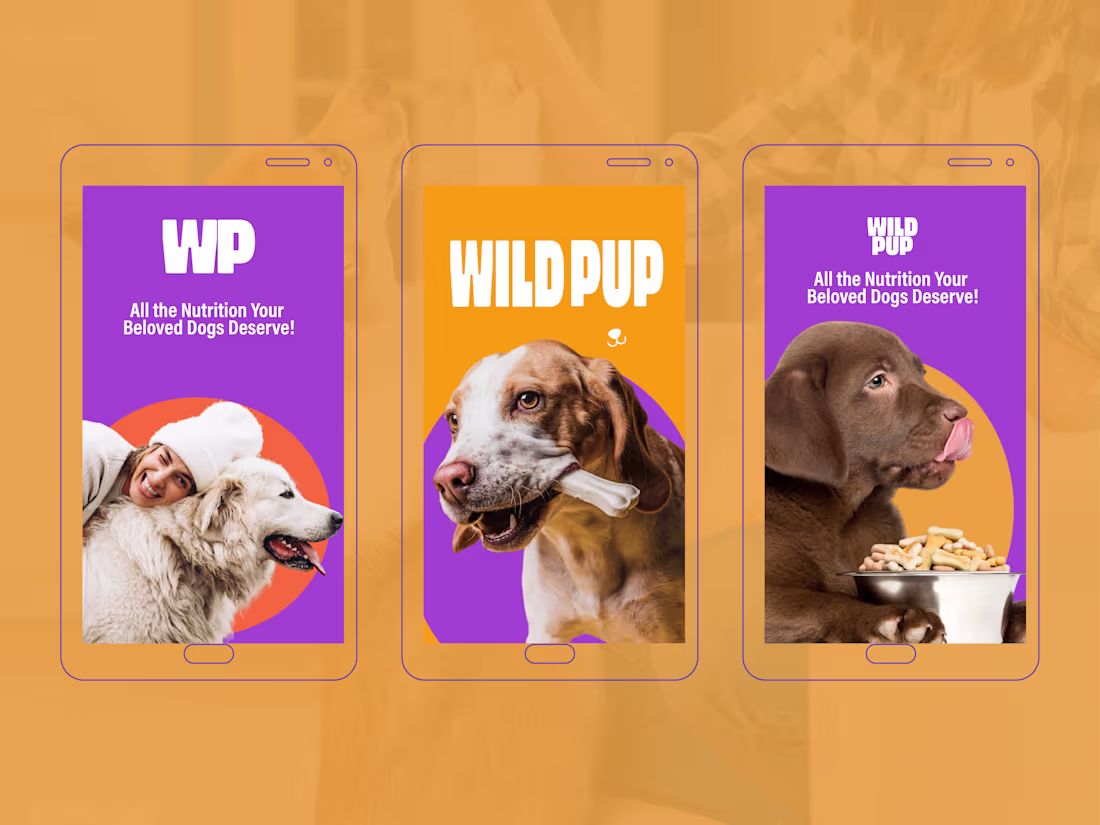
Meet Wild Pup where playful design meets pawsome nutrition! ...
0
1
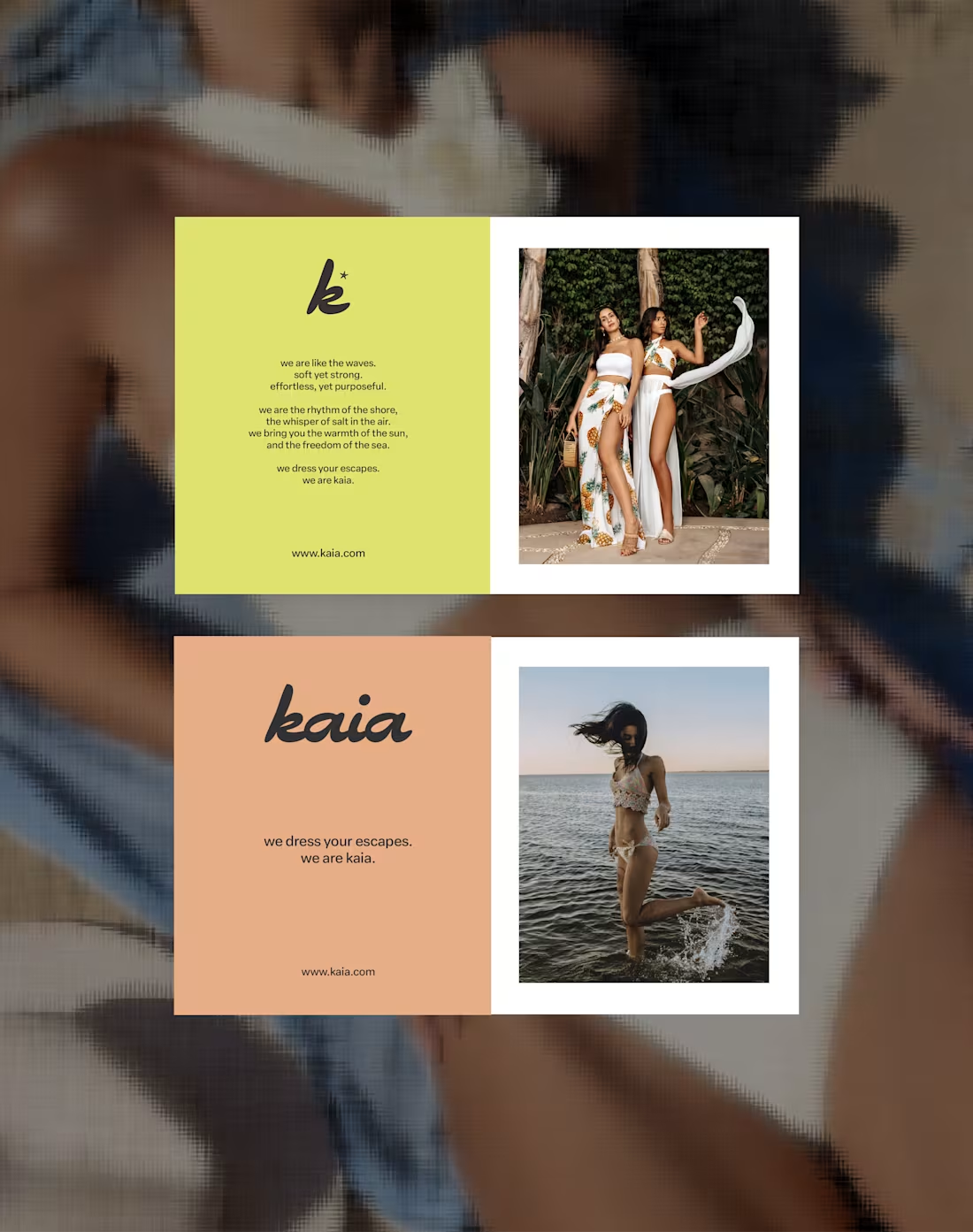
kaia – Swim & Resort Wear A brand dipped in tropical ease an...
0
1
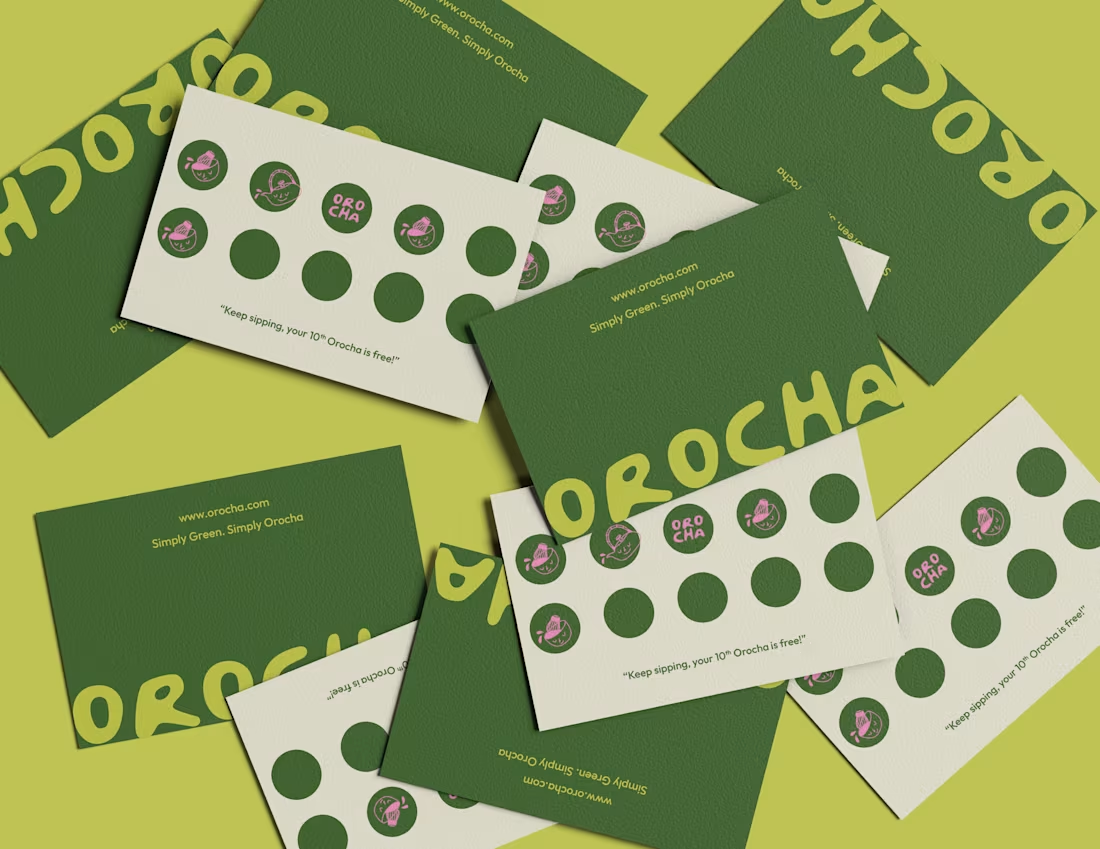
A clean, character-filled identity for Orocha, blending mini...
0
4
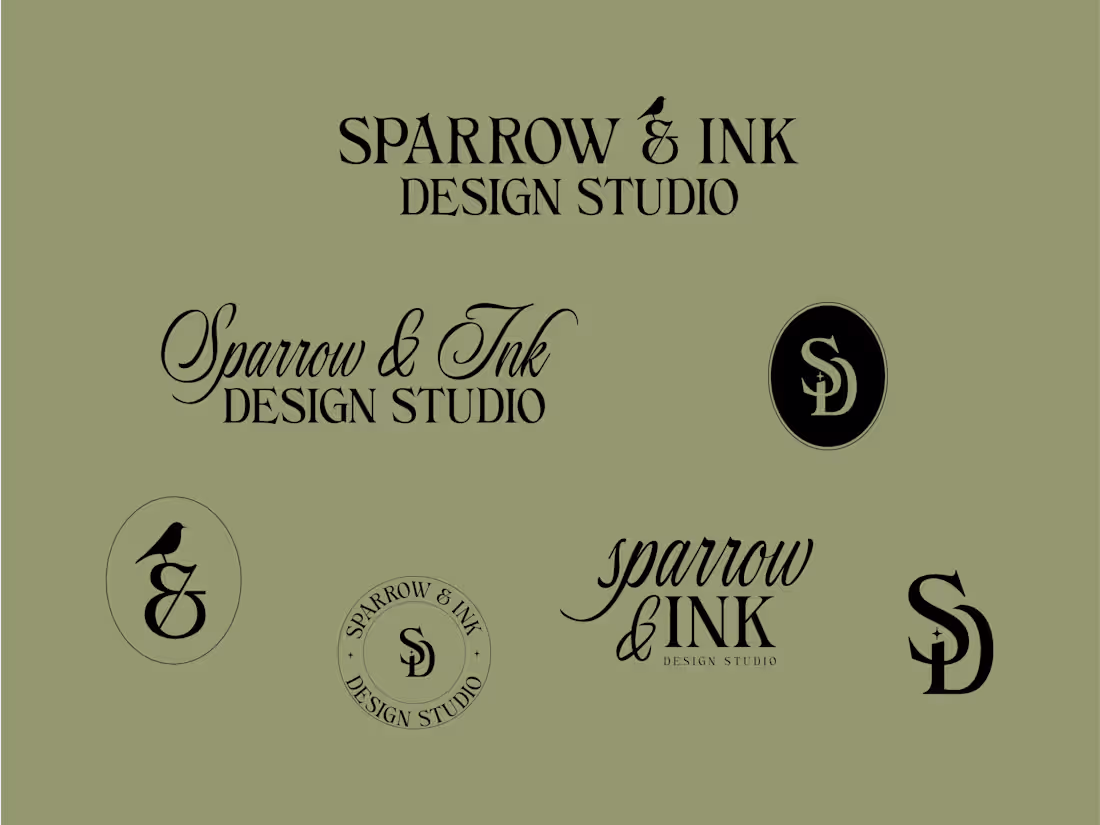
Bringing the essence of creativity, craftsmanship, and calm ...
0
6
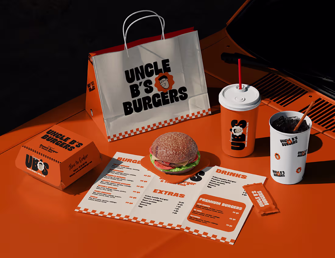
UNCLE B'S BURGER
0
1
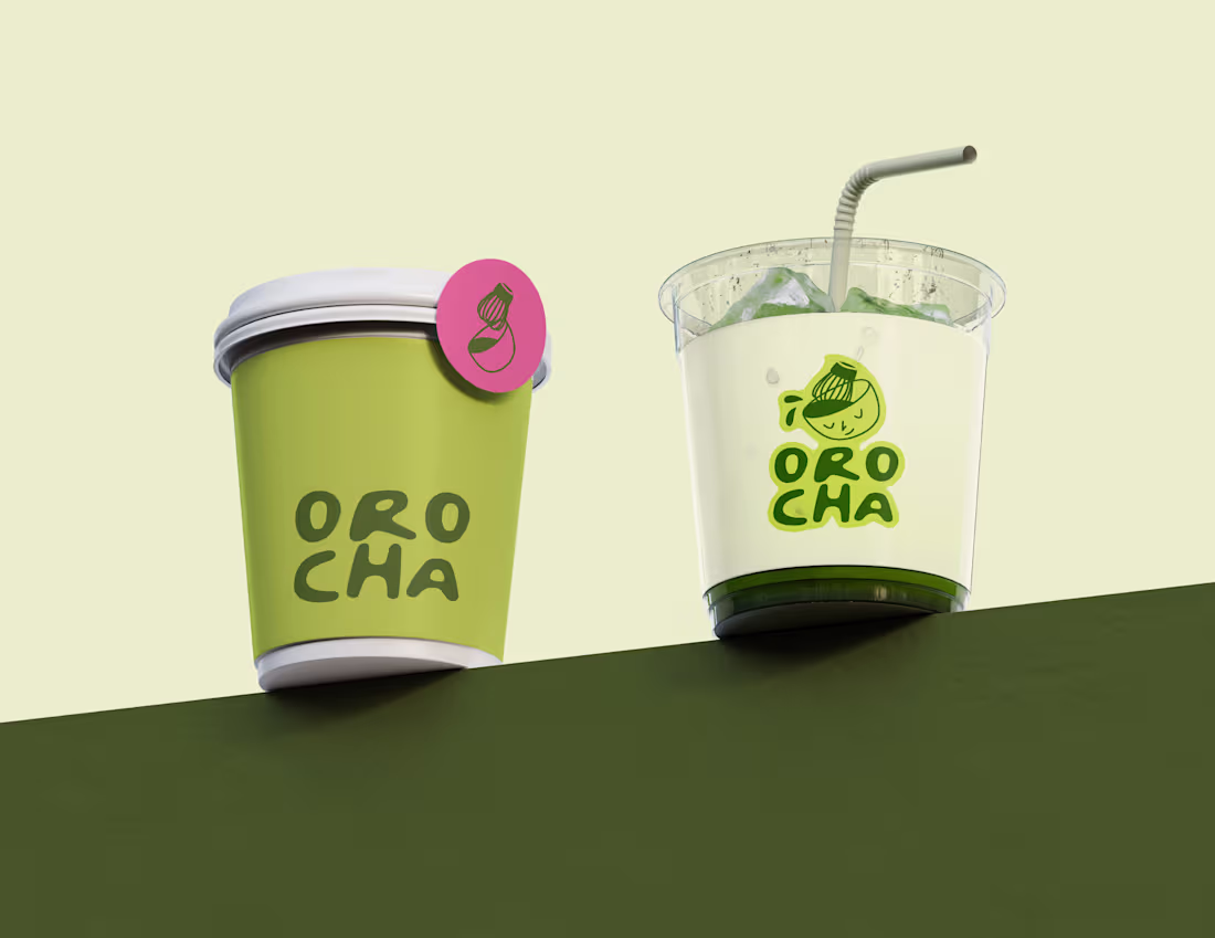
Orocha Matcha
0
2
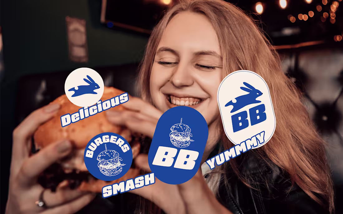
BUNBAE - BURGER BRANDING
0
1
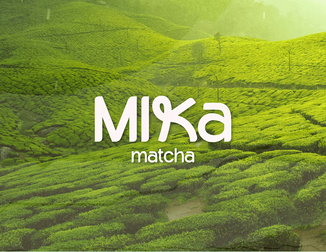
Mika Matcha - Matcha Powder Packaging / Brand Design
0
1
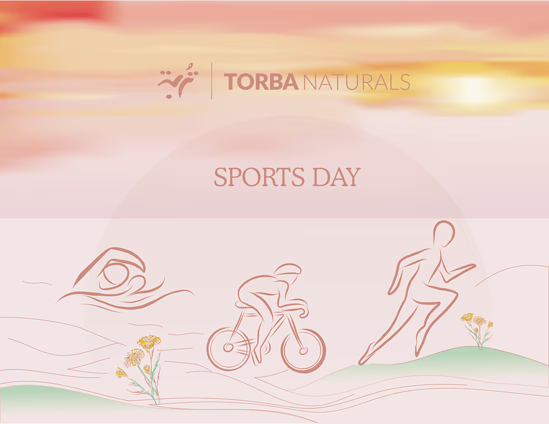
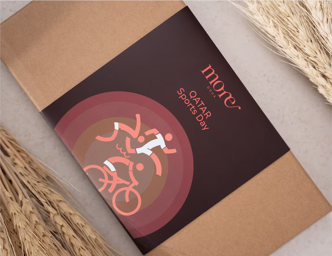
Qatar Sports Day - Torba Naturals
0
1
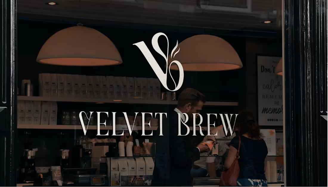
Velvet Brew - Cafe
0
1
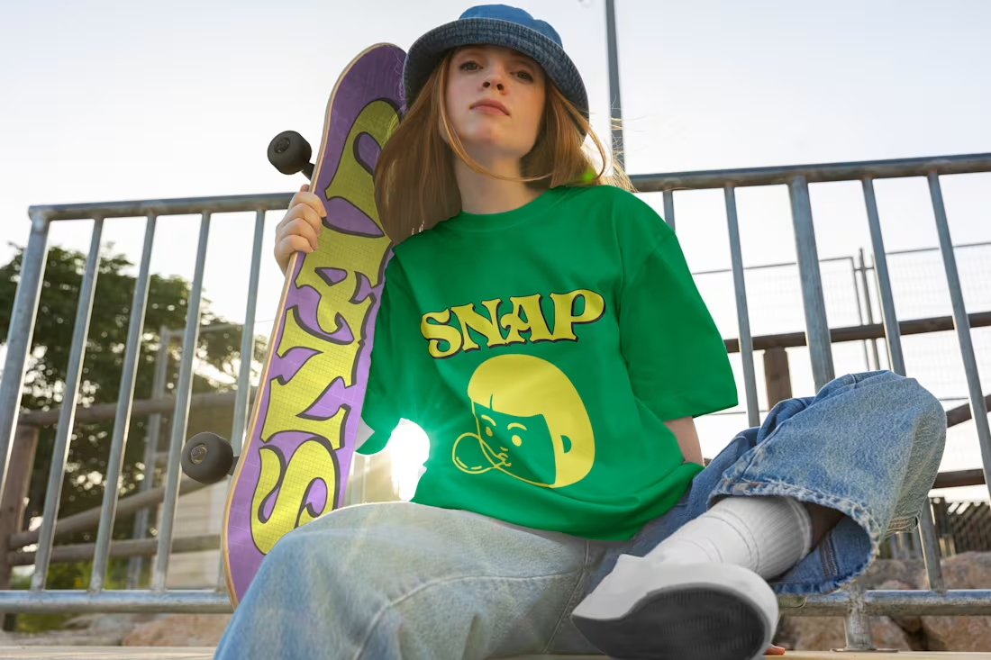
Snap - Bubble Gum Branding
0
1
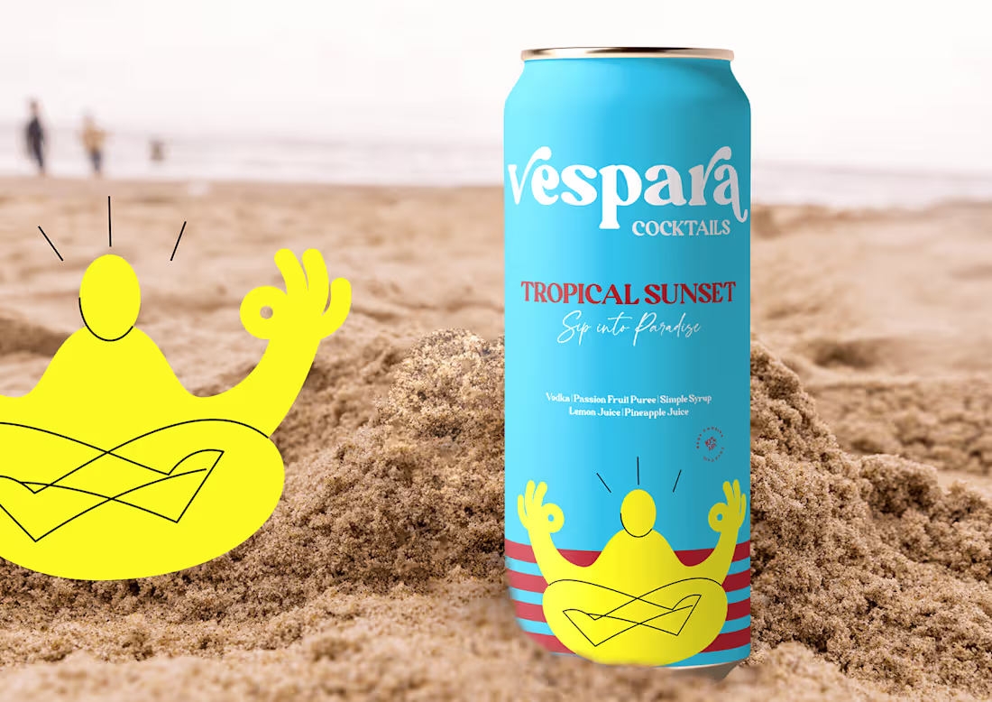
Vespara - flavourful, ready-to-drink cocktails in a can
0
2
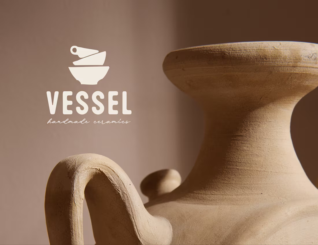
Vessel - Handmade Ceramics Studio Brand Design
0
3
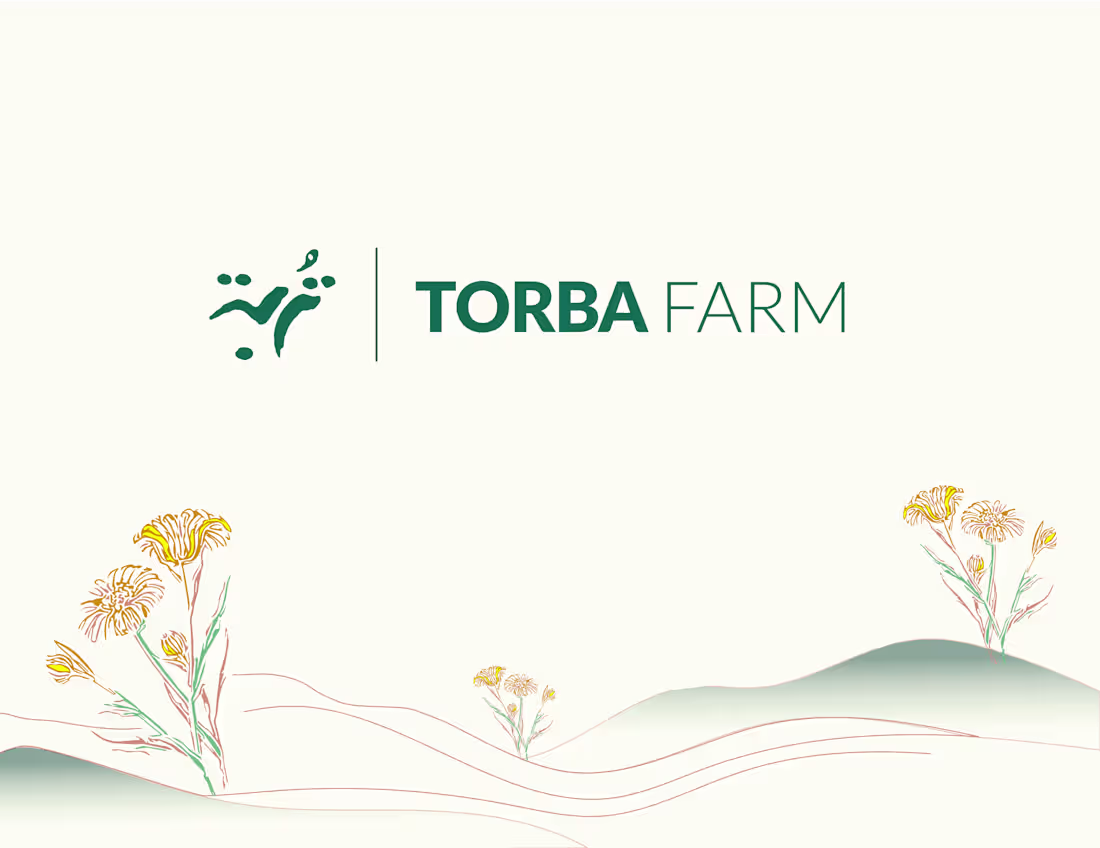
Torba Farm Shop - Qatar
0
1
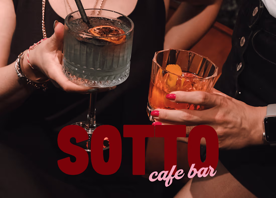
Sotto - Cafe Bar - Branding Design
0
1
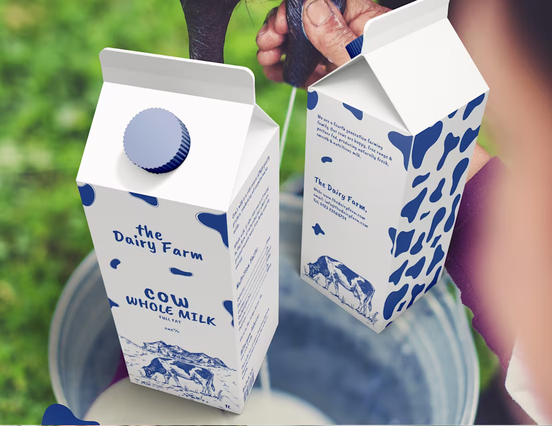
The Dairy Farm - Milk Packaging
0
1
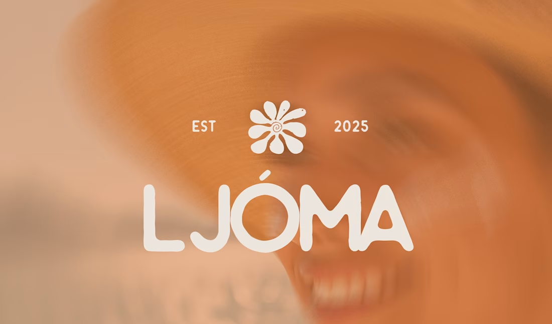
Ljoma - Sunscreen Branding
0
1
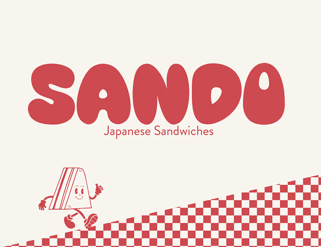
Sando - Japanese Sandwich
0
3
Qatar Sports Day - Chocolate Packaging
0
1

Crunch Bold Freeze-Dried Fruit Snack Brand Design
0
3
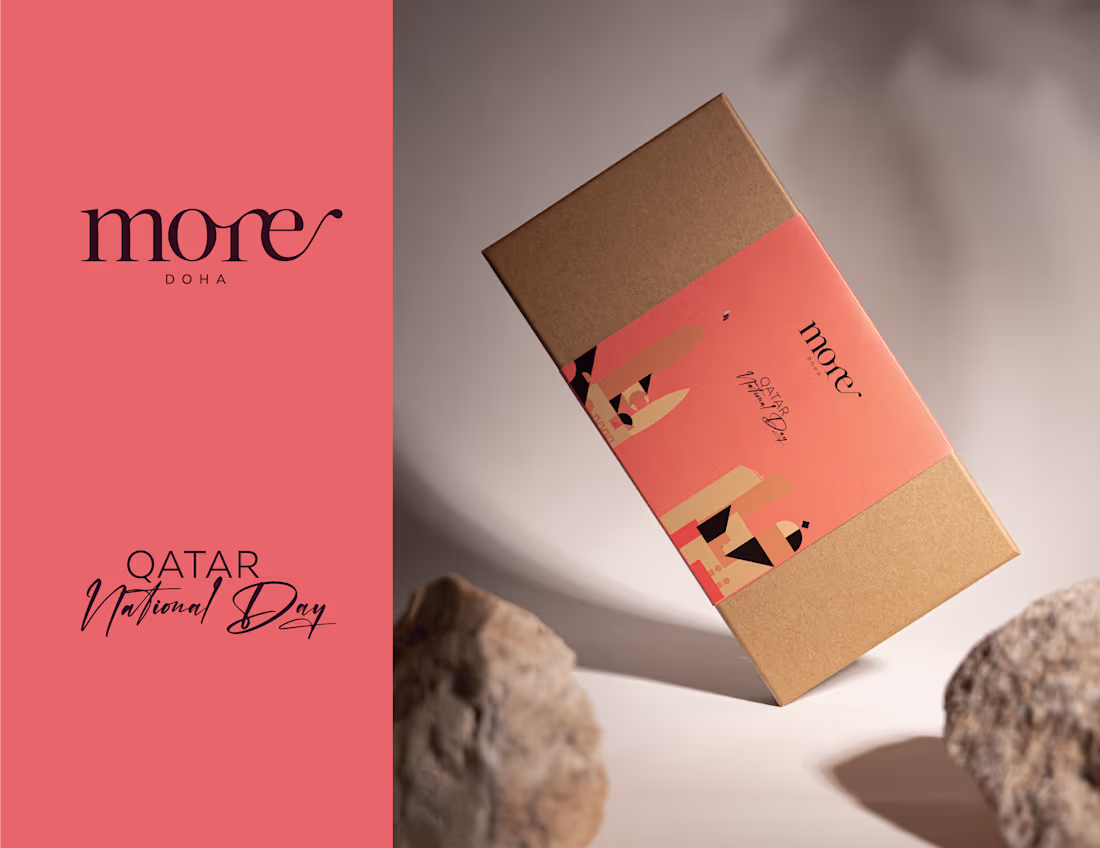
Qatar National Day - Chocolate Packaging - more
0
0
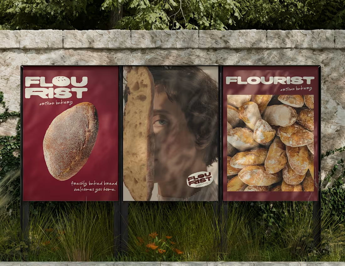
Flourist - Artisan bakery
0
0
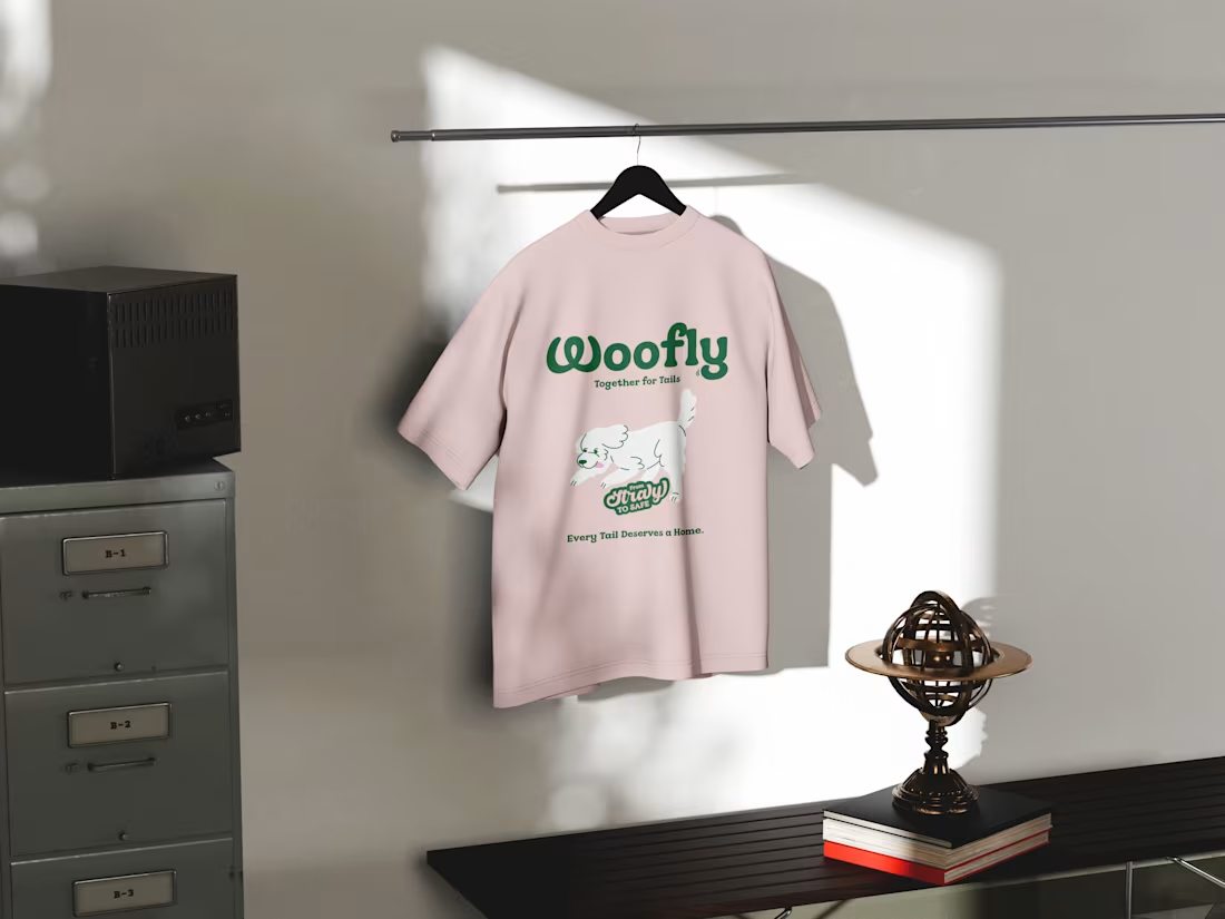
Woofly - Dog Rescue Ngo
0
2

Toss Bar - Salad Bar Branding
0
2
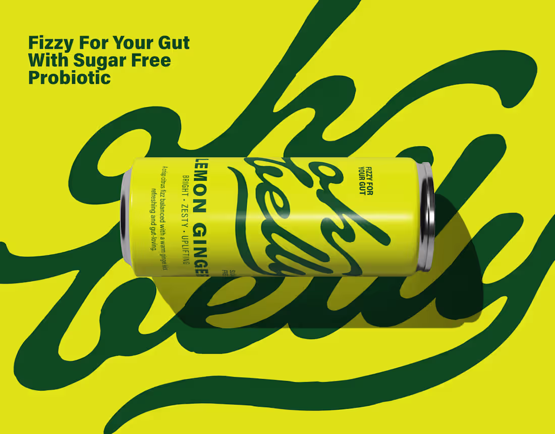
Oh Belly - Probiotic soda brand identity
0
0
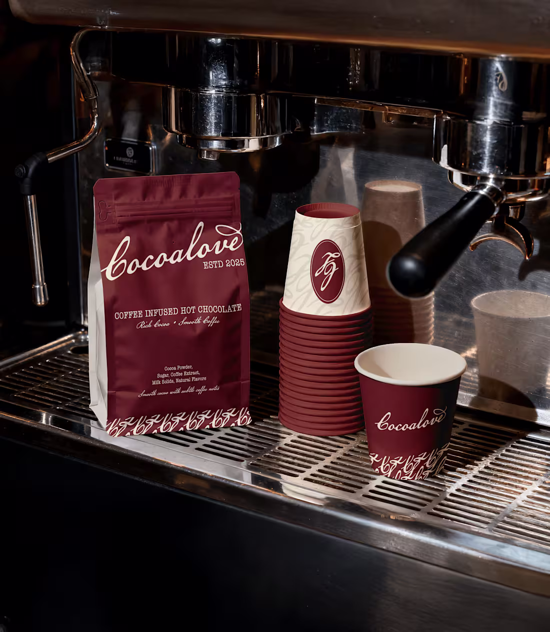
Cocoalove - Specialty Café
0
2
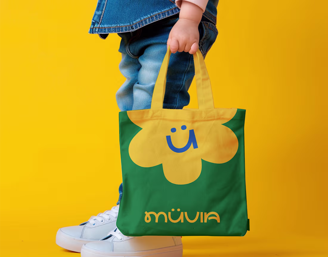
Muvia - Kids Clothing Brand Design
0
3
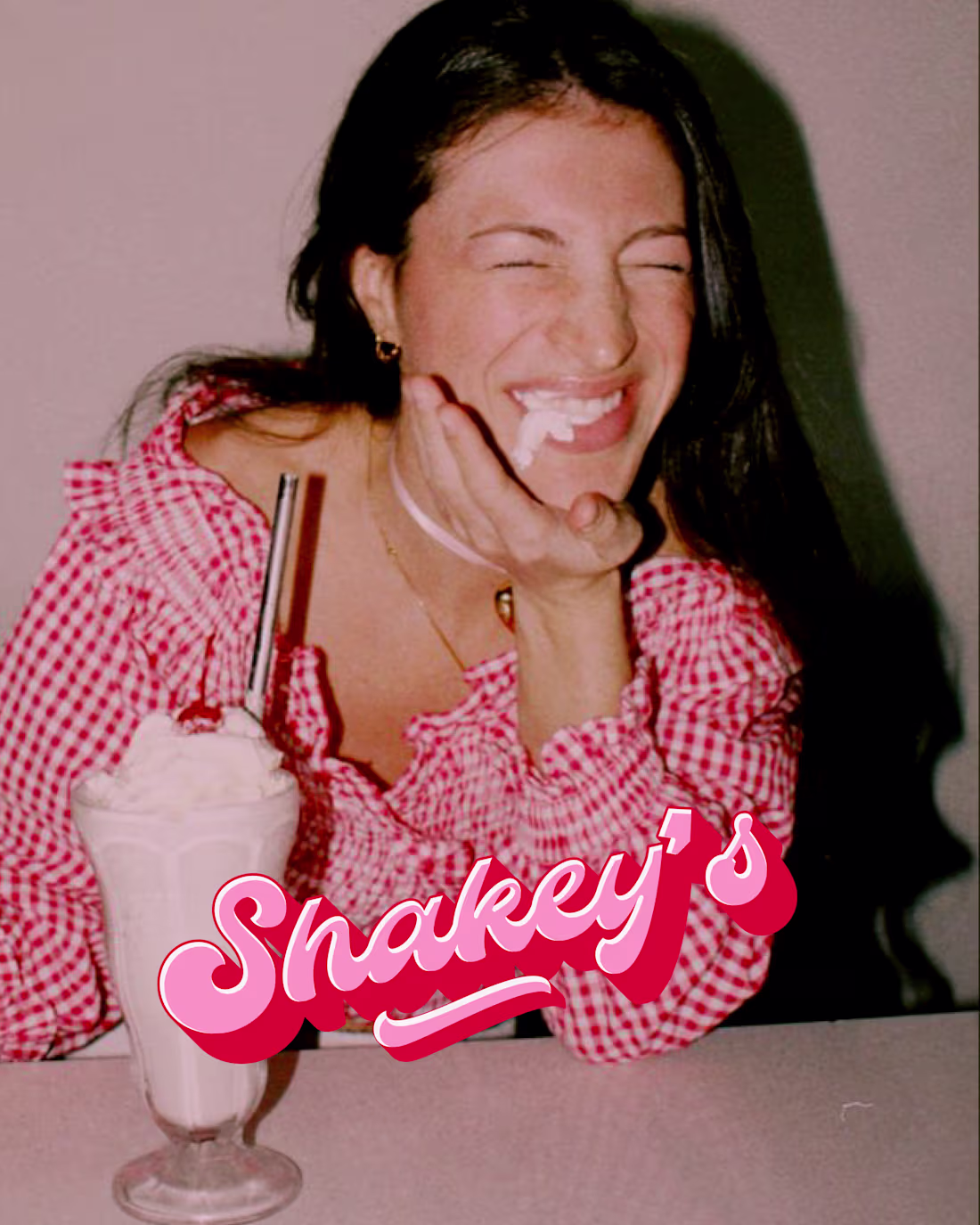
Shakey's - 80’s-inspired milkshake bar
0
1
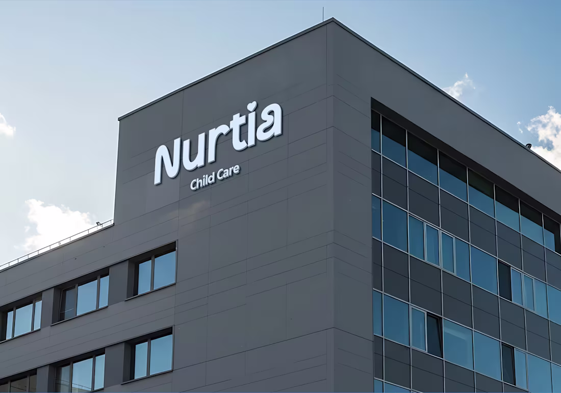
Nurtia - Child Care
0
0
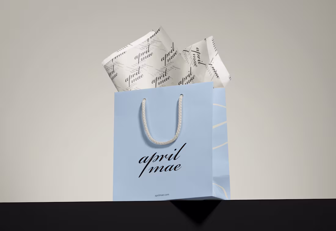
April Mae - Seamless underwear Branding
0
1
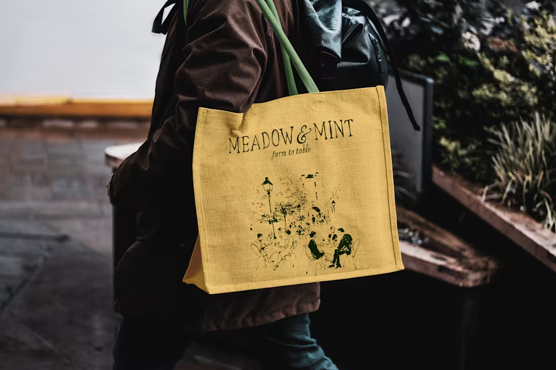
Meadow & Mint - Farm to table cafe
0
0
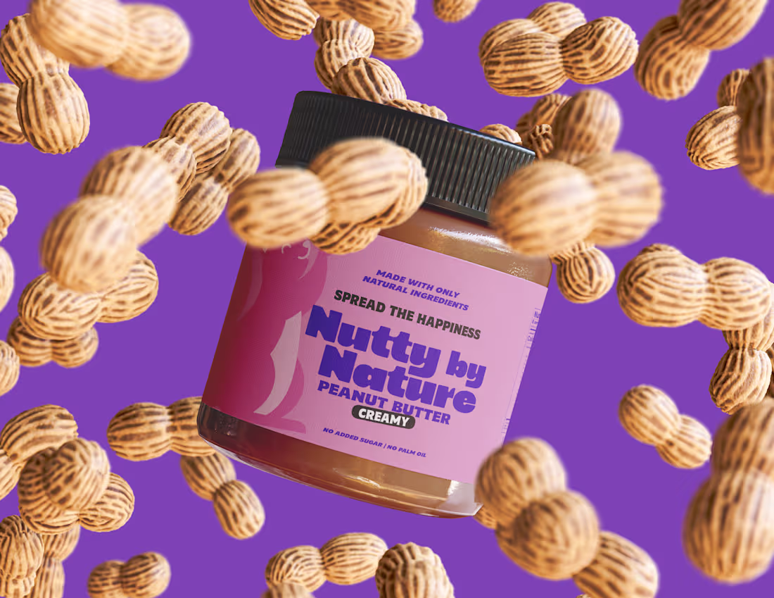
Nutty by Nature
0
0
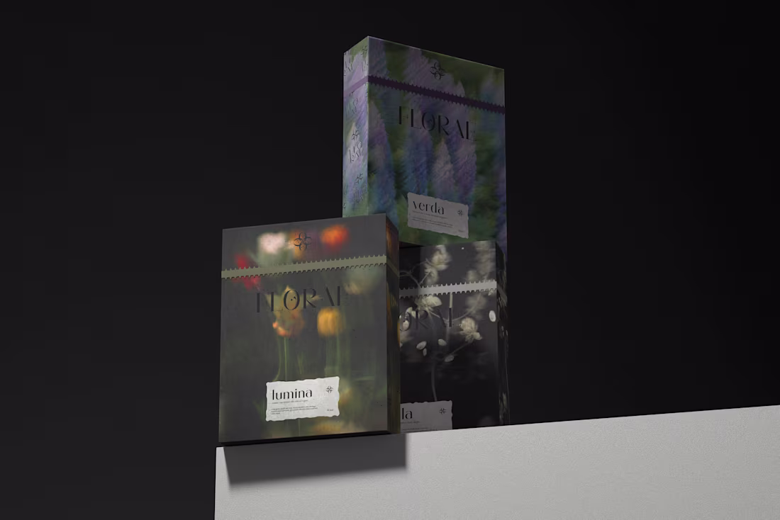
Florae - Perfume Brand Identity Design
0
0
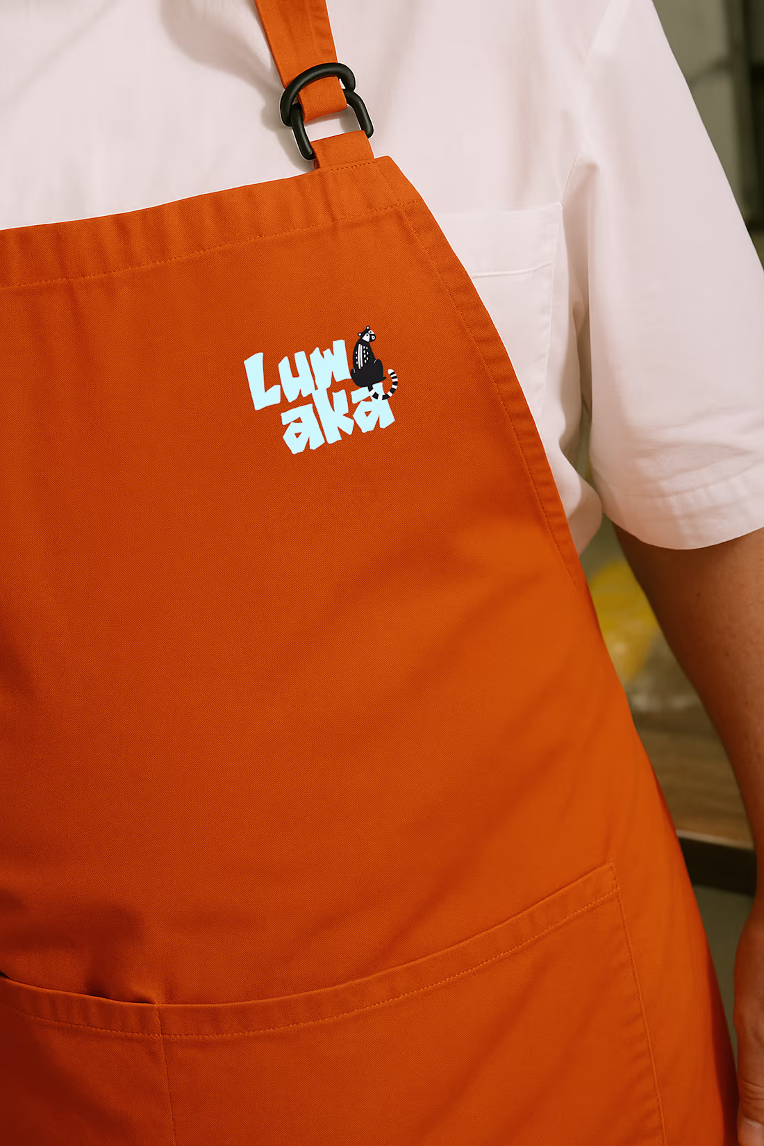
Luwaka - Coffee Cafe Brand Design
0
0