
Mosaddek Hosen Sajeeb
Data Analyst and AI Powered Website Developer
New to Contra
Mosaddek Hosen is building their profile!

A delayed reply can cost more than just a message—it can cost a customer.
Many businesses receive inquiries through Facebook Messenger and WhatsApp every day. But during busy hours, responding to every message immediately isn't always possible.
The result?
Potential customers move on to competitors who respond faster.
To solve this, I built an AI-powered Facebook Messenger & WhatsApp
Automation solution that can:
✅ Reply instantly, 24/7
✅ Answer frequently asked questions
✅ Share product or service information
✅ Handle customer conversations naturally
✅ Help businesses capture more leads without missing opportunities
The goal isn't to replace people—it's to ensure businesses never lose customers simply because no one was available to reply.
This video is a short demonstration of how AI automation can improve customer communication and create a better customer experience.
I'd love to hear your thoughts and feedback.
🌐 Portfolio: [ https://lnkd.in/g62nXJzx ]
#ArtificialIntelligence (https://www.linkedin.com/search/results/all/?keywords=%23artificialintelligence&origin=HASH_TAG_FROM_FEED) #AIAutomation (https://www.linkedin.com/search/results/all/?keywords=%23aiautomation&origin=HASH_TAG_FROM_FEED) #BusinessAutomation (https://www.linkedin.com/search/results/all/?keywords=%23businessautomation&origin=HASH_TAG_FROM_FEED) #WhatsAppAutomation (https://www.linkedin.com/search/results/all/?keywords=%23whatsappautomation&origin=HASH_TAG_FROM_FEED) #MessengerAutomation (https://www.linkedin.com/search/results/all/?keywords=%23messengerautomation&origin=HASH_TAG_FROM_FEED) #CustomerExperience (https://www.linkedin.com/search/results/all/?keywords=%23customerexperience&origin=HASH_TAG_FROM_FEED) #CustomerSupport (https://www.linkedin.com/search/results/all/?keywords=%23customersupport&origin=HASH_TAG_FROM_FEED) #LeadGeneration (https://www.linkedin.com/search/results/all/?keywords=%23leadgeneration&origin=HASH_TAG_FROM_FEED) #SmallBusiness (https://www.linkedin.com/search/results/all/?keywords=%23smallbusiness&origin=HASH_TAG_FROM_FEED) #DigitalTransformation (https://www.linkedin.com/search/results/all/?keywords=%23digitaltransformation&origin=HASH_TAG_FROM_FEED) #AI (https://www.linkedin.com/search/results/all/?keywords=%23ai&origin=HASH_TAG_FROM_FEED) #Automation (https://www.linkedin.com/search/results/all/?keywords=%23automation&origin=HASH_TAG_FROM_FEED) #OpenToWork (https://www.linkedin.com/search/results/all/?keywords=%23opentowork&origin=HASH_TAG_FROM_FEED)
1
21
📊 Data is everywhere.
Every click. Every purchase. Every transaction. Every customer interaction.
Behind every successful business is one thing: Data.
Companies no longer rely on guesswork. They use data to understand customer behavior, optimize operations, improve decision-making, reduce costs, and drive growth.
That's why data professionals are more valuable than ever.
Whether you're aiming to become a:
🔹 Data Analyst
🔹 Business Analyst
🔹 Business Intelligence (BI) Developer
🔹 Data Scientist
🔹 Machine Learning Engineer
🔹 Growth Analyst
...building strong data skills can open doors across almost every industry.
Start with the fundamentals:
✅ Excel
✅ SQL
✅ Python
✅ Power BI
✅ Statistics
✅ Data Visualization
Learning data isn't just about landing a job—it's about developing the ability to solve real-world business problems.
🎥 I created this short video to highlight how data is shaping our world and why now is one of the best times to invest in data skills.
If you have questions about Data Analytics, SQL, Python, Excel, or Power BI, feel free to connect or leave a comment. I'm always happy to discuss data and share what I've learned.
#Data #DataAnalytics #DataAnalyst #BusinessAnalytics #BusinessAnalyst #DataScience #MachineLearning #BusinessIntelligence #PowerBI #SQL #Python #Excel #DataVisualization #Analytics #AI #Learning #CareerGrowth #Upskilling #TechCareers #DataDriven #DataSkills #Dashboard #BI #LinkedInLearning
0
24
📊 Transform Your Business Data into Actionable Insights
Most businesses collect plenty of data—but very few use it effectively.
Raw spreadsheets don't help you make faster decisions. A well-designed dashboard does.
I help businesses turn complex data into interactive, easy-to-understand dashboards using:
📊 Power BI
📈 Microsoft Excel
📉 Looker Studio
Whether it's Sales Analytics, Financial Reporting, KPI Tracking, Marketing Performance, HR Analytics, or Business Intelligence, my goal is to create dashboards that help decision-makers understand their data at a glance.
In my latest service video, I showcase how I design clean, modern dashboards that are both visually appealing and business-focused.
If you're looking for a custom dashboard or want to improve your business reporting, I'd be happy to discuss your project.
📩 Feel free to connect or send me a message.
#PowerBI #DataAnalytics #BusinessIntelligence #Dashboard #DataVisualization #MicrosoftExcel #LookerStudio #SQL #BusinessAnalytics #KPIs #Reporting #DataDriven #Analytics #BusinessReporting #Freelancer
1
78
🚀 Project Showcase | Restaurant Management Website
Over the past few weeks, I've been working on a modern restaurant management website designed for real business use.
This project isn't just a landing page—it's a complete solution with:
✅ Responsive Restaurant Website
✅ Advanced Admin Dashboard
✅ Menu & Category Management
✅ Offer & Promotion Management
✅ Reservation System
✅ Gallery & Content Management
✅ SEO Settings
✅ Secure Authentication
✅ Supabase Database Integration
The project is currently deployed on Vercel, and it can be connected to a custom domain (e.g., .com) for production use.
Building this project helped me strengthen my skills in frontend development, backend integration, database design, authentication, and creating admin systems that business owners can manage without technical knowledge.
I'm continuously improving the project by refining the UI/UX, optimizing performance, and adding features based on real-world business requirements.
I'd love to hear your feedback. Constructive suggestions are always welcome!
#WebDevelopment #FullStackDeveloper #React #Supabase #Vercel #FrontendDevelopment #AdminDashboard #RestaurantWebsite #UIUX #SoftwareDevelopment #Portfolio #OpenToWork #Bangladesh
1
65
🚀 Just wrapped up a modern Admin Dashboard for a client project.
The focus was simple:
• Clean & intuitive UI
• Smooth user experience
• Efficient business management
• Responsive design
Building dashboards isn't just about making them look good—it's about creating tools that make day-to-day operations easier and more efficient.
I'd love to hear your thoughts on the design and user experience. Feedback is always appreciated!
If you're looking for a custom admin panel or web application for your business, feel free to connect or send me a message.
#WebDevelopment #AdminDashboard #AdminPanel #FullStackDeveloper #NextJS #TypeScript #ReactJS #TailwindCSS #UIUX #SoftwareDevelopment #WebDesign #FreelanceDeveloper
1
64
Stop paying for multiple AI subscriptions. Here's a smarter workflow.
One thing I've learned over the past few months is that you don't always need ChatGPT Pro, Claude Pro, Gemini Advanced, or other premium AI plans to get serious work done.
There are several powerful free AI models available today. The trick is knowing how to use them efficiently.
In this video, I show how I use multiple free AI models directly inside VS Code to:
Build full-stack web applications
Perform data analysis
Automate repetitive tasks
Debug and generate code faster
Stay productive without relying on a single model
When one model reaches its free usage limit, I simply switch to another and continue working. It's a practical workflow that has helped me save money while maintaining productivity.
If you're a developer, data analyst, data scientist, or AI enthusiast, this approach is definitely worth trying.
🎥 Check out the video and let me know what you think.
What AI tools are part of your daily workflow?
#ArtificialIntelligence #AI #VSCode #SoftwareDevelopment #WebDevelopment #FullStack #DataAnalysis #DataScience #Automation #MachineLearning #Coding #Programming #DeveloperTools #Productivity #OpenAI #Claude #Gemini #TechTips
1
79
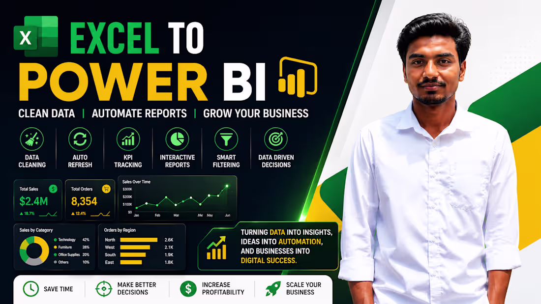
Most businesses already have data.
The problem is that the data is usually sitting inside Excel files and isn't being used effectively.
Sales reports, customer records, inventory data, marketing performance — everything is there, but finding useful insights often takes hours of manual work.
That's where Power BI can help.
I help businesses transform Excel data into interactive dashboards that are easy to understand and automatically updated.
With a well-designed dashboard, you can:
✅ Track sales and KPIs in real time
✅ Monitor business performance from one place
✅ Reduce manual reporting work
✅ Make faster, data-driven decisions
✅ Identify trends and opportunities more easily
Whether you're managing a small business, an online store, or a growing company, having clear visibility into your data can make a significant difference.
If you're still spending hours working with spreadsheets and manual reports, feel free to reach out.
#PowerBI #DataAnalytics #BusinessIntelligence #DashboardDevelopment #Excel #DataVisualization #BusinessAnalytics #ReportingAutomation
1
106
🚀 Built an Automated Invoice Generation System in Excel
Many small businesses still spend valuable time creating invoices manually.
To solve this problem, I developed an automated invoice system in Excel that instantly generates professional invoices while reducing manual data entry and calculation errors.
Key Features:
✅ Automatic Customer Information Retrieval
✅ Product-Based Dynamic Invoice Generation
✅ Automated Tax Calculations (SGST & CGST)
✅ Auto-Populated Product Details & Pricing
✅ Dynamic Total & Grand Total Calculation
✅ Clean and Professional Invoice Layout
✅ Faster and More Accurate Billing Process
This project demonstrates how Excel can be transformed into a powerful business automation tool without requiring expensive software.
By combining Excel formulas, data validation, lookup functions, and automation techniques, businesses can streamline their billing process and improve operational efficiency.
Tools & Skills Used:
📊 Microsoft Excel
📈 Data Validation
⚡ Excel Automation
🔍 XLOOKUP / Lookup Functions
📋 Invoice Management System
📉 Business Process Automation
Projects like this highlight how automation can save time, reduce errors, and improve productivity in day-to-day business operations.
🎥 Check out the video walkthrough below and let me know your thoughts.
I'm currently open to freelance opportunities involving:
• Excel Automation
• Dashboard Development
• Data Cleaning
• Power BI Reporting
• SQL & Python Analytics
#Excel #ExcelAutomation #InvoiceAutomation #BusinessAutomation #DataAnalytics #MicrosoftExcel #Dashboard #BusinessIntelligence #DataAnalyst #ExcelDashboard #Automation #Reporting #Productivity #DataManagement
1
3
168
Still using manual filters and calculations in Excel every day? 📊
In this short video, I demonstrated how the DSUM() formula can help automate category-based calculations dynamically without creating Pivot Tables again and again.
This is especially useful for:
✅ Sales Reports
✅ Inventory Tracking
✅ Financial Summaries
✅ Dynamic Office Reports
✅ Conditional Data Analysis
Instead of manually filtering datasets, DSUM allows Excel to calculate results automatically based on selected criteria — saving both time and effort in daily work.
Small Excel functions like this can make a huge difference in productivity and reporting efficiency.
🎥 Check out the quick walkthrough below 👇
#Excel #ExcelTips #DataAnalytics #DataAnalysis #BusinessIntelligence #DSUM #ExcelFormula #Dashboard #DataVisualization #OfficeProductivity #Analytics #DataAnalyst
2
154
🚀 Built a Fully Interactive Product Sales Analysis Dashboard using Google Sheets & Looker Studio
Not every business report requires complex tools or heavy infrastructure.
Sometimes, the fastest and smartest solution is combining Google Sheets with Looker Studio to create a powerful, automated, and real-time business intelligence system. 📊
For this project, I built a complete Product Sales Analysis Dashboard tracking:
💰 7.51M Total Revenue
📦 337 Total Orders
📈 Dynamic KPI Tracking
🎯 Interactive Filters & Slicers
🔄 Custom Transparent Reset Filter Button
But the real challenge wasn’t the dashboard itself — it was the data cleaning process behind it. 🛠️
The original dataset was extremely messy and inconsistent, so before visualization, I transformed and structured the data directly inside Google Sheets by:
✅ Automating date handling using formulas
✅ Creating data validation dropdown systems
✅ Building an automated Monthly Summary tracker
✅ Using conditional formatting to monitor sales targets instantly
✅ Organizing the backend into modular reporting tabs for scalable analysis
This project reminded me that strong data analytics is not about using the “biggest” tool — it’s about choosing the right workflow to deliver fast, actionable insights for decision-making.
Through projects like this, I continue improving my skills in:
📊 Data Analytics
📈 Dashboard Development
🧹 Data Cleaning
⚡ Automation
📂 Business Intelligence
📉 Data Visualization
I’m currently open to freelance projects and Data Analyst opportunities.
If your business needs help with:
Dashboard Development
Data Cleaning
Automated Reporting
Power BI / Excel / Google Sheets
SQL & Python-based analytics
feel free to connect with me.
🎥 Check out the 44-second walkthrough video below 👇
#DataAnalytics #DataAnalyst #GoogleSheets #LookerStudio #PowerBI #Excel #Dashboard #BusinessIntelligence #DataVisualization #DataCleaning #Analytics #FreelanceDataAnalyst #SQL #Python #Reporting #BusinessAnalytics
1
83
🚀 Built an Automated Power BI Dashboard with Real-Time File Refresh Workflow
Recently, I worked on a complete Power BI automation project where I transformed messy raw CSV data into a fully interactive business dashboard.
This project included:
✅ Data Cleaning with Power Query
✅ Handling messy and mixed date formats
✅ Data transformation & automation
✅ KPI Dashboard Creation
✅ Sales & Revenue Analysis
✅ Dynamic Visualizations
✅ Folder-Based Automated Refresh System
✅ Bangladesh Regional Map Integration
The most exciting part of this project was the automation workflow.
Instead of manually rebuilding reports every time new data arrives, I configured Power BI to automatically detect updated files from a folder source. Once new CSV files are added, the dashboard can refresh and update business insights instantly.
During the project, I also solved several real-world data problems like:
inconsistent date formats
null values
mixed discount scales
data type issues
automation refresh errors
This project helped me strengthen my skills in:
📊 Power BI
📈 Data Visualization
🧹 Data Cleaning
⚡ Automation Workflow
📂 Power Query
🐍 Data Analytics
As a Data Analyst, I enjoy building dashboards that are not only visually appealing but also practical for real business decision-making.
If you need help with:
Power BI Dashboards
Data Cleaning
Automated Reporting
Business Insights
Excel & CSV Data Processing
feel free to connect with me or knock me anytime.
#PowerBI #DataAnalytics #BusinessIntelligence #Dashboard #DataVisualization #PowerQuery #Automation #DataCleaning #Analytics #DataAnalyst #DataScience #CSV #Excel #Reporting #BusinessAnalytics
2
124
🚀 Built an Interactive Habit Tracker Dashboard using Excel Web!
Recently, I worked on creating a fully dynamic and visually interactive Habit Tracking Dashboard in Microsoft Excel Web to improve productivity tracking and data visualization skills.
📊 Features included in this project:
✅ Daily habit tracking system
✅ Dynamic progress calculations
✅ Interactive charts & analytics
✅ Monthly and yearly tracking
✅ Progress bars & KPI indicators
✅ Automated formulas and conditional formatting
✅ Clean dashboard UI design inside Excel Web
This project helped me practice:
• Excel Dashboard Design
• Data Visualization
• Spreadsheet Automation
• Data Analysis Techniques
• Productivity Analytics
• Interactive Reporting
I’m continuously exploring how Excel can be transformed into powerful analytical and business reporting tools — even without advanced software.
Would love to hear your feedback and suggestions! 👇
1
98
🚀 Just shared a quick Excel tutorial on how to combine multiple worksheets using the Consolidate Feature in Microsoft Excel.
In this video, I demonstrated how to:
✅ Merge data from multiple sheets
✅ Create a summary report automatically
✅ Save time without using complex formulas
✅ Organize datasets efficiently in Excel
As a Data Analyst, I believe mastering small but powerful Excel features can significantly improve workflow efficiency and reporting speed.
Excel is still one of the most essential tools in data analysis, business reporting, and dashboard preparation — and features like Consolidate make handling large datasets much easier.
🎥 Check out the video and let me know your thoughts!
2
92
Stop wasting time doing manual copy-paste work or struggling with rigid lookup formulas. 🛑 If you want to accelerate your data manipulation and build truly dynamic reports, you need to master the Excel OFFSET function.
Most professionals default to standard lookups, but they break the moment your data structure changes. Here is why the OFFSET formula is a game-changer for spreadsheet automation and advanced data analytics.
🚀 Why You Need the OFFSET Formula
Standard lookup functions only look for specific static values. OFFSET is different—it calculates a dynamic range on the fly. You should use it to:
Create Dynamic Dashboards: Automatically update charts and summary tables when new rows or columns are added.
Build Flexible Summaries: Extract specific blocks of data without hardcoding cell references.
Speed Up Workflows: Eliminate the need to manually drag, drop, or copy formulas across hundreds of cells.
🧠 How the OFFSET Logic Works (Grid Math)
Think of OFFSET like giving Excel a GPS coordinate map. It uses a simple coordinate system:
=OFFSET(reference, rows, cols, [height], [width])
The Anchor (reference): Your starting point on the spreadsheet (e.g., cell A1).
The Move (rows, cols): Tells Excel exactly how many steps to move from the anchor. For example, 1, 1 tells Excel to step 1 row down and 1 column right to find the data.
The Window (height, width): Instead of pulling just one cell, these numbers tell Excel the size of the block to grab. For example, 5, 7 commands Excel to instantly pull a block that is 5 rows high and 7 columns wide.
Thanks to modern Excel’s dynamic array features, the formula instantly "spills" that entire data block into your workspace. No manual adjustments required. 🎯
Mastering these advanced data modeling techniques is exactly how you turn raw datasets into efficient, automated workflows.
Check out the video breakdown below to see the grid math in action! 👇
#Excel #DataAnalytics #DataAnalysis #SpreadsheetAutomation #BusinessIntelligence #Productivity #AdvancedExcel #DataWorkflows
1
108
Nowadays, creating a portfolio feels like a piece of cake. You give a prompt to an AI, it generates the code, and your site is live for free. But what happens when that AI tool hits its daily limit? What if your site crashes or a link breaks and you don't know how to fix the code manually?
Every day, thousands of websites are created, but most are abandoned because they aren't maintained. I’m not just here to build; I’m here to ensure your digital presence is future-proof. I focus on the hard part: regular updates, clean manual coding, and professional maintenance so your site never fails you when a client is watching.
I built my own portfolio using a high-end AI workflow, then manually polished it to ensure it won’t crash and stays 100% under my control.
Check out my stable, professional portfolio here:
👉 sajeeb-the-analyst.vercel.app (http://sajeeb-the-analyst.vercel.app)
If you want a website that actually works and grows with you, let’s talk! 📊💻
1
80
Excel isn't just a spreadsheet—it's a BI powerhouse. 🚀
Most people believe you need expensive software subscriptions for high-end analytics. I’m here to prove that with advanced DAX, Power Pivot, and strategic design, Microsoft Excel can deliver world-class insights.
I recently completed this E-commerce Sales Analysis Dashboard, built 100% within Excel.
What I Delivered:
Dynamic Sales Intelligence: Real-time CY vs. PY comparisons with automated growth indicators.
Customer Behavior Tracking: Advanced metrics for loyalty, retention rates, and purchase patterns.
Executive UI/UX: A custom dark-mode interface designed for instant decision-making.
Scalable Data Architecture: A robust system that handles complex relationships and automated reporting.
The Result: A professional "Software-as-a-Service" experience within a tool your business already owns. No extra licenses—just clear, actionable data.
I specialize in Data Cleaning and Advanced Visualization. If you want to transform your numbers into a story that drives growth, let’s connect.
1
149
Think Excel is just for tables? Think again. 🚀
I built this fully interactive E-commerce Sales Dashboard 100% in Excel. No Power BI, no Tableau—just advanced DAX, Power Pivot, and strategic design.
The Reality:
Excel is "hard mode" for data viz. It’s more complicated to make it look this good, but it’s the one tool every business actually uses. Mastering it means being able to deliver insights in any environment.
What’s inside:
CY vs. PY Revenue Trends with dynamic indicators.
Customer Loyalty & Retention tracking.
Top Performance Deep-Dives by country and product.
Proof that you don’t need expensive subscriptions for high-end analytics—you just need the right architecture.
2
164
Case Study: Strategic Financial Intelligence Dashboard
Goal: To transform fragmented financial data into an executive-level decision-making tool.
The Work:
Data Engineering: Cleaned and reconciled 10,948 transactions from disconnected P&L and Balance Sheet sources using SQL, Python, and Power BI.
Advanced Analytics: Developed custom DAX models to track WCR (Working Capital Requirement), Debt-to-Equity ratios, and Net Income trends.
Visualization: Built a dynamic dashboard featuring risk gauges, WCR waterfall charts, and Month-over-Month (MoM) performance tracking.
The Impact:
Profitability: Confirmed a 15.3% net margin with a $2.1 Million net income on $13.7 Million in revenue.
Risk Management: Identified that 92% of revenue is concentrated in just two divisions, flagging a major strategic vulnerability.
Liquidity: Discovered $4.1 Million in outstanding AR, creating a plan to unlock $1.3 Million in working capital.
Cost Efficiency: Highlighted that Job Materials ($9.3M) drive 87% of expenses, providing a roadmap for margin improvement.
1
149
Ever stared at a spreadsheet and thought... there's got to be a better way?
That's where I come in. I'm a Power BI specialist who transforms raw financial data into interactive dashboards.
This company had 6 months of unorganized data. No idea which divisions were profitable. Four million dollars stuck in unpaid invoices.
I cleaned the data, built an interactive dashboard, created advanced metrics using DAX, and delivered a full strategic analysis.
Result? They found 1.3 million dollars in working capital they didn't know they had.
That's the power of business intelligence. If you need financial dashboards, data integration, or strategic analysis... I'm your person.
2
2
231
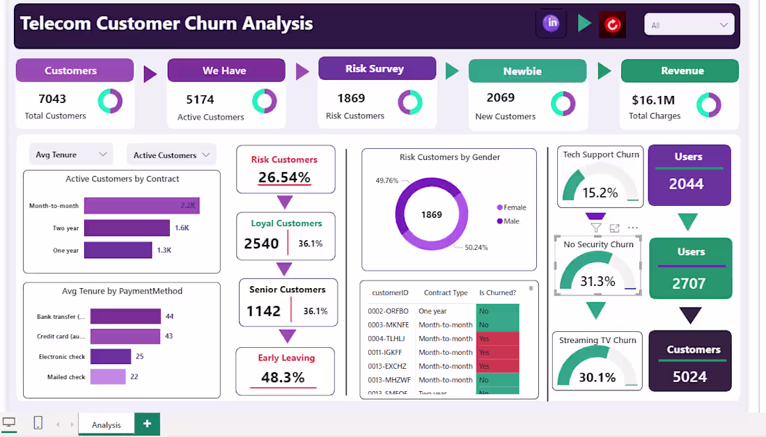
Telecom Customer Churn & Retention Analysis
Description:
This project involved analyzing a dataset of 7,043 customers to identify key drivers of churn and develop actionable retention strategies. I built an end-to-end Power BI dashboard that transforms raw service data into high-level business intelligence.
Key Features & Insights:
Churn Risk Identification: Developed DAX measures to track 1,869 "Risk Customers," revealing that 26.54% of the user base was at risk of leaving.
Service Impact Analysis: Identified that customers without Online Security had a significantly higher churn rate (31.3%) compared to other segments.
Behavioral Segmentation: Analyzed churn by contract type and payment method, finding that senior citizens showed a 48.3% early-leaving rate.
Technical Stack: Utilized PostgreSQL for data querying and Power BI for advanced data modeling, DAX calculations, and interactive visualization.
Business Impact:
By identifying high-churn segments (like those without tech support or security services), this dashboard allows telecom managers to target specific groups with retention offers, potentially saving a portion of the $16.1M in total charges at risk.
1
116
📊 Power BI Dashboard for Clear Business Insights
Many businesses have data but struggle to understand it.
In this video, I’m showing how I turn raw and messy data into a clean, interactive Power BI dashboard with clear KPIs and insights.
I help with:
• Data cleaning (Excel / SQL)
• Data analysis
• Power BI dashboard development
• KPI tracking and reporting
My goal is simple — make your data easy to understand and useful for decision-making.
If you need help with data cleaning or building a Power BI dashboard, feel free to message me.
#PowerBI #DataAnalytics #Excel #SQL #Dashboard #DataCleaning
1
3
233