
Higor Miguel
Brand Designer & Visual Creator
New to Contra
Higor is ready for their next project!
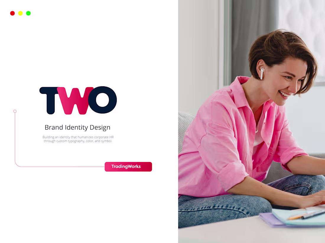
TWO is an HR technology company built to redefine how large enterprises experience Human Resources — moving away from operational bureaucracy toward strategic, people-first management.
I was responsible for the entire brand identity: concept, strategy, visual system, and all real-world applications. The core challenge was to create a brand that could speak to corporate decision-makers with authority, while feeling genuinely human — something rare in the HR market.
The solution began with the typography. Rather than using an off-the-shelf typeface, I customized the letterforms so the W and the O would integrate naturally with the brand symbol — a smile mark embedded directly into the wordmark. The result is a logo where meaning and form are inseparable: the name TWO literally smiles.
The color system pairs deep navy (#021E45) — conveying trust, stability, and corporate confidence — with a vibrant red-pink (#D20433 · #FB4879) that brings energy, warmth, and differentiation. Together, they define a brand that is serious about business and serious about people.
Beyond the brandbook, the identity was applied across social media, institutional presentations, marketing assets, and branded apparel — proving the system works at every scale and on every surface.
TWO is a brand built to last: distinctive enough to be remembered, flexible enough to grow.
0
57
Engineering the Future of SaaS & Tech Branding
Kortex.ai (http://Kortex.ai) is an elite, multidisciplinary case study designed to demonstrate how cutting-edge technology and core graphic design disciplines merge to build high-converting software brands.
Modern AI startups and SaaS tech companies don’t just need a static logo; they require a dynamic, high-energy visual narrative that can capture investor attention and stop user scrolling instantly. This project was engineered from scratch to show companies exactly how I execute this futuristic vision.
The Execution & Tool Stack:
Vector Precision (Adobe Illustrator): The core visual system, typography, geometric abstractions, and dark-mode responsive logos were meticulously crafted in Illustrator to guarantee absolute scalability and clean technical hand-offs.
Cinematic Motion (Generative AI Video): To solve the market's need for rapid, high-impact video assets, I leveraged advanced generative AI video tools to create a cinematic product presentation. This workflow showcases how a brand can launch with premium video content at a fraction of traditional animation timelines.
Strategic Visual Assets: A vibrant cyber-gradient palette built to stand out on app dashboards, product hunt launches, and tech landing pages.
💼 Available for Purchase & Hire
Looking to buy this ready-made brand? This complete kit (Editable Illustrator vectors, AI presentation video, typography grids, and color systems) is available for exclusive commercial purchase. Once sold, it is removed from the store.
Need this executed for your custom software or AI company? I am fully available to step in as your Visual Designer & AI Creative Director to build your custom ecosystem from the ground up.
Art Direction, Branding & AI Video Production: Higor Coutinho
1
211
For years, I've had a dream I can't shake: working for a creative company in the United States. It sounds simple when you say it out loud, but when you're a Brazilian creator trying to open those doors, you realize it's more than a dream—it's a real challenge.
I've built a solid career here in Brazil. I've worked with agencies, brands, incredible projects. I've learned a lot. But then you reach a point where you ask yourself: "Can I do this somewhere else? With different rules, a different language, a different context?"
The honest truth: I don't know if I'll make it. Nobody does. But I decided I'd rather try and fail than stay comfortable wondering "what if."
So I created this video.
It's not a masterpiece. It's sincere. It reflects this phase I'm in—vulnerable, determined, learning. I used tools, yes (AI-assisted script, generated voiceover, manually crafted captions). But every cut, every transition, every color choice was intentional. Because that's what I do: I pause, I think, and I create something with purpose.
What I'm learning in this process:
1️⃣ Resilience isn't about not quitting when things are easy. It's about showing up every day, studying, improving, facing rejection, and moving forward anyway.
2️⃣ You don't need to be perfect to start. You need to start to become perfect. I still have so much to improve, but I'm here, working on it.
3️⃣ Comfort zones are a dangerous luxury. Real growth happens on the other side of fear.
4️⃣ Building a career in another country isn't that different from building one here. It's the same thing: dedication, knowledge, quality work, and purpose. Just with new challenges, new perspectives, new context.
I'm in transition. Leaving a place where I have expertise, entering a place where I'll be a beginner again. And you know what? Being a beginner means there's still so much to learn. It means potential is infinite.
I'll keep creating. I'll keep learning. I'll keep facing challenges, one day at a time, without fear. Without giving up.
If you're a creator with a similar dream—whether it's leaving your country, exploring new markets, or just growing professionally—let me tell you this: Resilience is the most important tool you have. More than software, more than portfolio, more than networking.
Resilience is what keeps you when everything gets hard.
I'll keep posting my work. I'll keep improving. And I'll keep dreaming. Because dreams without action are fantasy. But action with dreams? That's real possibility.
3
332
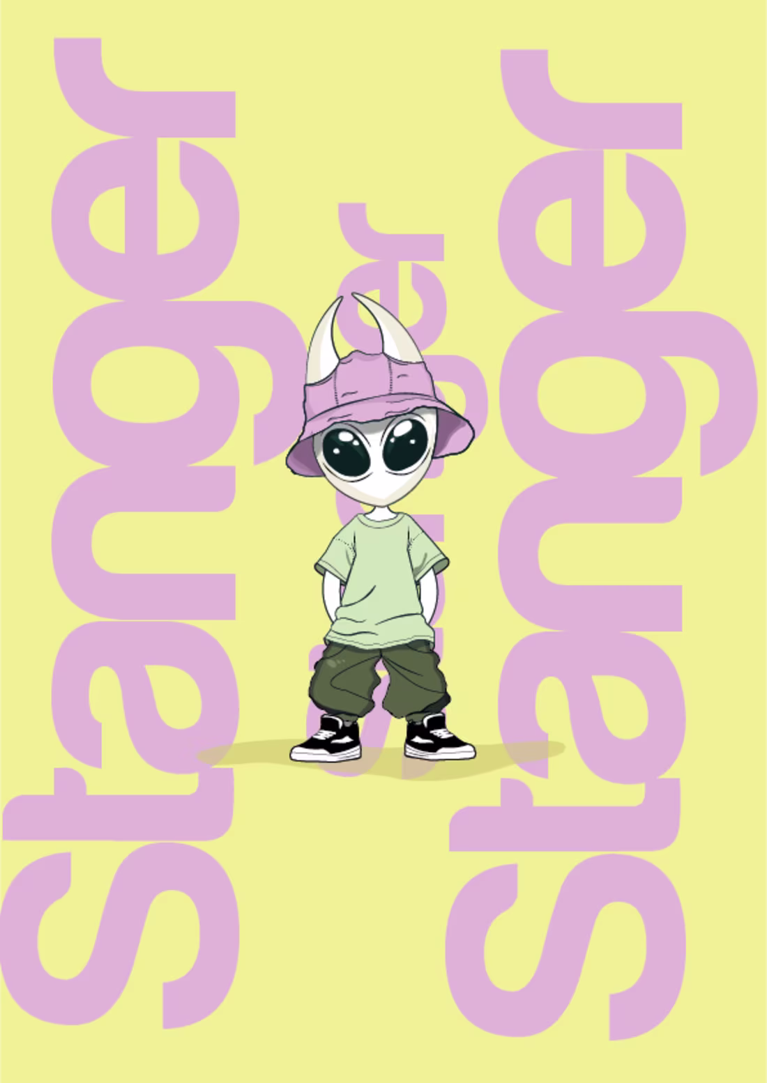
Stanger — Character-Driven Visual Identity for Alternative Streetwear
A complete brand identity system concepted for a modern, trend-forward clothing brand. The project centers around a unique virtual brand influencer—a charismatic alien mascot designed to bridge the gap between street fashion culture and digital community building.
The Power of Character Branding: Moving away from static, traditional apparel logos, this identity introduces a mascot with genuine personality. The character acts as a silent ambassador for the clothing line, making the brand instantly recognizable and highly adaptable for digital content, social media storytelling, and custom garment labels.
The Pastel Palette Strategy: Instead of relying on heavy or aggressive streetwear aesthetics, I engineered a sophisticated, low-saturation pastel color system. Blending muted sage green, lavender pink, and pale buttercream yellow creates an unexpected visual contrast that feels approachable, quirky, and distinctly premium.
Scalability & Modern Versatility: The visual assets feature flexible layout lockups and isolated vector badges, ensuring seamless application across screen printing, heavy-embroidery merchandising, e-commerce grids, and physical product tags.
Art Direction, Character Design & Branding: Higor Coutinho
2
340
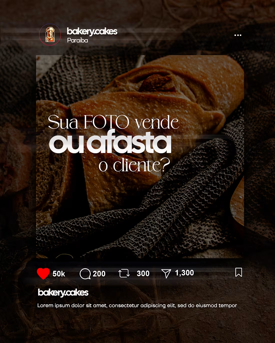
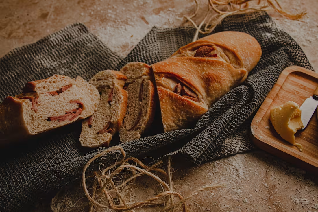
Design, Photography, and Marketing: The Visual Conversion Triad
This carousel project is a practical demonstration of how I connect three essential pillars into a single creative asset: Commercial Photography, Graphic Design, and Content Strategy. Developed for a premium artisanal bakery niche, the goal was to build a visual ecosystem focused on attracting and converting the consumer.
The Marketer Side (Strategy): The content structure is built entirely on a high-retention narrative. We start with a provocative hook ("Does your PHOTO sell or push customers away?"), deliver immediate value with practical tips, and close with a clear sales Call to Action (CTA).
The Photographer Side (Sensory Aesthetic): The background images utilize a rustic art direction and moody, high-contrast lighting to accentuate the product's authentic texture, triggering an instant sensory craving in the viewer.
The Designer Side (Identity & Layout): Crafted using a sophisticated hierarchy in Figma, blending refined serif typography with bold, modern sans-serif elements to ensure a highly readable and aesthetically flawless layout for the feed.
When a creator masters image execution, layout design, and conversion intent, the visuals stop being just beautiful and start driving real business performance.
Art Direction, Photography & Strategy: Higor Coutinho
1
323
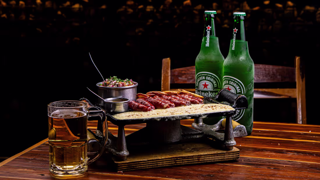
Commercial Food Photography — Capturing Texture and Human Interaction
A commercial-grade visual series focusing on high-impact food styling and storytelling for the modern gastronomic market. The goal of this project was to move beyond static, sterile plating and instead trigger an immediate sensory response through dynamic composition.
The Human Element: By incorporating active hands breaking open crispy textures or drizzling sauces, the layout transforms from a simple product shot into an engaging, living experience.
Lighting & Textural Contrast: Engineered directional, high-contrast bar lighting to accentuate the condensation on glassware, the glazes on the savory dishes, and the crisp macro details of the ingredients.
Chromatic Harmony: Balanced warm, rustic wooden undertones with vibrant greens and rich tones to anchor the premium, comforting essence of the culinary experience.
Photography, Styling & Art Direction: Higor Coutinho
2
3
377
Breaking the Niche: Why I Refuse to Be Just One Type of Creator
Some people might look at my multidisciplinary profile and think it's chaotic. But the reality is much simpler: I am deeply in love with the process of creating and learning about art.
I am a photographer, a designer, a video editor, and an animator. To me, these aren't separate boxes—they are seamlessly connected parts of who I am. Whenever I am told I need to restrict myself to just one niche and abandon the others, it genuinely limits my creative drive. I thrive when I bridge different mediums together.
This recent project is a testament to that freedom. I wanted to push my boundaries with food photography and complex visual composition, while simultaneously using my craft to support a small, independent business in my local region.
The final result is a beautiful intersection of lighting, staging, and digital design.
The Project: Local Business Support / Food Styling & Photography Study
Art Direction: Higor Coutinho
2
303
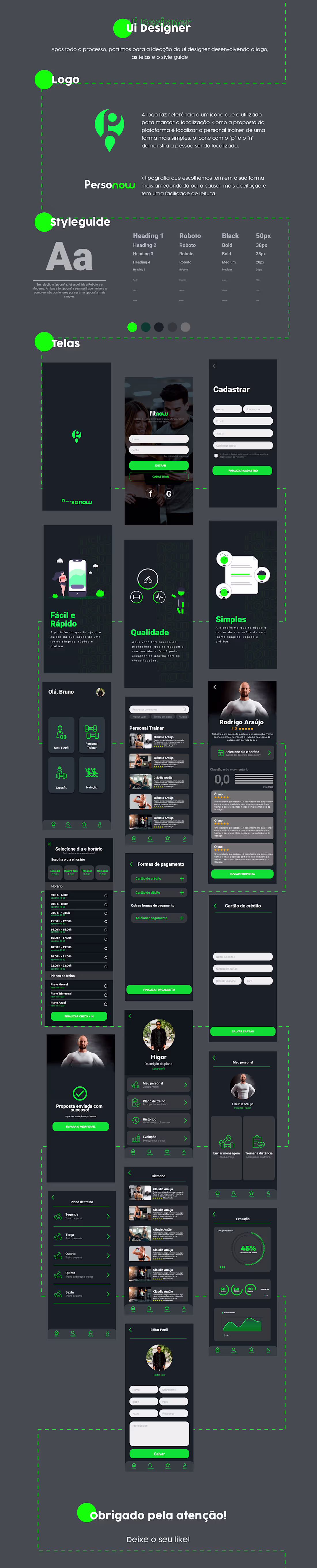
Where it all began: My very first UX/UI project 🚀
Every creative journey has a starting point, and this milestone represents mine: my first complete case study as a UX/UI Designer.
I have always been deeply passionate about studying, exploring new tools, and expanding my horizons. For me, design is an ongoing learning curve. For this project, "Personow", I challenged myself to execute the entire end-to-end visual ecosystem—from refining the brand identity and typography scales to structuring clean, dynamic mobile interfaces.
Looking back at this asset reminds me of how vital a relentless pursuit of knowledge is. It laid the groundwork for the multidimensional designer I am today, and I’m always hungry for the next challenge.
Project Evolution: Identity Ideation ➔ Styleguide Architecture ➔ High-Fidelity UI UI.
1
298
Essa animação em loop ficou excelente! O estilo de ilustração flat com a textura de granulado (grain texture) e a paleta de cores quentes trazem uma estética retrô e nostálgica muito forte, que funciona super bem para prender a atenção nas redes sociais.
Aqui estão duas opções de descrição em inglês focadas em destacar suas habilidades de animação 2D, motion graphics e física de loops (movimentos cíclicos), acompanhadas das traduções:
Option 1: Technical & Process-Focused (Ideal para Behance ou Portfólio)
Retro Journey — 2D Motion Graphics & Seamless Loop Study
A seamless 2D flat animation loop created to explore secondary motion physics and analog texture integration. The project focuses on giving a clean vector asset a nostalgic, alive feeling through deliberate micro-animations.
Motion Physics: Engineered a rhythmic chassis bounce, independent wheel rotation loops, and a stylized exhaust smoke expansion to simulate a continuous, dynamic forward drive.
Texture Overlay: Implemented an animated grain/noise overlay to break the static perfection of digital vectors, perfectly matching the warm, sun-drenched retro color palette and silhouette skyline.
Seamless Execution: Designed as a perfect, mathematically precise loop optimized for infinite replay on digital screens, website loaders, or social media feeds.
Illustration & Animation: Higor Coutinho
1
273
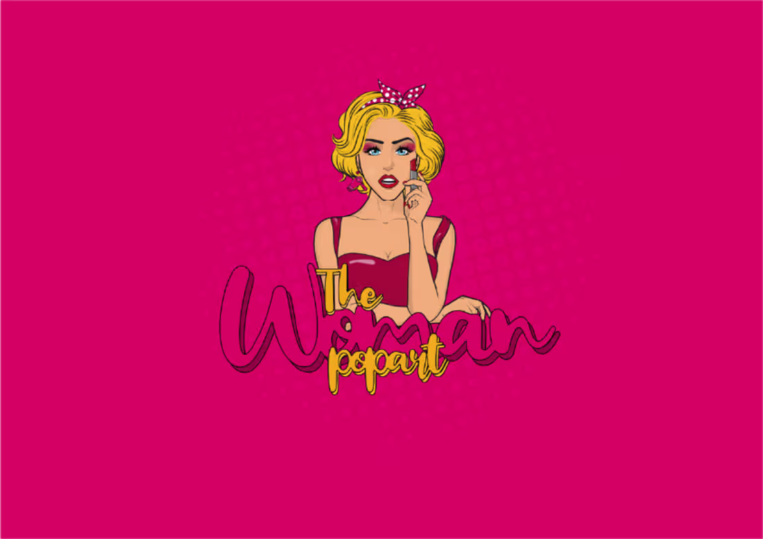
Brand Reveal: The Woman Pop Art
Who says branding for the beauty and aesthetic industry needs to be quiet and beige?
The Woman Pop Art was designed to turn heads. Built on a rich retro comic aesthetic, this visual identity merges a casual, joyful vibe with true premium elegance.
From the stylized custom character illustration to the high-contrast color scheme and playful product pattern system, every single asset was structured to look striking on product tags, sticker seals, and digital grids.
Aesthetic: Bold, Retro-Modern, and Energetic.
Design & Execution: Higor Coutinho
Want to give your brand an unmistakable voice and visual presence? Let's talk.
2
217
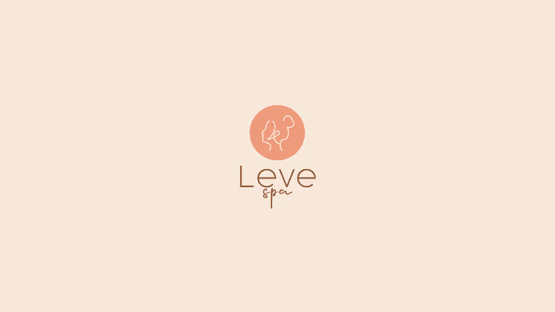
Visual Identity System: Leve Spa 🌿✨
Another identity successfully executed, this time for the premium wellness industry. Leve Spa is all about tranquility, minimalism, and connection.
From the continuous line-art logo to the warm, grounding palette of clay and deep green, every single detail was meticulously crafted to deliver a clean and cohesive brand experience that stands out on the shelf and in digital spaces.
Typography: Cocogoose + Casella
Design & Art Direction: Higor Coutinho
Looking to elevate your brand's visual storytelling? Let's connect and build it together.
2
183
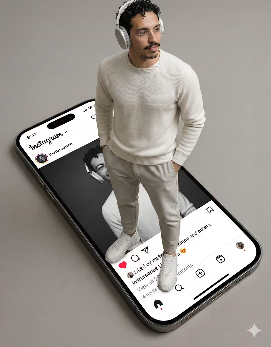
A personal conceptual asset designed to showcase how I integrate cutting-edge AI into my multimedia workflow. Rather than relying on traditional stock libraries, I leveraged AI image generation to establish the core subject and aesthetic direction, combining it with advanced Photoshop compositing to execute the final 3D pop-out effect.
This piece registers my technical ability to treat AI as a collaborative engine—using it to accelerate art direction while maintaining absolute control over perspective, complex selections, lighting, and shadow physics in post-production.
Core Skills: AI Prompting & Curation, Complex Compositing, Shadow Engineering, Art Direction.
Tools: Generative AI Tools / Adobe Photoshop.
1
213
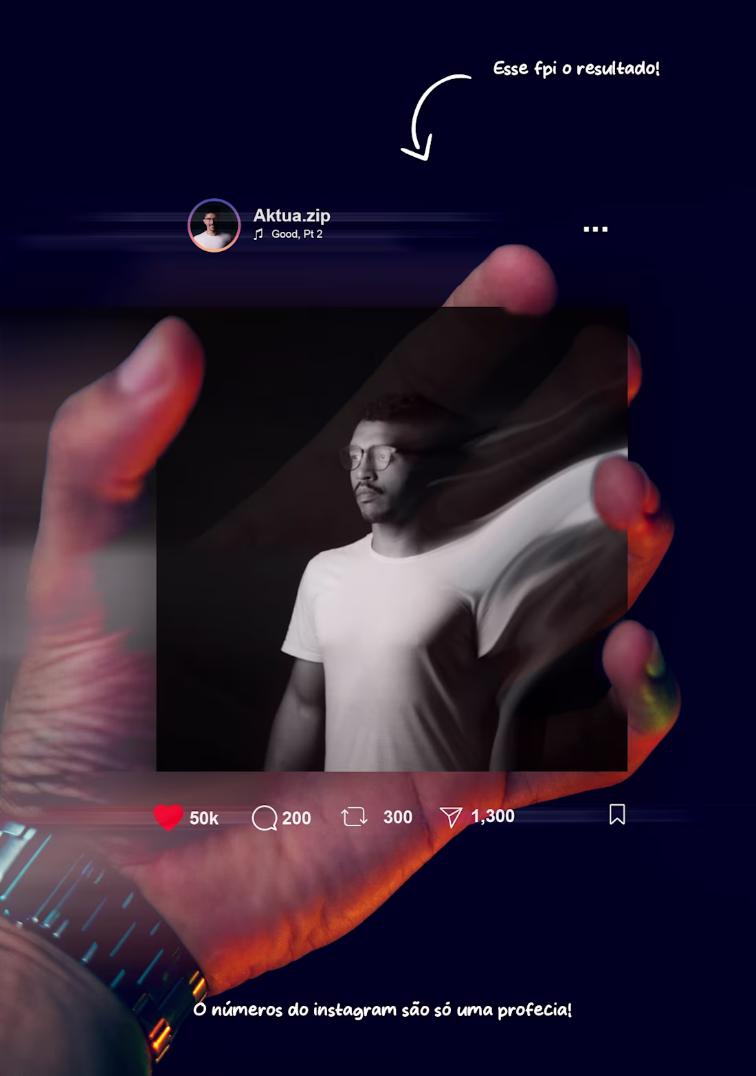
Here is a brief look at my creative process and multimedia skills. I put this carousel together specifically to demonstrate my proficiency in complex Photoshop editing, professional photography, and advanced photo manipulation.
Swipe through to see the entire journey—from reference and selection to custom blending and photographing my own hand for the final mockup.
Skills Demonstrated: Photoshop, Photography, Image Editing, and Photo Manipulation.
2
230
Another branding project successfully executed for the beauty industry. Meet Ella Hair—a visual identity designed to feel modern, sophisticated, and deeply welcoming. From the refined typographic choices to the premium color palette, every asset was crafted to mirror the self-confidence and care they deliver to their clients daily. So proud to see this brand come to life!
3
218
Finding Poetry in the Ordinary
We often walk right past the most beautiful parts of our day. I filmed, narrated, and directed this short piece to prove that even the most ordinary, everyday moments hold deep, emotional stories when we stop to look closely.
From the quiet cinematography to the immersive sound design, every detail was crafted to evoke a genuine human connection. I don’t just capture footage—I capture feelings.
If you want to tell a story for your brand that doesn't just sell, but truly touches hearts and connects with people on a human level, let’s bring it to life together.
2
215
Industrial product video edited in CapCut to showcase the high strength and durability of Force tires.
1
200
Mobile-shot & CapCut-edited reel designed to elevate our agency's social presence and personal marketing.
2
229
This format highlights your strategic and technical decision-making, proving your value as a complete audiovisual creator.
Cinematography, Art Direction & Editing: "Pisos Force" Commercial
The Objective: To translate the robustness, durability, and safety of Pisos Force rubber flooring into a dynamic, premium commercial tailored specifically for the high-performance CrossFit market.
My Creative & Technical Decisions:
Cinematography (Director of Photography): I opted for high-contrast, dramatic lighting (chiaroscuro) paired with sharp rim lights to accentuate the athlete's movement and, crucially, the texture and relief of the rubber flooring. I intentionally used tight close-ups and low-angle shots (contra-plongée) to convey a sense of raw power, weight, and absolute stability at the exact moments of impact.
Art Direction: I built an industrial, minimalist gym environment utilizing a desaturated color palette. This deliberate choice allowed the brand-specific elements (such as the red accents on the athlete's gear) and the flooring itself to take absolute center stage. Every piece of equipment—plates, dumbbells, and lifting chalk—was meticulously placed to seamlessly guide the viewer’s eye back to the floor.
Editing & Post-Production: The montage was engineered with a crescendo rhythm that mirrors the rising intensity of a heavy workout. I utilized fast-paced cuts tightly synchronized with hard-hitting sound design and clean, modern typography overlays. This allowed the technical attributes of the product (Flexibility, Extreme Durability, High Shock Absorption) to be communicated organically, peaking right at the climactic barbell drop.
🔗 Watch the full project here: https://www.youtube.com/watch?v=6IFVUUjir0I
3
265
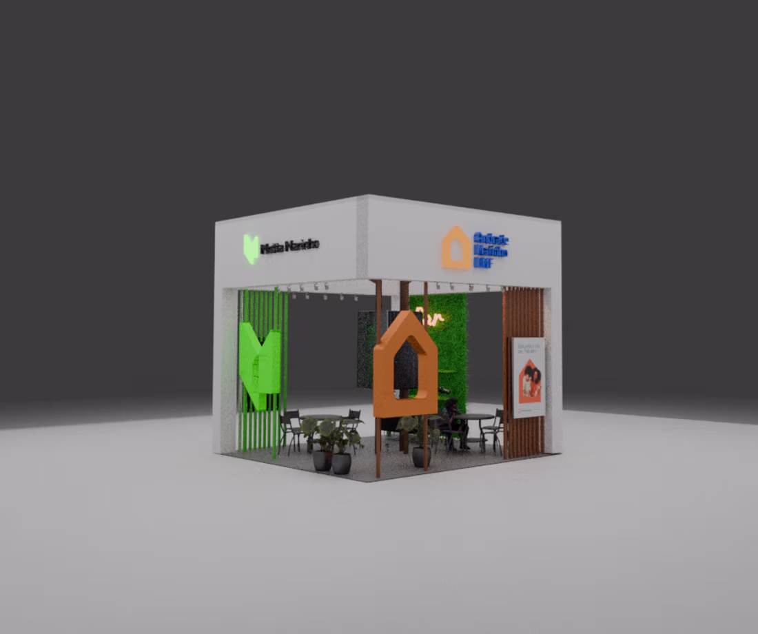
The client approached me with a complex operational hurdle: they needed an exhibition booth that seamlessly unified two distinct brands (Motta Marinho and Andrade Marinho EMF) into a single, cohesive space. A specialized traditional agency had previously drafted a concept, but the results lacked brand clarity and failed to communicate how both companies strategically collaborate. The challenge was to integrate two visual corporate identities without cluttering the layout, ensuring that passing trade show attendees could immediately grasp the partnership.
2
222