Hab sahilw
Creative Strategist | Brand Identity Designer | SMM Designer
Ready for work
Hab is ready for their next project!
“Art + logo creates this branding, custom tradition in a modern way.
This is 3 months of design work. They said the audience should experience it like a painting , something you could take to a top exhibition and sell as art.
This is real work. What do you think, Contra family?”
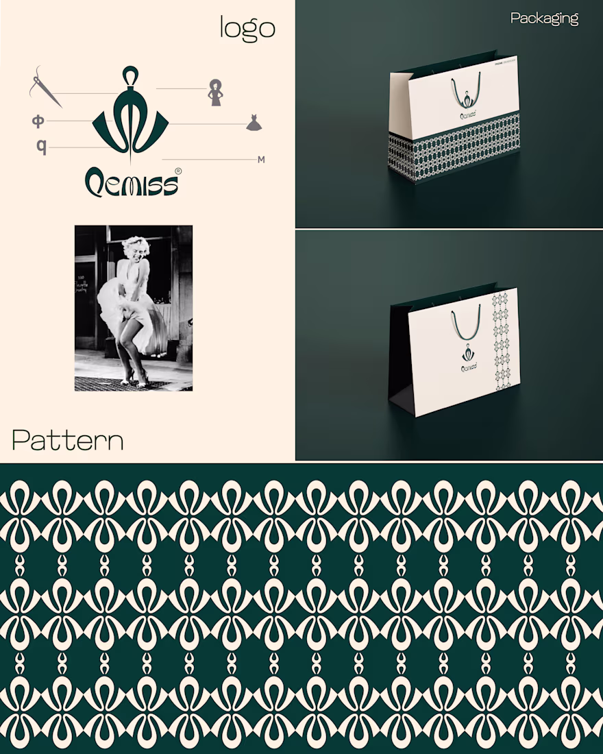
You know Marilyn Monroe, the famous American actress? Do you remember that iconic pose where her dress flips up? I was thinking about creating a branding/logo inspired by that pose, but with a custom, traditional, and modern touch. This is the logo I made last week what do you think about it? I just want to know your opinion.
Was trying a logo for KALUPUTICS. Don’t I deserve a repost, hire, job, or something guys? 😭🔥
Day 76 Not Getting a Job on Contra but have a good portfolio
.....
still
struggling !!!
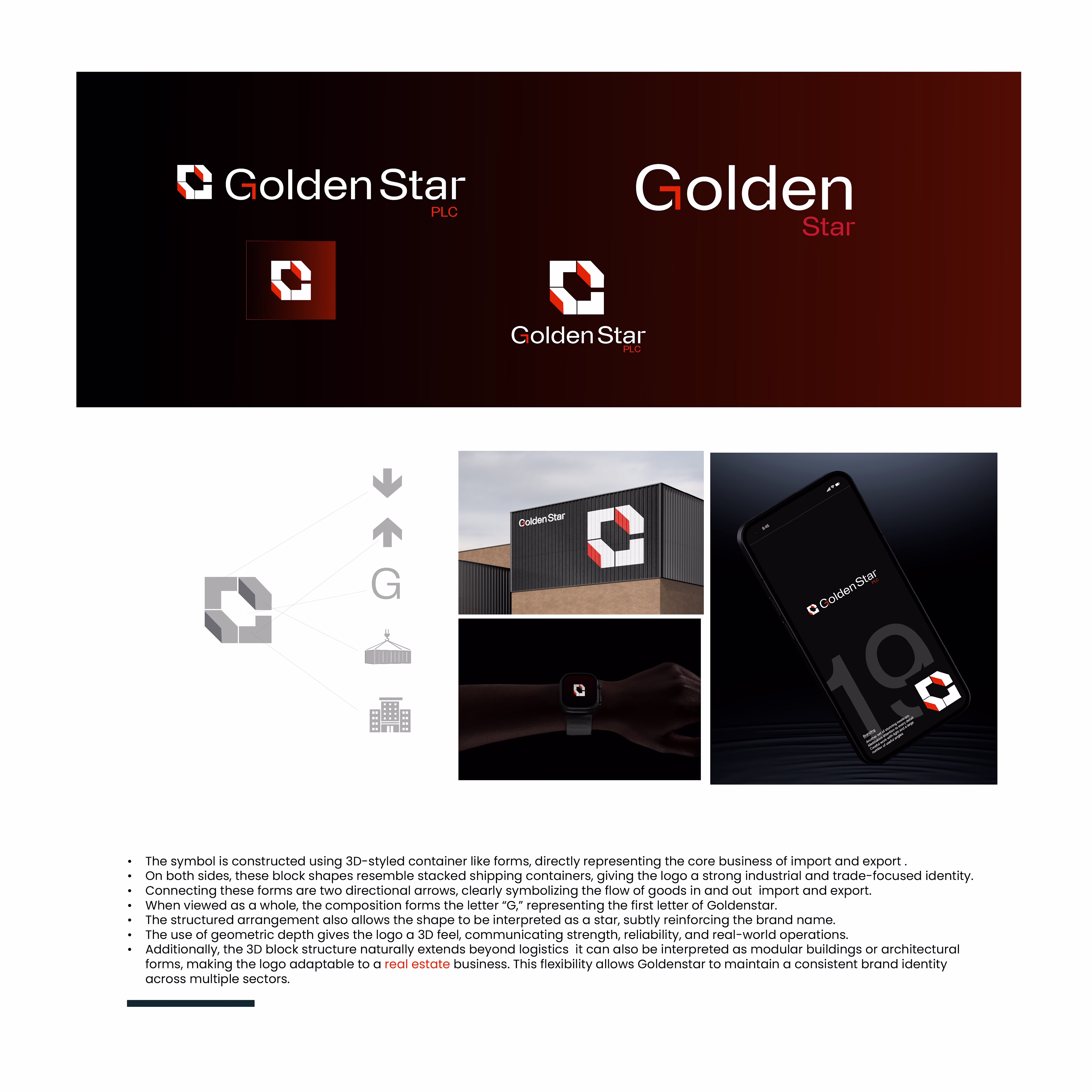
See the arrows, see the containers this is the import and export branding I recently created. They say THE TERM ‘out of the box’ defines it. What do you think?