The network for creativity
Join 1.25M professional creatives like you
Connect with clients, get discovered, and run your business 100% commission-free
Creatives on Contra have earned over $150M and we are just getting started
Back to feedPost

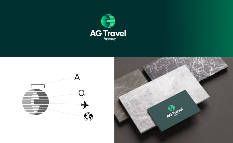
Another logo proudly added to my portfolio. ✨
I designed this brand identity for AG Travel Agency, combining the letters A and G into a minimalist globe, complemented by an airplane to represent global travel, movement, and exploration.
#LogoDesign #BrandIdentity #TravelAgency #MinimalLogo #GraphicDesigner #LogoDesigner #Branding #CreativeDesign

The network for creativity
Join 1.25M professional creatives like you
Connect with clients, get discovered, and run your business 100% commission-free
Creatives on Contra have earned over $150M and we are just getting started








Related posts

How can branding make people feel part of a community?
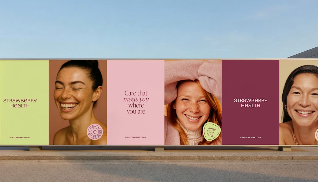
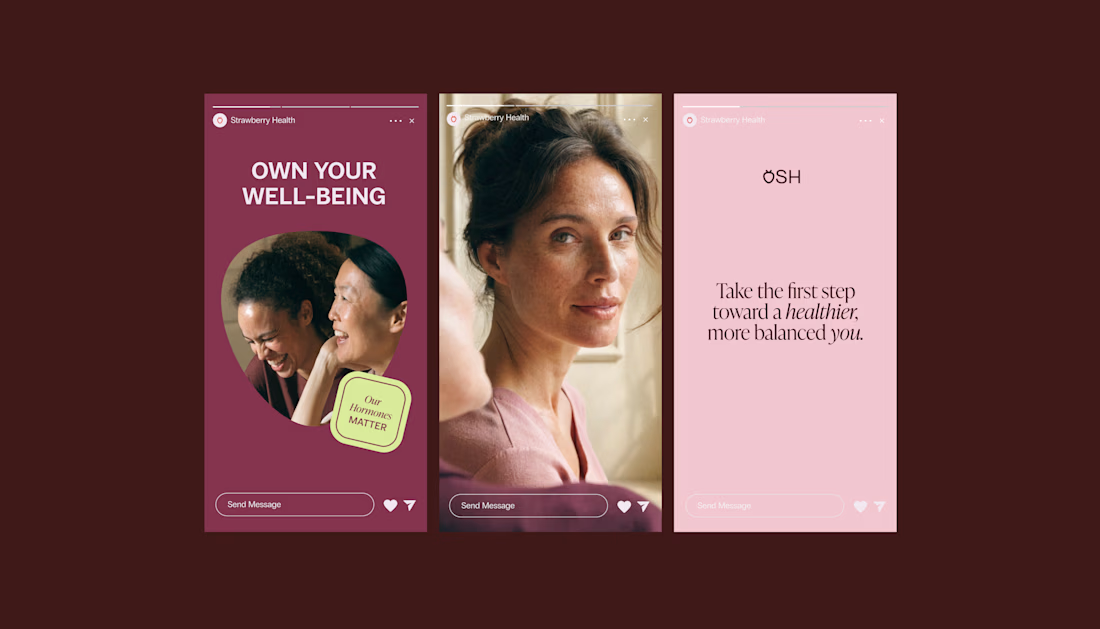
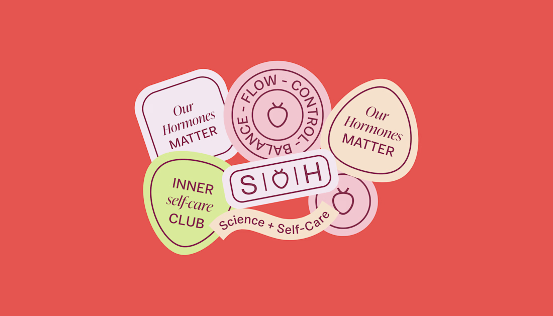
When working on Strawberry Health, we explored how visual identity could make women’s health feel more approachable and collective.
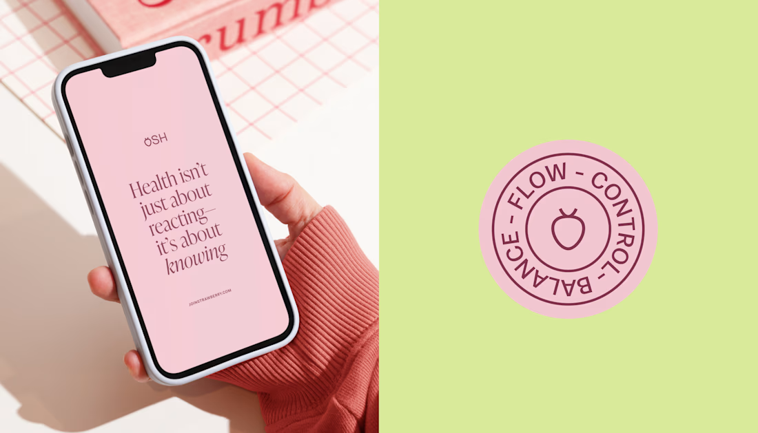
One of the ways was through supporting brand elements: stickers, badges and phrases that could live beyond the logo and become expressions of belonging.
These elements turned the identity into something people could interact with, share and make their own.
It’s a small detail, but I think it’s an important part of building brands around communities: the identity shouldn’t only identify the brand. It should give people something to identify with.

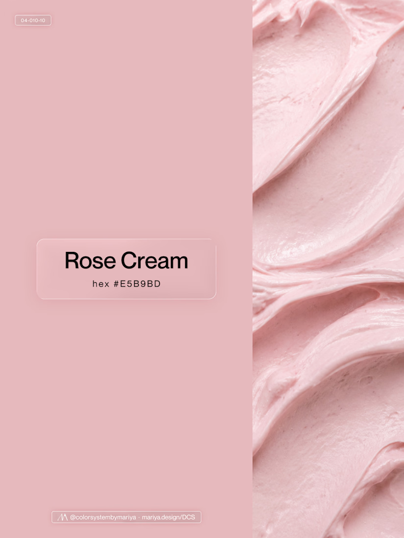
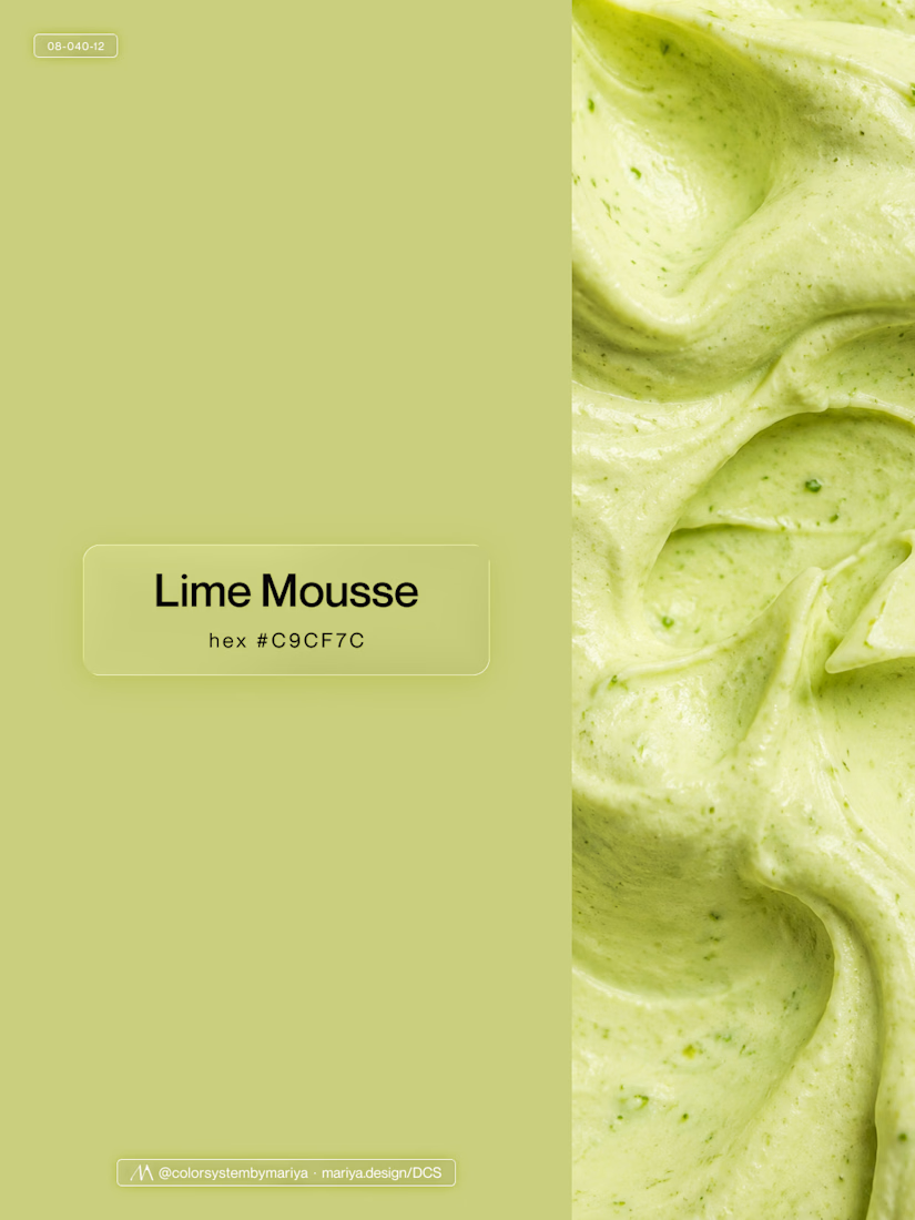
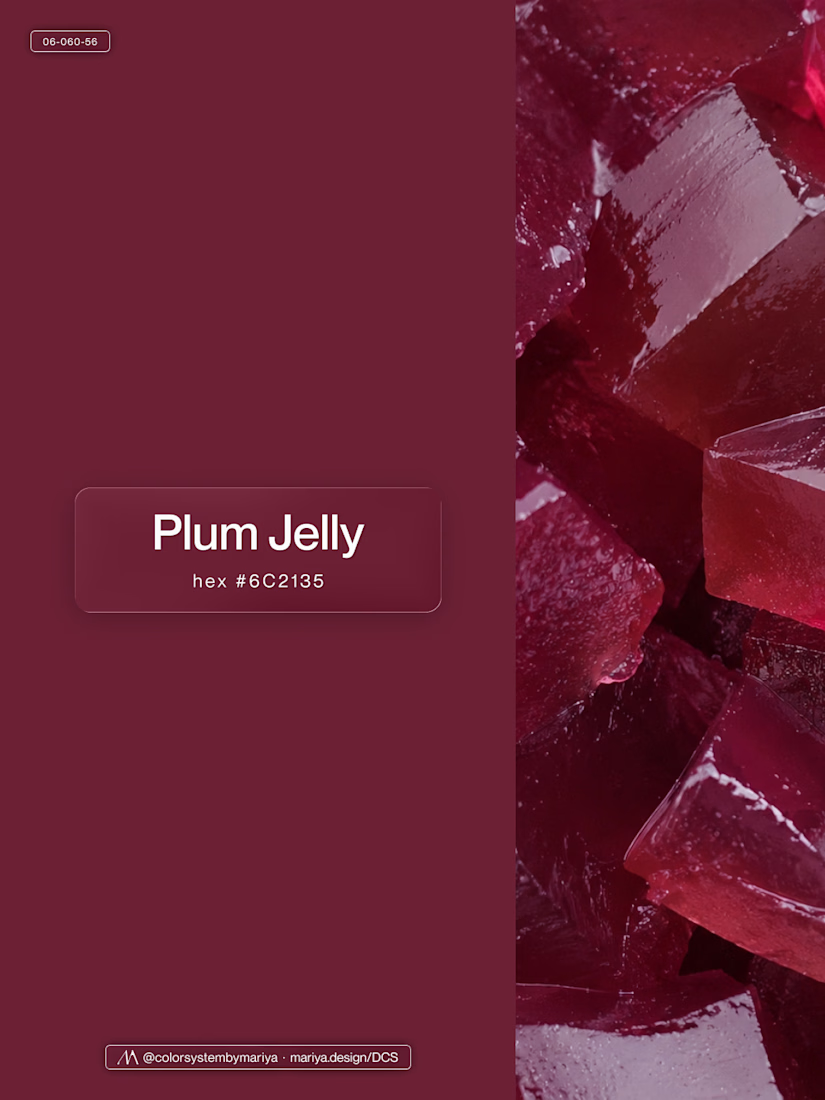
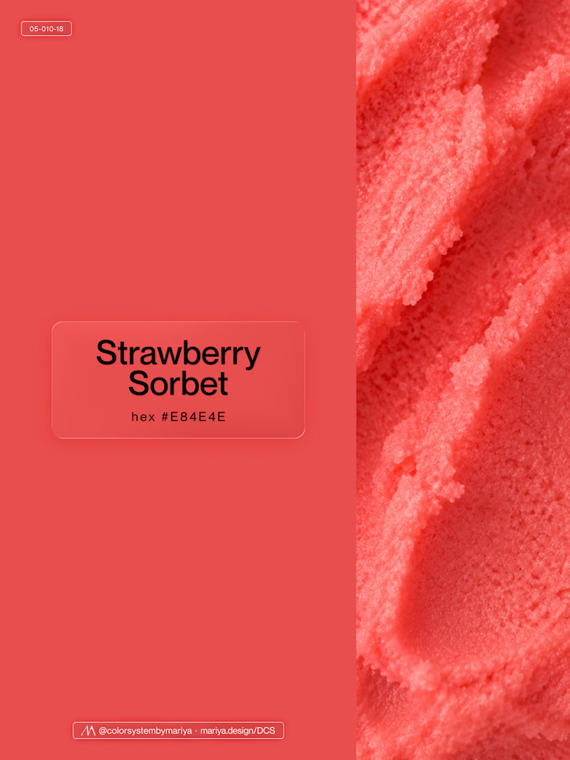
Love, love, love the colors. My mind goes: Rose Cream, Lime Mousse and Plum, hmmmm, which Plum... Plum Jelly. And of course, Strawberry Sorbet.
Let me match the vibe using my delicious swatches 😊

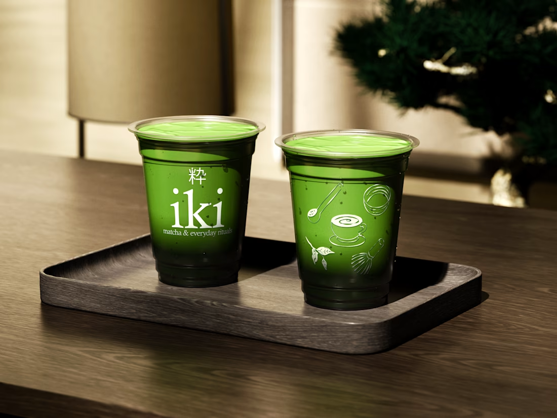
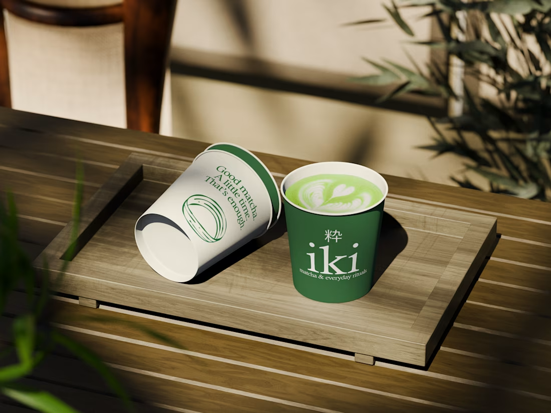
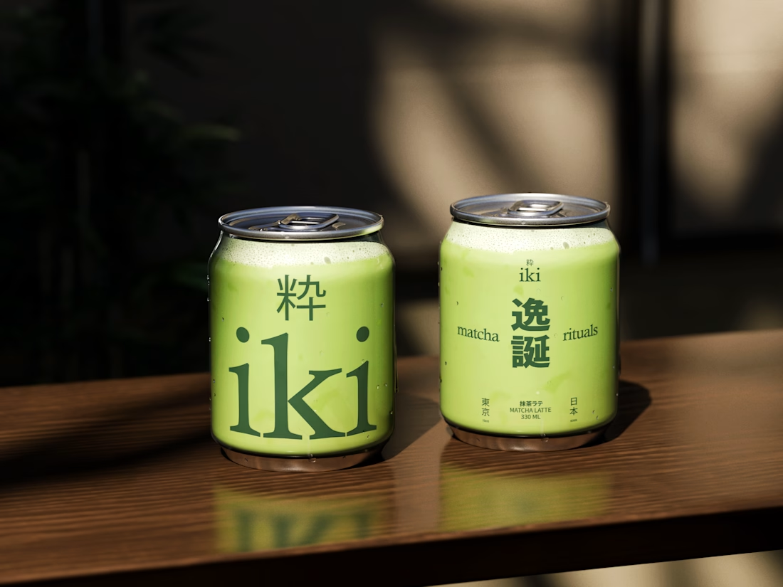
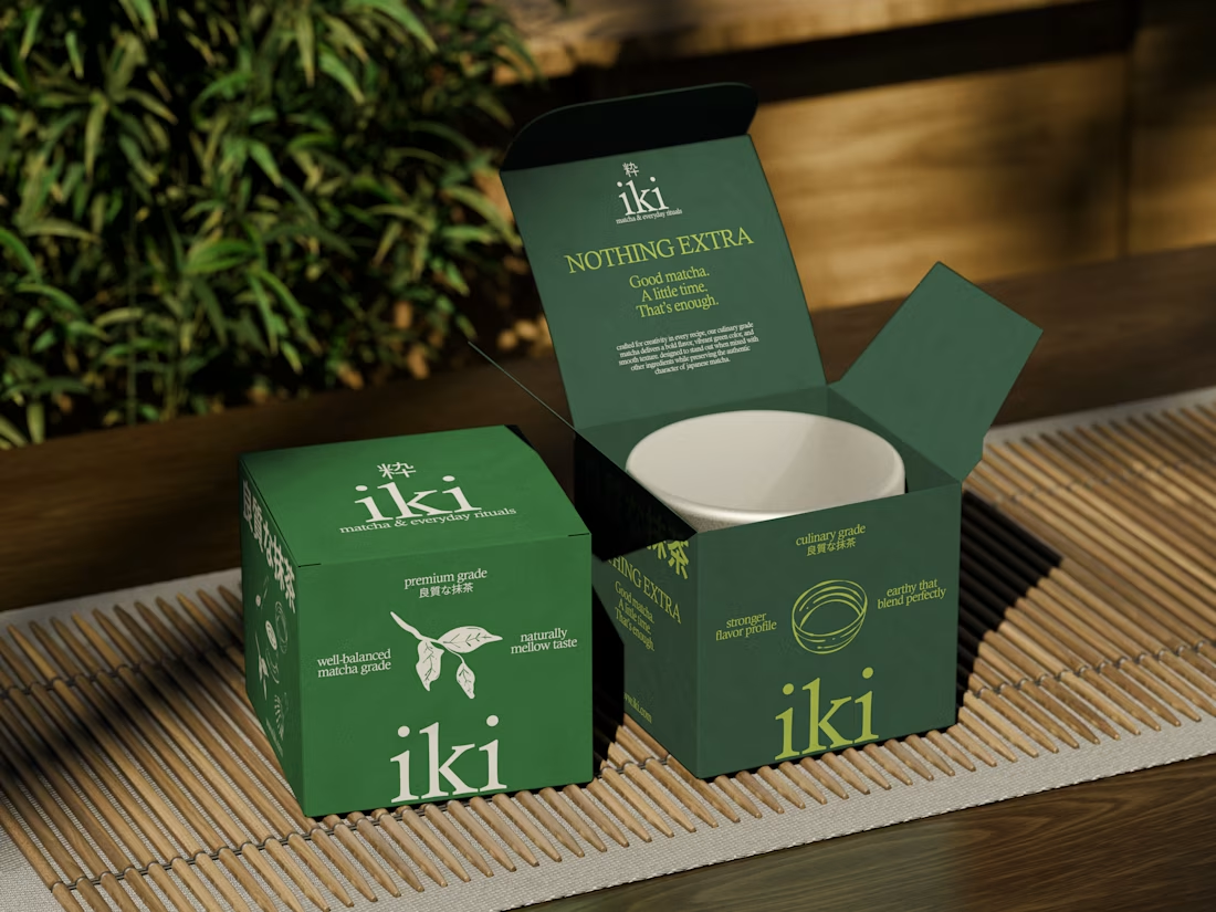
more visuals from iki, a matcha shop i’ve been working on 🍵
the project is getting close to its final stage, and it’s been really interesting to see how the initial concept has gradually turned into a complete brand.
from the strategy to the visual identity, every decision has helped shape a more cohesive and distinctive world for iki.
almost there. excited to share more of the final result soon

Strong concept and thoughtful execution. The logo feels distinctive and communicates the brand identity clearly.


Can't believe this brand is 3years now.
Check out the full project here: https://behance.net/gallery/182972929/SAGAH-Branding-project


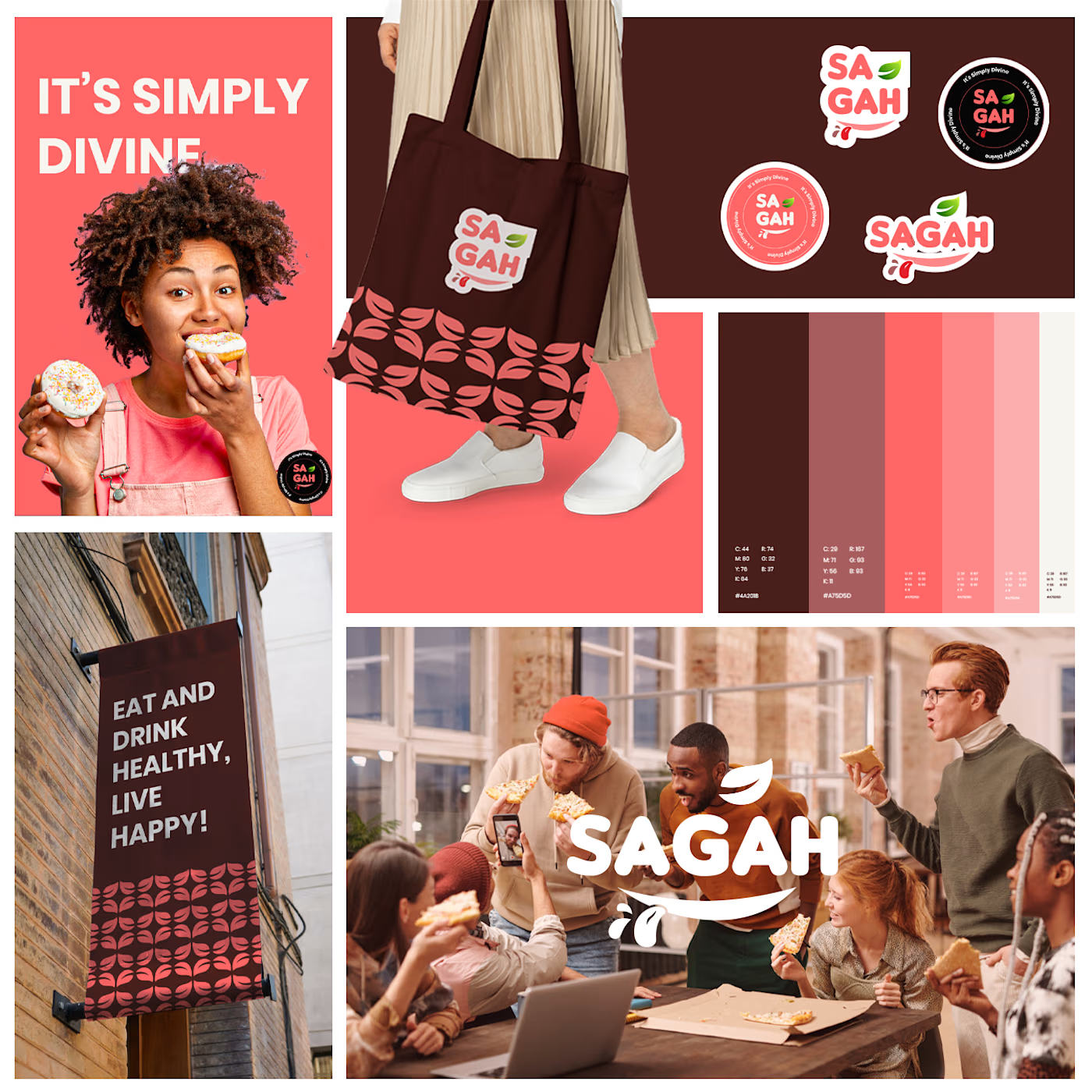
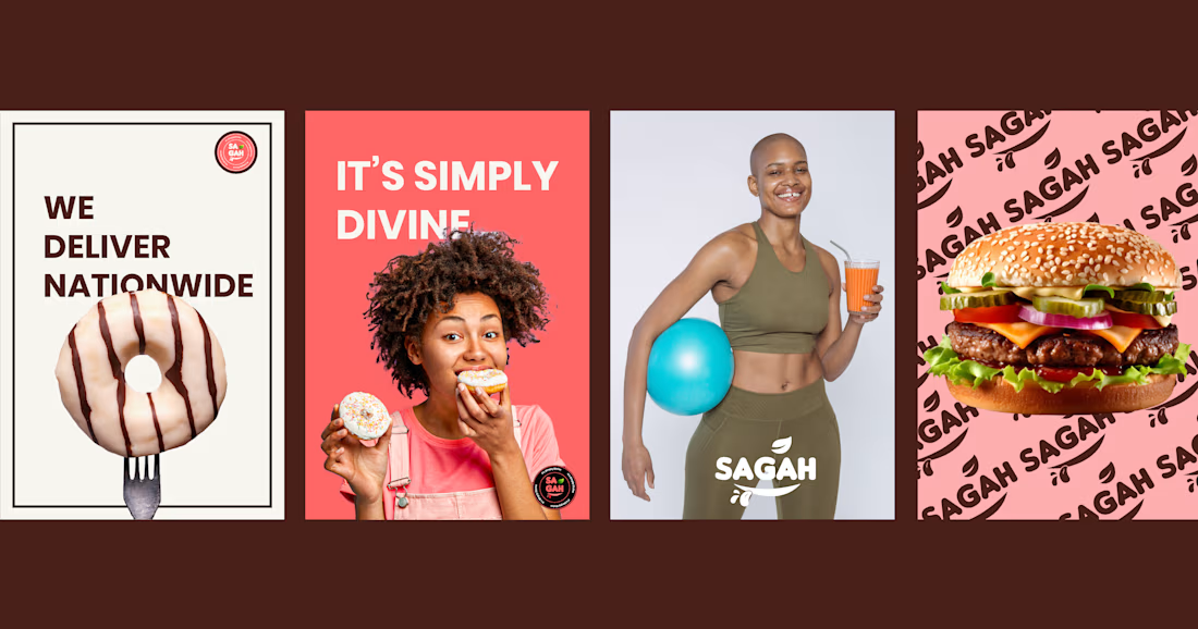
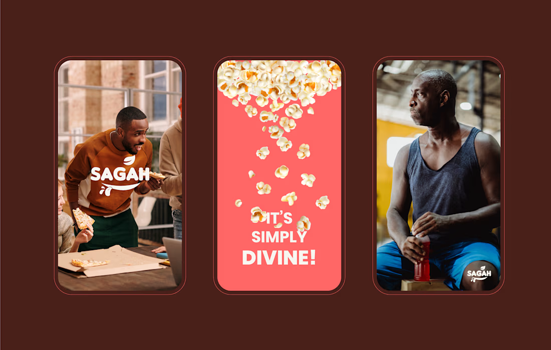
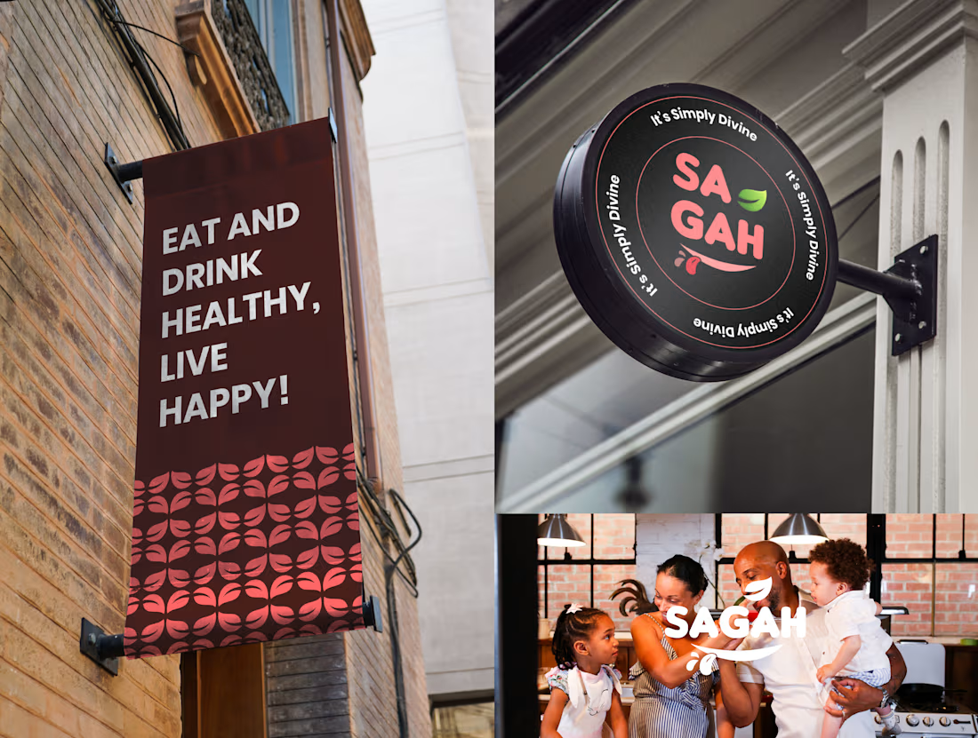

Really love this SAGAH branding! The color palette and the tote bag mockup look super clean and consistent. Great work on the overall identity 👏