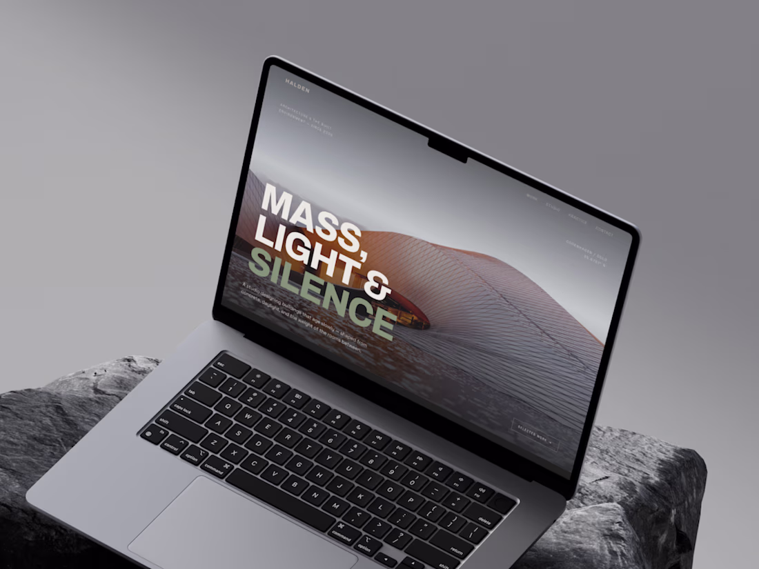
HALDEN is a concept Nordic architecture studio I created as a design brief, working between Copenhagen and Oslo on houses, cultural buildings, and adaptive reuse.
YoPrint: Redesigning a SaaS Customer Portal for Print Shops
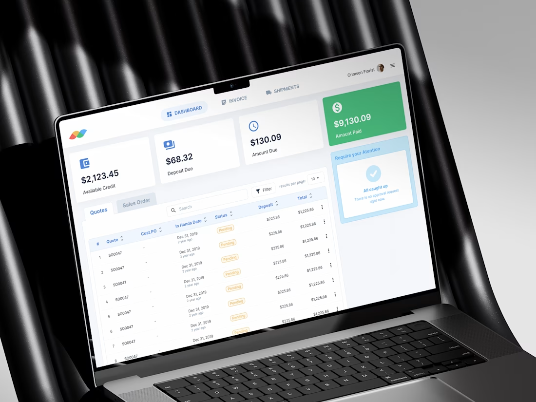
Animated this B2B analytics dashboard using Figma Motion, Figma's new native animation feature that finally lets you prototype real motion without leaving the design tool.
No After Effects. No Jitter. Just Figma.
Figma Motion is still early, but the potential for designers to...
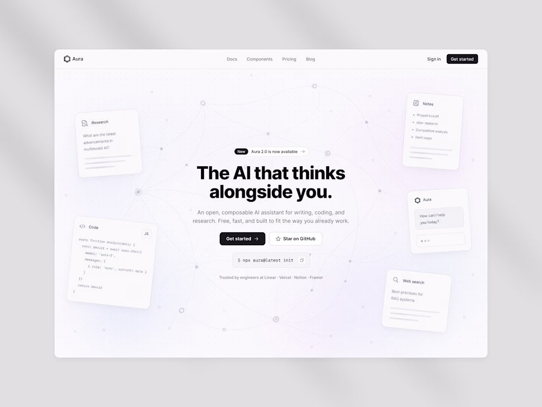
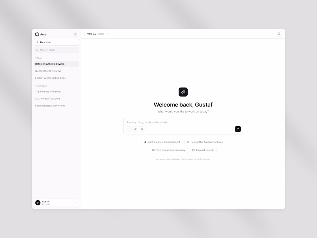
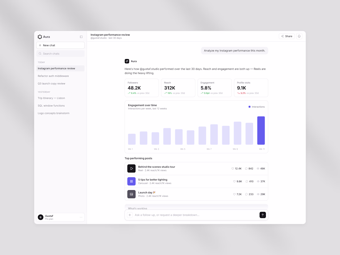
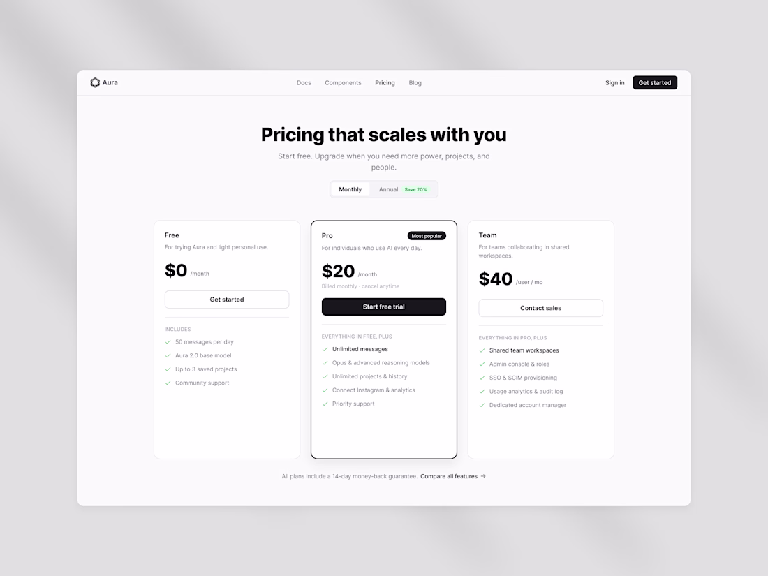
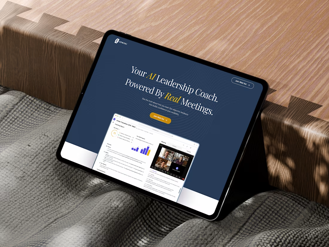
Design exploration "Aura", an AI assistant platform.
Built with shadcn/ui as the foundation, explored a clean design system across 4 key screens: hero landing, pricing, analytics dashboard, and empty state.
Monochrome base with subtle accent colors for data viz, consistent rounded cards and soft shadows throughout.