Gustafian D's Work | Contra
Work by Gustafian D
Sign Up
Post a job
Sign Up
Log In
pro
Gustafian D
Senior Web & Product Designer
Message
Follow
1x
Hired
5.00
Rating
29
Followers
Framer expert
Framer expert
Indonesia
Work
Posts
Reviews
Services
About
Indonesia
0
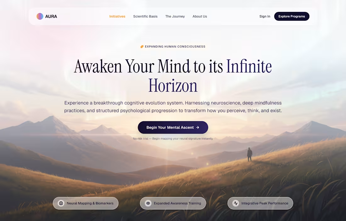
Wellness landing page hero
0
15
0
Raven: Designing a Receipt-to-Rewards Sweepstakes App for Everyday Shoppers
0
71
1
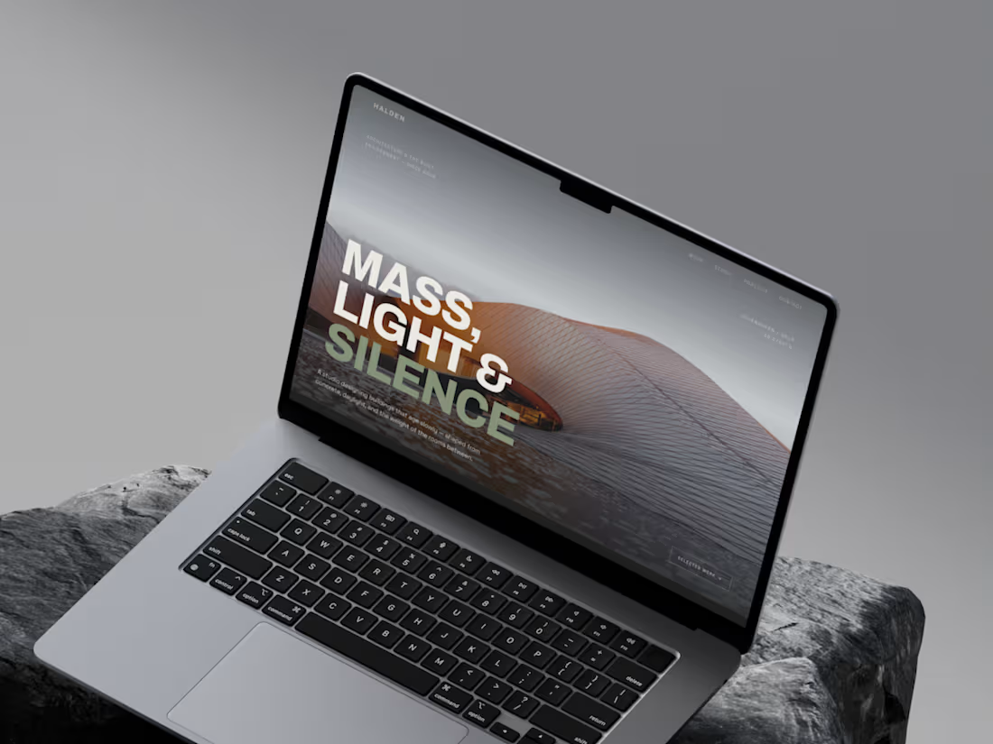
HALDEN Studio Website Design
1
7
0
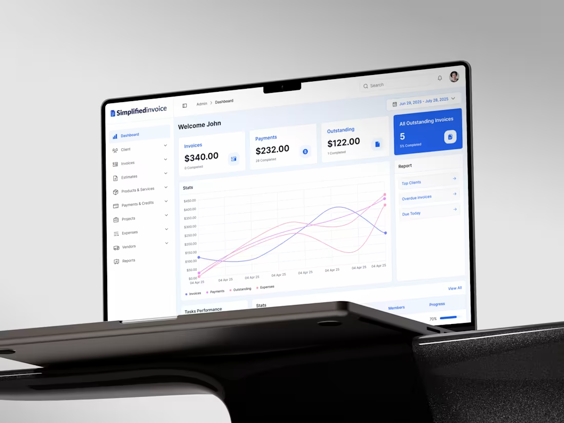
SaaS Invoicing Dashboard Redesign
0
2
0
Redesigning YoPrint's Customer Portal
0
2
0
Sensei AI Coaching Website Design & Development
0
6
0
HALDEN — Concept Website for an Architecture Studio A self-initiated project designing the full web presence for a Nordic architecture practice: brand tone, editorial layout, project case study structure, and scroll-based motion. What this demonstrates: - Positioning a studio through restraint instead of noise - Case study pages structured to sell the work (context, decisions, materials) - A design system built on typography and spacing, easy to extend If you're an architect, studio, or premium brand that wants a site with this level of craft, let's talk.
0
81
1
Animated this B2B analytics dashboard using Figma Motion, Figma's new native animation feature that finally lets you prototype real motion without leaving the design tool. No After Effects. No Jitter. Just Figma. Figma Motion is still early, but the potential for designers to own the full motion handoff is significant. Would love to hear from other designers experimenting with it. What's your motion workflow right now?
1
82
1
Design exploration "Aura", an AI assistant platform. Built with shadcn/ui as the foundation, explored a clean design system across 4 key screens: hero landing, pricing, analytics dashboard, and empty state. Monochrome base with subtle accent colors for data viz, consistent rounded cards and soft shadows throughout.
1
84
0
Hero section for Otaru AI - AI coaching platform for sales teams. Clean, minimal, and product-led. The UI does the talking.
0
76
4
Experimenting with some fresh, organic tones for a climate-tech project. the goal was to create a sense of transparency and trust through the use of soft blurs and a structured white-space layout.
5
4
239
2
Design Flashback: YoPrint Admin Dashboard Redesign Redesigning an Admin interface is all about balancing power with simplicity. For YoPrint, the focus was on stripping away visual noise to let the functionality shine. Key Goals: - Optimized workflows for internal teams - Cleaner data visualization and navigation - Enhanced control through a more intuitive UI It's rewarding to see how these design choices continue to support user efficiency and scale. #UIDesign #UX #AdminPanel #B2B #DesignPortfolio
5
2
172
0
Nimas Associate Website Redesign & Wordpress Development
0
5
1
I tried combining a dreamy, ethereal style with a structured company hero section for this landing page. I think the vibrant shapes and deep tones give it a modern tech feel while keeping the trust factor high for the recovery service. What do you think of the vibe? ✌️
1
156
0
Invoicing SaaS Dashboard Redesign - SimplifiedInvoice
0
6
1
Bleujoin - Data & Analytics Consulting Company
1
2
0
YoPrint - Customer Dashboard Redesign
0
37
0
Dirory Website Design
0
33
0
Astir Nutrition Website Redesign
0
9
0
Waste 4 Change Mobile Web Redesign
0
17