The network for creativity
Join 1.25M professional creatives like you
Connect with clients, get discovered, and run your business 100% commission-free
Creatives on Contra have earned over $150M and we are just getting started
Back to feedPost
Taste Test

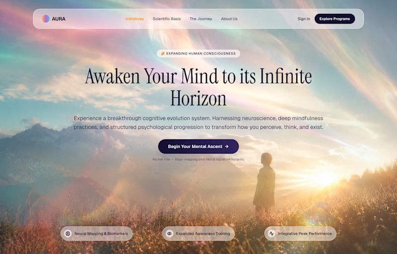
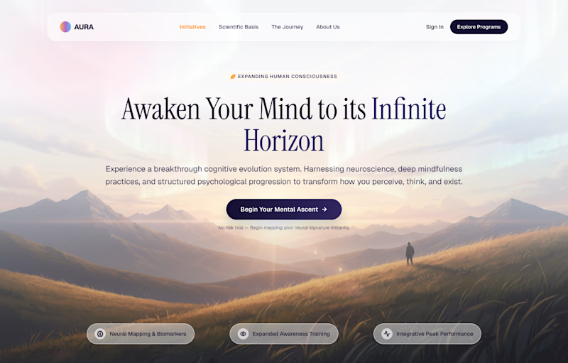
Wellness landing page hero. Which version earns the click?
16 voted
46%
19 voted
54%
35 votes
Closed


I'd choose the second one 100 times
Ha, your vote landed on the first one so I'm counting this as a split decision. Curious what pulls you to the grounded version. Is it the readability of the headline or the way the figure sits in the frame?
Haha, nope 😄 I meant the Vivid + ethereal one.

wow, both is perfect!
Thanks man!

I like the second one
You're the second person to say that, which is interesting because the poll is running the other way. What makes the warm one work for you?
It feels warmer and fits better to vision you are trying to achieve imo.

Nature is beautiful and it really pops, making the design look great. The vivid + ethereal hero section works really well for me.
Thanks Samuel. That was the bet with the vivid one. The light does the emotional work so the copy can stay calm. The tradeoff is headline contrast, which is why I kept the type weight heavier on that version.
Yeah, sure, I understand and it actually looks great.

Warm + grounded win for me as the heading are visible clearly, while in the vivid the heading text are slightly less visible compare to the previous one
That is the exact tradeoff I was watching. The vivid version puts the headline over the brightest part of the sky, so it needs either a heavier weight or a scrim to hold up. The warm one gets that legibility for free from the darker ridgeline. Good catch.
Yeah thanks

GOing with the Warm version
Warm is closing the gap fast. Is it the legibility or the mood for you?

Fair point. The proof chips under the CTA are meant to carry the credibility, but they are too vague to do it. Naming the actual method would fix more than any color change. Thanks for pushing past the poll question.

The first one feels like a soft, almost weightless burst of energy with its neon colors.
Weightless is exactly the word I was after. The open question is whether that energy still reads as calm enough for a wellness product or tips into something more like a festival poster. Where does it land for you?
For me, it still reads as wellness rather than a festival poster, though it definitely feels more energetic than the second one. What made me choose the first one was how much the neon treatment stand out. It feels fresh and unexpected. But for the wellness theme itself, I think...

Ohh it's tough both
It is. If you had to click one right now, which?
I'd choose 1st one

The vivid + ethereal looks catchy to me

thats looks very nicee

Wow Amazing Work Brother

The network for creativity
Join 1.25M professional creatives like you
Connect with clients, get discovered, and run your business 100% commission-free
Creatives on Contra have earned over $150M and we are just getting started

Challenges
View all


Related posts

I’m testing two different creative directions and would love your honest opinion.
Version A focuses on a bright, minimal gallery experience with circular visual experiments.
Version B explores a darker, more cinematic product direction for Montairé with hardware-focused visuals.
Which one feels cooler, more premium, and more memorable — A or B?
I’d also love feedback on the typography, layout, animation, and overall art direction.
10 voted
53%
9 voted
47%
19 votes
Closed
I’d lean toward Version B. The darker direction gives the hardware more presence and makes the whole experience feel more intentional and engineered. Version A is visually interesting, but B gives Montairé a much clearer identity at first glance.


Same course. Two completely different vibes.
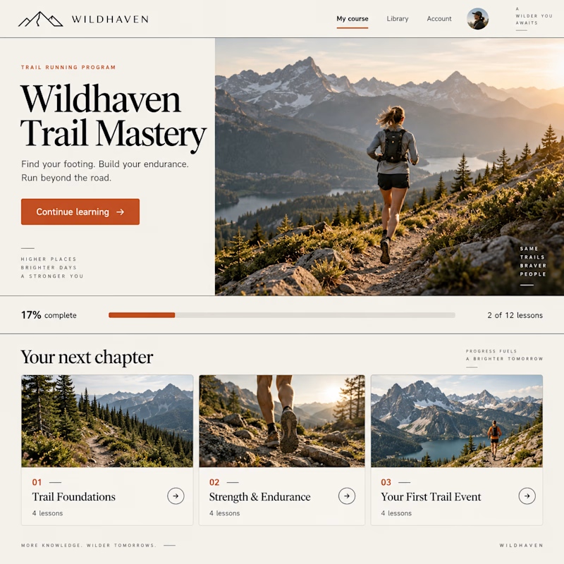
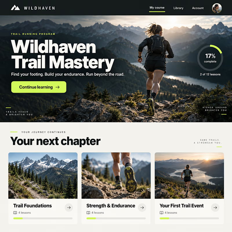
Exploring two design concepts for a Kajabi course experience: warm and editorial, or bold and cinematic.
Same curriculum. Different typography, layout, and visual direction.
Which one would you rather learn inside—1 or 2?

10 voted
19%
44 voted
81%
54 votes
Closed


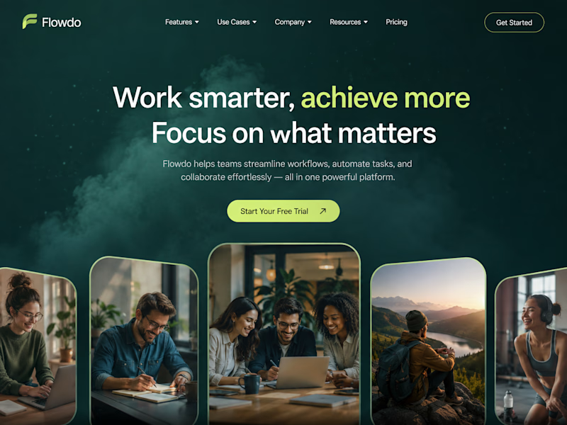
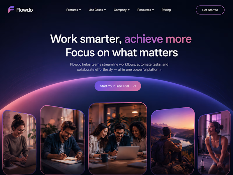
One header, two color stories.
Green: cool tones, feels productive and safe
Purple: gradient glow, feels modern and premium
Same words. Different first impression.
Which one would make you click "Get Started"?

26 voted
59%
18 voted
41%
44 votes
Closed

Went with calm and focused. The copy is literally asking people to focus on what matters, so a header that competes for attention with a glow works against its own message.