
Federico Rojas
Senior brand designer. 20+ yrs. Remote, Costa Rica.
New to Contra
Federico is ready for their next project!
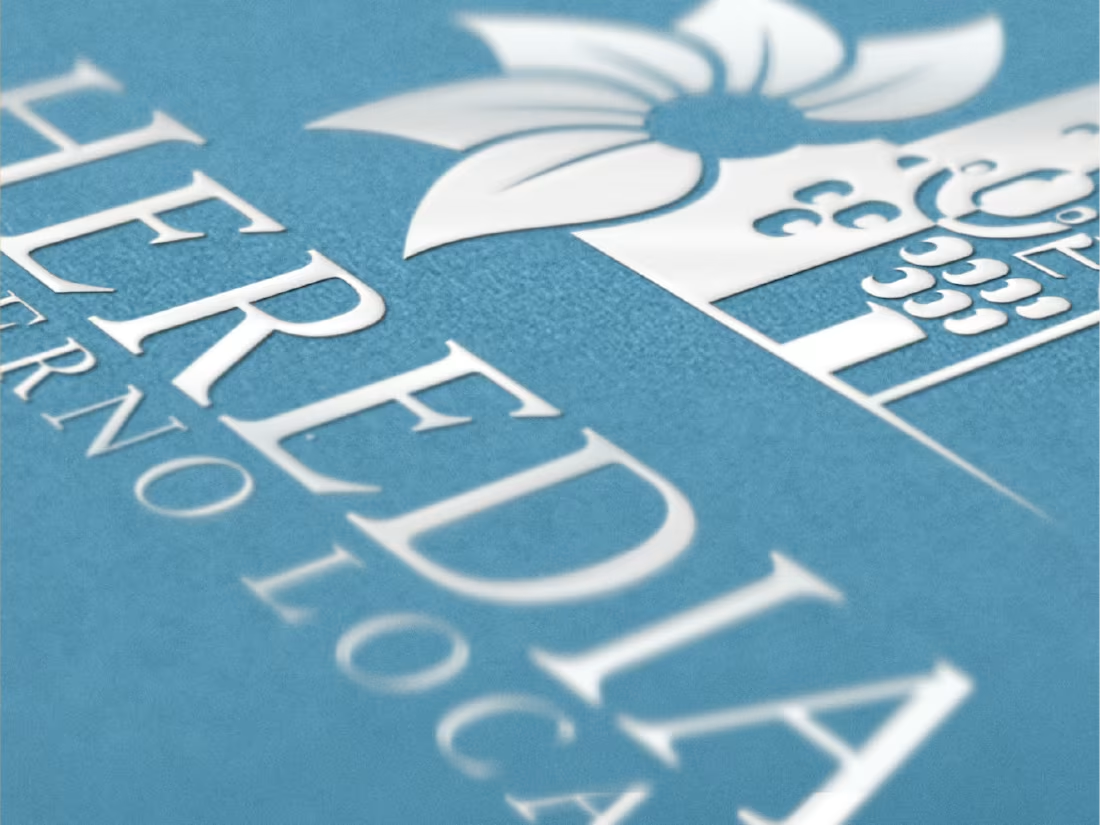
Heredia had a story that predated the internet by centuries. But in 2017, the way the city presented itself online told almost none of it.
The website was outdated, difficult to navigate, and built for a moment that had long passed. Citizens looking for services, visitors trying to understand the city, none of them were being served by what existed. The Municipalidad knew it was time for something new, and they did not want to do it halfway.
What started as a website redesign became something much larger.
As we worked through the digital experience, it became clear that the visual identity itself needed to evolve alongside it. A city communicates through everything it puts in front of people, its signage, its documents, its digital presence, and all of it was pointing in different directions. So we proposed a new corporate identity, one that could anchor everything the Municipalidad of Heredia needed to say.
The process was rigorous and public. This was not a decision made behind closed doors. The new identity was presented to the community and submitted to a popular vote. When the results came in, the people of Heredia had chosen it as their own.
We also redrew and digitalized the official City Shield, honoring the historical weight of that symbol while giving it the precision and clarity it needed to work across every modern context.
A new website. A new identity. A renewed shield. All of it rooted in a city that had been worth representing well all along.
1
2
19
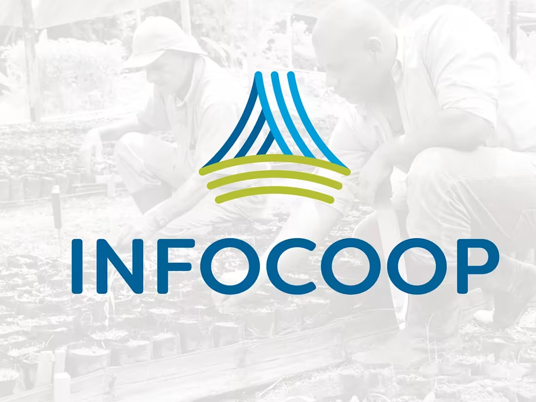
The National Institute of Cooperative Development had been part of Costa Rica's economic fabric for decades. INFOCOOP existed to support cooperative enterprises, to help communities organize, produce, and grow together. But by 2017, the institution felt it: the identity they carried no longer reflected who they were or who they wanted to reach.
The decision to change was not superficial. It was a commitment to rebuilding from the inside out.
We started at the core, with the values the institution had always held, and worked outward from there. What did INFOCOOP stand for? What did it feel like to be part of a cooperative movement? Those questions shaped every decision that followed, from the logo mark to the typography to the color palette that would eventually live on everything from official documents to the sides of vehicles to the signage on their buildings.
That last part mattered more than it might seem. A brand that only works on a business card is not a brand. It is a logo. INFOCOOP needed a system that could carry the weight of a public institution, one that felt authoritative enough to represent the state and approachable enough to speak to the communities it served.
When it was done, the new identity did what the best institutional design always does. It made INFOCOOP look like what it had always been, just finally seen clearly.
1
2
29
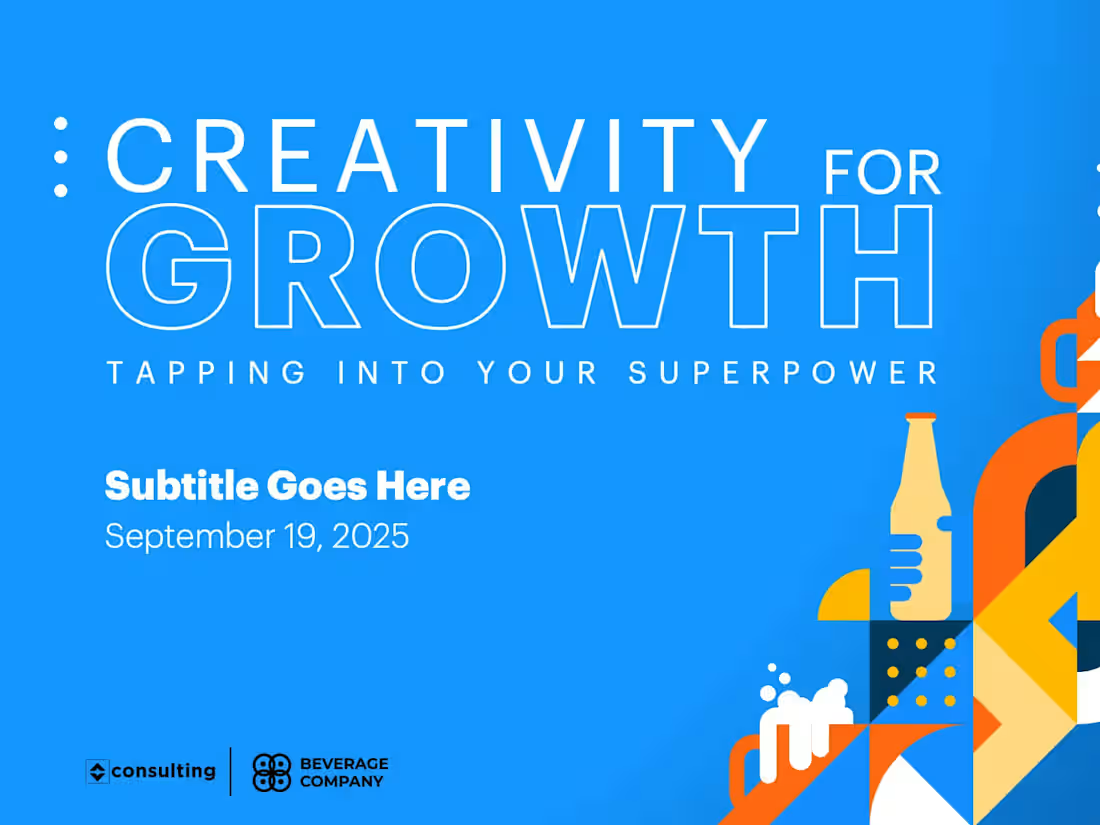
When Molson Coors came to us, the brief was deceptively simple: create a brand for an internal corporate event. But the reality was anything but simple. The event was happening in four U.S. cities at the same time, Chicago, Detroit, Atlanta, and Miami, with roughly 1,000 people walking into spaces that had to feel like they belonged to the same world, even though they were hundreds of miles apart.
That meant every decision had to scale. A logo that worked on a lanyard had to work on a wall decal. Character illustrations that felt right on a sticker had to hold up when animated in After Effects. A color palette chosen for a presentation deck had to translate to a cap, a t-shirt, a stamp.
The creative challenge was not just design. It was coherence under pressure, across formats, across cities, across every touchpoint an attendee might encounter from the moment they walked in to the moment they left.
So we built a system. Not just a logo, but a complete visual language with its own personality, illustrated characters, motion graphics, textures, and a palette that tied everything together without flattening it. The kind of brand that feels considered at every scale, because it was.
1
54
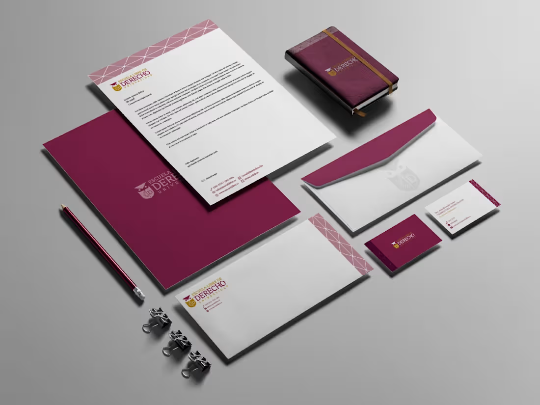
The Escuela Libre de Derecho had a history worth honoring. Rather than starting from scratch, the challenge was to find what already lived in the institution's identity and bring it forward into something that felt current.
The owl was already there, a symbol the school had long carried as a representation of wisdom and the guidance of knowledge. So was the sun, and the letter "D," both anchored in the visual memory of those who knew the institution. The new identity didn't replace these elements. It reimagined them, giving each one a cleaner, more confident form while preserving the meaning behind them.
The result was a complete visual system built around symbols the school already owned, updated to carry the Escuela Libre de Derecho into a new chapter without losing sight of where it came from.
1
35