


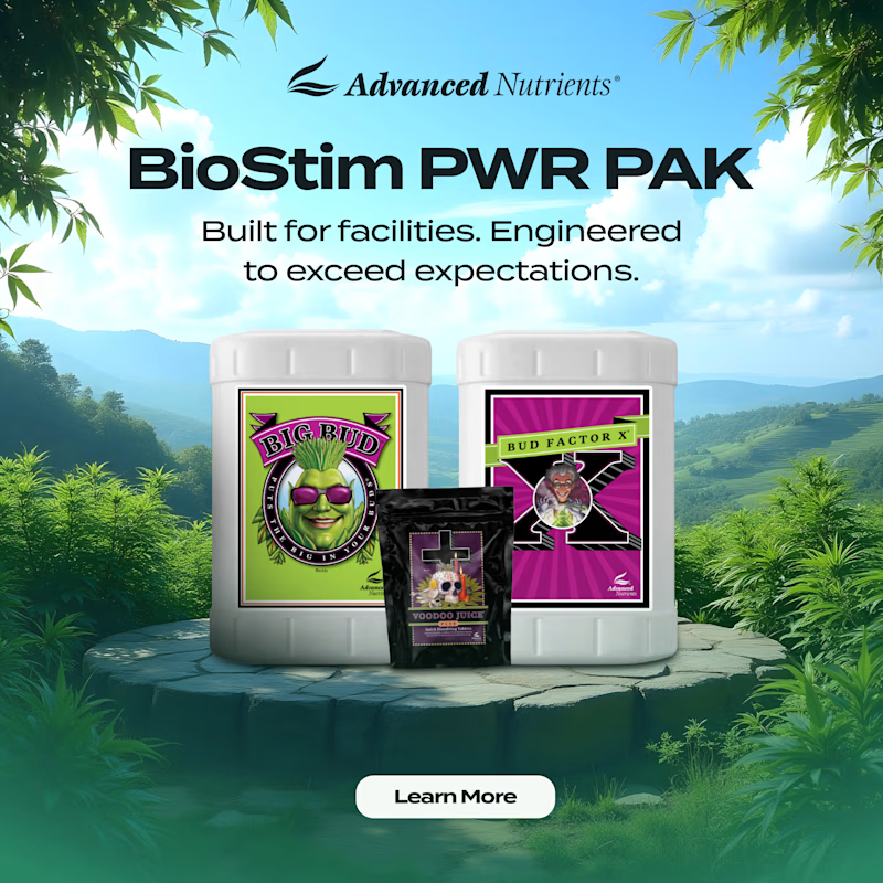
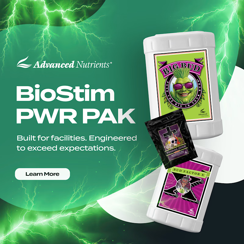
Two social ad directions for Advanced Nutrients’ BioStim PWR PAK. Same product, completely different energy.
Option A: natural landscape background, products centered on a stone pedestal, feels grounded and premium
Option B: electric green lightning background, products fanned...
5 votes
Ends in 15h
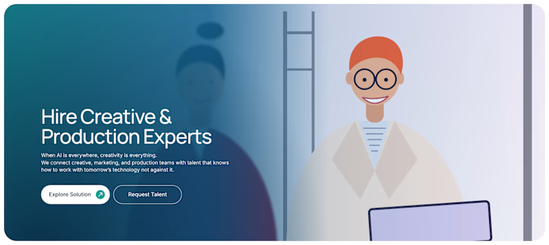
Two hero directions for a creative talent platform. Same copy, totally different visual approach.
A: real photography, purple gradient overlay, feels human and immediate
B: illustrated character, teal gradient, feels modern and brand-forward
Which one makes you want to hire through this platform? 👇

8 voted
100%

0 voted
0%
8 votes
Closed
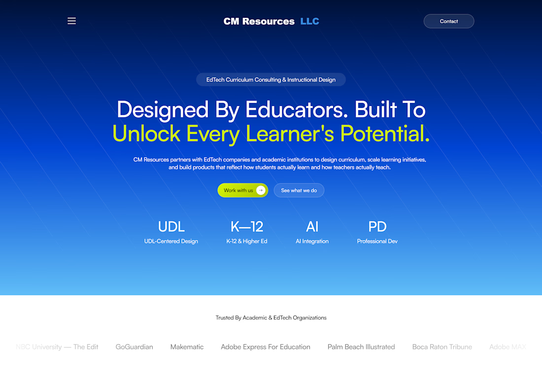
I designed and developed the CM Resources LLC website in Framer, creating a modern, responsive experience that reflects the brand’s expertise in EdTech curriculum consulting and instructional design.
The design features a bold gradient hero section, clear messaging, intuitive...

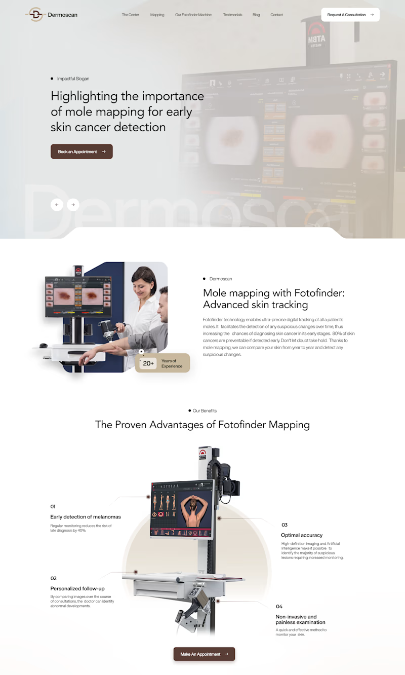
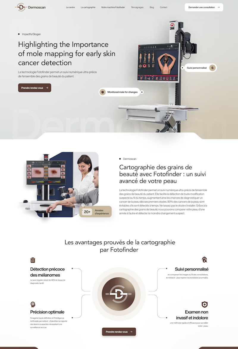
Same Dermoscan website, two hero layouts.
A: text left, machine image fills the right, clean and clinical
B: text left, Fotofinder machine right with floating feature callouts, feels more interactive
Which hero section communicates the product better at first glance? 👇
2 voted
18%
9 voted
82%
11 votes
Closed
Great Design Sumayya

🚀 A little reminder that sometimes we all need a wake-up call to stop overthinking and start creating!
As designers and developers, it’s easy to get caught up in planning, perfection, and waiting for the right moment. But progress happens when we take action.
What’s one thing...