The network for creativity
Join 1.25M professional creatives like you
Connect with clients, get discovered, and run your business 100% commission-free
Creatives on Contra have earned over $150M and we are just getting started
Back to feedPost
Taste Test

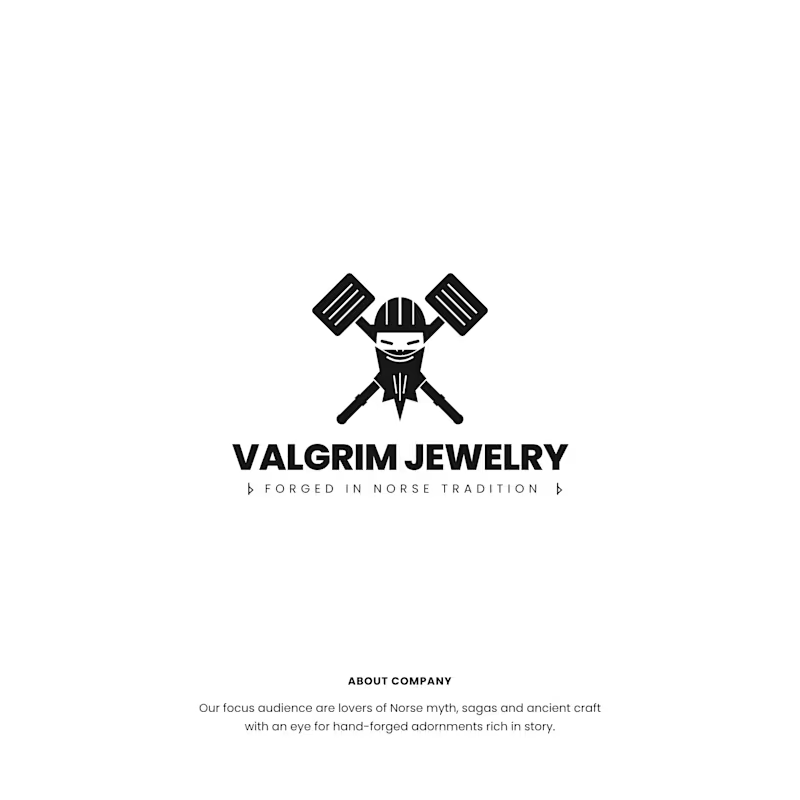
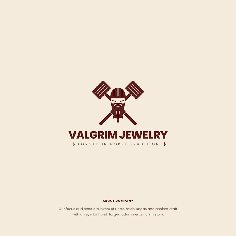
Two colorway directions for Valgrim Jewelry, a Norse-inspired hand-forged jewelry brand.
Same mark. Viking warrior with crossed hammers, “Forged in Norse Tradition.”
Option A: black on white. Raw, bold and graphic. Feels like it belongs on a forge.
Option B: deep burgundy on warm parchment. Aged and earthy. Feels like it belongs in a saga.
Which one would you wear on a pendant? 👇
3 voted
33%
6 voted
67%
9 votes
Closed

This mark is fire! Viking warrior + crossed hammers perfectly captures "Forged in Norse Tradition". Option A feels raw and bold 🔥

love the deep burgundy one

Black on white is great

Same Viking mark in two colorways is a great way to show how much tone comes from palette alone. Black on white feels forged and graphic, while the burgundy on parchment reads like a saga. For a jewelry brand I'd lean toward the parchment, since it feels more handed-down and collectible.
The network for creativity
Join 1.25M professional creatives like you
Connect with clients, get discovered, and run your business 100% commission-free
Creatives on Contra have earned over $150M and we are just getting started



Related posts

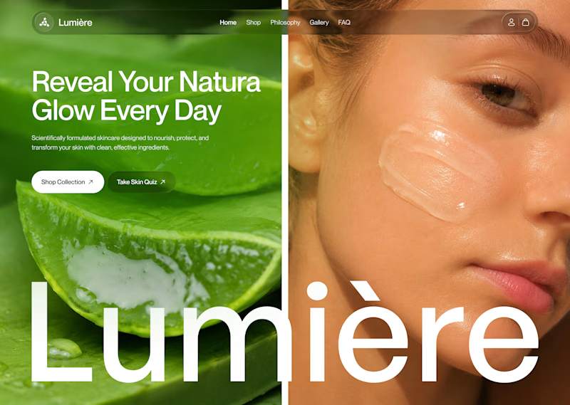
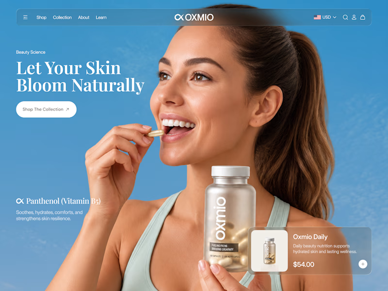
Your design has 3 seconds to earn attention. Which skincare brand wins?
A leads with confidence, energy, and aspiration. B builds trust through nature, freshness, and simplicity.
Great design doesn’t just look good. It makes people feel the brand before they read a word.
A or B? Which would make you stop scrolling?


30 voted
52%
28 voted
48%
58 votes
Closed


B without questions

Brand identity concept for Yummi! 🍊 Which presentation do you like more for this brand?
👉 Option A: Clean minimalist log
👉 Option B: Real cafe logo
It's really hard for me to manage which logo is best to look in mokcup designs.
Let me know your thoughts in the comments!
3 voted
43%
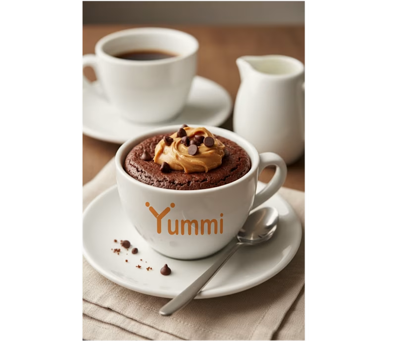
4 voted
57%
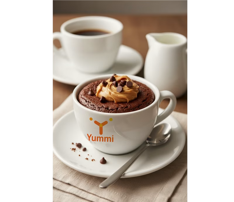
7 votes
Closed
Smaller is better

Same layout. Same copy. Completely different feel.
Swapping just the color palette and gradient glow changed the whole personality of this Wezzi hero section.
Which one fits a SaaS brand better? 👇

10 voted
50%
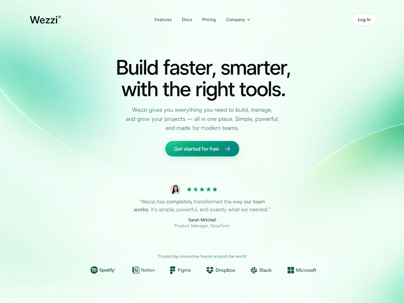
10 voted
50%
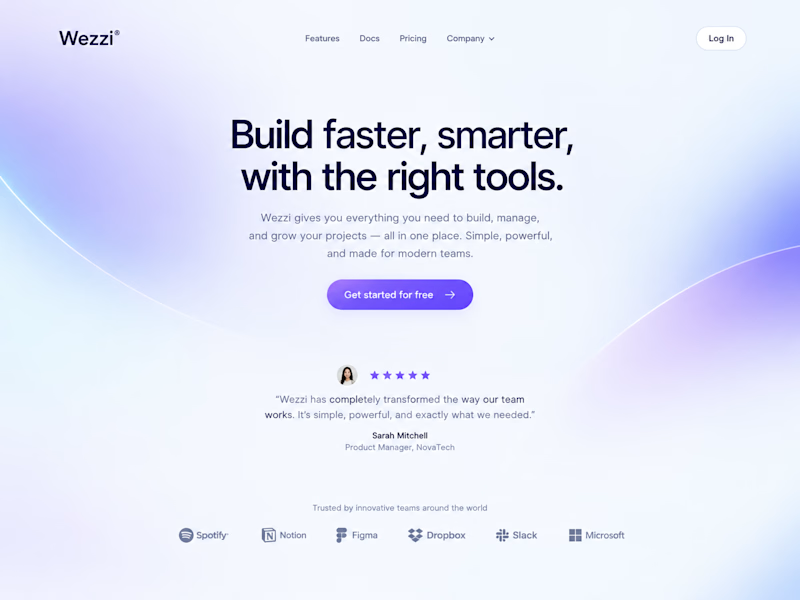
20 votes
Closed
Such a great demonstration Amina! It's amazing how just changing the color palette and gradient glow completely shifts the personality — same layout, same copy but totally different vibe. This Dreamy Haze version feels so soft, modern and perfect for a SaaS brand, very...