
pro
Fadhli Sheik
Motion Designer (Jitter) • AI • No code • Product Designer
- $1k+
- Earned
- 3x
- Hired
- 5.00
- Rating
- 24
- Followers
I set out to bridge the gap between high-end culinary aesthetics and functional food-tech UI. For kulilinari.com (http://kulilinari.com), the mission was to create a digital experience as appetising as the food itself.
As it's a one-pager and long-scrolling, I strategically mapped the user journey to place primary CTAs within natural thumb-reach zones, reducing cognitive load and friction during the selection process.
5
4
185
🚀
1 year.
Countless iterations.
One course page finally live.
Higher-ed UX hits differently, you’re not just organising content, you’re helping someone make one of their first big life decisions.
Shaped by student feedback, built through real collaboration, and designed for clarity over complexity.
Quietly proud of this one.
3
2
156
Benefits at a glance
0
3
Design system - Course listing page
0
8
Sping - Smart Freight & Logistics Platform
1
23
Ohyes I eventually made a custom component to import my 3D files into Framer and it's sleeeeek. You can adjust lighting and rotation speed too.
Will publish the component for free soon once I cleaned this up.
1
2
285
Landing Page Performer — Designing for clarity, motion & impact
1
16
Rizq X - Designing a premium digital presence for growth
0
22
Jetpac Global
1
17
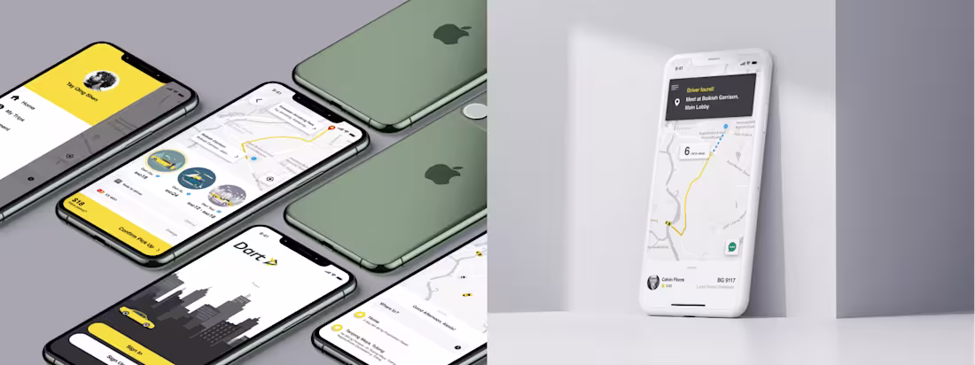
Dart App — Intuitive mobile experience design
0
12
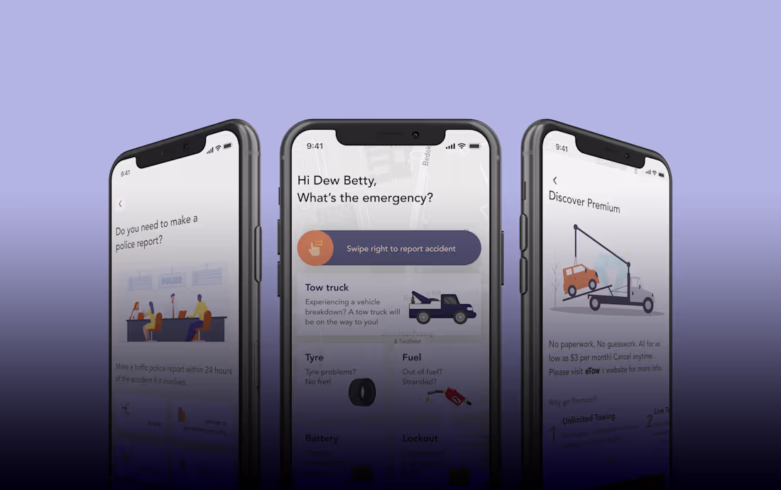
🚗 Towing App
0
16