
Eugenia Gulkevych
Graphic Designer specializing in branding, identity & digita
New to Contra
Eugenia is building their profile!

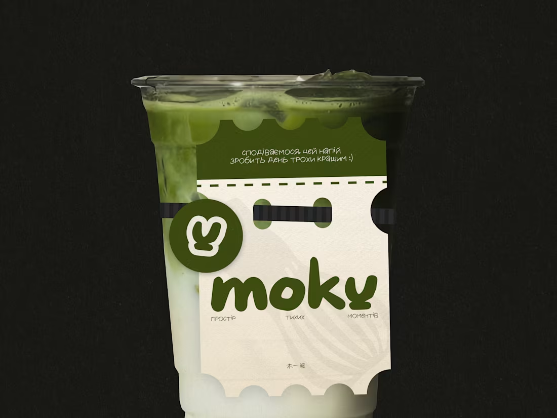
MOKU — Matcha Café Brand Identity
MOKU is a conceptual matcha café in Kyiv, created around a dark, atmospheric interpretation of Japanese-inspired aesthetics.
The identity was designed to move away from the light, pastel, and overly playful visual language often associated with matcha cafés. Instead, MOKU combines deep, muted tones with Japanese-inspired visual references to create a more sophisticated, atmospheric, and distinctive character.
The branding explores a balance between traditional Japanese aesthetics and a contemporary café experience. The visual system includes the logo, typography, color palette, graphic elements, and supporting applications, creating a cohesive identity across the café environment and brand materials.
The result is a dark and refined visual identity that feels calm, modern, and rooted in Japanese-inspired culture while still being approachable for a contemporary Kyiv audience.
3
33
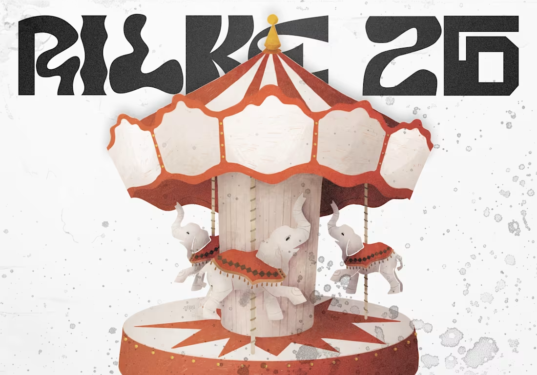
Rilke26 — Literary Festival Identity
Rilke26 is a visual identity concept for a literary festival inspired by the work and legacy of Rainer Maria Rilke.
The project explores how literature, poetry, and Rilke’s distinctive atmosphere can be translated into a contemporary visual language. The identity combines expressive typography with a graphic system designed to create a recognizable and cohesive festival presence.
The project includes the development of the visual identity, typography, graphic compositions, and promotional materials, creating a flexible system that can be applied across different festival touchpoints.
0
23
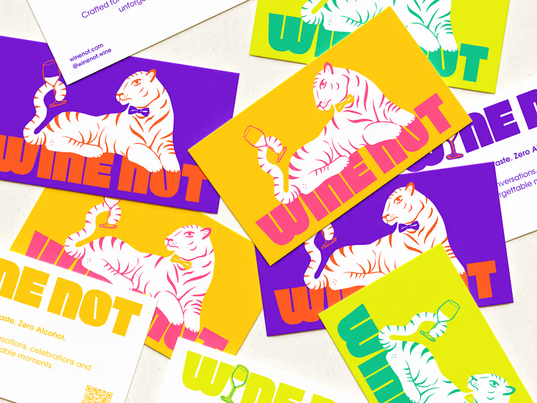
WineNot Brand — Visual Identity & Branding
WINE NOT is a non-alcoholic wine brand created for a younger, modern audience looking for an alternative to traditional wine.
The identity combines a playful and expressive visual language with a clean, contemporary foundation. The project included the development of the brand identity, logo, typography, color palette, and a custom illustration system.
The illustrations were created as an important part of the brand’s personality, adding a more approachable and distinctive character to the identity. They were designed to work across different brand touchpoints while keeping the visual language consistent and recognizable.
The final identity brings together branding, illustration, and packaging to create a cohesive and memorable presence for a modern non-alcoholic wine brand.
1
24
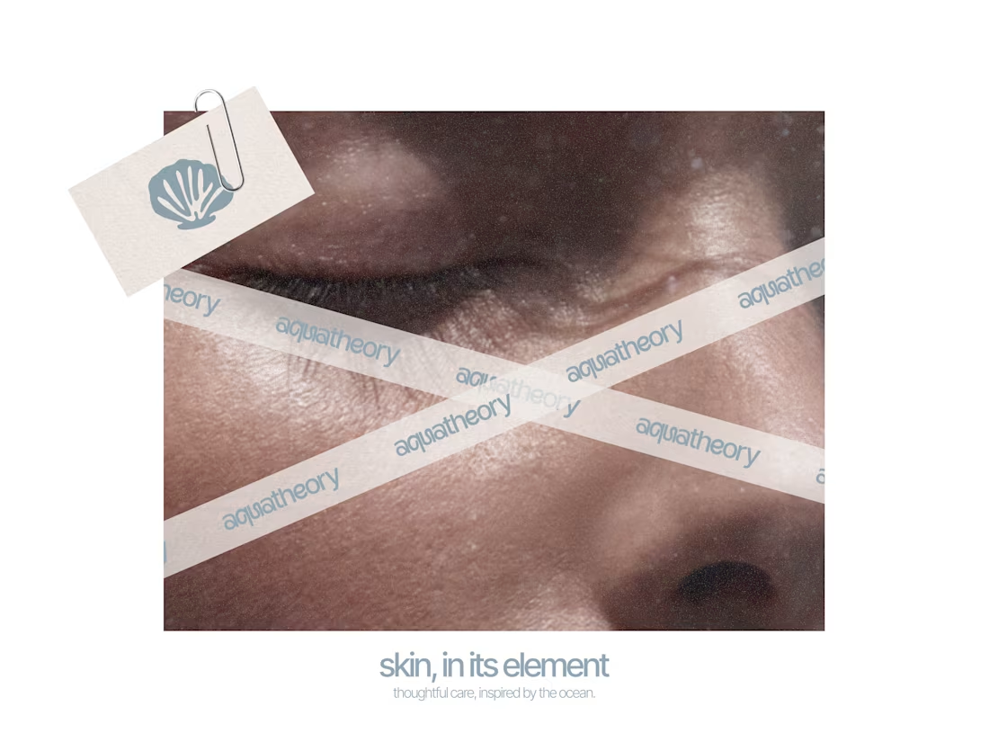
Aquathery — Minimal Skincare Brand Identity
Aquathery is a conceptual skincare brand created around a light, minimal, and elegant visual direction.
The project focused on developing both a typographic logo and a symbol that could communicate the brand's clean and feminine character while remaining versatile across different applications.
I explored typography, proportions, and simple visual elements to create a refined identity that feels modern, approachable, and timeless.
0
23