Esther Inontah
Design Partner to Founders | Mobile & Web Apps | Websites
Ready for work
Esther is ready for their next project!
Prototype ✨
Instead of static slides, I designed an interaction loop that:
• Sparks curiosity
• Builds visual momentum
• Nudges decisive action
I care a lot about how early product moments shape conversion and retention.
Always committed to building thoughtful, high-impact experiences with teams that values design 🚀
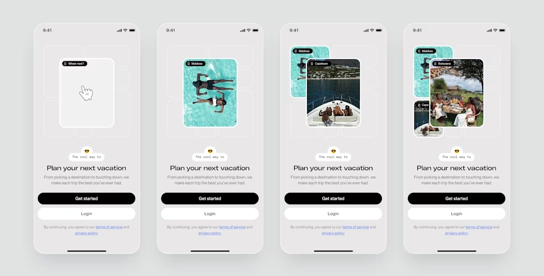
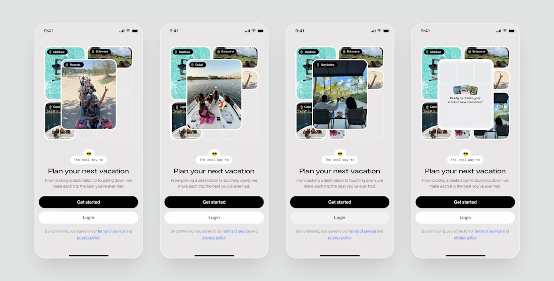
Onboarding screen for a travel planning app✨
Instead of static slides, I designed this as an interactive journey.
• The default state sparks curiosity
• Tap reveals possible destinations progressively
• Final state nudges users to create their own stack of memories
The overall goal...
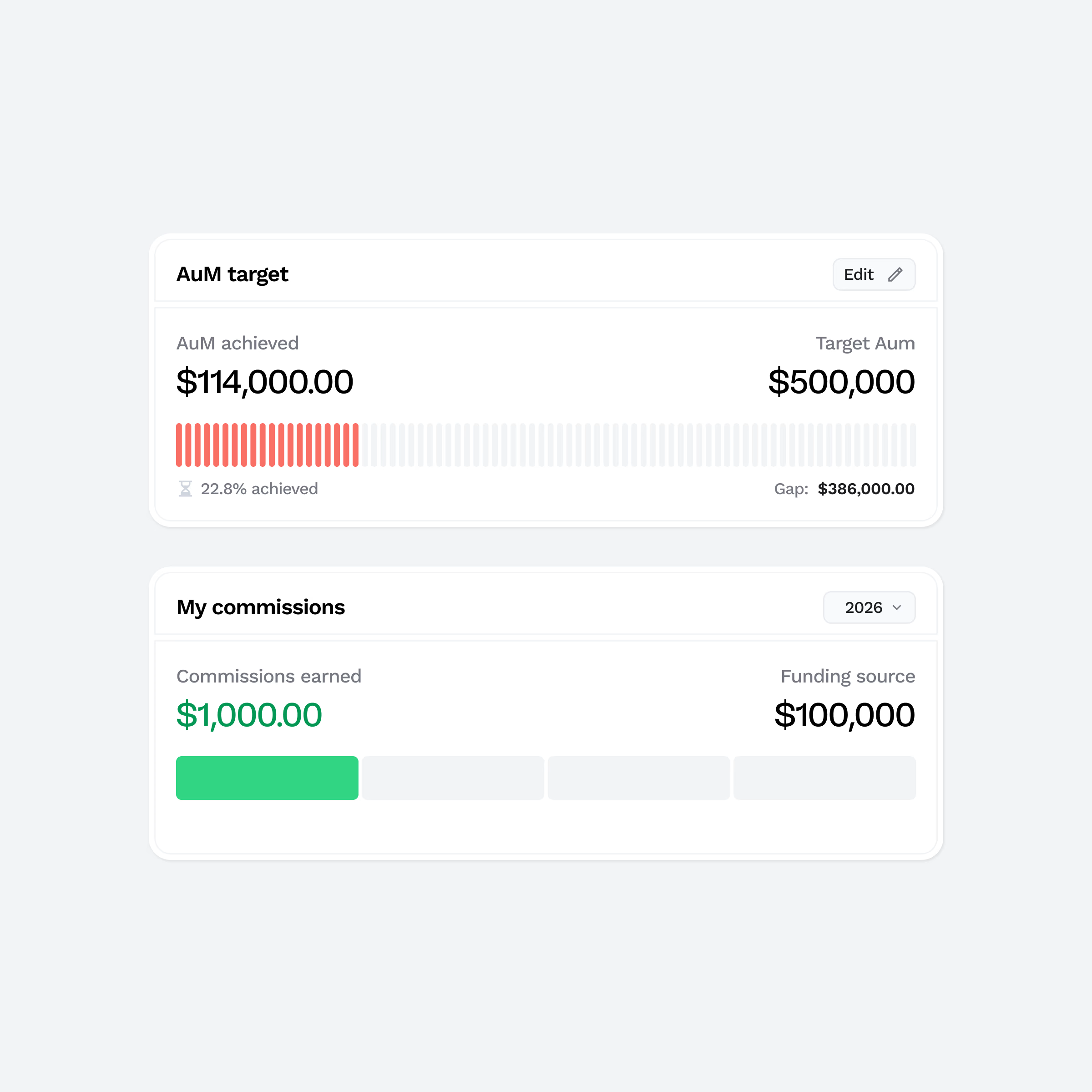
Some data visualisation components I designed for a sales management admin tool✨
The goal was to:
• Make AUM progress instantly scannable
• Surface funding gaps clearly
• Highlight earned commissions alongside funding sources
The segmented progress indicators help quantify...
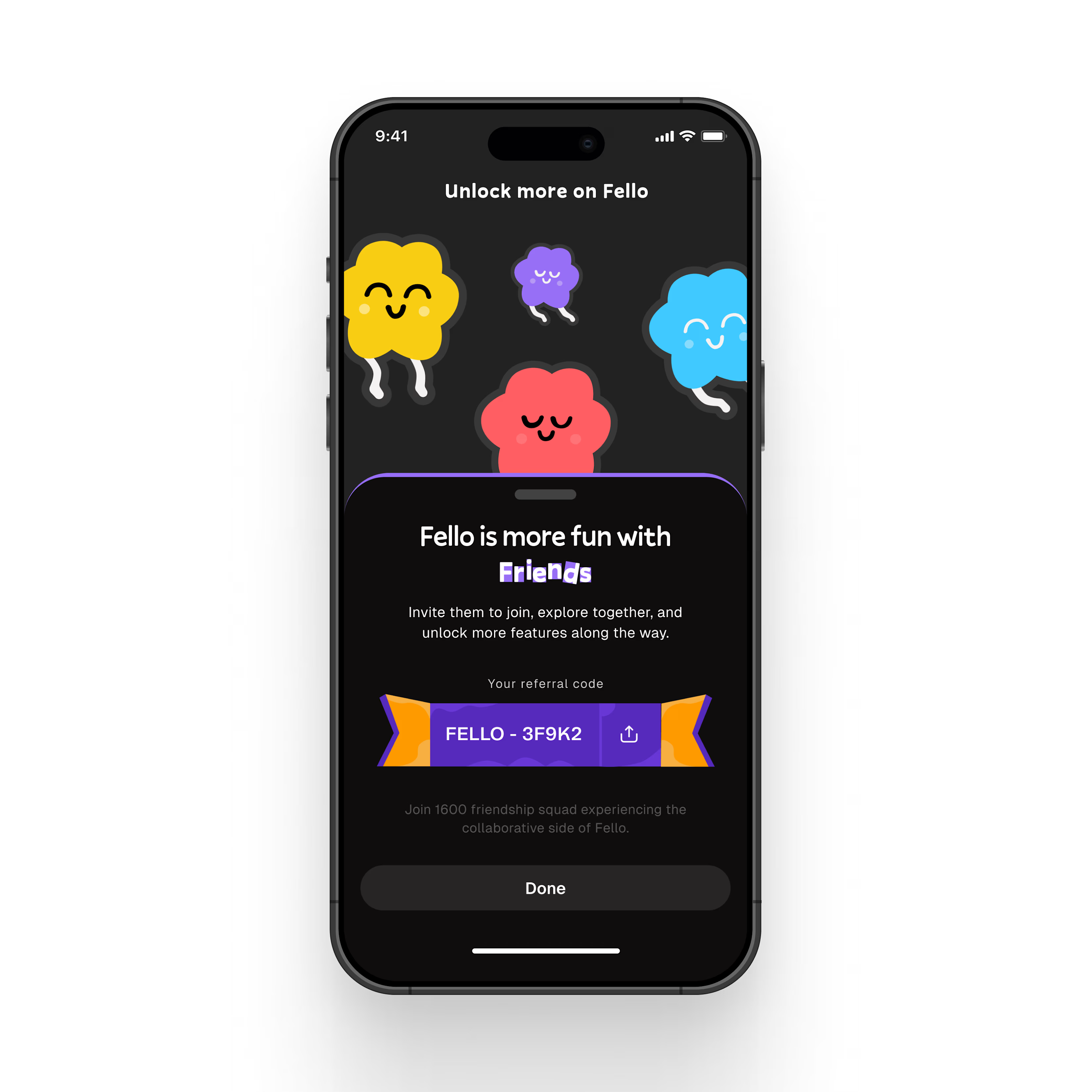
This referral invite screen was designed to drive organic growth while keeping the experience light and social.
The custom illustrations reinforce the primary copy that says “Fello is better with friends,” while the bold referral code component ensures clarity and easy sharing.
...
This is the way to go, honestly 👌
Clients are actual people, and just like every other human, they appreciate genuinity and an honest desire to help solve their problem.
Even though they rightfully pay for these services, they tend to stick with people who approach...

