
Esther Inontah
Design Partner to Founders | Mobile & Web Apps | Websites
Ready for work
Esther is ready for their next project!
Prototype ✨
Instead of static slides, I designed an interaction loop that:
• Sparks curiosity
• Builds visual momentum
• Nudges decisive action
I care a lot about how early product moments shape conversion and retention.
Always committed to building thoughtful, high-impact experiences with teams that values design 🚀
2
2
52
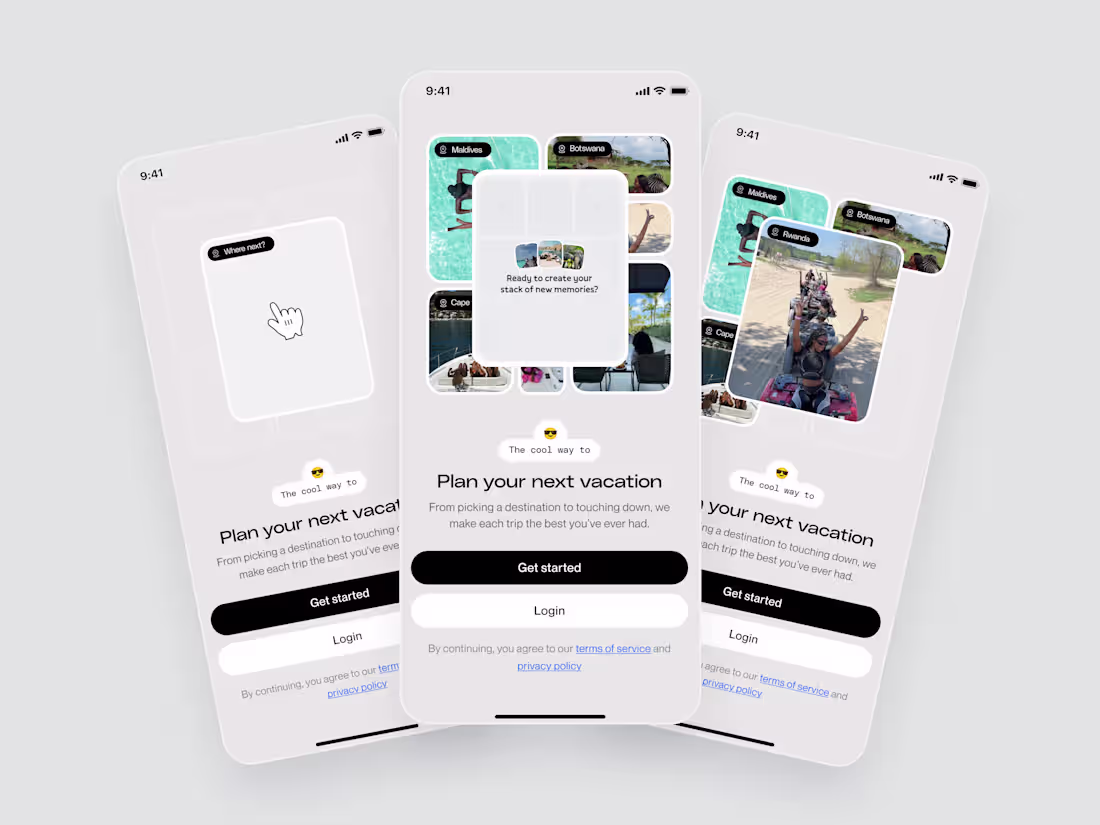
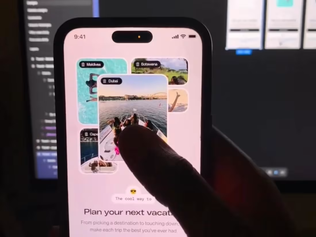
Onboarding screen for a travel planning app✨
Instead of static slides, I designed this as an interactive journey.
• The default state sparks curiosity
• Tap reveals possible destinations progressively
• Final state nudges users to create their own stack of memories
The overall goal of this approach is to: increase emotional buy-in, and increase users desire to tap "Get started"
I'd share the prototype soon.
2
2
75
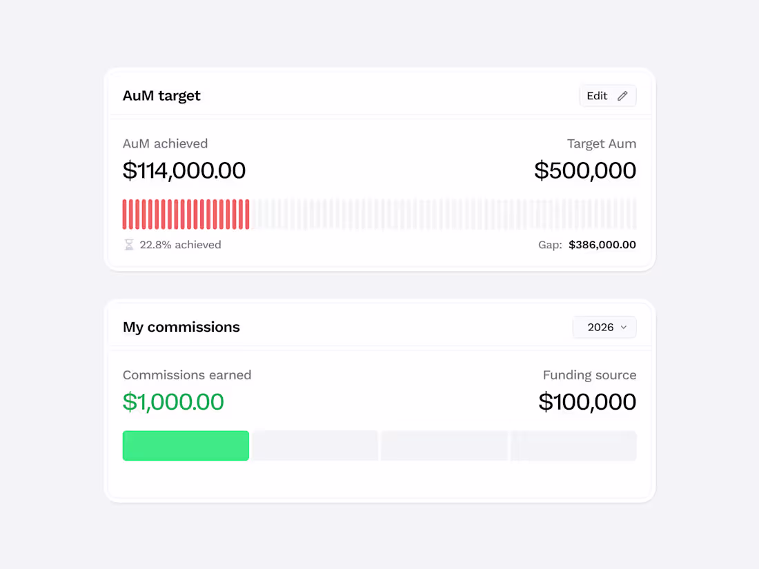
Some data visualisation components I designed for a sales management admin tool✨
The goal was to:
• Make AUM progress instantly scannable
• Surface funding gaps clearly
• Highlight earned commissions alongside funding sources
The segmented progress indicators help quantify momentum, while the typographic hierarchy ensures decision-makers can assess performance in seconds.
Happy to hear your thoughts on it.
3
83
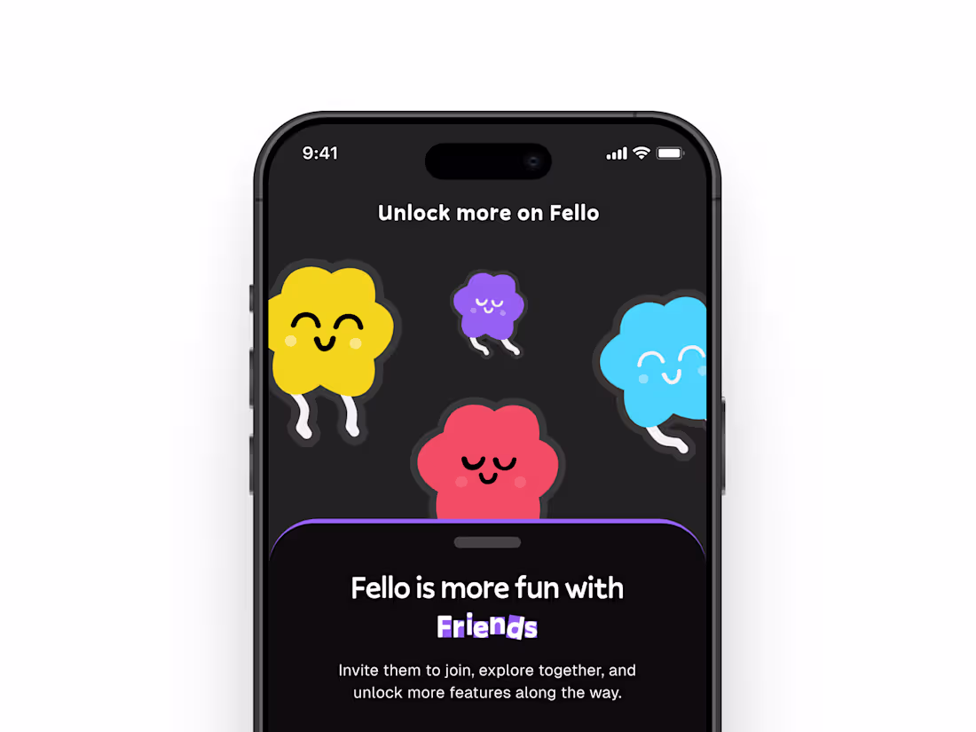
This referral invite screen was designed to drive organic growth while keeping the experience light and social.
The custom illustrations reinforce the primary copy that says “Fello is better with friends,” while the bold referral code component ensures clarity and easy sharing.
The dark theme creates contrast and hierarchy, guiding attention from value proposition → referral code → action.
Designed to increase user-driven acquisition while maintaining brand personality and emotional appeal.
Happy to hear your thoughts on this.
To work with me, contact: esther.designpartner@gmail.com
(mailto:esther.designpartner@gmail.com)Or book a call: https://cal.com/esther.designpartner
2
88
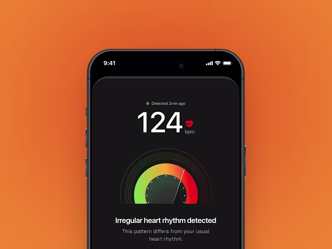
Designing for medical signals
When a user’s heart rhythm changes, the interface shouldn’t cause panic, but provide a clear information and guide the user on the next necessary action to take.
This concept explores how health data can be communicated responsibly, while balancing data, hierarchy, and necessary actions.
2
124
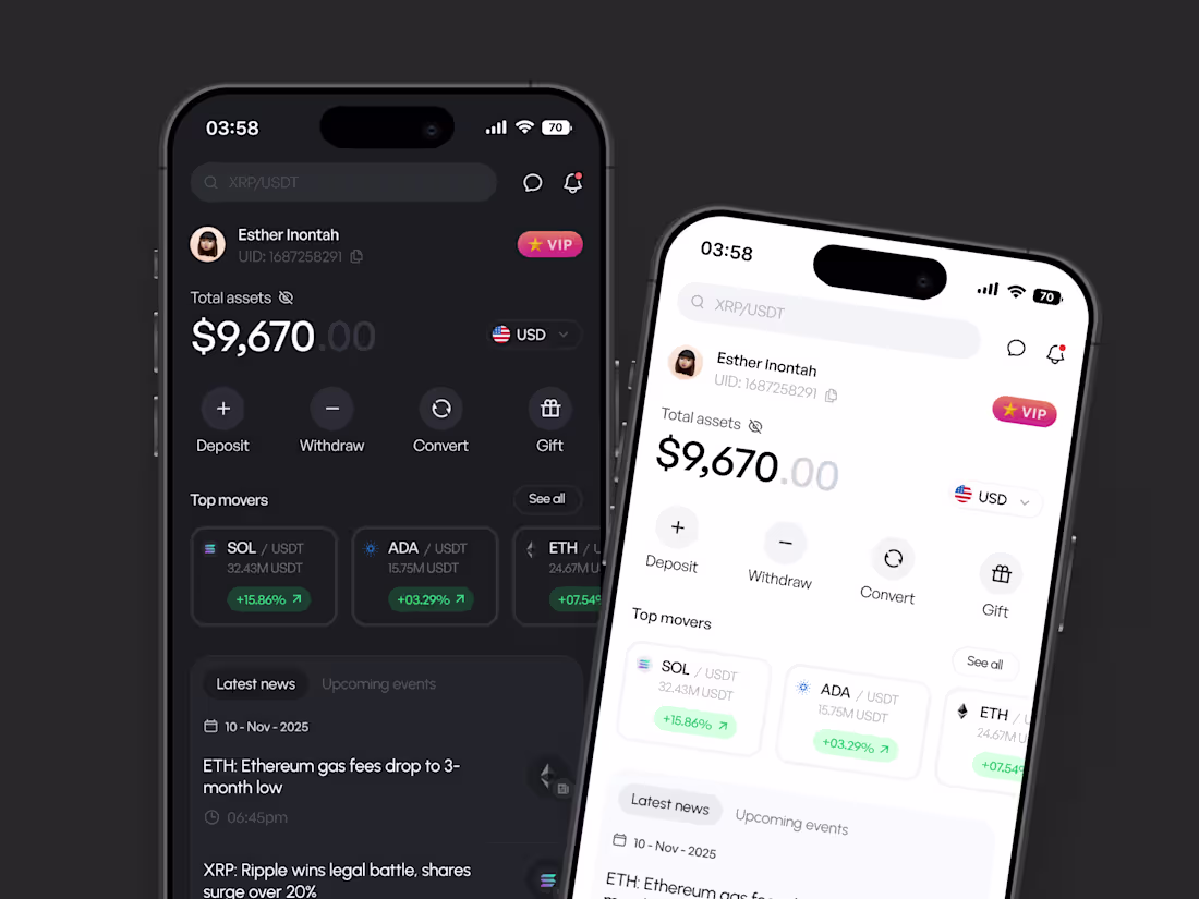
This project explores the design of a modern crypto trading dashboard focused on clarity, speed, and control, especially in high-information environments.
The goal was to present complex financial data in a way that feels approachable without sacrificing depth or control.
I designed both light and dark themes to support different user preferences while maintaining strong visual hierarchy and readability.
Key actions like deposits, withdrawals, and conversions are prioritized, with market performance and news presented in a clean, scannable layout.
1
119
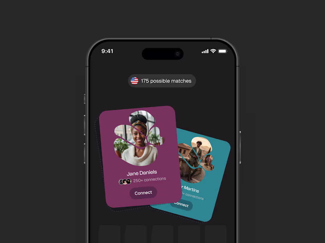
I designed and prototyped an onboarding screen for an app that helps people find and connect with others with similar interests.
The focus was on making the first screen feel welcoming, clear, and exciting enough to want to explore what's next.
Happy to hear your thoughts on it.
1
112
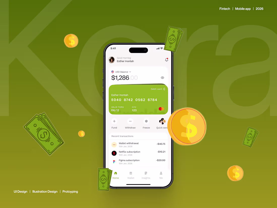
A Clarity-First Finance App Experience
1
2
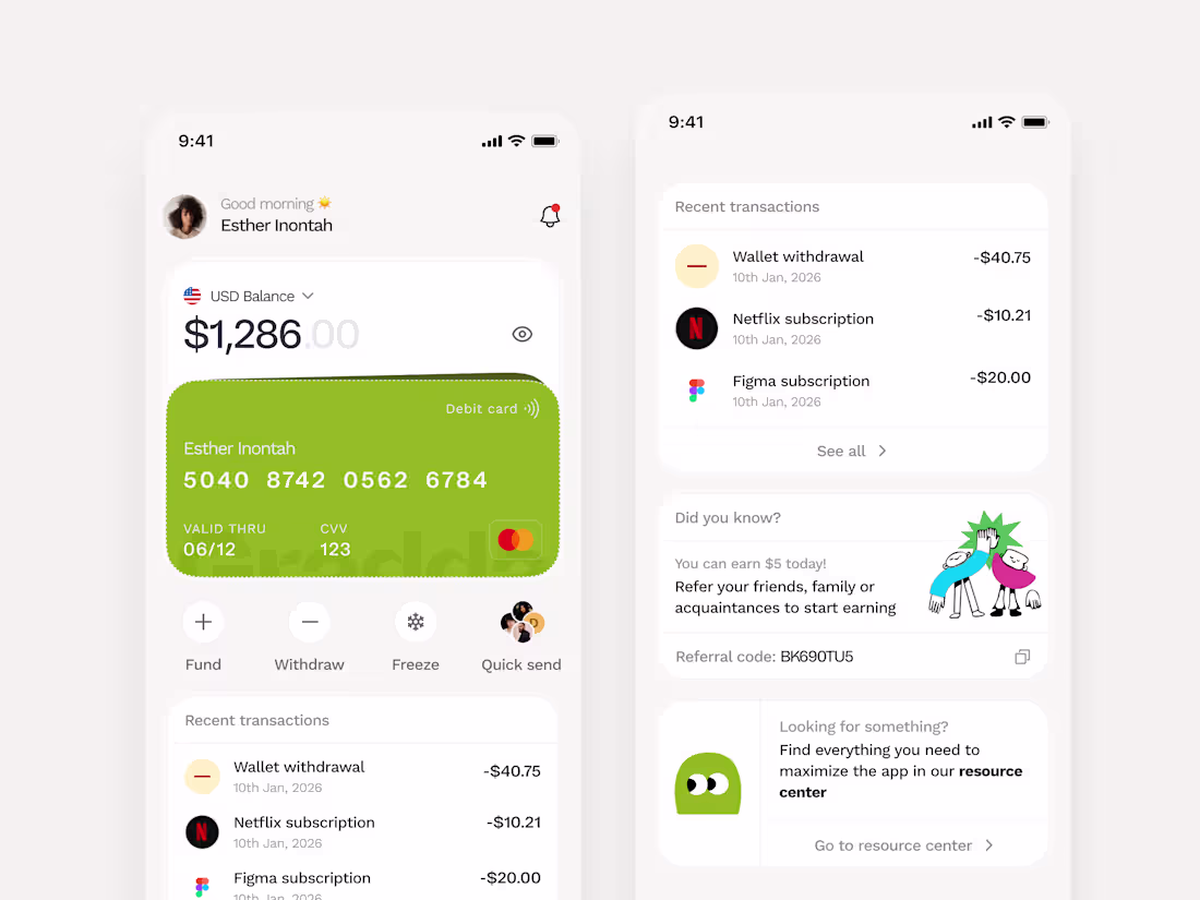
Home screen design for a finance management platform.
I recreated the illustrations used in the designs as well.
Happy to hear your thoughts on it.
Would be sharing the case study, once done.
2
151