
Emmanuel Daniel
Product Designer · SaaS Dashboard Design · App Screenshot
Ready for work
Emmanuel is ready for their next project!
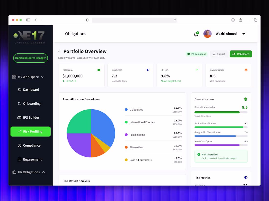
IPS Builder Module Development for ONE17 Capital
0
0
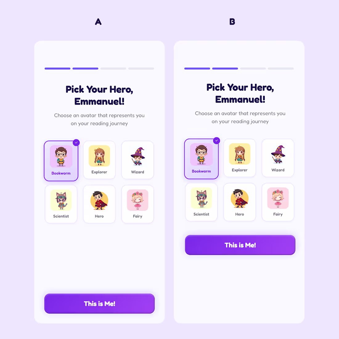
Currently working on a Story app for a client and i got to ask myself something
Which is a better button placement for accessibility and why
A or B
0
57

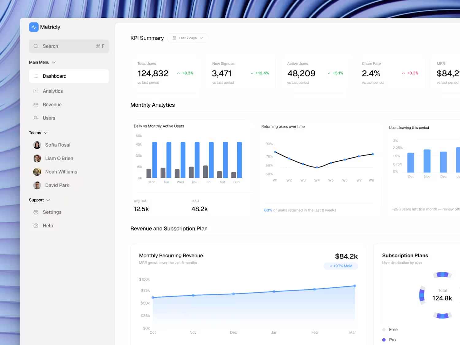
Here's how I designed a SaaS analytics dashboard that reduces churn and the decisions behind it.
KPI cards first. Total Users, Signups, Active Users, Churn Rate, MRR all above the fold. The founder should never have to scroll to know if the business is healthy.
Churn gets its own chart. Most dashboards bury churn in a settings page. I put "Users leaving this period" right next to the retention and engagement charts because churn context only makes sense next to growth data.
Revenue and subscription plan in one section. MRR trend + plan distribution side by side = one complete picture of revenue health.
Sidebar stays minimal. Dashboard, Analytics, Revenue, Users. That's it. No feature bloat. No 12-item mega menu.
The result: a founder can open this dashboard and make a decision in under 60 seconds.
I design SaaS dashboards for founders who want to reduce churn and improve retention. Open to new projects.
#UIDesign #UXDesign #ProductDesign #SaaSDesign #DashboardDesign #Figma #SaaS
3
125
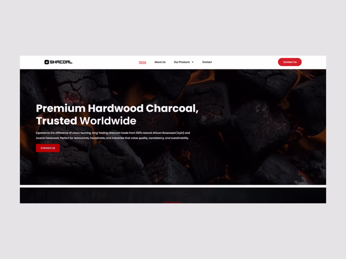
SHARCOAL Rebranding and Website Redesign
0
0
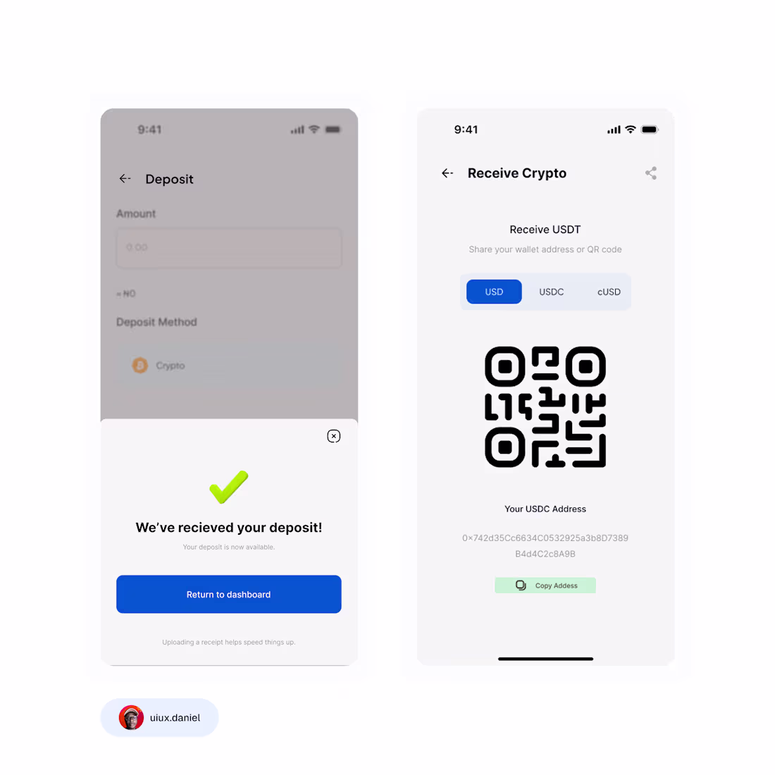
Just wrapped this clean mobile flow for Senti a digital wallet that lets users deposit funds and receive crypto without stress.
My focus here was simple:
make money movement feel calm, clear, and predictable.
So I designed:
a smooth onboarding screen
a clean deposit flow with both success & error states
and a crisp “receive crypto” page with wallet options + QR
Little things like spacing, icon clarity, and easy buttons are what make users feel safe when real money is involved and that’s exactly what I leaned into.
If you’re building a fintech or Web3 product and want your UI to feel trustworthy and modern, I can help you design something users actually enjoy using.
2
5
148