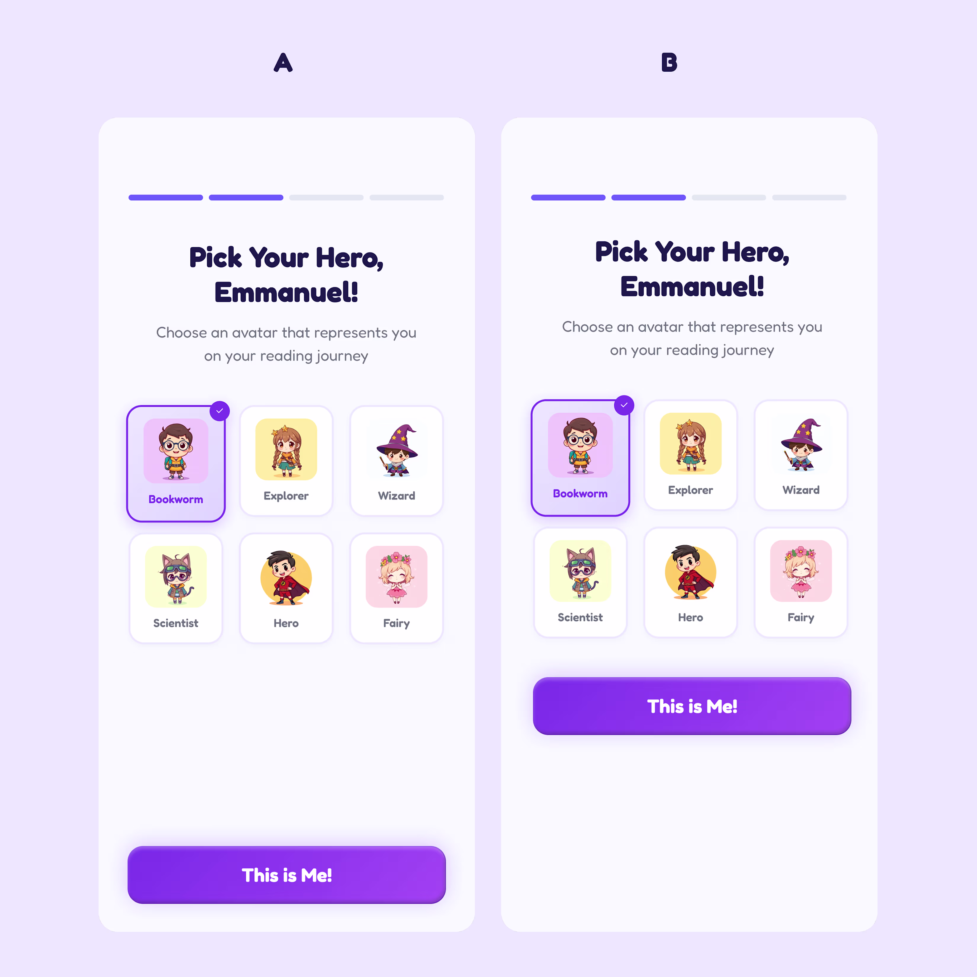
Currently working on a Story app for a client and i got to ask myself something
Which is a better button placement for accessibility and why
A or B
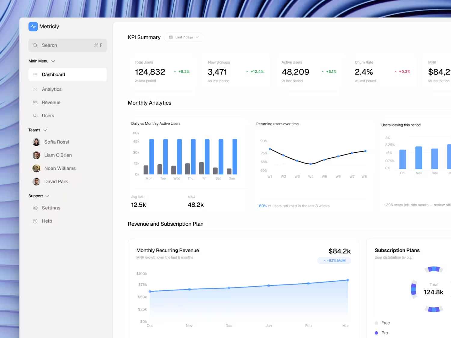
Here's how I designed a SaaS analytics dashboard that reduces churn and the decisions behind it.
KPI cards first. Total Users, Signups, Active Users, Churn Rate, MRR all above the fold. The founder should never have to scroll to know if the business is healthy.
Churn gets its own...

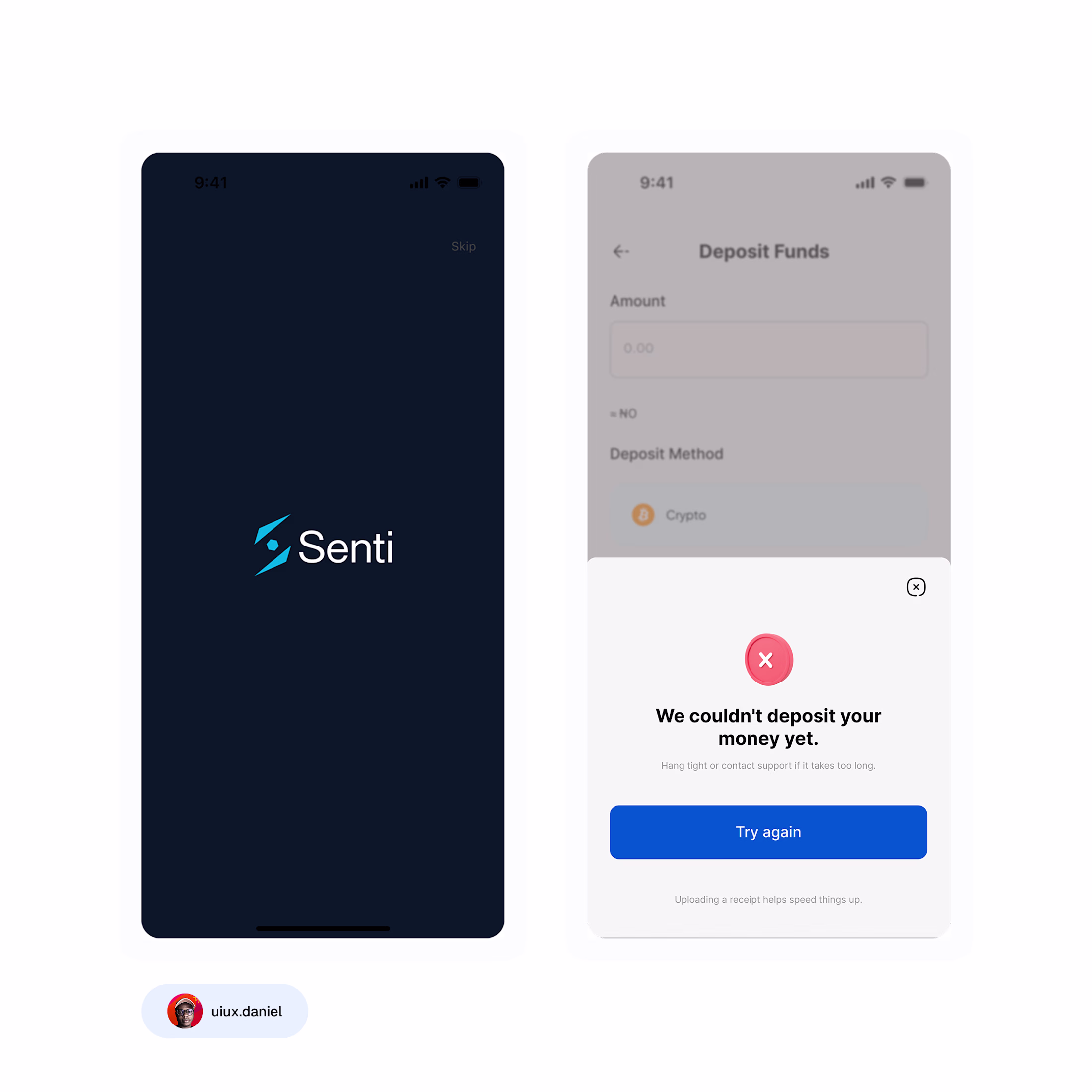
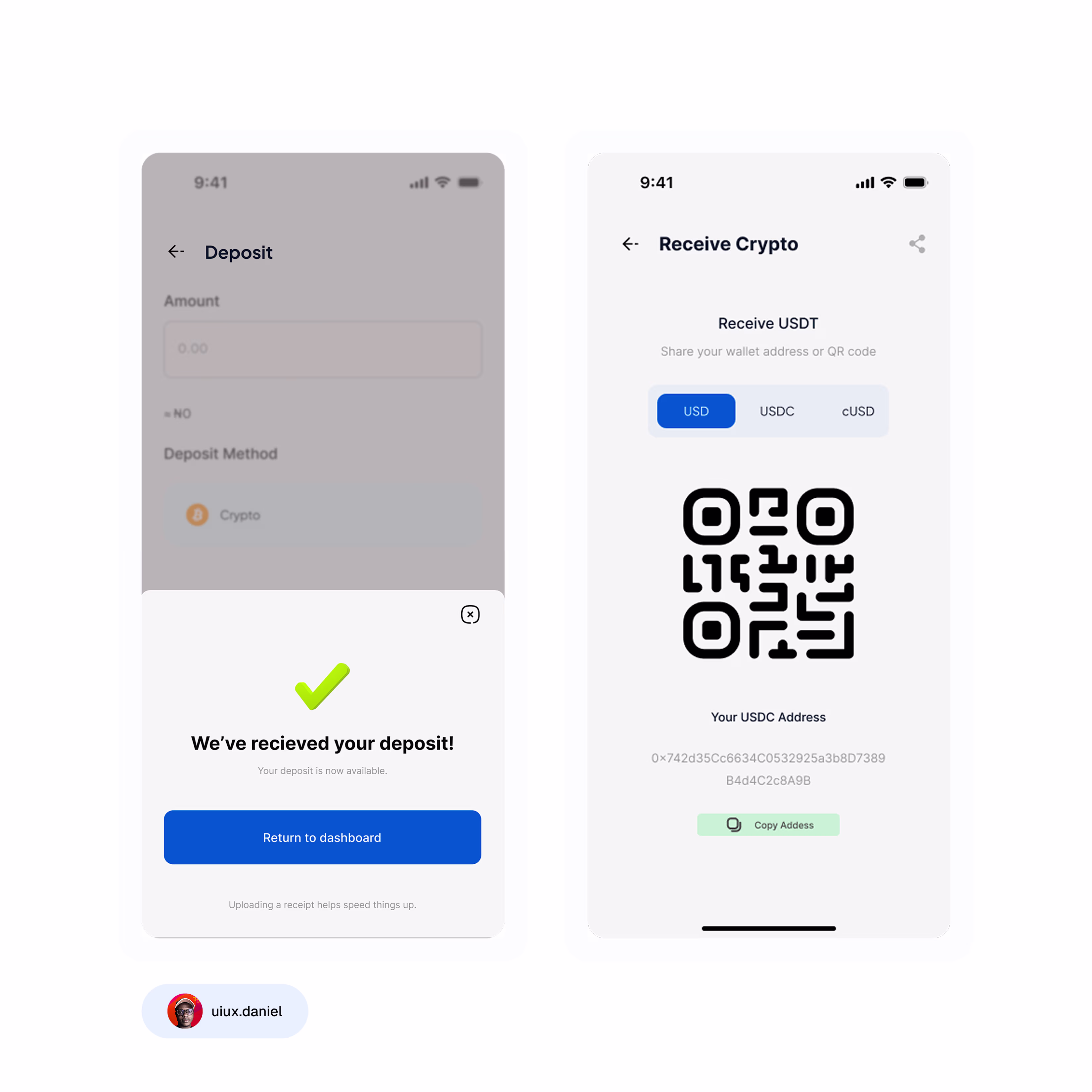
Just wrapped this clean mobile flow for Senti a digital wallet that lets users deposit funds and receive crypto without stress.
My focus here was simple:
make money movement feel calm, clear, and predictable.
So I designed:
a smooth onboarding screen
a clean deposit flow with both...
People often ask me what inspires me to make minimalistic designs, but i just know that less is more and design speaks volume when you know exactly what to remove.
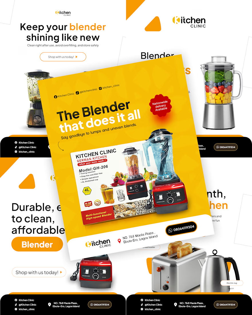
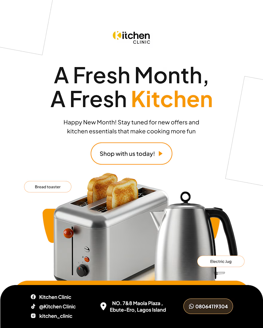
A project i handled for Kitchen Clinic