The network for creativity
Join 1.25M professional creatives like you
Connect with clients, get discovered, and run your business 100% commission-free
Creatives on Contra have earned over $150M and we are just getting started
Back to feedPost
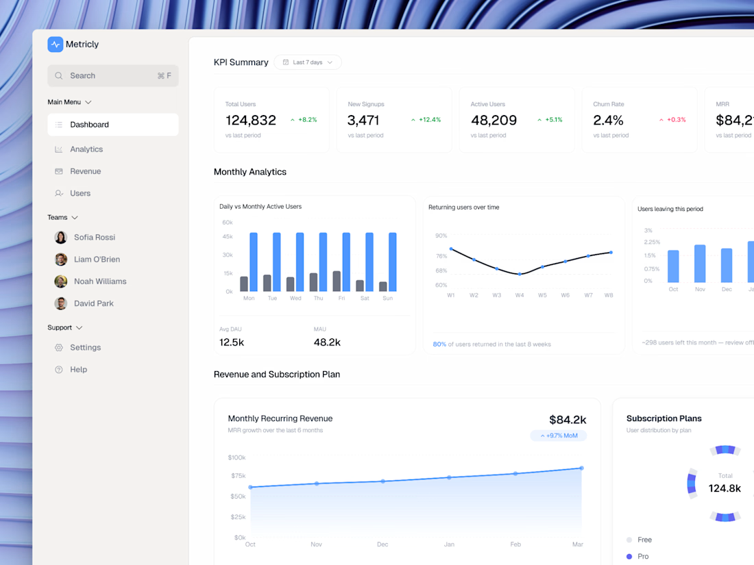
Here's how I designed a SaaS analytics dashboard that reduces churn and the decisions behind it.
KPI cards first. Total Users, Signups, Active Users, Churn Rate, MRR all above the fold. The founder should never have to scroll to know if the business is healthy.
Churn gets its own chart. Most dashboards bury churn in a settings page. I put "Users leaving this period" right next to the retention and engagement charts because churn context only makes sense next to growth data.
Revenue and subscription plan in one section. MRR trend + plan distribution side by side = one complete picture of revenue health.
Sidebar stays minimal. Dashboard, Analytics, Revenue, Users. That's it. No feature bloat. No 12-item mega menu.
The result: a founder can open this dashboard and make a decision in under 60 seconds.
I design SaaS dashboards for founders who want to reduce churn and improve retention. Open to new projects.
#UIDesign #UXDesign #ProductDesign #SaaSDesign #DashboardDesign #Figma #SaaS
The network for creativity
Join 1.25M professional creatives like you
Connect with clients, get discovered, and run your business 100% commission-free
Creatives on Contra have earned over $150M and we are just getting started
Related posts
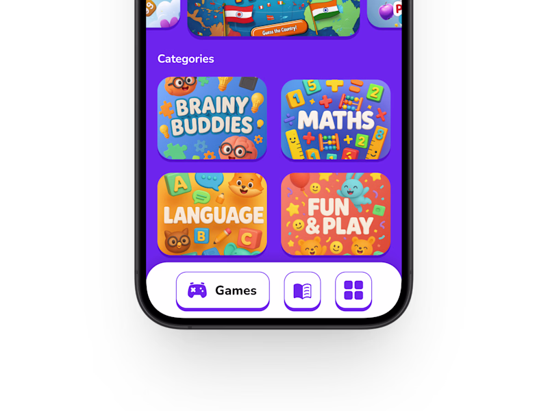
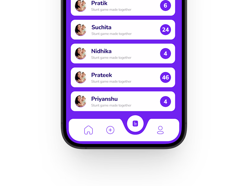
This is an AI-powered entertainment platform designed for young kids, focused on creating a safe, engaging, and intuitive experience for early-age users.
Currently exploring two different navbar approaches for the app interface. Which one feels more suitable for a children-focused experience? 🎨🧩
19 voted
63%
11 voted
37%
30 votes
Closed
Nice!
The best kind of portfolio update is seeing the work keep working!!
Last year, I helped build the foundation for Sleep or Die, from brand strategy and identity to creative direction and photography.
🤯 Just this week the brand has gone on to receive $1M in funding, and I’ve been seeing accounts with 75K–100K+ followers sharing the brand and some of the photography I created in those early stages.
While the brand has evolved since my initial work with them, it’s a nice reminder that the early stuff matters. The strategy, the visuals, the tone, the way a brand shows up before most people know who they are; it all becomes part of the foundation.
Very grateful to have played a role in getting this one off the ground!!
branddesignerbrandstrategistgraphicdesignerBrand StrategyBrand DesignGraphic DesignAdobe IllustratorAdobe SuiteFigma

This is wonderful 😊
Different feelings when you see brand you worked for grow to success
Looks amazing
Trending
Claude
Claude has entered the design space. How are you using Claude Design?
Contra University
Learn from expert creatives how to earn more using next-gen AI tools.
creativeaiflow
Creative AI workflows are evolving. What tools do you use, and what are their strengths and weaknesses?
portfolioreview
The best portfolios tell a story, not just show a grid. Share yours for feedback.
freelancerlife
Freelancer life is wins, pivots, and everything in between. What’s yours right now?