The network for creativity
Join 1.25M professional creatives like you
Connect with clients, get discovered, and run your business 100% commission-free
Creatives on Contra have earned over $150M and we are just getting started
Back to feedPost
Taste Test

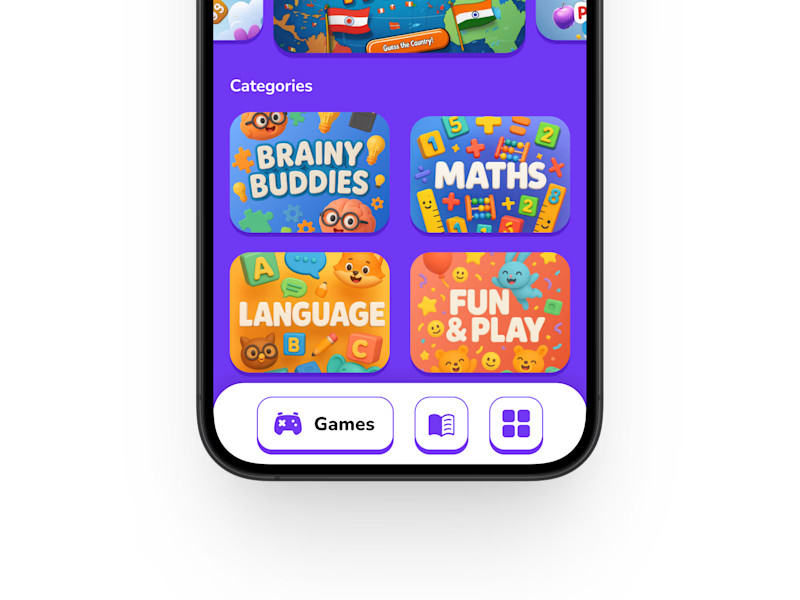
This is an AI-powered entertainment platform designed for young kids, focused on creating a safe, engaging, and intuitive experience for early-age users.
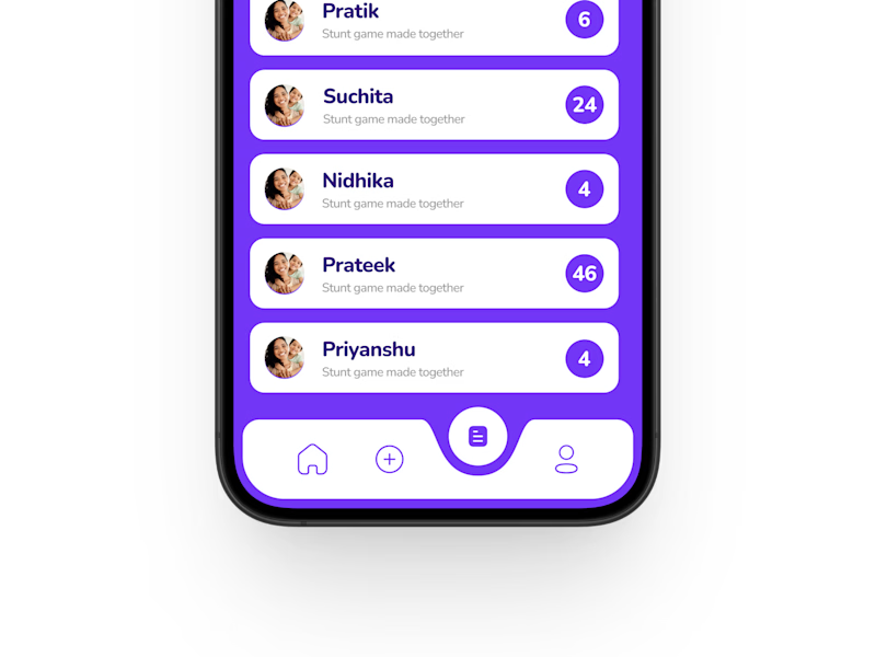
Currently exploring two different navbar approaches for the app interface. Which one feels more suitable for a children-focused experience? 🎨🧩
17 votes
Ends in 1d

Nice!
Thanks !!

For kids, I would lean toward the option with clearer labels and larger tap targets. Recognition matters more than minimalism here.
Exactly my thought process as well. Since it’s designed for kids, I wanted the navigation to feel clearer and easier to interact with. Appreciate the feedback!

Bar 1 is super nice
Appreciate it !!
You are welcome

Am going for bar 1 since is made for kids it should feel playful

if your target audience is children, navigation bar 1 feels more suitable and attractive😍

I went with Navigation Bar 1 because it feels more playful, colorful, and intuitive for kids ✨
The larger icons and category-focused layout make it easier and more engaging for early-age users to navigate.

Amazing designs!
The network for creativity
Join 1.25M professional creatives like you
Connect with clients, get discovered, and run your business 100% commission-free
Creatives on Contra have earned over $150M and we are just getting started
Related posts

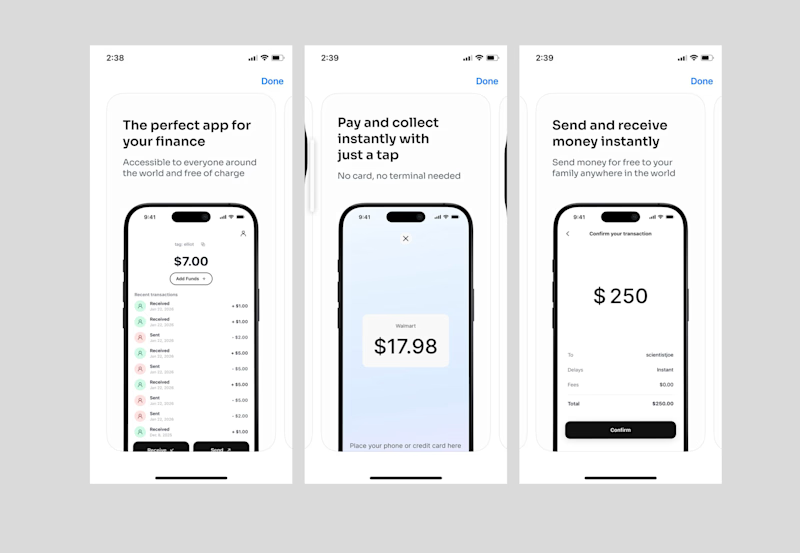
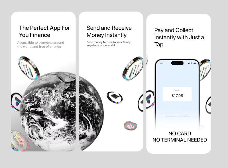
Redesigned this Tilt Pay App store design and I think the difference speaks for itself. Curious, which option feels best to you ?

7 voted
14%
42 voted
86%
49 votes
Closed

Option 2 is definitely way better, but i think there's some alignment issues to the margin and consistency issues with the subtext.

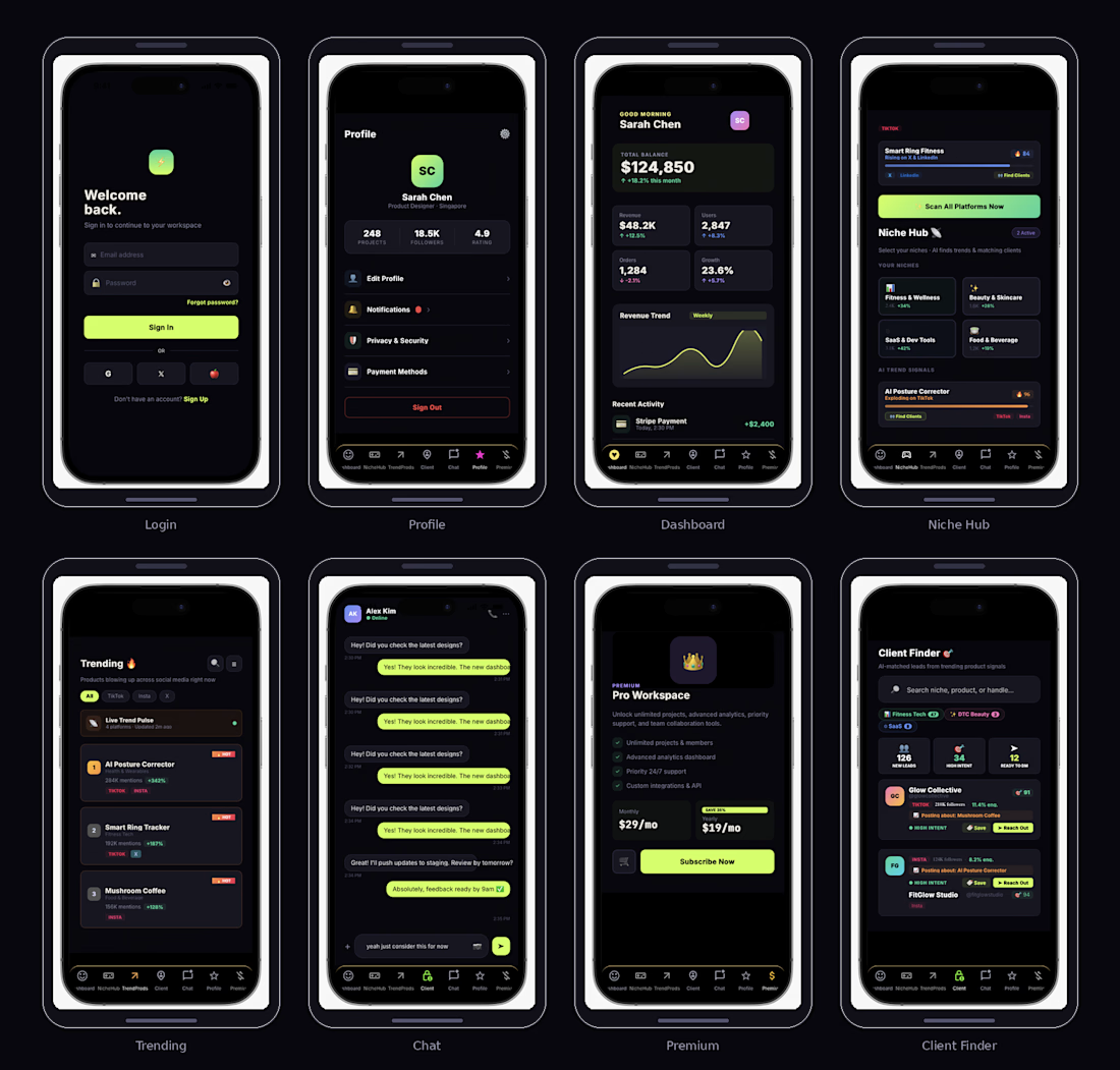
Here's my submission for the @Bubble.io X @Contra HQ 👾
PulseWay is a mobile-first social intelligence tool that scans trending products across TikTok, Instagram, X, and LinkedIn — then matches small businesses with potential clients who are already engaging with those trends.
Link: PulseWay
The problem 😶🌫️
Small businesses and freelancers spend hours scrolling, cold DMing, and guessing who might need their services. There's no shortage of demand — viral products create buying intent every single day — but there's no simple way to connect that trending signal to an actual lead you can reach out to. The gap between "this product is blowing up" and "here's someone ready to buy" is where most small businesses lose time and money.
Category ☀️
Productivity / Sales & Marketing tools for solopreneurs, freelancers, and small business owners.
Seasonal connection📈
Summer is launch season — new products flood social media, creators push content harder, and consumer spending peaks. The App is built for this exact window: when trends move fast, the businesses that spot them first and reach the right people first win. The tool turns seasonal trend spikes into a client acquisition engine rather than noise you scroll past.
Monetisation💰
Freemium model with two tiers. Pro ($19/mo yearly, $29/mo monthly) unlocks unlimited niche tracking, full client finder with AI match scores, real-time alerts, direct in-app outreach, and advanced analytics. The 35% yearly discount drives annual commitments and predictable revenue.


Stunning!

Already in love with this one 🐣
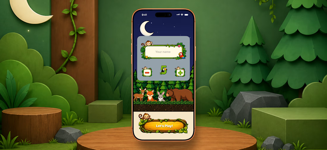
Designed and developed for one of my latest projects. The onboarding is my favorite part so far.
Creative design with a fully custom UI and original characters. built with SwiftUI.
What do you think?


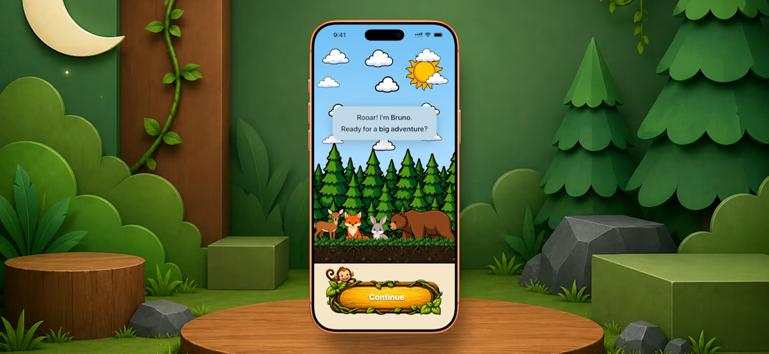

I’m in love with this animation 😍
It really gives me the feeling of old-school games🔥







Trending

Claude
Claude has entered the design space. How are you using Claude Design?

Contra University
Learn from expert creatives how to earn more using next-gen AI tools.
creativeaiflow
Creative AI workflows are evolving. What tools do you use, and what are their strengths and weaknesses?
portfolioreview
The best portfolios tell a story, not just show a grid. Share yours for feedback.
freelancerlife
Freelancer life is wins, pivots, and everything in between. What’s yours right now?