
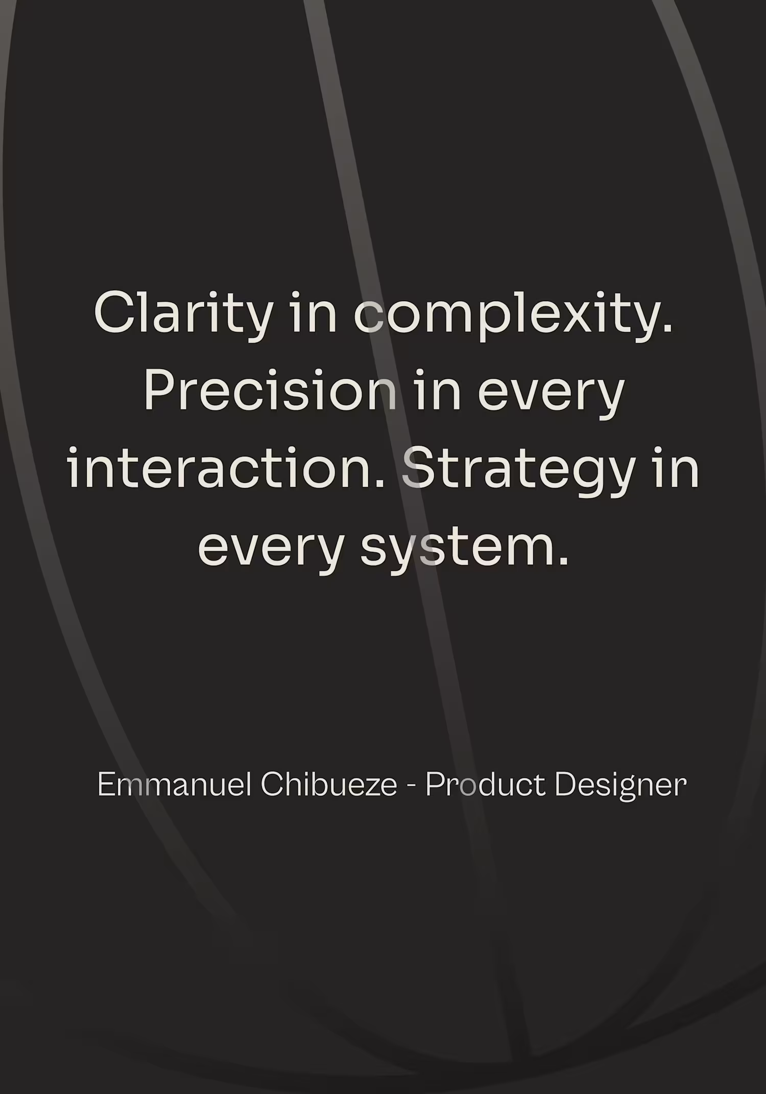
Emmanuel
UX/UI Designer: Transforming Ideas into Products
Ready for work
Emmanuel is ready for their next project!
Did you know that Design systems is not just about consistency?!
I have shaved 30+ minutes off a single workflow, because of Verdant design system.
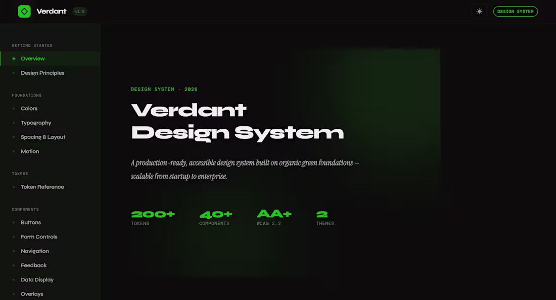
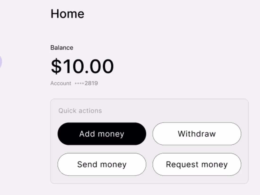
I’m Emmanuel, a product designer, and building the Verdant Design System changed how I design.
Instead of rethinking components every time, I just focus on solving the actual problem.
That shift compounds: faster execution, cleaner decisions, less fatigue.
Most designers actually lack systems.
Verdant is mine. You can check it out
Check it out: https://tichoo07.github.io/verdant-design-system/
0
10
Verdant — full system walkthrough.
This is a system built for speed, consistency, and clear interaction.
Every component is designed to behave, so you’re not guessing states or rebuilding patterns.
I’m packaging this into a Figma file you can use across projects.
If you’d use this, I’d like to know what you’d expect from it.
Check out Verdant: https://tichoo07.github.io/verdant-design-system/
1
48
When systems fail, most products say: “Something went wrong. Try again.”
That creates confusion, breaks trust, and often leads to user drop-off.
So I redesigned the error state into a clear system status experience.
Instead of a dead-end message, this approach communicates:
• What’s happening → Server issue with retry timing
• What still works → Users can continue key actions
• What’s affected → AI analysis and sync are temporarily unavailable
The goal is simple:
Remove uncertainty and keep users in control—even during failure.
This kind of thinking improves:
User trust
Task continuation
Overall product reliability perception
If your product has critical flows, failure states aren’t edge cases, they’re core experiences.
1
28
After working on several product interfaces, one thing kept showing up repeatedly: teams don't design the system behind the screens.
Buttons get recreated, spacing becomes inconsistent, and so on...
So I decided to explore a different approach.
I built Verdant, a modern design system focused on scalability, accessibility, and consistency.
It’s built around a structured foundation:
• Token-based color architecture
• Reusable UI components
• Light and dark theming
• Accessibility-aware patterns
• A documentation site to make the system usable across teams
The goal was to design the infrastructure that makes good design repeatable, not just a design system.
Verdant is still evolving, but the foundation is live.
Check it out https://tichoo07.github.io/verdant-design-system/
Curious to hear from other designers and developers
2
3
59
It was an absolute privilege to be a part of this #Makeathon.
I literally pushed Figma Make a lot when doing this project.
With more than 45 different versions I finally came to a near perfect result.
Layr is an AI-powered constraint engine that transforms UX research and accessibility into enforceable interface behavior. Layr emerged as a simulation of governed interface design, where research and accessibility may be questioned, Gravity keeps everything in balance.
I would love to hear what you think once you have interacted with it: https://blast-hope-57106957.figma.site/
4
112
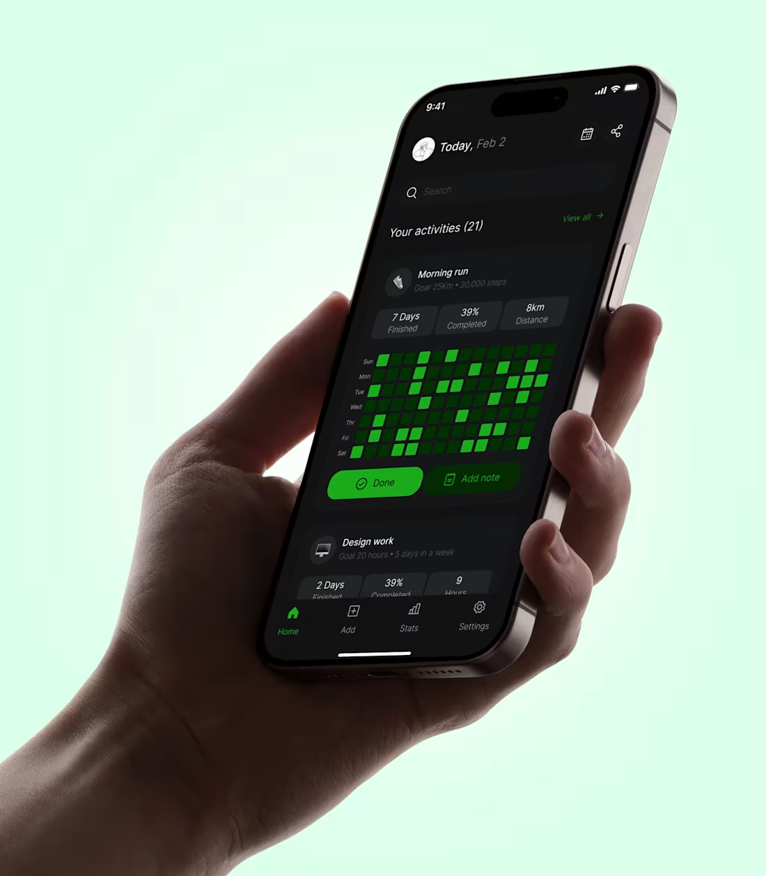
People don’t always quit because they’re lazy. They quit because they’re mentally exhausted. Think about it for a sec!
Deadlines, habits, metrics, progress, when all of that lives in your head, everything feels heavier than it actually is. You forget the days you showed up. You remember the gaps more than the consistency.
One quiet thing a really good products does is to take the weight off the mind.
Instead of asking users to “stay disciplined,” they make progress visible. Instead of relying on memory, they turn effort into something you can glance at. Small signals. Clear patterns. No pressure, just proof. The perfect mix.
That shift changes behavior more than motivation ever will.
I am curious, how you think about reducing mental load in the products you build? 🤔
2
39
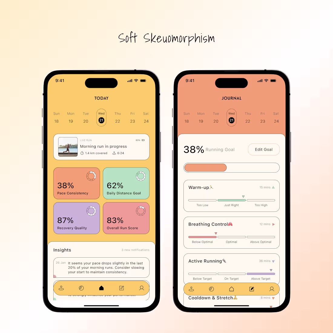
Skeuomorphism gets a bad reputation because it’s often treated as decoration.
But when used intentionally, it’s a communication tool.
In this design, the tactile surfaces, depth, and shadows aren’t there to look fancy, they exist to reduce learning time. Familiar visual cues help users instantly understand what’s interactive, what’s important, and what actions are possible, without needing instructions.
Good design isn’t about following trends blindly. It’s about choosing the right visual language for the problem you’re solving.
If you’re building a product where clarity, trust, or onboarding speed matters, and you need a designer who thinks beyond aesthetics, let’s work.
3
47
Privacy-first analytics that show what matters, the moment it happens.
This is what modern web analytics should feel like.
3
69
Hero sections are not supposed to be boring. This was made in framer.
1
33
Designing Financial Workspace: Extending Activation
0
2
Fintech Onboarding Flow Redesign
0
1