Fintech Onboarding Flow Redesign
Emmanuel
Designing Trust: From First Tap to Everyday Finance
Overview
Early-stage fintech products lose a large percentage of users before the first transaction. The biggest reason isn’t UI quality, it’s when sensitive actions are requested.
This project explores how re-ordering onboarding steps and designing for trust-first activation can increase first-deposit conversion.
The Problem
Most fintech onboarding flows request high-risk information too early:
Debit card details
Full KYC data
PIN setup
All before the user understands product value.
This leads to:
High early drop-off
Fear-based abandonment
Low activation rates
The Design Goal
Design an onboarding flow that:
Builds trust before asking for sensitive data
Creates momentum with a clear first success moment
Drives users toward their first meaningful action: funding their account
The Constraints
Must support KYC and card linking
Must remain under 2 minutes total flow time
Must be intuitive for first-time fintech users
Mobile-first experience
Flow Strategy
Instead of asking for everything at once, the flow is deliberately sequenced into three psychological phases:
Setting Expectations Before Asking for Information
Before asking users for any personal information, the product answers one quiet question:
“Can I trust this?”
Instead of starting with forms, I introduced a short three-screen sequence that establishes clarity, utility, and confidence in under 10 seconds.
Splash screen framework
By the time users reach onboarding, they are no longer evaluating the product —
they are already inside the experience.
Splash screens
Account Creation, Entry Without Resistance
The first form field must feel reversible, not binding.
Friction is minimised
Privacy reassurance reduces subconscious form anxiety
The user still feels in control
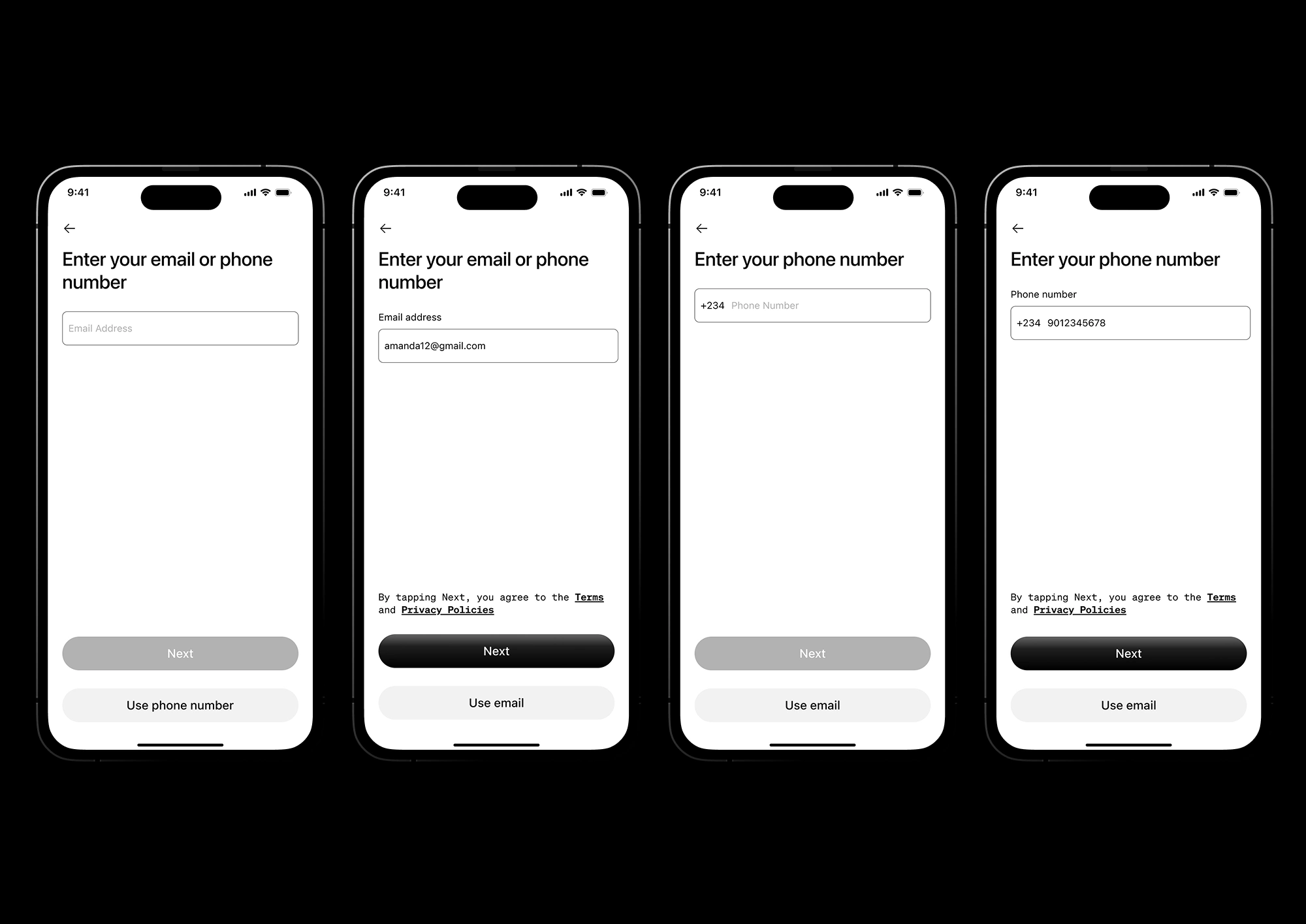
Email and phone number entry
OTP Verification, Protection, Not Punishment
This is a psychological checkpoint.
Instead of feeling like a barrier, it is framed as a protective action, a small step that proves the product is watching over the user.
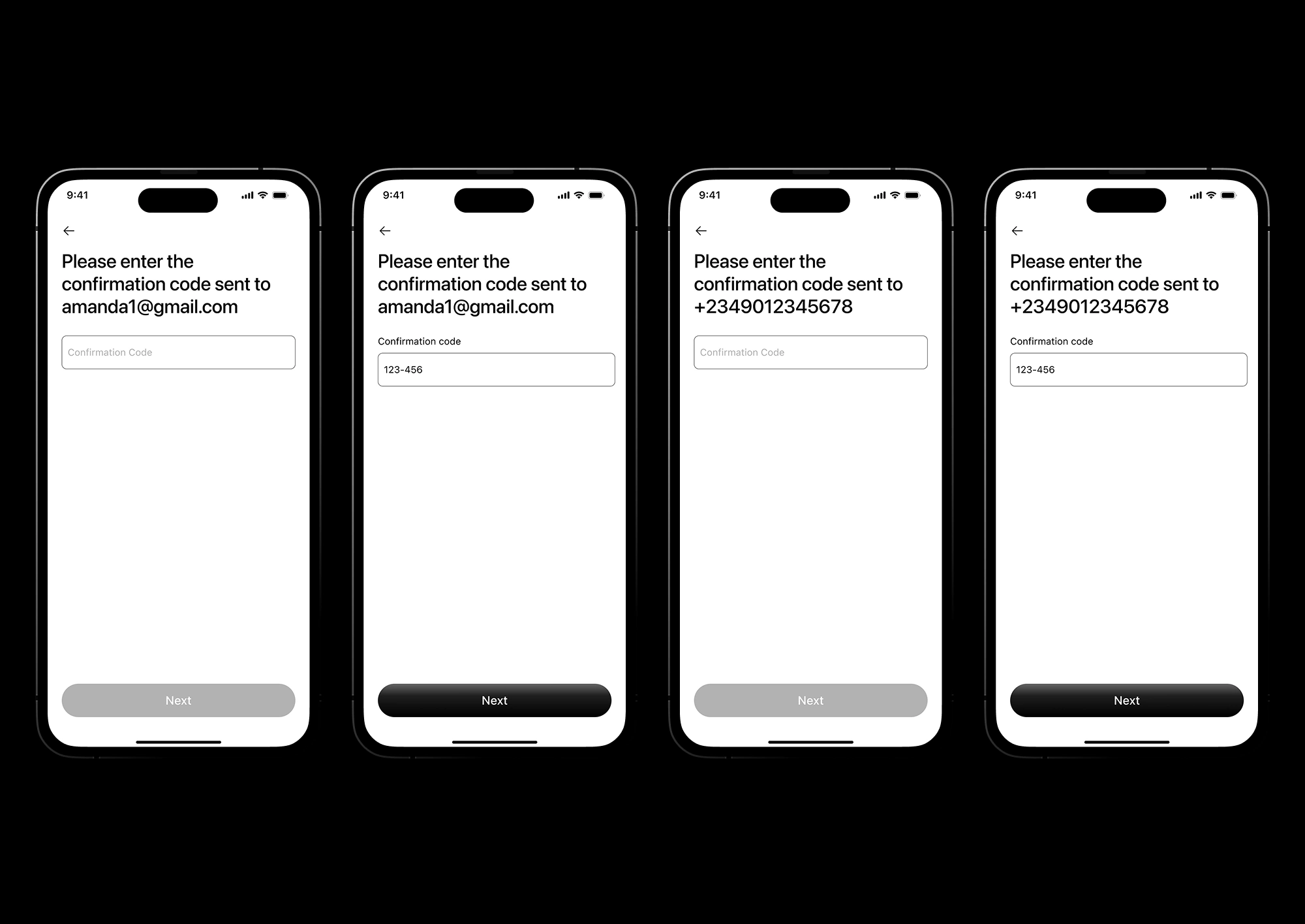
OTP Verification screens (email ad phone number)
Identity Basics, Compliance Without Fear
This is where most fintechs lose people.
Here, the language shifts from regulation to personal safety, making verification feel like a shield rather than surveillance,
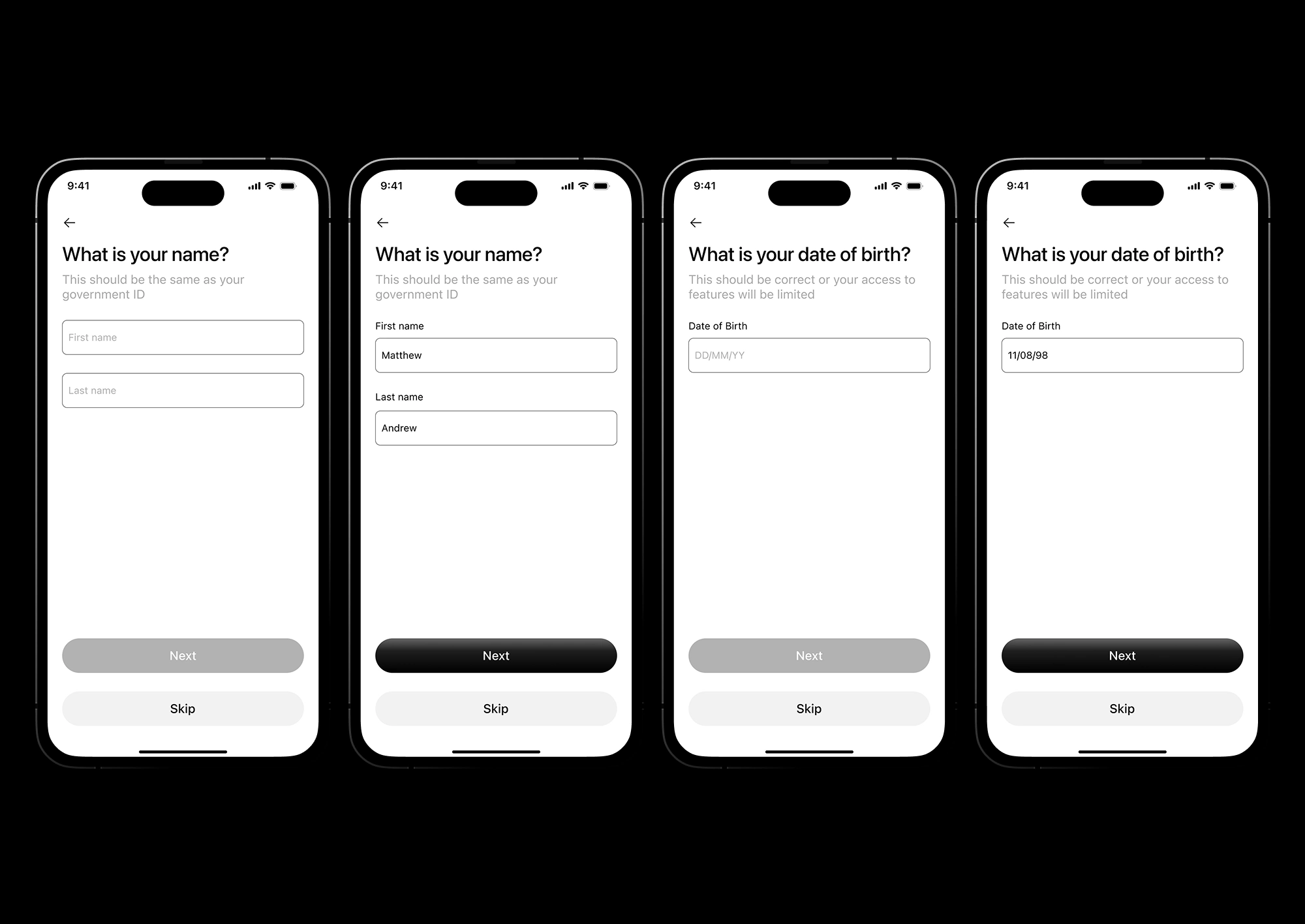
Name and date of birth input screens
Security Setup, Ownership Transfer
This is the moment the product becomes theirs.
Explaining what the PIN protects transforms a task into a boundary of trust.
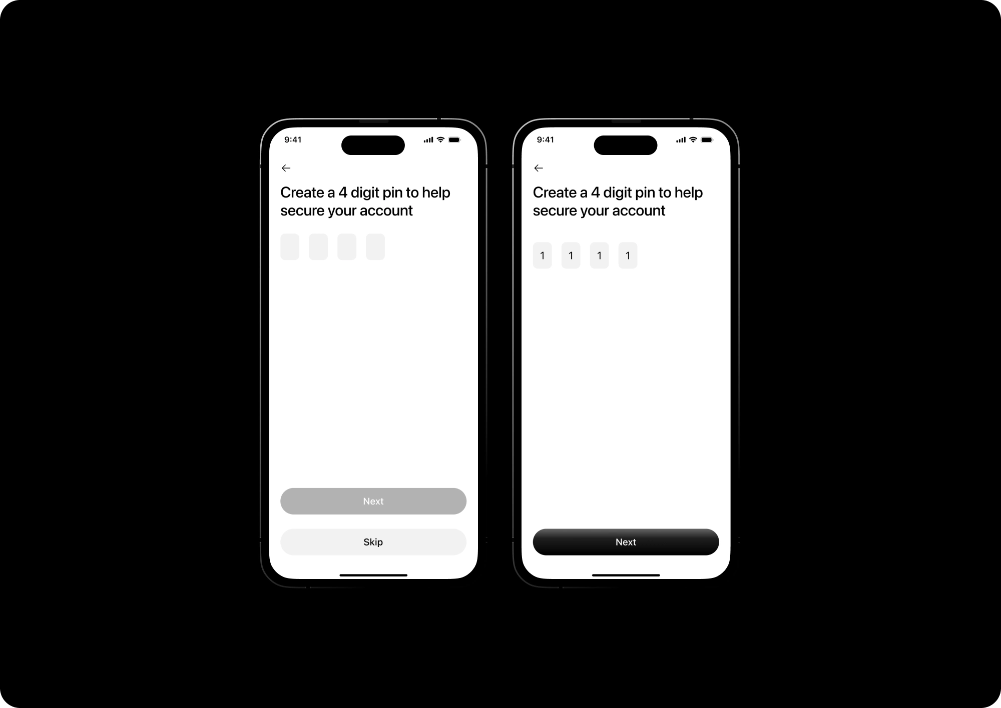
Security PIN
Post-Onboarding Activation Screen
This is not a dashboard.
This is a conversion engine.
Design Decisions:
Balance starts at $0.00 to avoid false trust
Only one primary action above the fold: Add Money
Withdraw hidden until account funded
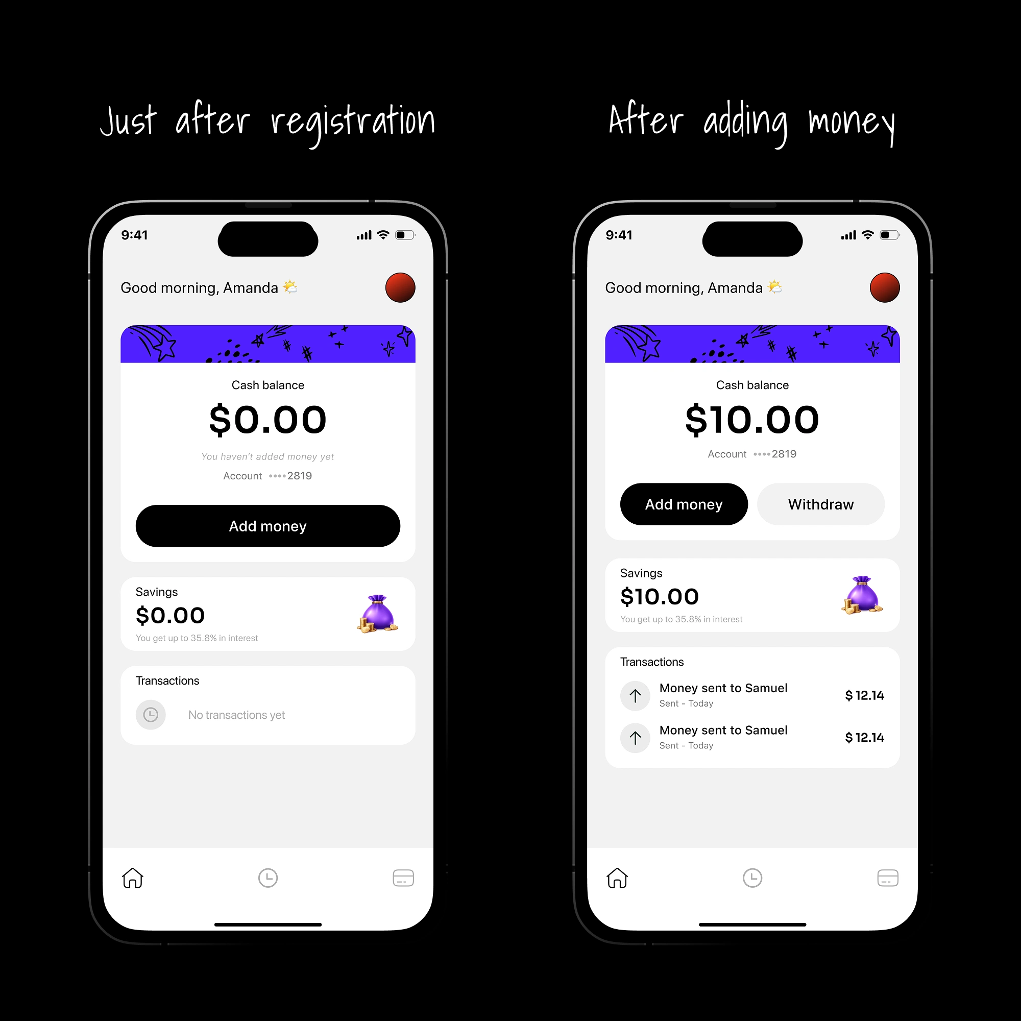
Home page before and after money added
Key Insight
The main thing about fintech onboarding is that; is not about showing features.
It is about earning permission.
Users don’t abandon because your UI is bad, they abandon because you ask for trust before you deserve it.
Outcome
This flow reframes onboarding as a psychological journey, not a checklist.
By sequencing trust before friction, it turns sign-ups into activated users.
Desktop prototype preview
Like this project
Posted Jan 2, 2026
Redesigned fintech onboarding to build trust and increase first deposit conversions.
Likes
0
Views
1
Timeline
Dec 16, 2025 - Jan 2, 2026