Designing Financial Workspace: Extending Activation
Emmanuel
Designing Financial Workspace
Extending Activation Into Daily Use (Desktop Experience)
Mobile onboarding activates users.
Desktop is where trust compounds.
After the first successful transactions on mobile, power-users naturally migrate to larger screens to:
Reconcile spending
Track multiple transfers
Manage their account with less friction
This is where most wallets fail, they simply stretch the mobile UI.
I designed the desktop experience as a financial control surface, not a bigger phone.
Design Question?
How might we help users reason about their money, not just move it?
Why Desktop Deserves Its Own Product Thinking?
Desktop sessions are:
Longer
More deliberate
Less emotional, more analytical
So the interface must shift from activation energy to cognitive clarity.
Desktop Information Architecture
The desktop product is structured around three daily user intents:
Overview: What is my current financial state?
Transactions: What has happened?
Account: How do I control risk and identity?
Each screen exists because it maps to a mental job the user already performs.
Home Dashboard, From Awareness to Control
This screen answers one question:
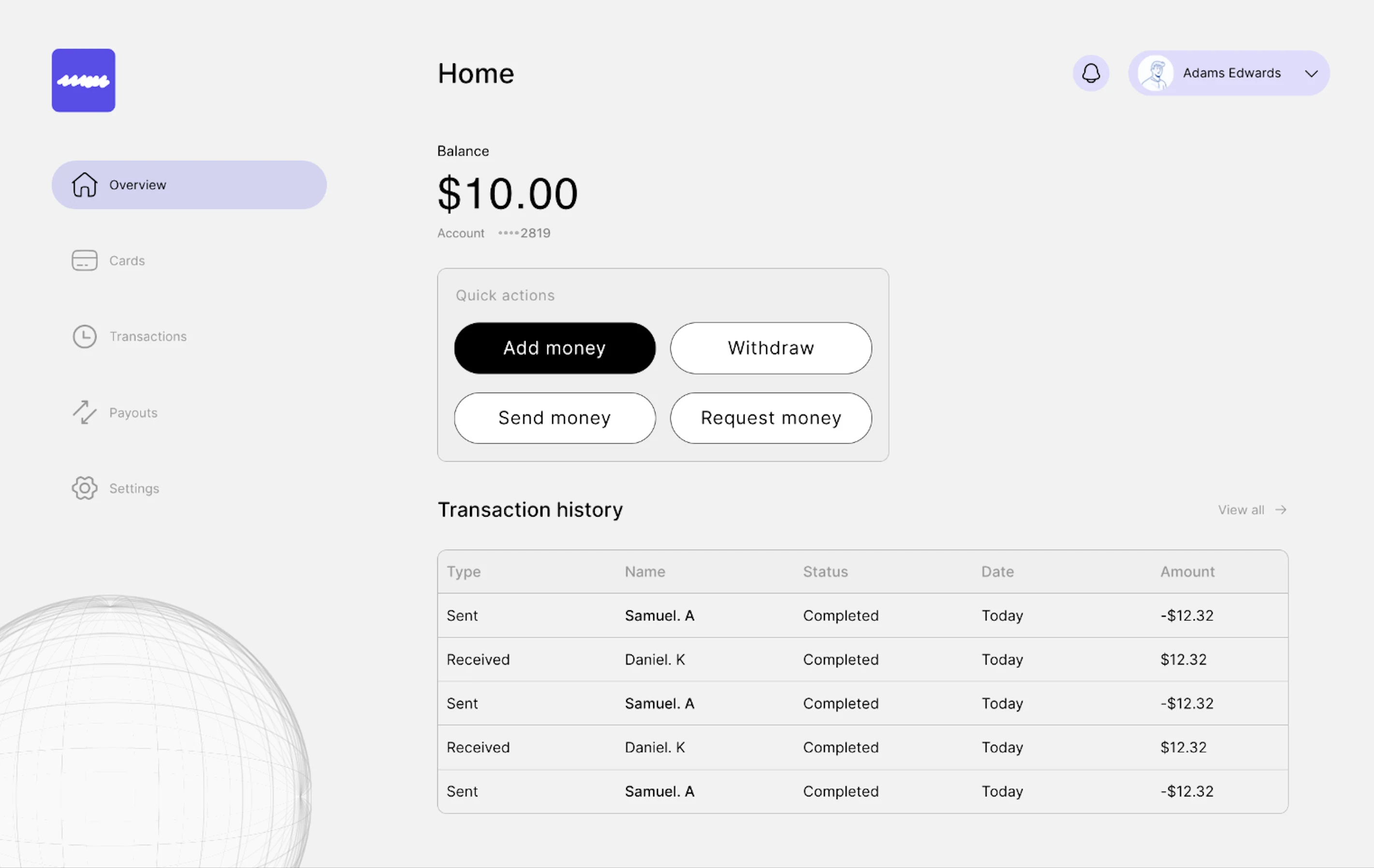
Home page (Overview)
“Where do I stand right now?”
The design is intentionally quiet. No charts. No gamification. No dopamine.
Because money isn’t entertainment, it’s responsibility.
Designing Calm Quick Actions
Instead of icons and colour noise, I used:
Text-only buttons
Equal height & width for muscle memory
One dominant primary action
This reframes actions from “options” into decisions.
Transactions Page Memory, Not Movement
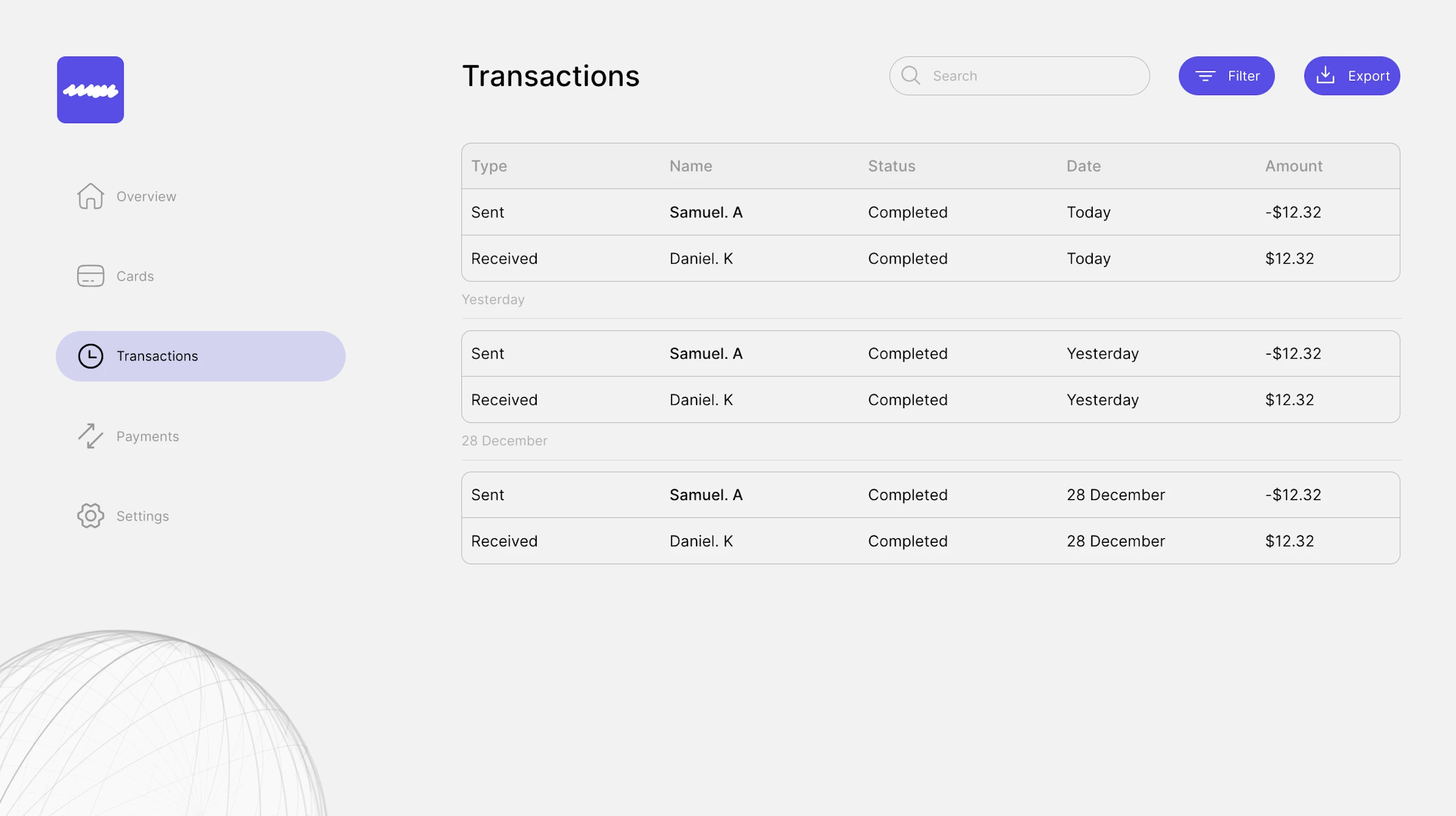
Transaction Page
Users don’t come here to transact, they come here to verify reality.
The real jobs-to-be-done
Did my money leave?
Who received it?
When exactly?
This is why I:
Used a table, not cards
Grouped by temporal context (Today / Yesterday / Date)
Aligned amounts visually for pattern recognition
This page is designed for financial recall, not aesthetics.
Account Page, Where Trust Is Renewed
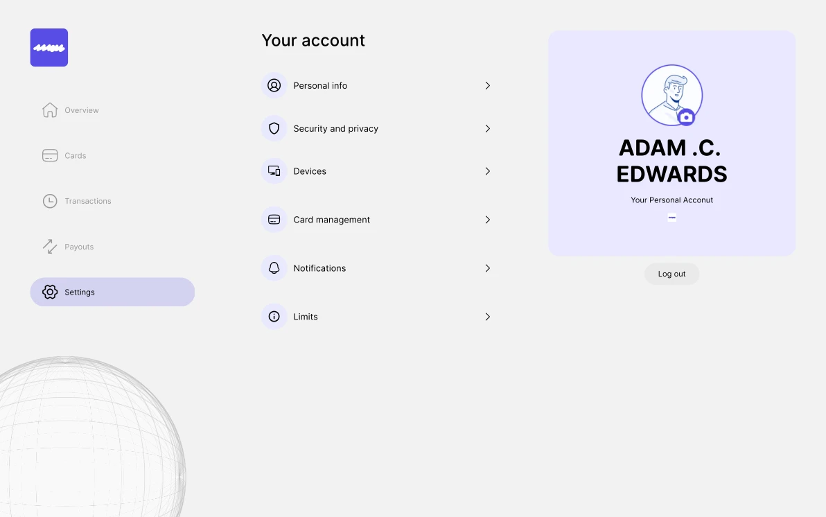
Account page
The account screen is not a feature list, it is a control room. Every section represents a real anxiety users carry:
Security and Privacy: “Can someone access my money?”
Devices: “Who else is logged in?”
Card Management: “What if I lose my card?”
The right-hand profile panel isn’t decoration, it reinforces ownership, identity, and accountability.
Why This Desktop Experience Matters
This is where users stop being new customers and become long-term holders. Mobile creates belief. Desktop creates habit.
Together, they complete the loop:
Mobile → Activation
Desktop → Retention
Trust → Advocacy
Outcome
This continuation transforms the product from a tool into a financial environment. Not just where money moves, but where financial confidence is built
Like this project
Posted Jan 2, 2026
Designed a desktop financial interface for user retention.