Edgar Florentin
Profile in progress
Edgar is building their profile!

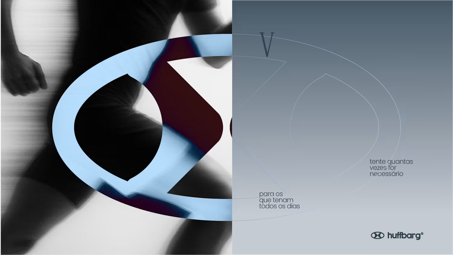
Everyone is trying something. A better life, a better job, a healthier routine, a fresh start. HUFFBARG was created for those people, the ones who try every day, fail, and try again.
To turn that into a brand, we looked for the physical proof of trying: lactate. When energy demand spikes during intense effort, the body ramps up lactate production to keep generating energy fast. And it isn't waste: the body reuses it as fuel. It's the chemical response of a body that refuses to quit, and it surges precisely when you're truly trying.
Everything in HUFFBARG comes from it. The color palette was drawn from the lactic acid molecular model. The molecule's structure, once adjusted, forms the "lactic H" behind the symbol. Around it, an oval circuit stands for consistency, continuity and persistence, while echoing the shape of the mouth mid-"huff", the sound of effort that gives the brand its name.
The positioning closes the loop: FOR THOSE WHO TRY EVERY DAY. A brand that doesn't celebrate perfection, but effort, with messages like "Respect your effort" and "Try as many times as it takes".
The project covers brand concept and strategy, symbol, color palette, typography, visual language, tagline and campaign, OOH and merchandise applications, plus a brand ecosystem with gym, running and protein lines.
2
1
44
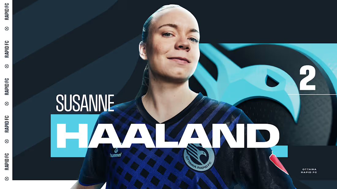
Sharing a project I'm really proud of: the 2025 broadcast design for the Northern Super League, Canada's new professional women's soccer league.
What made this one special is that the league had no visual history on TV. Every graphic viewers saw in that first season had to be created from zero, for a league that was introducing itself to the country.
The goal was a broadcast identity that feels as ambitious as the league itself: bold enough to stand out on screen, clear enough to follow at a glance, and flexible enough to carry six different clubs inside one consistent system.
The biggest lesson for me: when you design for a league that's just being born, you're not only packaging matches. You're helping define how people will remember its first season.
Full case study: https://www.behance.net/gallery/228093753/NSL-2025-Broadcast-Design-for-Womens-Football-League
I'd love to hear from anyone working in sports or broadcast design: how do you approach building a visual system for a league that's launching from scratch?
3
17
268