The network for creativity
Join 1.25M professional creatives like you
Connect with clients, get discovered, and run your business 100% commission-free
Creatives on Contra have earned over $150M and we are just getting started
Back to feedPost
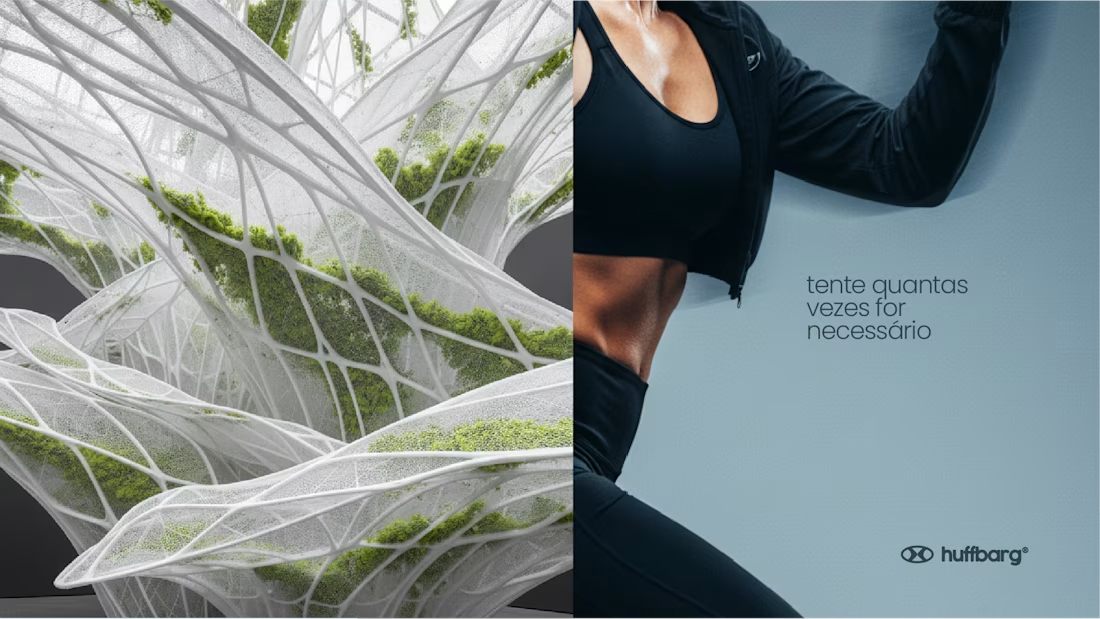
Everyone is trying something. A better life, a better job, a healthier routine, a fresh start. HUFFBARG was created for those people, the ones who try every day, fail, and try again.
To turn that into a brand, we looked for the physical proof of trying: lactate. When energy demand spikes during intense effort, the body ramps up lactate production to keep generating energy fast. And it isn't waste: the body reuses it as fuel. It's the chemical response of a body that refuses to quit, and it surges precisely when you're truly trying.
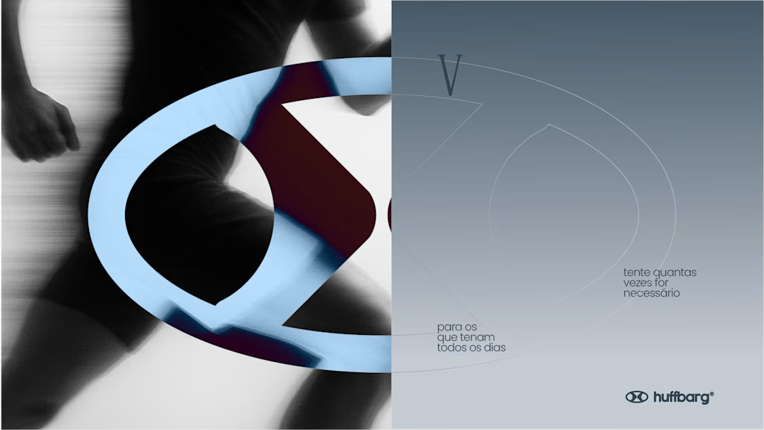
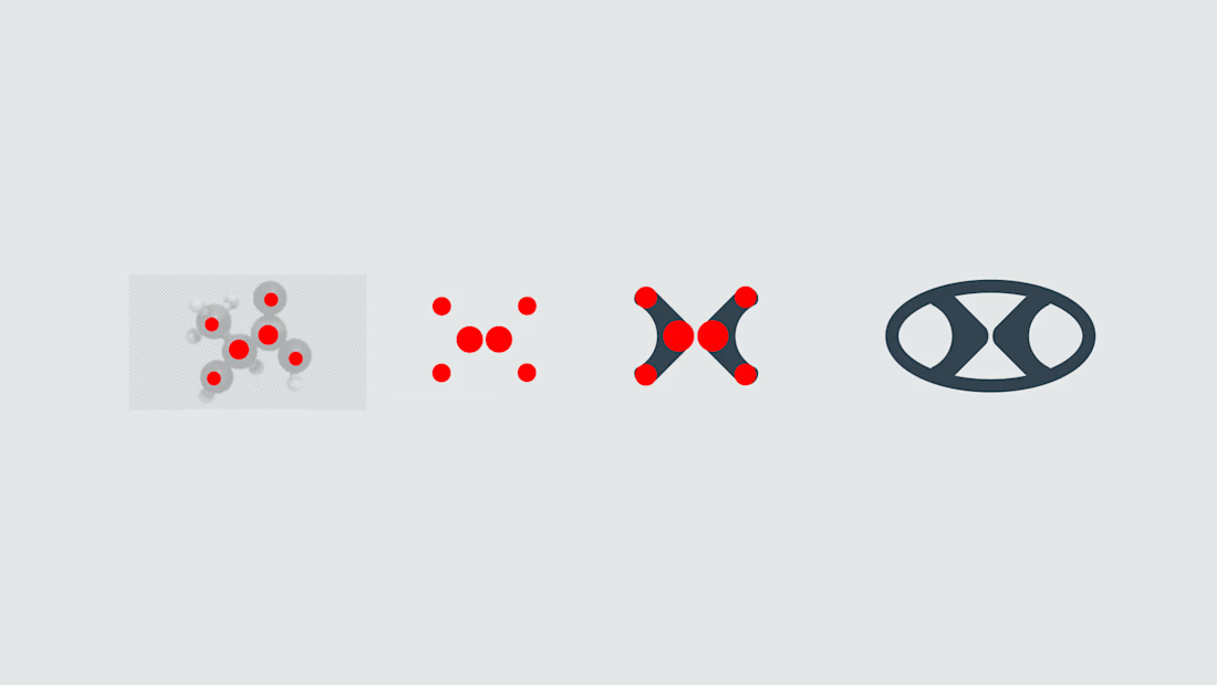
Everything in HUFFBARG comes from it. The color palette was drawn from the lactic acid molecular model. The molecule's structure, once adjusted, forms the "lactic H" behind the symbol. Around it, an oval circuit stands for consistency, continuity and persistence, while echoing the shape of the mouth mid-"huff", the sound of effort that gives the brand its name.
The positioning closes the loop: FOR THOSE WHO TRY EVERY DAY. A brand that doesn't celebrate perfection, but effort, with messages like "Respect your effort" and "Try as many times as it takes".
The project covers brand concept and strategy, symbol, color palette, typography, visual language, tagline and campaign, OOH and merchandise applications, plus a brand ecosystem with gym, running and protein lines.



These are so good!

Thank you! I’m really happy to hear that
The network for creativity
Join 1.25M professional creatives like you
Connect with clients, get discovered, and run your business 100% commission-free
Creatives on Contra have earned over $150M and we are just getting started





Related posts


Love the tonality across all the shots, they really tie together nicely!

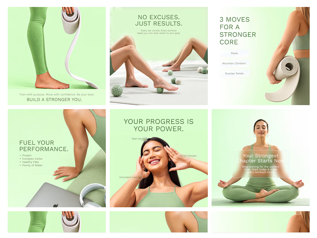
Social Media Design for a fitness brand


great color and design

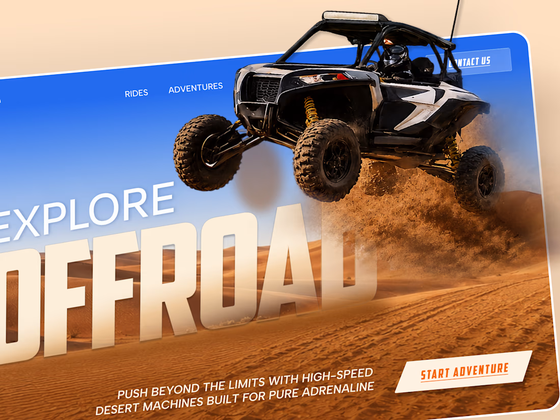
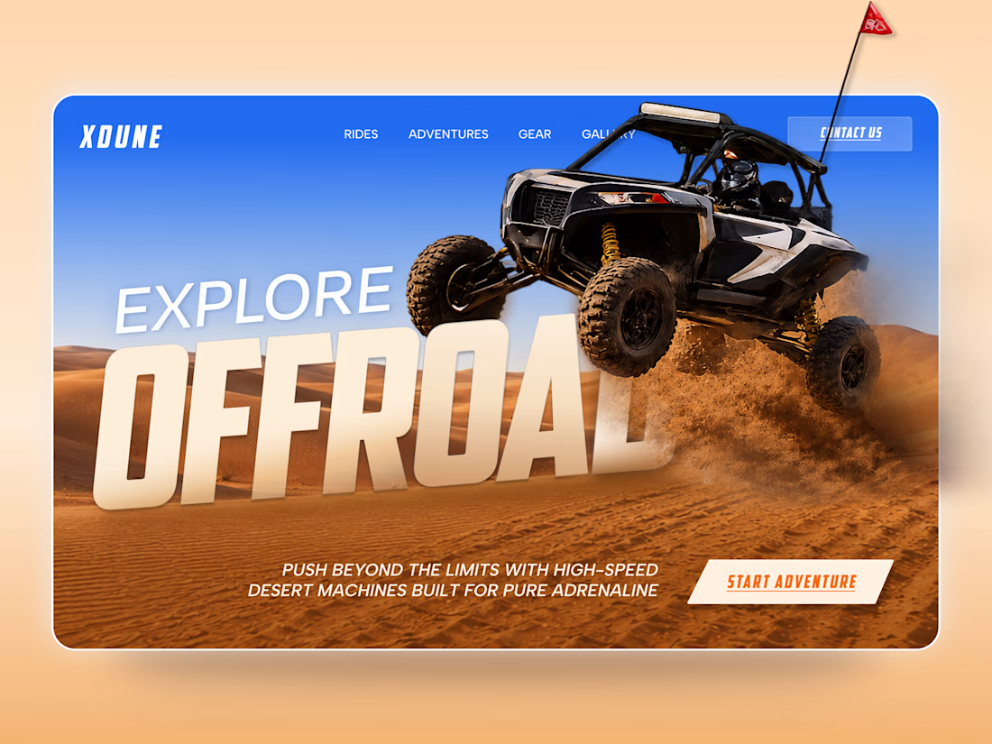
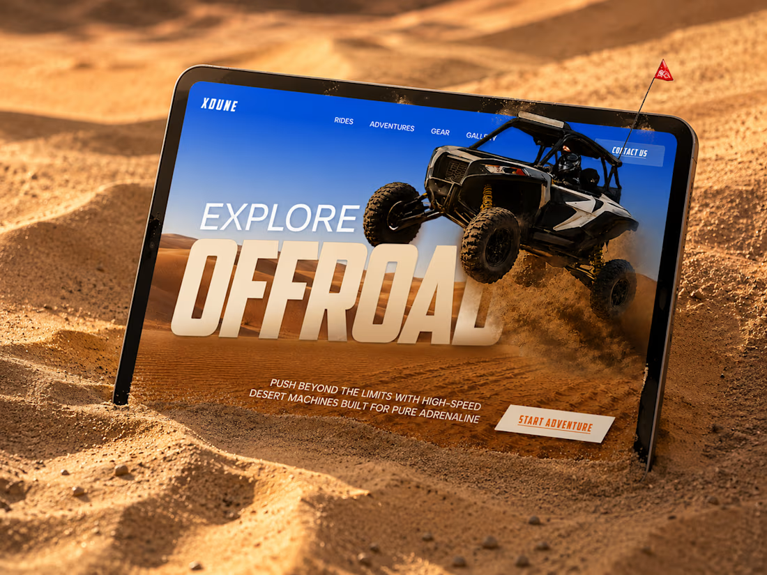
XDUNE — Off-Road Adventure Landing Page
A bold landing page concept built around speed, freedom, and off-road adventure 🔥
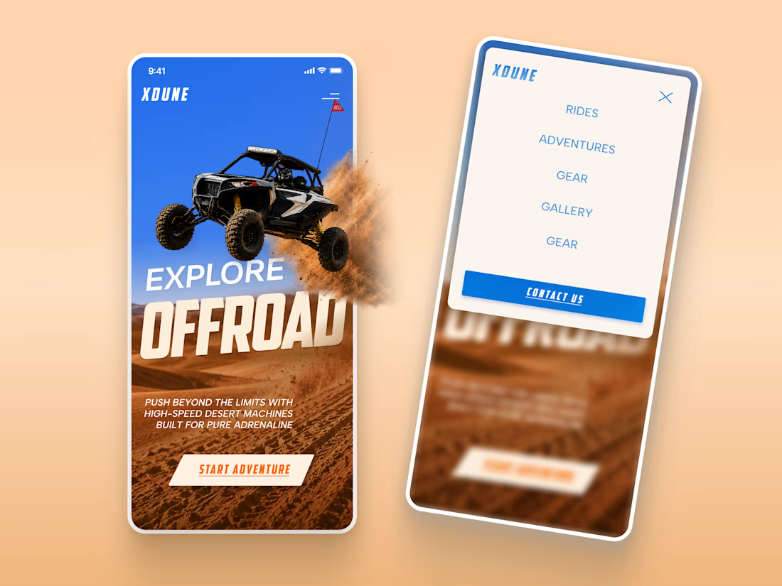
The visual direction combines desert landscapes, oversized typography, and a dynamic vehicle composition to make the experience feel energetic from the first screen
Special attention was given to:
• Strong action-focused hero composition
• Bold typography and clear hierarchy
• Desert-inspired visual atmosphere
• Adventure-focused CTA
• Responsive mobile experience
• Simple and clean navigation
The result is a high-energy landing page that feels fast, adventurous, and made for people who want to get off the road
Looking to create a bold website for an automotive, outdoor, or adventure brand? Let’s connect 🚀

love the vibe