Projects using iStock
Projects using iStock
Sign Up
Post a job
Sign Up
Log In
Filters
1
Projects
People
Message
1
Edward Jaiyeola
pro
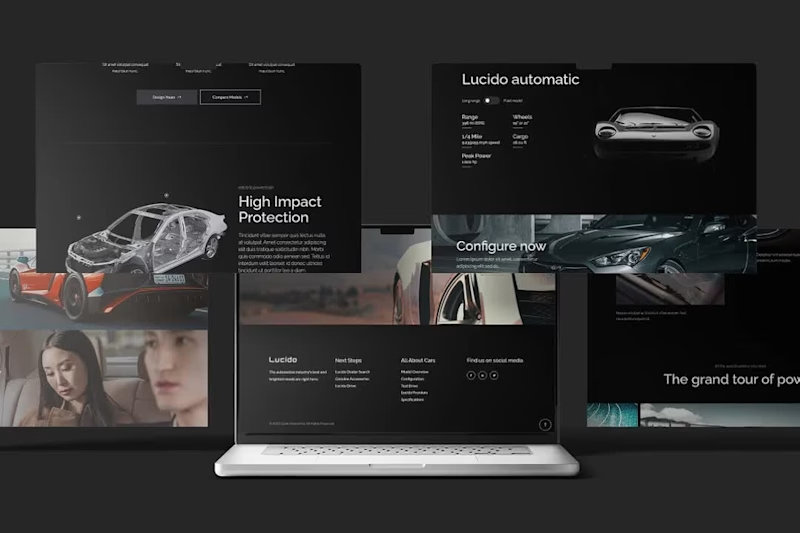
This was just me having fun with the Qi3 Theme Lucido Automotive template on my figma. Luxurious, Dark and Modern.
1
61
Message
0
Grace Pereda @ Graceful Studio
pro
Infographics
0
5
Message
0
Fadare Caleb Timileyin
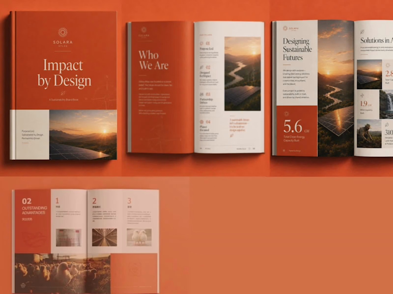
1. The Goal of the Project The goal was to transform an ordinary corporate book into a premium, modern, and visually engaging brand publication. I wanted the final design to communicate professionalism and sustainability while creating a strong visual identity that could remain consistent across the cover and interior pages. The project was rebranded as SOLARA ATLAS – Impact by Design, with a visual direction centred on sustainability, innovation, and positive environmental impact. 2. The Challenges Faced The original design had useful information but lacked a distinctive brand personality and stronger visual hierarchy. The main challenge was finding a way to present large amounts of text, statistics, images, and corporate information without making the pages feel crowded or repetitive. Another challenge was maintaining consistency across different types of pages while still making every spread visually interesting. The design needed to work equally well for storytelling pages, statistics, corporate information, photographs, and infographic-style content. 3. Project Overview SOLARA ATLAS is a premium sustainability-focused brand book designed to communicate a company's purpose, environmental initiatives, achievements, and impact. I developed a complete visual direction using a sophisticated combination of terracotta orange, warm cream, charcoal, and natural photography. Elegant serif typography was paired with clean supporting fonts, minimalist line icons, strong numerical highlights, modular grids, and carefully selected renewable-energy imagery. The final concept includes a distinctive book cover and multiple editorial page layouts, creating a cohesive publication that feels professional, contemporary, and premium. 4. The Solution I Brought to the Client's Problem I redesigned the publication around a clear editorial system rather than treating every page as an individual design. I established a consistent colour palette, typography hierarchy, grid structure, icon style, photography direction, and visual language that could be applied throughout the entire book. I used bold section introductions to improve navigation, large statistics to make important information immediately noticeable, modular layouts to simplify complex information, and high-quality imagery to create emotional and visual impact. The result was a publication that transformed the client's information into a strong branded experience that is easier to read, more memorable, and visually capable of positioning the organisation as modern, credible, and premium.
0
99
Message
1
Chelsi Architzel
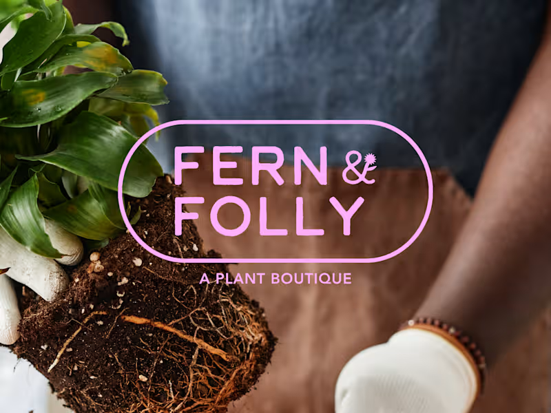
Fern & Folly is the kind of plant shop you walk into and immediately want to live inside. Warmly lit, a little wild, and chock full of things you didn't know you needed. The problem was their branding didn't say any of that. F&F came to me with a great name, a loyal customer base, and almost no visual identity. My job was to build something that matched the energy already in the room and could scale as the business (and plants!) grew. I designed Fern & Folly's full identity system around a small set of bold, reusable shapes. Those shapes do everything, everywhere: they live in the logo, the iconography, the surface patterns, the hang tags, the packaging. The whole brand pulls from the same visual vocabulary, so every touchpoint feels like it belongs. As a result, I built the missing piece for a brand that already has strong roots, making sure that they show up exactly as intended no matter where they're seen. The color palette is distinctive without being too loud, and beautifully alive in the same way the shop is — a little overgrown, in the best way.
2
1
163
Message
1
Sabrina Pate
Dynamic Composition: Utilized a landscape layout that integrates a powerful vehicle silhouette against a natural, atmospheric backdrop to evoke a sense of adventure. Brand-First Typography: Employed heavy, bold sans-serif typefaces to mirror the "Bold Capabilities" of the product and maintain established brand identity. Visual Layering: Executed complex layering techniques to integrate the vehicle seamlessly with background elements and high-visibility branding. Conversion-Oriented Design: Strategically placed "Book a Ride Today" and "Auto Deals" elements to create a clear, actionable path for the viewer.
1
39
Message
0
Noor Hussain
Behoof — Artistic Blog & Journal Website UI Design Behoof is a UI design concept crafted for an artistic lifestyle and journaling blog — designed to feel like a moody, elegant "artistic diary" where stories, thoughts, and photography come together. The visual direction leans into a dark, cinematic theme with warm gold accents, elegant serif typography, and soft floral/nature textures that give the brand a poetic, editorial feel. The homepage opens with a striking hero section pairing bold typography with a warm, glowing photo frame, followed by quick-access category tiles (Life Style, Mental Health, Advice). An About Behoof section builds a personal, storytelling connection, while a dedicated Authenticity block reinforces the brand's voice. A Latest Articles grid and an "Explore Thoughtful Pieces" section showcase content with rich editorial imagery, and a Photography & Cinematography showcase adds a strong visual/portfolio touch before closing with a newsletter sign-up and footer. Design Highlights: Dark, moody color palette with elegant gold highlights Elegant serif + clean sans-serif typography pairing for an editorial feel Strong use of circular/arched image framing for a artistic, gallery-like touch Consistent grid system and defined color/font system for scalability Fully designed mobile layout included Clean, structured design ready for development handoff Note: This is a UI/UX design deliverable only (design concept/mockup) — no development or coding included.
0
58
Message
7
Abdullahi Usman
Tired of faceless brands and overseas call centers? So is SuperSolar. 🇦🇺 I recently wrapped up the brand identity and social media kit for Sydney’s newest solar leader. The goal was clear: move away from "digital-only" noise and back to local, face-to-face trust. ☀️ The Brand: SuperSolar ⚡ The Mission: 100% Australian-owned, in-person expertise. 📢 The Hook: "Bills Over." This project was about building a brand that feels like a neighbor, not a corporation. Check out the full identity below!
2
7
168
Message
0
Abel-onuh Paul
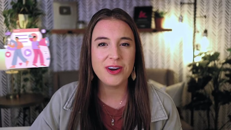
YouTube Tutorial Video • SaaS Software Tutorial • Screen Recording Editing • Digital Marketing Content This is a software tutorial / educational YouTube video explaining how to use ManyChat for beginners. The video combines talking-head footage, screen recordings, branded title cards, animated visual elements, UI highlights, and product demonstrations.
0
11
Message
0
Rebecca Taylor
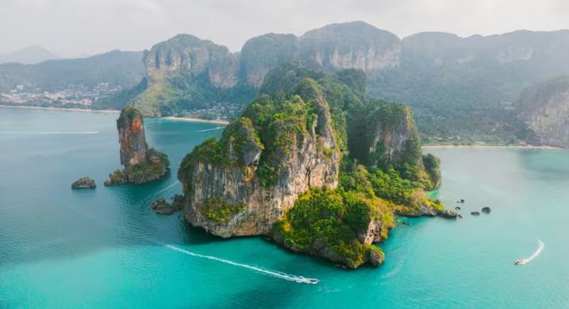
Editorial feature on emerging yacht charter destinations for 2025, combining destination insight and industry trends to highlight the shift toward remote, experience-driven travel.
0
57
Message
0
Vanshika Kataria
Branding & Logo Design
0
46
Message
0
Muhammad Waleed Khan
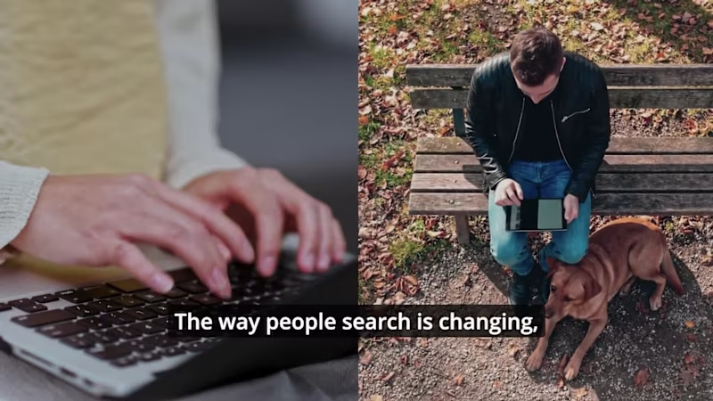
I worked on this KIME SaaS demo using a combination of raw footage, stock visuals, and UI demonstrations to create a realistic, product-driven experience. My focus was to blend real-world visuals with clean UI motion so the product feels both tangible and understandable. Instead of relying only on animation, I structured the flow to connect real usage scenarios with the software interface. Every scene was designed to balance storytelling and clarity, showing how the product works in real context while keeping the visual style modern, smooth, and engaging. The result is a hybrid demo that feels practical, human, and easy to connect with while still maintaining a strong SaaS product identity.
0
70
Message
0
Sandra Acevedo
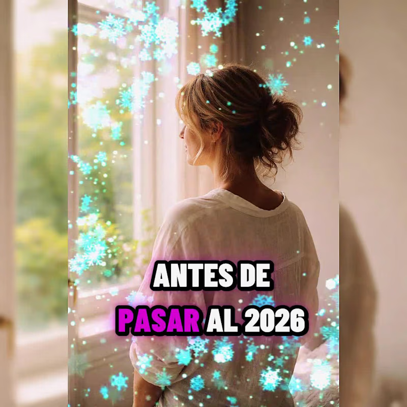
Los Nuevos 50+ despiden el
0
7
Message
0
Timmy Labode
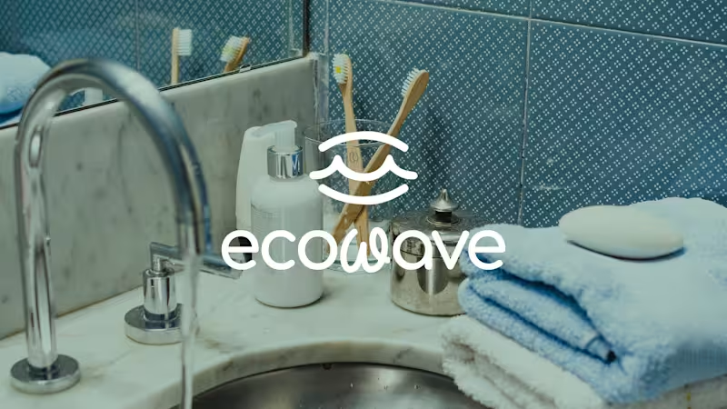
Ecowave Brand Identity
0
11
Message
1
Jeffrey Marshall
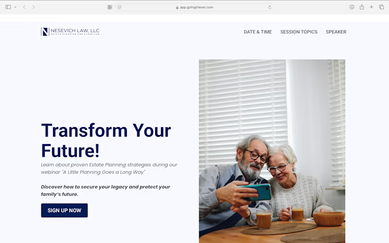
Landing Page Design
1
138
Message
0
Adefisayo Adojutelegan
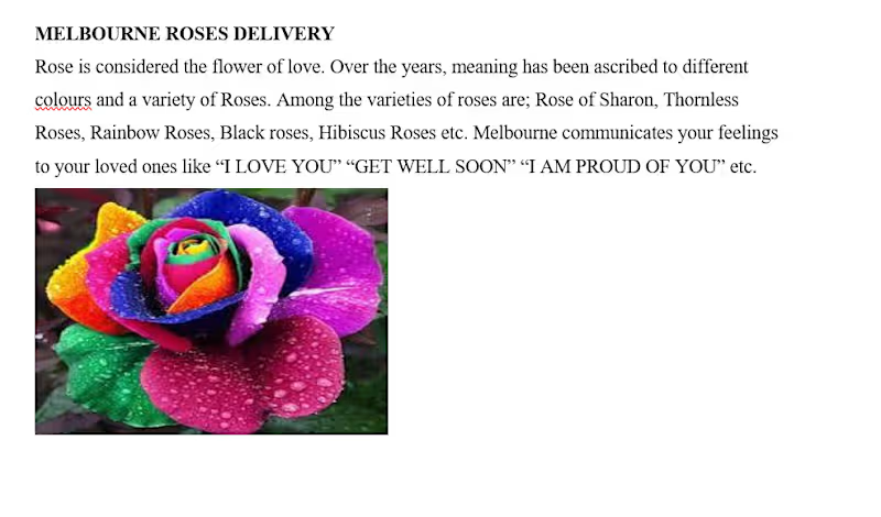
A landing page copy piece written for Melbourne florist shop, a flower delivery brand. The brief required translating a simple product listing into emotionally driven brand copy, connecting rose varieties and colours to human feelings and personal moments.
0
32
Message
0
Bradley Perkins
Aerial Photos of Michigan
0
0
Explore projects