




Hey folks 👋
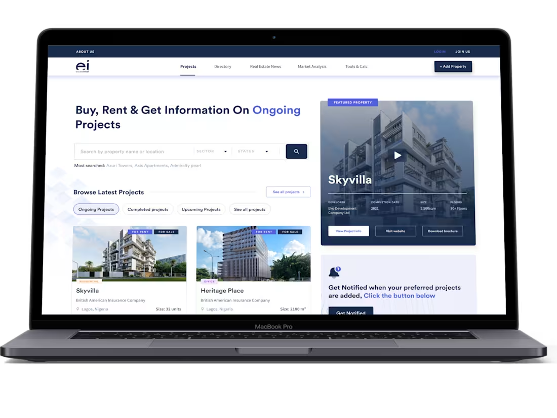
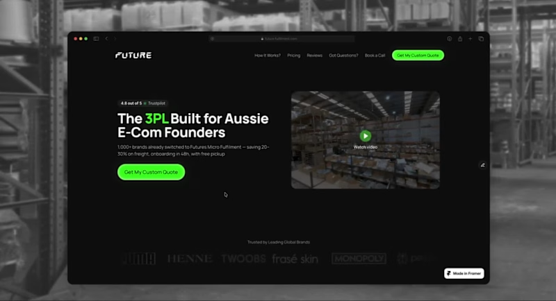
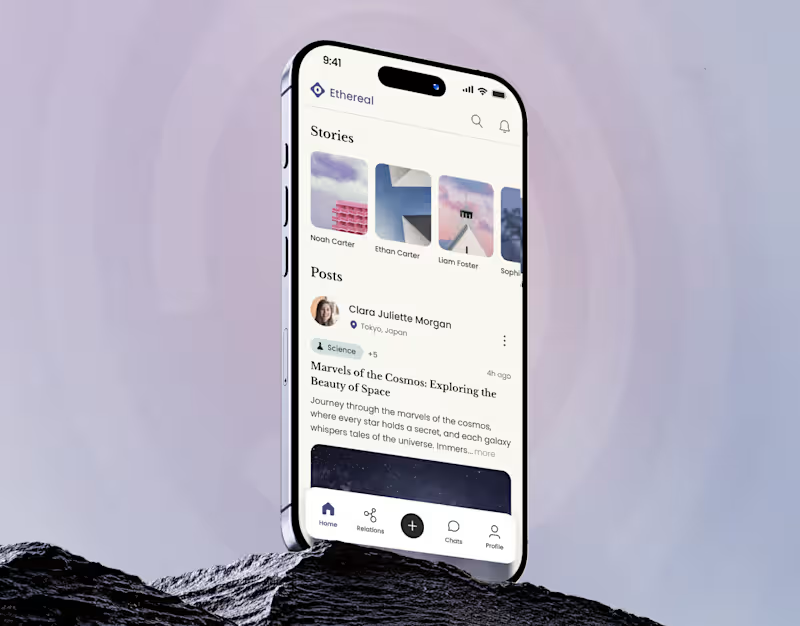
Sharing a small peek at one of the internal product pages we designed, this section highlights the core principles the team works by.
We kept the layout minimal and the tone calm so the content stays front and center.
The dark theme helped give everything a more focused, grounded feel, especially paired with imagery that shows the human side of AI.
0
77
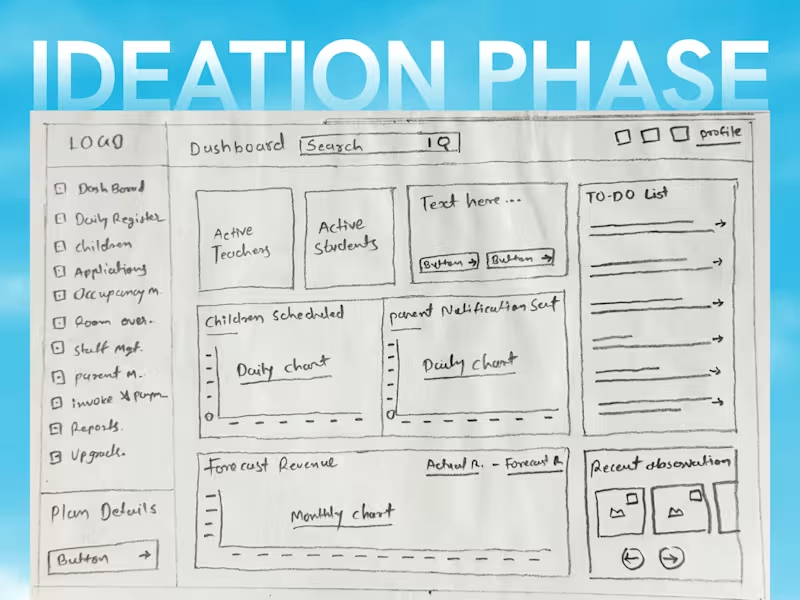
TrustNEST - SaaS Dashboard Redesign
Childcare and school administrators often struggle with cluttered interfaces that hide crucial daily metrics. For TrustNEST, I led an end-to-end redesign starting from rapid paper wireframing to map out user flows and structure heavy data metrics.
Moving from the initial layout, I overhauled the information architecture, transformed flat charts into interactive data visualizers, redesigned the sidebar navigation, and organized daily task queues—turning complex administrative chores into a clean, modern, and high-efficiency dashboard experience.
0
169