Music Streaming App UX/UI Design
Olena Andreieva
A UI/UX concept exploring how personalization, navigation, and subtle interactions can make discovering audio content feel more natural.
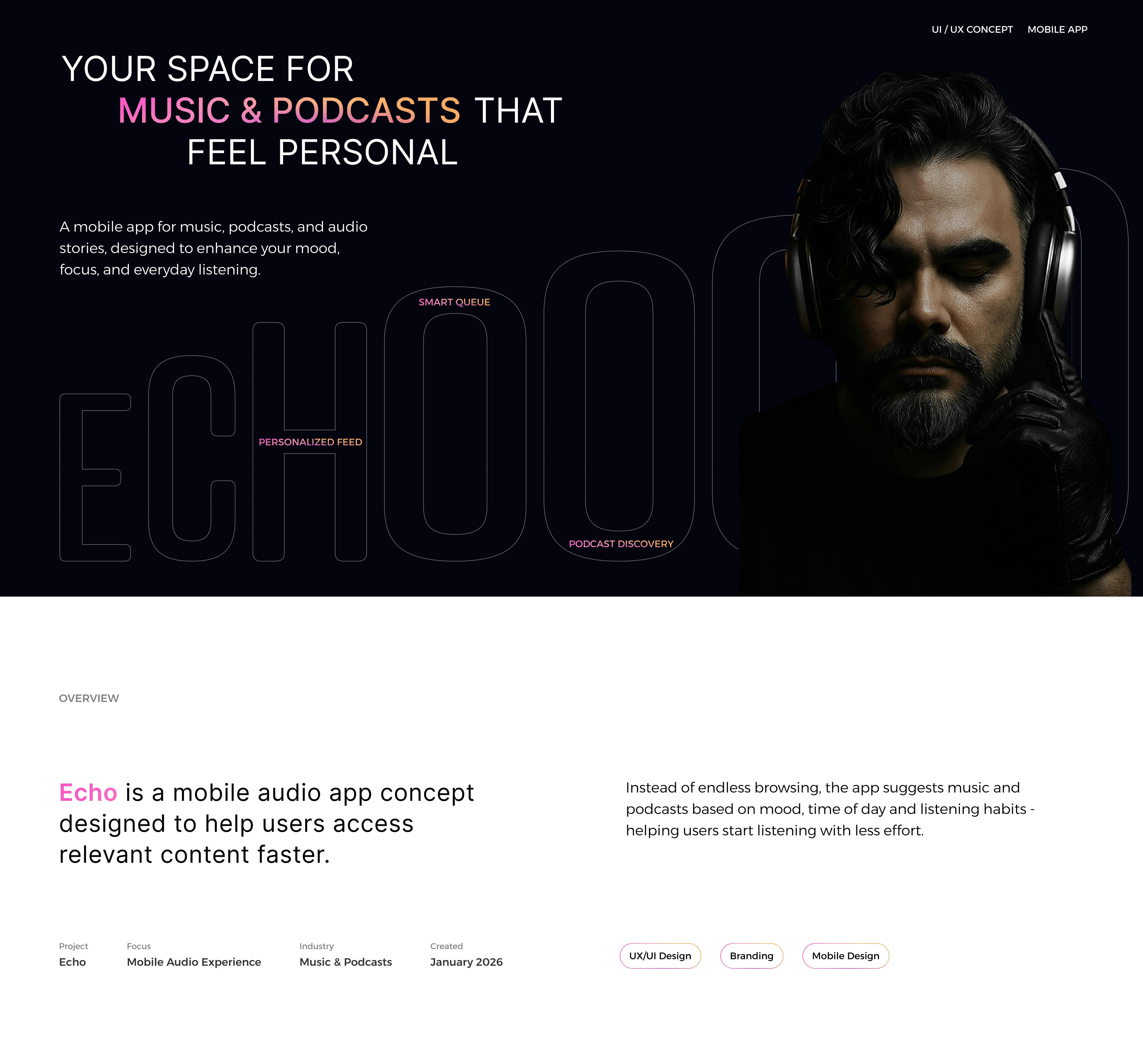
Every design decision started with one question: how can listening feel more effortless? Rather than adding more features, the concept explores how personalization, clear navigation, and thoughtful interactions can reduce friction throughout the experience.
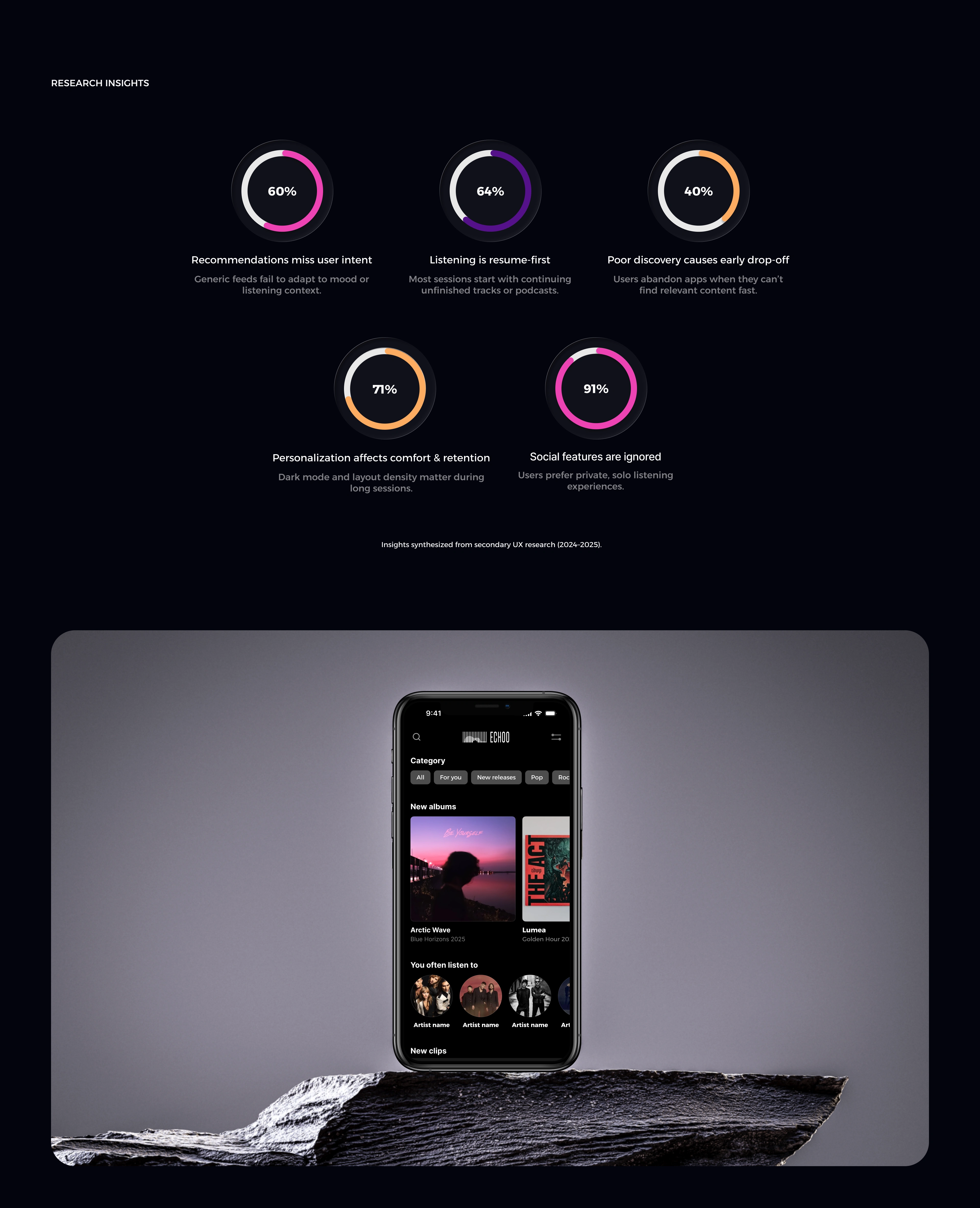
Instead of treating research as a separate phase, the findings became a framework for prioritizing features and shaping the product from the very beginning.
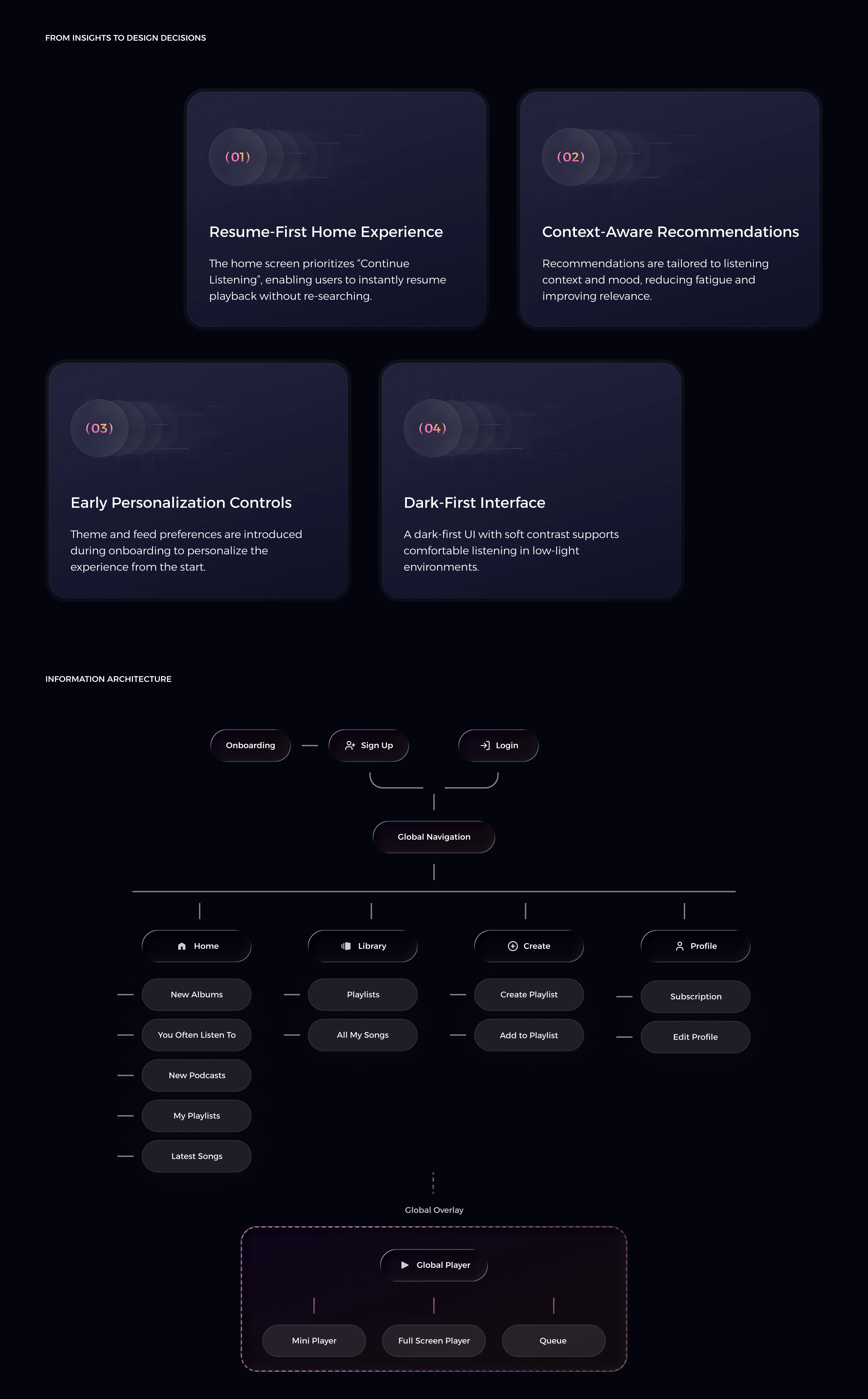
Before moving into visuals, I mapped the experience around the most common listening journeys to keep navigation predictable and reduce unnecessary steps.
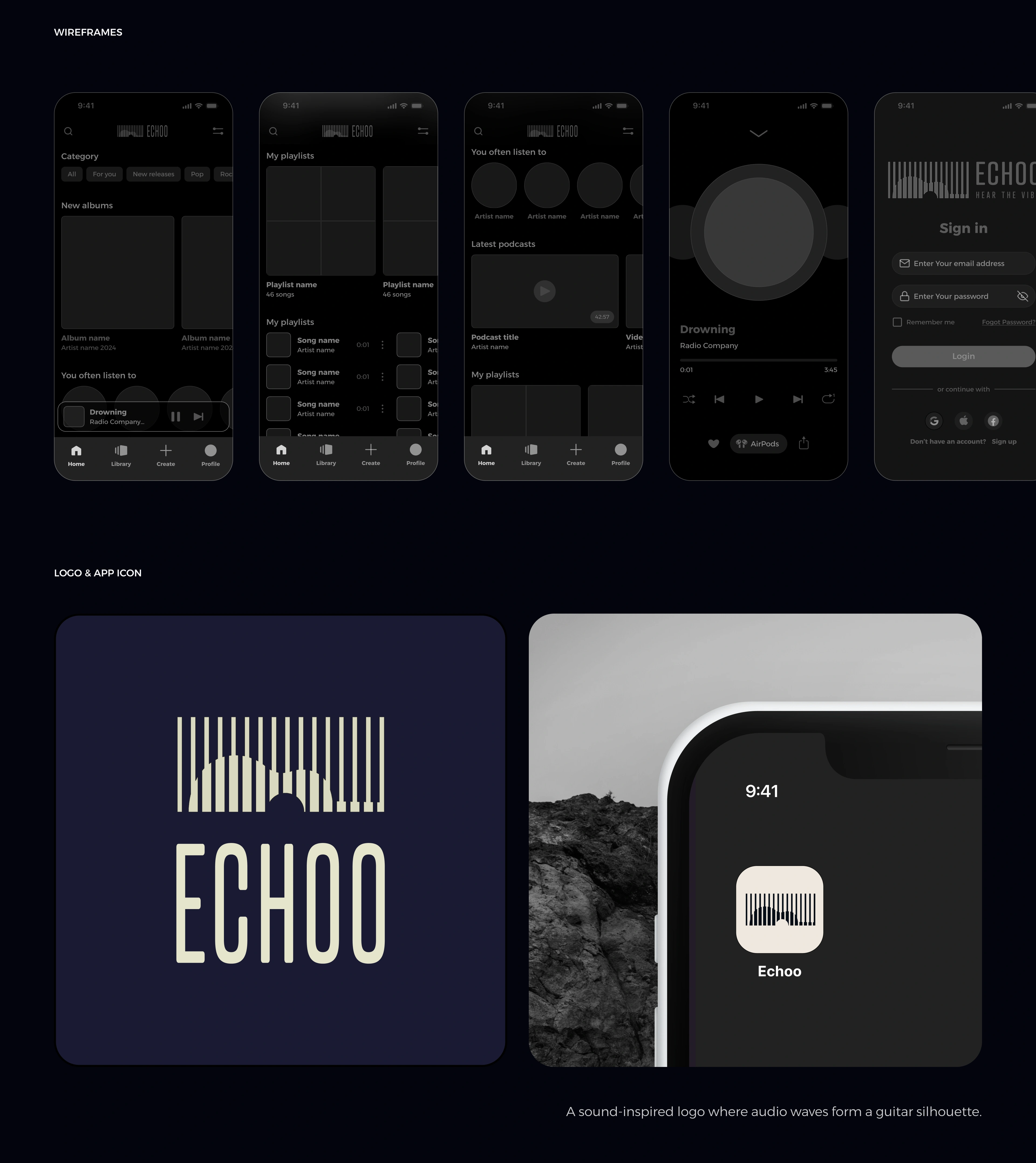
Wireframes helped validate content hierarchy and user flows early, making it easier to refine interactions before focusing on the visual language. The branding was developed alongside the interface to create a consistent experience where identity and usability support each other.
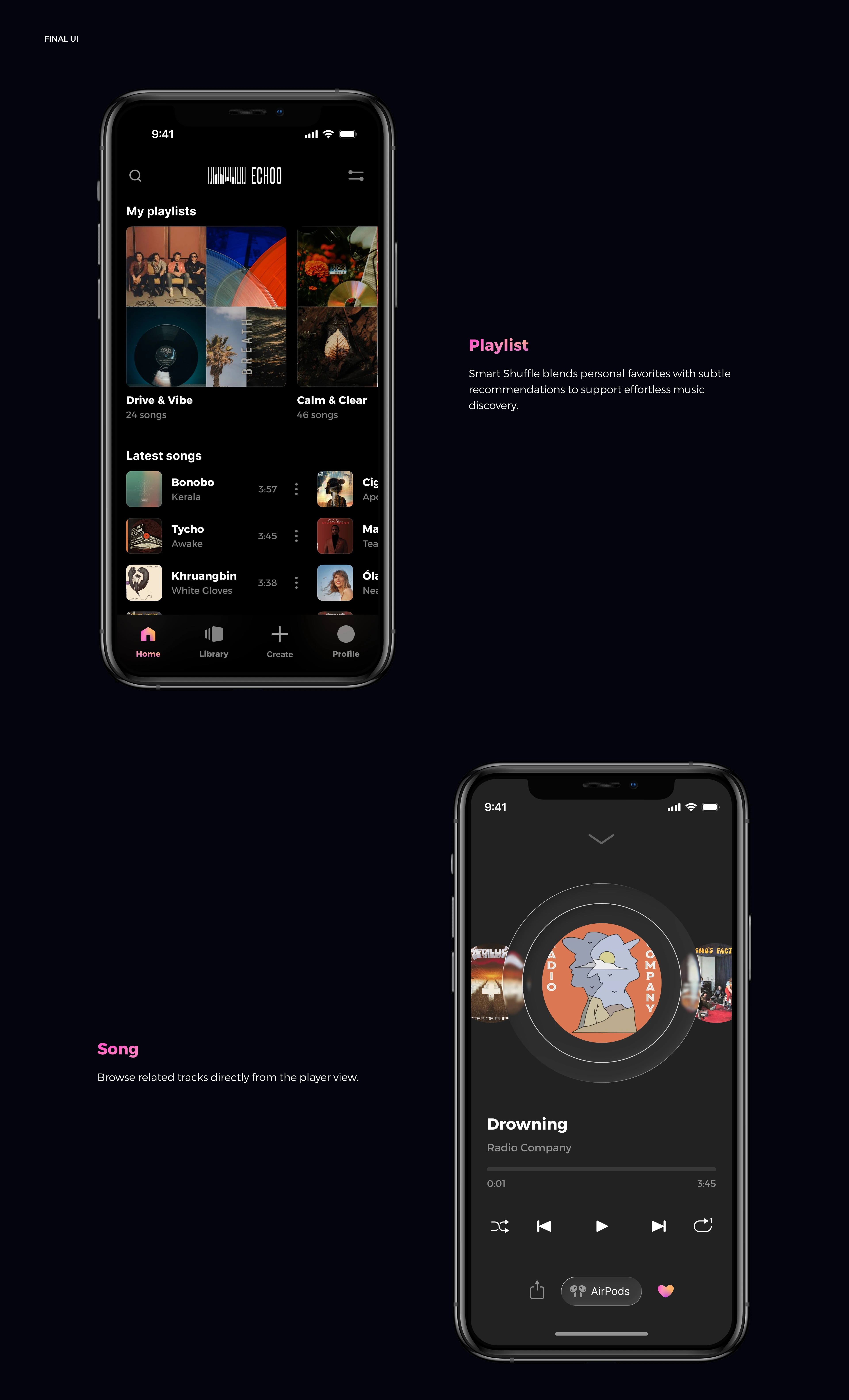
The final interface balances clarity with atmosphere, allowing content to remain the primary focus while maintaining a distinctive visual identity.

Every visual element - from typography to color and spacing - was selected to support long listening sessions without creating visual fatigue.
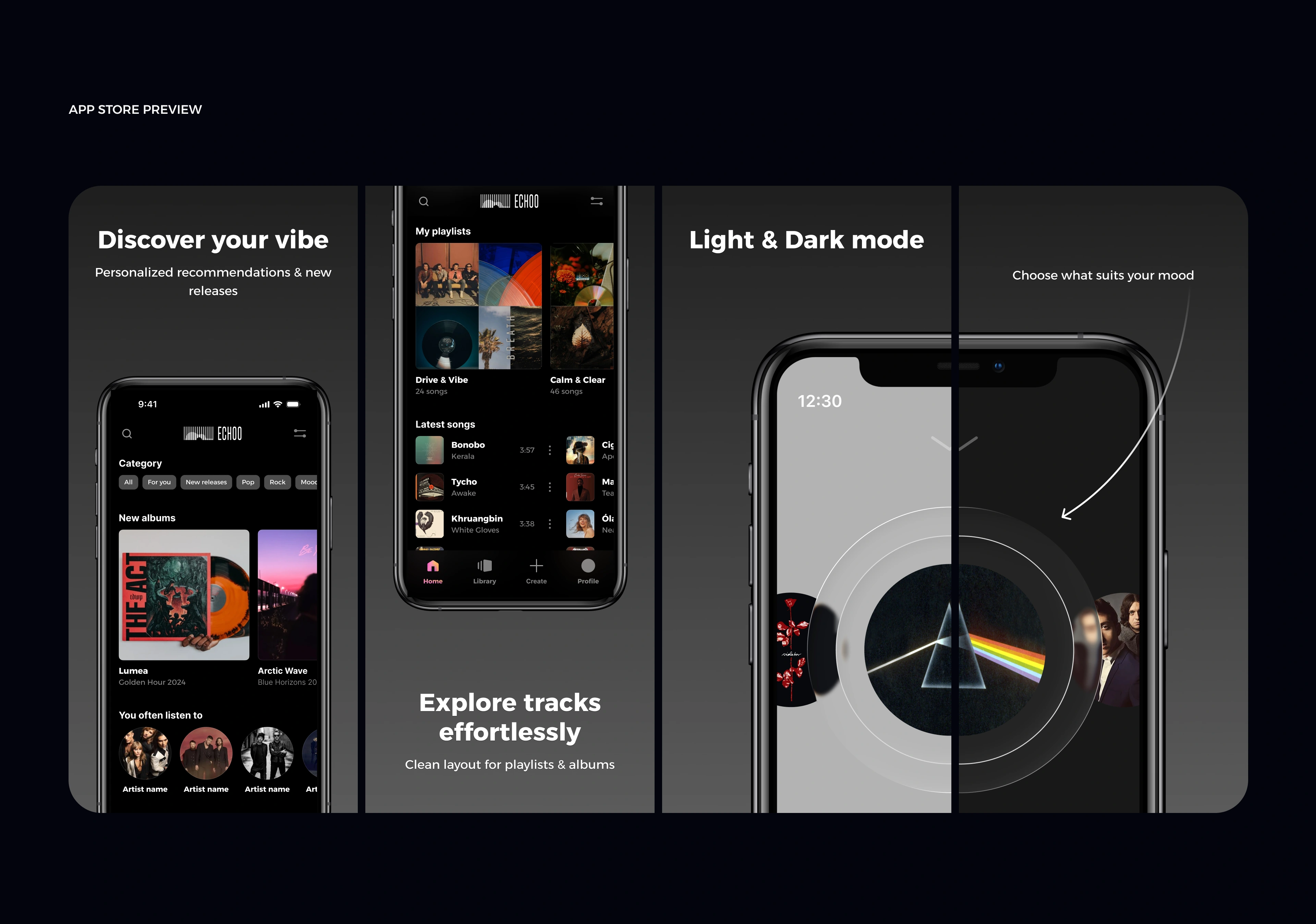
The concept was designed as a cohesive product experience, demonstrating how research, interaction design, branding, and interface design work together to support everyday listening.
Like this project
Posted Jul 1, 2026
Mobile app UX/UI design, music streaming app, user research, wireframing, interaction design, personalized recommendations, dark UI, Figma, product design.