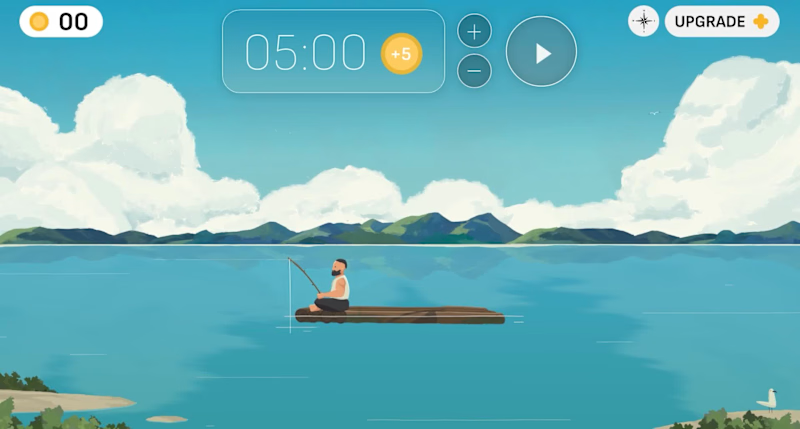
I designed this focus app interface called 'Sea of Focus' for a client last year which sadly never saw the light of day.
All made in @Rive, using Photoshop files, with the final export planned for a web app.
The idea was that when a user completes a focus session, they are rewarded with in-app currency to upgrade their virtual raft with pets, flags, and music players.
All in all, it was great fun to work on despite it not getting out there!
1
1
432
SIRKEL
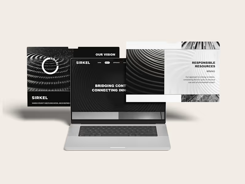
Closing the loop: brand strategy, creative direction and copywriting for a global investment venture
Brand strategy, naming, creative direction, visual identity, website and copywriting for Sirkel Ventures, an investment business working across renewable energy, mining and global markets.
THE STORY
Sirkel was built around a simple idea: seemingly separate opportunities are often part of something much bigger.
The business works across industries, markets and geographies, connecting capital, expertise and opportunity. I wanted the brand to make those connections visible.
That led naturally to the idea of the circle, and to Sirkel.
From there, I built the visual and verbal world around movement, connection and impact. Circles, ripples, loops and repeating forms became a way to show how one investment can create effects far beyond its starting point.
The language followed the same thinking. “Bridging continents. Connecting innovators.” “Embracing diversity and creating opportunity.” “Join our Sirkel of change and impact.”
The result was a bold, stripped-back identity that could move comfortably between mining, renewable energy and investment without belonging too obviously to any one of them.
WHAT IT TAUGHT ME
That a good brand idea can do more than hold a business together. It can help make sense of a business that operates across very different worlds.
And that sometimes the simplest shape gives you the biggest world to build from.
0
118

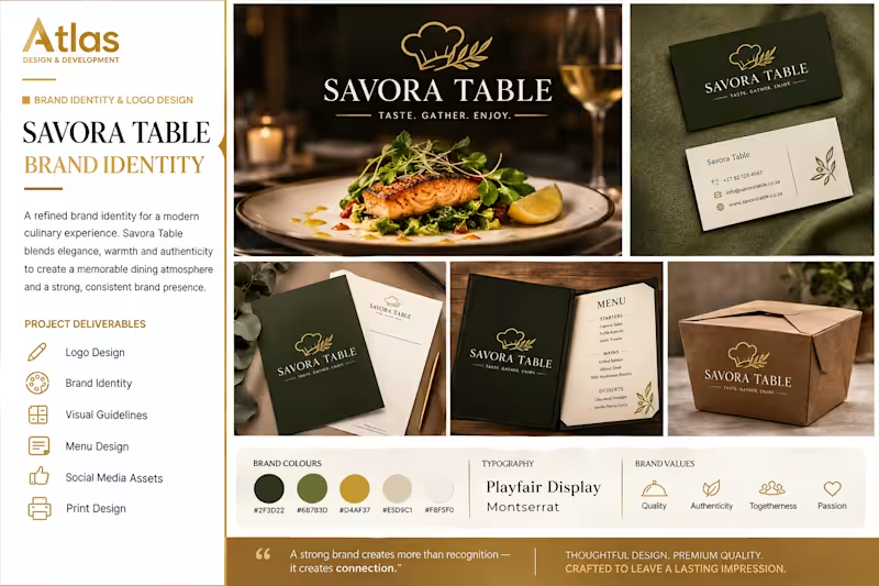
BRAND IDENTITY & LOGO DESIGN
The Problem
Savora Table needed a distinctive brand identity that would capture the warmth, quality, and refined experience of modern dining while creating a strong and memorable visual presence.
The Solution
I developed a complete visual identity featuring an elegant logo, refined typography, a sophisticated colour palette, and branded assets including stationery, menus, packaging, and social media visuals.
The Result
The final identity creates a premium and cohesive brand experience that feels warm, authentic, and memorable across both digital and physical touchpoints.
1
144