Gitas Art: Brand Direction & Visual Identity

Brigitta van Besouw


Gita’s Art Rebrand Moodboard
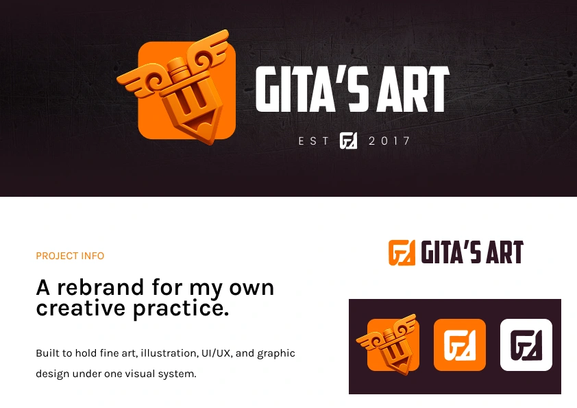
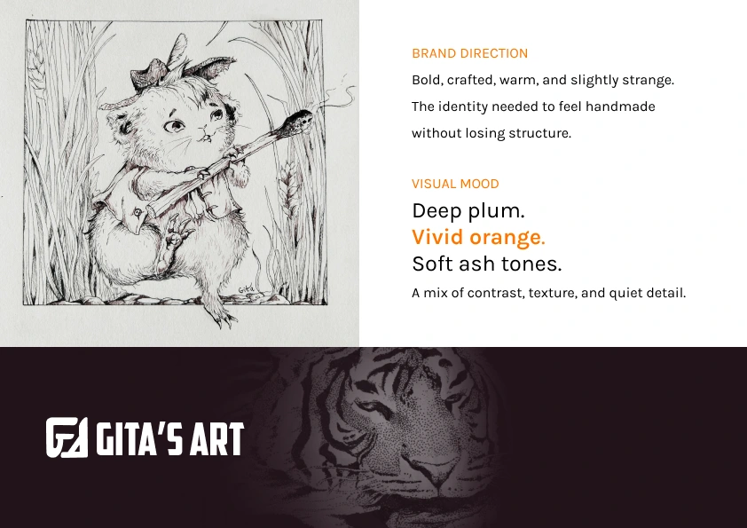
Gita’s Art needed a visual system with more backbone.
The practice had outgrown a loose collection of styles. Fine art, illustration, UI/UX, graphic design, and game UI all needed to sit under one identity without flattening the weird, detailed, handmade parts.
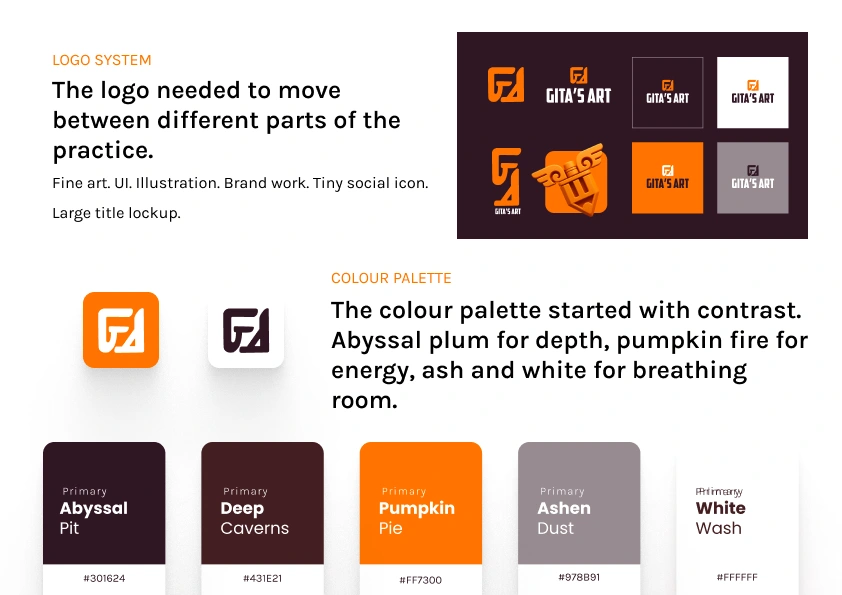
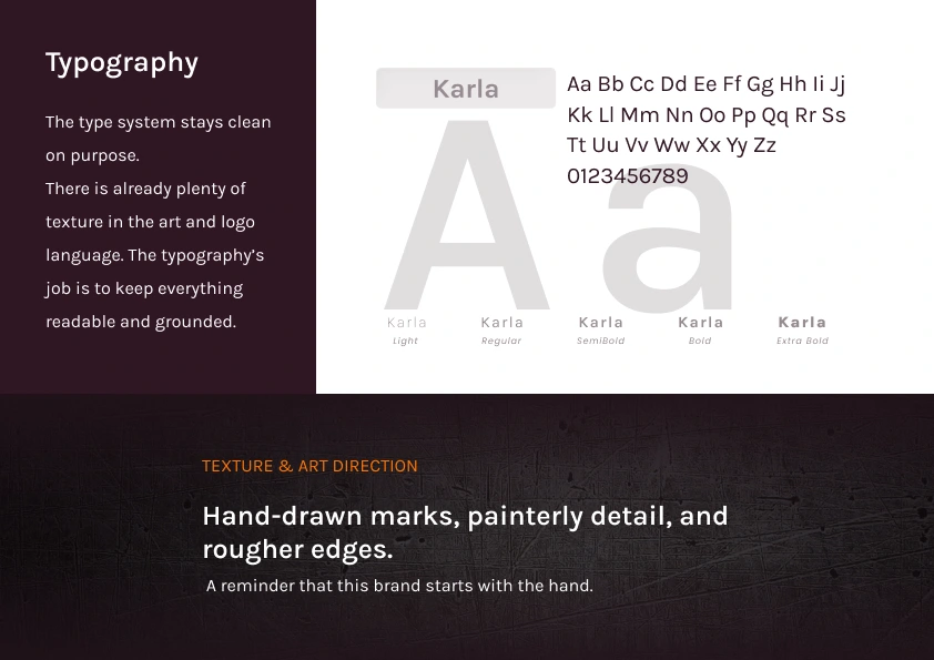
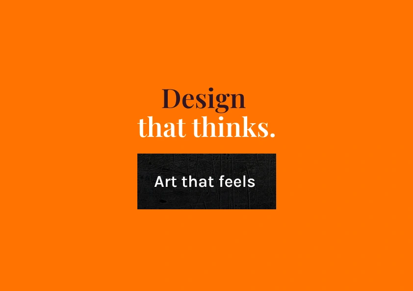
This moodboard sets the foundation: deep plum, vivid orange, clean type, sharp logo marks, and enough texture to keep the hand visible.
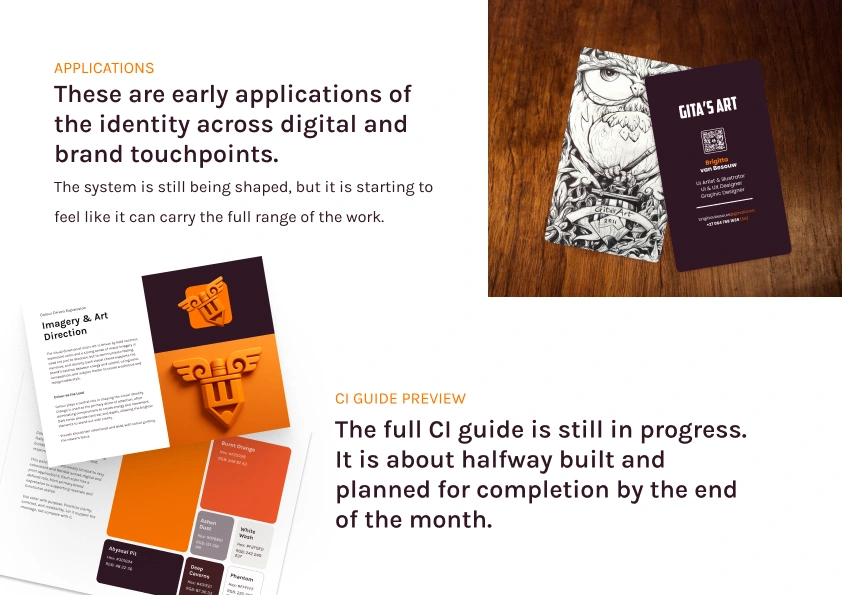
The full CI guide is still being built and should be finished by the end of the month.
Thank you for taking the time to explore this project.
I am always open to new collaborations, commissions, and design challenges. For inquiries or opportunities, reach me at hello.gitasart@gmail.com
If you enjoyed this project, a Like is always appreciated and helps more people discover my work.
Follow along for more:
Like this project
Posted Oct 26, 2026
Gita’s Art needed a stronger visual foundation that could hold multiple creative disciplines under one clear identity. This moodboard explores the early brand direction for my multidisciplinary studio, bringing together fine art, illustration, UI/UX design, graphic design, and game UI into one cohesive visual language. The direction combines deep plum tones, vivid orange, clean typography, sharp logo treatment, and tactile texture to balance professionalism with expressive handmade energy. The goal was to create a brand system with more structure, more confidence, and enough flexibility to support both commercial design work and personal art practice.